Illustration of how to create a circular progress bar using CSS3
The basic idea of making a circular progress bar is to draw a basic arc shape, and then in CSS3 we can control its rotation to connect the basic shapes in series and create the effect of partial disappearance. Let’s learn how to make a diagram using CSS3 Method of circular progress bar
First of all, when someone asks you whether you can make a circular progress bar effect, if it is a static complete circular progress bar, then it is very simple:
.circleprogress{
    width: 160px;
    height: 160px;
    border:20px solid red;
    border-radius: 50%;
} 
Then you will say, this is very simple. But what if it's not a complete circle? I thought about it for a while:
.circleprogress{
  width: 160px;
  height: 160px;
  border:20px solid red;
  border-left:20px solid transparent;
  border-bottom:20px solid transparent;
  border-radius: 50%;
}
Then I still said, this is not difficult. However, what if they are not all multiples of 45 degrees?
OK, let’s set up a 200x200 square first, and then we’ll complete our effects here:
.circleProgress_wrapper{
  width: 200px;
  height: 200px;
  margin: 50px auto;
  position: relative;
  border:1px solid #ddd;
}
Next I will put two more rectangles in this container, each rectangle takes up half:
<p class="circleProgress_wrapper">
        <p class="wrapper right">
            <p class="circleProgress rightcircle"></p>
        </p>
        <p class="wrapper left">
            <p class="circleProgress leftcircle"></p>
        </p>
 </p>
.wrapper{
width: 100px;
height: 200px;
position: absolute;
top:0;
overflow: hidden;
}
.rightright{
rightright:0;
}
.left{
left:0;
}
The key point here is The overflow:hidden; of .wrapper plays a key role. Both rectangles have overflow hiding set, so when we rotate the circle inside the rectangle, the overflow part will be hidden, so that we can achieve the effect we want.
As you can see from the html structure, there will be a circle in the left and right rectangles. Let’s talk about the right semicircle first:
.circleProgress{
width: 160px;
height: 160px;
border:20px solid transparent;
border-radius: 50%;
position: absolute;
top:0;
}
.rightcircle{
border-top:20px solid green;
border-right:20px solid green;
rightright:0;
}
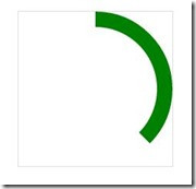
As you can see, the effect has come out. In fact, it was originally a semicircular arc, but because we set the upper and right borders, half of the upper border overflowed and was hidden, so we can pass The rotation can be restored:
.circleProgress{
width: 160px;
height: 160px;
border:20px solid transparent;
border-radius: 50%;
position: absolute;
top:0;
-webkit-transform: rotate(45deg);
}
So as long as you rotate the angle you want, you can achieve a progress bar of any proportion. Next, realize the left semi-circle arc and turn it into a full circle:
.leftcircle{
border-bottom:20px solid green;
border-left:20px solid green;
left:0;
}
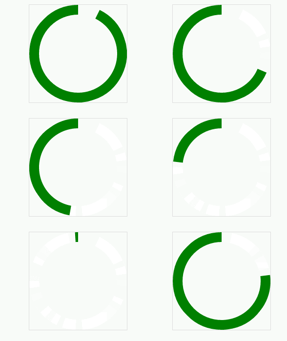
The next step is to make it move. The principle is this, first rotate the right semi-circle 180 degrees, and then rotate the left semi-circle 180 degrees. In this way, the two semi-circles all overflow and disappear, so it looks like the progress bar is scrolling again. Effect:
.rightcircle{
border-top:20px solid green;
border-right:20px solid green;
rightright:0;
-webkit-animation: circleProgressLoad_right 5s linear infinite;
}
.leftcircle{
border-bottom:20px solid green;
border-left:20px solid green;
left:0;
-webkit-animation: circleProgressLoad_left 5s linear infinite;
}
@-webkit-keyframes circleProgressLoad_right{
0%{
-webkit-transform: rotate(45deg);
}
50%,100%{
-webkit-transform: rotate(225deg);
}
}
@-webkit-keyframes circleProgressLoad_left{
0%,50%{
-webkit-transform: rotate(45deg);
}
100%{
-webkit-transform: rotate(225deg);
}
}
Of course, we only need to adjust the angle to achieve the reverse effect:
.circleProgress{
width: 160px;
height: 160px;
border:20px solid transparent;
border-radius: 50%;
position: absolute;
top:0;
-webkit-transform: rotate(-135deg);
}
@-webkit-keyframes circleProgressLoad_right{
0%{
-webkit-transform: rotate(-135deg);
}
50%,100%{
-webkit-transform: rotate(45deg);
}
}
@-webkit-keyframes circleProgressLoad_left{
0%,50%{
-webkit-transform: rotate(-135deg);
}
100%{
-webkit-transform: rotate(45deg);
}
}

Okay, the next step is to move towards the final effect. As we saw at the beginning, it is a bit like when we use 360 Guards to clean up the garbage. The effect, of course, is not very similar:
.circleProgress_wrapper{
width: 200px;
height: 200px;
margin: 50px auto;
position: relative;
border:1px solid #ddd;
}
.wrapper{
  width: 100px;
  height: 200px;
  position: absolute;
  top:0;
  overflow: hidden;
}
.rightright{
  rightright:0;
}
.left{
  left:0;
}
.circleProgress{
width: 160px;
height: 160px;
border:20px solid rgb(232, 232, 12);
border-radius: 50%;
position: absolute;
top:0;
-webkit-transform: rotate(45deg);
}
.rightcircle{
border-top:20px solid green;
border-right:20px solid green;
rightright:0;
-webkit-animation: circleProgressLoad_right 5s linear infinite;
}
.leftcircle{
border-bottom:20px solid green;
border-left:20px solid green;
left:0;
-webkit-animation: circleProgressLoad_left 5s linear infinite;
}
@-webkit-keyframes circleProgressLoad_right{
0%{
border-top:20px solid #ED1A1A;
border-right:20px solid #ED1A1A;
-webkit-transform: rotate(45deg);
}
50%{
border-top:20px solid rgb(232, 232, 12);
border-right:20px solid rgb(232, 232, 12);
border-left:20px solid rgb(81, 197, 81);
border-bottom:20px solid rgb(81, 197, 81);
-webkit-transform: rotate(225deg);
}
100%{
border-left:20px solid green;
border-bottom:20px solid green;
-webkit-transform: rotate(225deg);
}
}
@-webkit-keyframes circleProgressLoad_left{
0%{
border-bottom:20px solid #ED1A1A;
border-left:20px solid #ED1A1A;
-webkit-transform: rotate(45deg);
}
50%{
border-bottom:20px solid rgb(232, 232, 12);
border-left:20px solid rgb(232, 232, 12);
border-top:20px solid rgb(81, 197, 81);
border-right:20px solid rgb(81, 197, 81);
-webkit-transform: rotate(45deg);
}
100%{
border-top:20px solid green;
border-right:20px solid green;
border-bottom:20px solid green;
border-left:20px solid green;
-webkit-transform: rotate(225deg);
}
} As you can see, it is actually just some more animations that change the colors of different borders. Let everyone practice this! The main thing is to use two rectangles to achieve such a circular progress bar effect. Pay special attention to the overflow rule, which plays a key role.
The above is the detailed content of Illustration of how to create a circular progress bar using CSS3. For more information, please follow other related articles on the PHP Chinese website!
 The Lost CSS Tricks of Cohost.orgApr 25, 2025 am 09:51 AM
In this post, Blackle Mori shows you a few of the hacks found while trying to push the limits of Cohost’s HTML support. Use these if you dare, lest you too get labelled a CSS criminal.
 Next Level CSS Styling for CursorsApr 23, 2025 am 11:04 AM
Custom cursors with CSS are great, but we can take things to the next level with JavaScript. Using JavaScript, we can transition between cursor states, place dynamic text within the cursor, apply complex animations, and apply filters.
 Worlds Collide: Keyframe Collision Detection Using Style QueriesApr 23, 2025 am 10:42 AM
Interactive CSS animations with elements ricocheting off each other seem more plausible in 2025. While it’s unnecessary to implement Pong in CSS, the increasing flexibility and power of CSS reinforce Lee's suspicion that one day it will be a
 Using CSS backdrop-filter for UI EffectsApr 23, 2025 am 10:20 AM
Tips and tricks on utilizing the CSS backdrop-filter property to style user interfaces. You’ll learn how to layer backdrop filters among multiple elements, and integrate them with other CSS graphical effects to create elaborate designs.
 SMIL on?Apr 23, 2025 am 09:57 AM
Well, it turns out that SVG's built-in animation features were never deprecated as planned. Sure, CSS and JavaScript are more than capable of carrying the load, but it's good to know that SMIL is not dead in the water as previously
 'Pretty' is in the eye of the beholderApr 23, 2025 am 09:40 AM
Yay, let's jump for text-wrap: pretty landing in Safari Technology Preview! But beware that it's different from how it works in Chromium browsers.
 CSS-Tricks Chronicles XLIIIApr 23, 2025 am 09:35 AM
This CSS-Tricks update highlights significant progress in the Almanac, recent podcast appearances, a new CSS counters guide, and the addition of several new authors contributing valuable content.
 Tailwind's @apply Feature is Better Than it SoundsApr 23, 2025 am 09:23 AM
Most of the time, people showcase Tailwind's @apply feature with one of Tailwind's single-property utilities (which changes a single CSS declaration). When showcased this way, @apply doesn't sound promising at all. So obvio


Hot AI Tools

Undresser.AI Undress
AI-powered app for creating realistic nude photos

AI Clothes Remover
Online AI tool for removing clothes from photos.

Undress AI Tool
Undress images for free

Clothoff.io
AI clothes remover

Video Face Swap
Swap faces in any video effortlessly with our completely free AI face swap tool!

Hot Article

Hot Tools

PhpStorm Mac version
The latest (2018.2.1) professional PHP integrated development tool

ZendStudio 13.5.1 Mac
Powerful PHP integrated development environment

DVWA
Damn Vulnerable Web App (DVWA) is a PHP/MySQL web application that is very vulnerable. Its main goals are to be an aid for security professionals to test their skills and tools in a legal environment, to help web developers better understand the process of securing web applications, and to help teachers/students teach/learn in a classroom environment Web application security. The goal of DVWA is to practice some of the most common web vulnerabilities through a simple and straightforward interface, with varying degrees of difficulty. Please note that this software

Atom editor mac version download
The most popular open source editor

Notepad++7.3.1
Easy-to-use and free code editor


