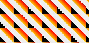
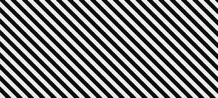
This article mainly introduces the practical tutorial for sharing CSS3 stripe background production. It will be explained separately based on the Forefox browser and the webkit kernel browser. Friends in need can refer to it
mozilla kernel browser makes background background gradient
1. Make a simple horizontal stripe gradient background
-mozilla kernel browser Device css style:
body {
 background-color: #aaa;
 background-image:-moz-linear-gradient(#000 25%,#fc0 80%);
 background-size: 50px 50px;
}
Represented by Firefox, the display effect is as follows: 
Change the value of background-size to control the background The height of the stripes. In the above example, the value of -moz-linear-gradient is divided into two groups, the start value and the end value. At the same time, the start position of the start value and the end position of the end value are set. The parts with different positions form a gradient. The part before the start position is filled with the starting color value, and the part after the end value is filled with the ending color value.
2. Change the direction of the stripes
body {
 background-image:-moz-linear-gradient(0deg,#000 25%,#fc0 80%);
}
Add a set of parameters 

##3. We try to add a few more color gradients
body {
 background-image:-moz-linear-gradient(45deg,#000 25%,transparent 25%,#fc0 80%);
}

body {
 background-image:-moz-linear-gradient(0deg,#000 25%,transparent 25%,transparent 50%,#fc0 50%,#f00 75%,transparent 75%);
}

4. The prototype of the twill background
Now if you change the original 0deg to 45deg, what will it look like?
body {
    background-image:-moz-linear-gradient(45deg,#000 25%,transparent 25%,transparent 50%,#000 50%,#000 75%,transparent 75%);
    background-size:16px 16px;
}

5. Final effect
Although the twill background above has come out, it has not yet achieved the final effect we want. Let's modify the color value inside again and change it to white. The current color value is #fff, we change it to rgba in the form of rgba(255,255,255,1), the first three numbers are rgb, and the fourth number is alpha. Now we change this alpha to semi-transparent, code As follows:body {
background-color: #eee;
background-image: -moz-linear-gradient(45deg, rgba(255, 255, 255, 0.2) 25%, transparent 25%, transparent 50%, rgba(255, 255, 255, 0.2) 50%, rgba(255, 255, 255, 0.2) 75%, transparent 75%, transparent);
background-size: 16px 16px;
}
webkit core
1. Make a simple vertical stripe background
body {
    background-color: #eee;
    background-image:-webkit-gradient(linear,0 0,100% 0,from(#fff),to(#000));
    background-size: 80px 80px;
}
body {
    background-image:-webkit-gradient(linear,0 100%,100% 0,from(#fff),to(#000));
}
body {
    background-image:-webkit-gradient(linear,0 0,100% 0,from(#fff),to(#000),color-stop(25%,#fc0),color-stop(50%,#0fc),color-stop(75%,#f0c))
}
The code is as follows:
background-image:-webkit-gradient(linear,0 0,100% 0,color-stop(25%,#0fc),color-stop(25%,transparent),color-stop(50%,transparent),color-stop(50%,#fc0),color-stop(75%,#f0c),color-stop(75%,transparent));
5. Follow step 2 to adjust the direction
The code is as follows:
background-image:-webkit-gradient(linear,0 100%,100% 0,color-stop(25%,#0fc),color-stop(25%,transparent),color-stop(50%,transparent),color-stop(50%,#fc0),color-stop(75%,#f0c),color-stop(75%,transparent));
6、调整颜色,调整background-size大小
body {
    background-image:-webkit-gradient(linear,0 100%,100% 0,color-stop(25%,#000),color-stop(25%,transparent),color-stop(50%,transparent),color-stop(50%,#000),color-stop(75%,#000),color-stop(75%,transparent));
    background-size: 16px 16px;
}
7、调整颜色值的透明度,最终效果如下:
虽然上面的斜纹背景已经出来了,但还没有达到我们想要的最终效果。我们再把里面的颜色值修改一下,换成白色。现在的颜色值为#fff,我们再把它换成rgba形式为rgba(255,255,255,1),前面的三个数字为rgb,第四个数字为alpha,现在我们把这个alpha改成半透明的,最终代码如下:
body {
    background-color: #eee;
    background-image: -moz-linear-gradient(45deg,#fff 25%, transparent 25%, transparent 50%,#fff 50%,#fff 75%, transparent 75%, transparent);
    background-image:-webkit-gradient(linear,0 100%,100% 0,color-stop(25%,rgba(255,255,255,0.2)),color-stop(25%,transparent),color-stop(50%,transparent),color-stop(50%,rgba(255,255,255,0.2)),color-stop(75%,rgba(255,255,255,0.2)),color-stop(75%,transparent));
    background-size: 16px 16px;
}
上面的代码加上了上面讲的mozilla内核浏览器下的写法,在火狐、谷歌浏览器中测试显示正常。
The above is the detailed content of Share practical tutorials on making CSS3 striped backgrounds. For more information, please follow other related articles on the PHP Chinese website!
 Adding Box Shadows to WordPress Blocks and ElementsMar 09, 2025 pm 12:53 PM
The CSS box-shadow and outline properties gained theme.json support in WordPress 6.1. Let's look at a few examples of how it works in real themes, and what options we have to apply these styles to WordPress blocks and elements.
 Create a JavaScript Contact Form With the Smart Forms FrameworkMar 07, 2025 am 11:33 AM
This tutorial demonstrates creating professional-looking JavaScript forms using the Smart Forms framework (note: no longer available). While the framework itself is unavailable, the principles and techniques remain relevant for other form builders.
 Demystifying Screen Readers: Accessible Forms & Best PracticesMar 08, 2025 am 09:45 AM
This is the 3rd post in a small series we did on form accessibility. If you missed the second post, check out "Managing User Focus with :focus-visible". In
 Create an Inline Text Editor With the contentEditable AttributeMar 02, 2025 am 09:03 AM
Building an inline text editor isn't trivial. The process starts by making the target element editable, handling potential SyntaxError exceptions along the way. Creating Your Editor To build this editor, you'll need to dynamically modify the content
 Working With GraphQL CachingMar 19, 2025 am 09:36 AM
If you’ve recently started working with GraphQL, or reviewed its pros and cons, you’ve no doubt heard things like “GraphQL doesn’t support caching” or
 Making Your First Custom Svelte TransitionMar 15, 2025 am 11:08 AM
The Svelte transition API provides a way to animate components when they enter or leave the document, including custom Svelte transitions.
 Comparing the 5 Best PHP Form Builders (And 3 Free Scripts)Mar 04, 2025 am 10:22 AM
This article explores the top PHP form builder scripts available on Envato Market, comparing their features, flexibility, and design. Before diving into specific options, let's understand what a PHP form builder is and why you'd use one. A PHP form
 File Upload With Multer in Node.js and ExpressMar 02, 2025 am 09:15 AM
This tutorial guides you through building a file upload system using Node.js, Express, and Multer. We'll cover single and multiple file uploads, and even demonstrate storing images in a MongoDB database for later retrieval. First, set up your projec


Hot AI Tools

Undresser.AI Undress
AI-powered app for creating realistic nude photos

AI Clothes Remover
Online AI tool for removing clothes from photos.

Undress AI Tool
Undress images for free

Clothoff.io
AI clothes remover

AI Hentai Generator
Generate AI Hentai for free.

Hot Article

Hot Tools

Zend Studio 13.0.1
Powerful PHP integrated development environment

SublimeText3 Chinese version
Chinese version, very easy to use

SublimeText3 Linux new version
SublimeText3 Linux latest version

Notepad++7.3.1
Easy-to-use and free code editor

Dreamweaver CS6
Visual web development tools


