Home >Web Front-end >CSS Tutorial >Detailed process analysis of making thumbnails with CSS3
Detailed process analysis of making thumbnails with CSS3
- 高洛峰Original
- 2017-03-07 15:20:331748browse
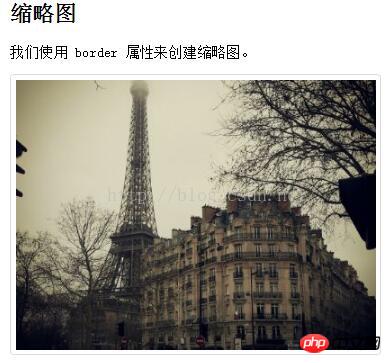
We use the border attribute to create thumbnails, the details are as follows
<!DOCTYPE html>
<html>
<head>
<style>
img {
    border: 1px solid #ddd;
    border-radius: 4px;
    padding: 5px;
}
</style>
</head>
<body>
<h2>缩略图</h2>
<p>我们使用 border 属性来创建缩略图。</p>
<img src="/static/imghwm/default1.png"  data-src="paris.jpg"  class="lazy"   alt="Paris"    style="max-width:90%"  style="max-width:90%">
</body>
</html>

How do thumbnails serve as connections?
<!DOCTYPE html>
<html>
<head>
<style>
a {
    display: inline-block;
    border: 1px solid #ddd;
    border-radius: 4px;
    padding: 5px;
    transition: 0.3s;
}
a:hover {
    box-shadow: 0 0 2px 1px rgba(0, 140, 186, 0.5);
}
</style>
</head>
<body>
<h2>缩略图作为连接</h2>
<p>我们使用 border 属性来创建缩略图。在图片外层添加一个链接。</p>
<p>点击图片查看效果:</p>
<a target="_blank" href="paris.jpg">
  <img src="/static/imghwm/default1.png"  data-src="paris.jpg"  class="lazy"   alt="Paris"    style="max-width:90%"  style="max-width:90%">
</a>
</body>
</html>

The above is the entire content of this article. I hope it will be helpful to everyone's learning, and I also hope that everyone will support the PHP Chinese website.
For more detailed process analysis of CSS3 thumbnail creation and related articles, please pay attention to the PHP Chinese website!
Statement:
The content of this article is voluntarily contributed by netizens, and the copyright belongs to the original author. This site does not assume corresponding legal responsibility. If you find any content suspected of plagiarism or infringement, please contact admin@php.cn

