Home >Web Front-end >CSS Tutorial >Detailed explanation of examples of using CSS to achieve triangle effects
Detailed explanation of examples of using CSS to achieve triangle effects
- 高洛峰Original
- 2017-03-04 10:34:141553browse
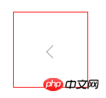
Method 1: Use border to set the border, the element has height and width
<i class="triangle"></i>

.triangle {
     transform: rotate(45deg);
     display: block;
     width: 12px;
     height: 12px;
     border: 1px solid #9e9e9e;
     border-top-color: transparent;
     border-right-color: transparent;
     background-color: #fff;
}
##Effect:

Method 2: Use border to support the triangle
<i class="triangle"></i>

.triangle {
     display: block;
     position: absolute;
     width: 0;
     border-width: 6px;
     border-color: transparent transparent red;
     border-style: dashed dashed solid;
     top: -12px;
     right: 76px;
}
##Effect :

Application scenario: Click 234 or click to select when the triangle points to the corresponding option

Tips: 1. Learn to often use pseudo elements such as after or before to implement triangles
2.
The difference between the two methods: The second method sets the triangle background color and the border color to be the same; the first method sets the triangle background color and the border color The colors can be different; the method needs to be selected according to the effects of different application scenarios. The second method can also achieve different effects of background color and border color by using two triangle covers with different colors.
The above simple example of using CSS to achieve the triangle effect is all the content shared by the editor. I hope it can give you a reference, and I hope you will support the PHP Chinese website.
For more detailed examples of CSS achieving triangle effects, please pay attention to the PHP Chinese website for related articles!
Related articles
See more- How Can I Reliably Hide `` Elements in `` Menus Using CSS?
- Did you know you can optimize your website&#s load time by with just one line of code?
- Configuring Tailwind as a Design System
- Learn CSS Grid: Simple Guide with Plenty of Examples
- Why Doesn\'t :hover Work Properly with Adjacent-Sibling Selectors in Webkit Browsers?

