Home >Web Front-end >CSS Tutorial >Detailed explanation of simple examples of making triangles and buttons with CSS
Detailed explanation of simple examples of making triangles and buttons with CSS
- 高洛峰Original
- 2017-03-04 10:08:382754browse
Let me first talk about how to make a triangle. I believe you will see some triangles in the navigation bar when you visit the website. For example:
In the header menu bar of NetEase homepage , there will also be a triangle like this

When the mouse passes over, the triangle will flip vertically, as follows

Now I Sharing the method of making triangles, mainly made of borders
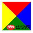
First, the square formed by the merging of four triangles, that is, the four triangles formed by the four borders of the square
Source code:
<!DOCTYPE html>
<html lang="en">
<head>
    <meta charset="UTF-8">
    <title>正方形</title>
    <style>
    .p{
        width: 0px;
        height: 0px;
        border-top:50px solid red;
        border-bottom:50px solid green;
        border-left:50px solid yellow;
        border-right:50px solid blue;
        /*注意:四条边框的宽度必须相同!*/
}
    </style>
</head>
<body>
    <p class="p"></p>
</body>
</html>
##The effect is as follows:

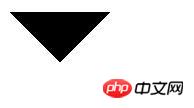
##Now, to take out one of the triangles, we actually need to remove the other Hide the
<!DOCTYPE html>
<html lang="en">
<head>
    <meta charset="UTF-8">
    <title>制作三角形箭头</title>
    <style>
    .arrow{
        width:0;
        height:0;
        border-top:50px solid #000;     /*设置并显示上边框*/
        border-bottom:none;             /*不设置下边框*/
        border-left:50px solid transparent;     /*设置但隐藏左边框*/
        border-right:50px solid transparent;    /*设置但隐藏右边框*/
    }
    .arrow:hover{
        border-top:none;                  /*鼠标经过时,不设置上边框*/
        border-bottom:50px solid #000;    /*鼠标经过时,设置并显示下边框*/
    }
    </style>
</head>
<body>
    <p class="arrow"></p>
</body>
</html>
 Next, I will share a button method
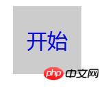
It is mainly realized by using border style, box shadow and pseudo-class effect
Source code:<!DOCTYPE html>
<html lang="en">
<head>
<meta charset="UTF-8">
<title>CSS制作按钮</title>
<style type="text/css">
.btn{
width:100px;
height:100px;
background:#ccc;
border-radius:50%;
box-shadow:5px 5px 10px #000; /*设置外阴影*/
}
.btn:active{
background:#bbb;
box-shadow:5px 5px 10px #000 inset; /*设置内阴影*/
}
.btn p{
font-size:30px;
font-family:"微软雅黑";
color:blue;
float:left;
margin-top:28px;
margin-left:20px;
}
</style>
</head>
<body>
<p class="btn">
<a href="###">
<p>开始</p>
</a>
</p>
</body>
</html>
 The effect may not be very beautiful and needs to be improved. Everyone can use their own abilities Use your imagination to create better results. I wish you all a happy study!
The above simple example of using CSS to create triangles and buttons is all the content shared by the editor. I hope it can give you a reference, and I hope you will support the PHP Chinese website.
For more detailed examples of simple examples of making triangles and buttons with CSS, please pay attention to the PHP Chinese website for related articles!

