Home >Web Front-end >H5 Tutorial >SVG (Scalable Vector Graphics) viewbox attributes viewbox and preserveAspectRatio
SVG (Scalable Vector Graphics) viewbox attributes viewbox and preserveAspectRatio
- 黄舟Original
- 2017-02-27 15:08:302332browse
In addition to the two basic width and height setting properties of width and height, SVG also has two more advanced properties
viewbox and preserveAspectRatio
Look at the example below
<svg width=300 height=300>
    <rect x=10 y=10 width=10 height=10></rect></svg>
rect { fill: red;}
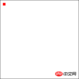
Now let’s add a viewbox attribute
<svg width=300 height=300 viewbox="0 0 30 30">
    <rect x=10 y=10 width=10 height=10></rect></svg>
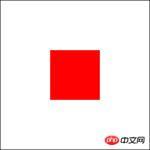
the graphics that were very small just now
now become so big
This is the wonder of viewbox
viewbox="0 0 30 30" 0 0 specifies the coordinates of the origin (upper left)
And 30 30 specifies the width of the svg High
is equivalent to our customized coordinate system of svg
Master Zhang Xinxu has a more vivid explanation of this:
SVG is like our monitor screen, and viewBox is a screenshot tool The selected box,(If you specify only viewbox without specifying width and height, then the svg will occupy the entire screen) viewbox and viewportDue to the width of our svg above The height is 300×300, and we scaled it to 30×30The final presentation is to display the screenshot content in the frame in full screen again on the monitor!
So it’s easy to figure it out
But how would it behave if it were not scaled proportionally?
And the picture in "screenshot mode" is called viewbox (width, height, viewbox is specified)
<svg width=300 height=300>
    <rect x=10 y=10 width=10 height=10></rect></svg>
Below I write the two modes together so that they can be compared well This is how it is displayed on the page
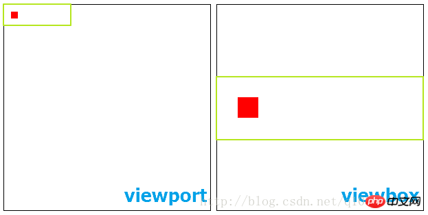
We found that it is in the center position after being enlarged
If we want to adjust its position
We need to use the preserveAspectRatio attribute
| Meaning | |
|---|---|
| Viewport and viewBox left alignment | |
| viewport and viewBox x-axis center alignment | |
| Viewport and viewBox are aligned on the right | |
| viewport and viewBox are aligned on the top | |
| Viewport and viewBox y-axis center alignment | |
| viewport and viewBox bottom alignment |
Also note that x is lowercase and Y is uppercase
| Meaning | |||||||||||||||||||||||
|---|---|---|---|---|---|---|---|---|---|---|---|---|---|---|---|---|---|---|---|---|---|---|---|
| slice | |||||||||||||||||||||||
| none | |||||||||||||||||||||||
| 属性值 | 含义 |
|---|---|
| xMin | viewport和viewBox 左边对齐 |
| xMid | viewport和viewBox x轴中心对齐 |
| xMax | viewport和viewBox 右边对齐 |
| YMin | viewport和viewBox 上边对齐 |
| YMid | viewport和viewBox y轴中心对齐 |
| YMax | viewport和viewBox 下边对齐 |
这里x和Y是组合使用的
同时还要注意x是小写,Y是大写
第二部分:
| 属性值 | 含义 |
|---|---|
| meet | 保持纵横比缩放viewBox适应viewport |
| slice | 保持纵横比同时比例小的方向放大填满viewport |
| none | 扭曲纵横比以充分适应viewport |
这个属性值得默认值大概就是 preserveAspectRatio="xMidYMid meet"
我们可以尝试调整这些值来了解这些属性值得含义
<svg width=300 height=300>
    <rect x=10 y=10 width=10 height=10></rect></svg>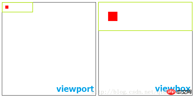
<svg width=300 height=300>
    <rect x=10 y=10 width=10 height=10></rect></svg>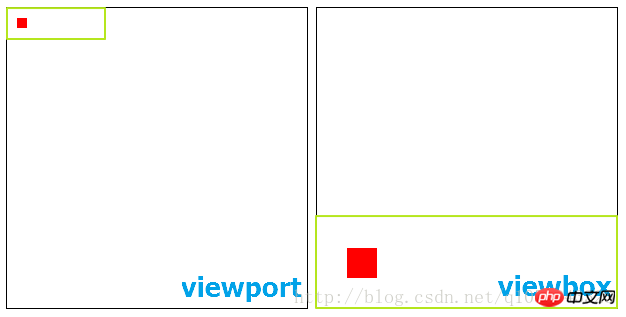
第二个属性值
meet类比于css中background-size的属性值contain
slice类比于css中background-size的属性值cover
CSS3背景相关属性
<svg width=300 height=300>
    <rect x=10 y=10 width=10 height=10></rect></svg>
这里我把x设置为xMin否则就看不到小红方块了
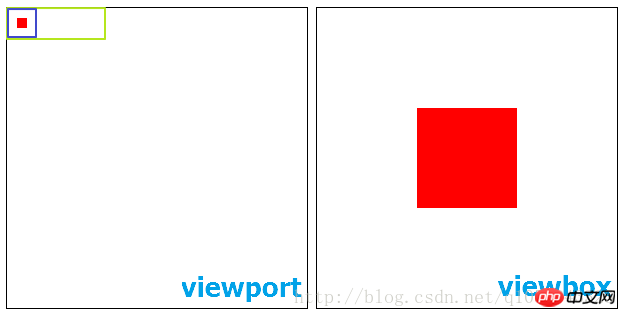
显示的结果就是我vieport中用紫色框标记的部分
以上就是SVG(可缩放矢量图形)视区盒属性viewbox与preserveAspectRatio的内容,更多相关内容请关注PHP中文网(www.php.cn)!
Related articles
See more- AlloyTouch full-screen scrolling plug-in creates a smooth H5 page in 30 seconds
- HTML5 actual combat and analysis of touch events (touchstart, touchmove and touchend)
- Detailed explanation of image drawing examples in HTML5 canvas 9
- Regular expressions and new HTML5 elements
- How to combine NodeJS and HTML5 to drag and drop multiple files to upload to the server

