Home >Web Front-end >CSS Tutorial >Shape of application of new features of CSS3
Shape of application of new features of CSS3
- 高洛峰Original
- 2017-02-25 15:36:011725browse
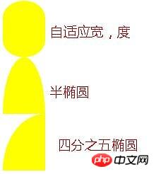
1. Adaptive ellipse
border-radius feature:
The horizontal and vertical radii can be specified separately, and the value It can be a percentage, just use / (slash) to separate the two values (adaptive width ellipse can be implemented).
You can also separately specify four horizontal and vertical radii with different angles (semi-ellipse can be realized)
Quarter ellipse, mainly Is to adjust the horizontal and vertical radius
Sample code:
.wrap{
            border-radius: 50% / 30%;
            width: 60px;
            height: 80px;
            background: yellow;
        }
        .wrap02{
            width: 60px;
            height: 80px;
            background: yellow;
            border-radius: 50% / 100% 100% 0 0;
        }
        .wrap03{
            width: 60px;
            height: 80px;
            background: yellow;
            border-radius: 100% 0 0 0;
        }

2. Flat quadrilateral
- ##Needs to be applied to the skewX of transform for distortion
- Mainly solves the problem that the container becomes a flat quadrilateral, and Internal text and elements are displayed vertically with
- nested elements. Internal elements can be reversely twisted using skew. Nested inner elements must be block because transform cannot be applied to inline elements.
- Use pseudo-elements to distort (:before)
.wrap{
            width: 80px;
            height: 40px;
            transform: skewX(-45deg);
            background: yellow;
        }
        .wrap>p{
            transform: skewX(45deg);
        }
        .btn{
            position: relative;
            padding: 10px;
        }
        .btn:before{
            content: '';
            position: absolute;
            top: 0px;
            left: 0px;
            right: 0px;
            bottom: 0px;
            z-index: -1;
            background: #85a;
            transform: skewX(-45deg);
        }

3. Diamond shape
- Apply the nesting of elements, and the outer and inner elements rotate with each other to achieve eight Angular;
- Design the max-width width of the internal element to be 100%, so that the entire image can only fill the entire outer p; ## The #scale attribute controls the magnification of its image. By default, the center point is the origin of magnification (the Pythagorean theorem will be used, do not specify additional transform-origin).
.wrap{
            width: 200px;
            transform: rotate(-45deg);
            overflow: hidden;
        }
        .wrap > img{
            transform: rotate(45deg) scale(1.42);
            max-width: 100%;
        }
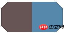
 ##4. Corner cutting effect
Using linear-gradient, you can set the angle, multi-value and gradient transparency to achieve this.
- You also need to pay attention to the settings of the background-size and background-repeat attributes to prevent overlapping backgrounds from causing the effect to not take effect
.wrap{
            width: 200px;
            height: 100px;
            background: #58a;
            background: linear-gradient(-135deg, transparent 15px, #58a 0px) top right,
            linear-gradient(135deg,transparent 15px, #655 0px) top left,
            linear-gradient(-45deg, transparent 15px, #58a 0px) bottom right,
            linear-gradient(45deg, transparent 15px, #655 0px) bottom left;
            background-size: 50% 50%;
            background-repeat: no-repeat;
        }

- border-image uses svg to make pictures
- border sets the width + transparency, plus the border-image-slice is biased inward Shifting creates a border with cut corners;
- background-clip: Set to padding-box, otherwise the background will extend to the border.
.wrapSvg{
border:15px solid transparent;
border-image: 1 url('data:image/svg+xml, <svg xmlns="http://www.w3.org/2000/svg" width="3" height="3" fill="%2358a"><polygon points="0,1 1,0 2,0 3,1 3,2 2,3 1,3 0,2"/></svg>');
margin-top: 50px;
width: 200px;
height: 100px;
background: #58a;
background-clip: padding-box;
}
Other solutions
Utilize clip-path attribute, but not fully supported - css4 will directly give the corner-path attribute to support corner cutting
- 5. Trapezoid pattern
Understand the basic principles of transform
##a and d represent scaling and cannot be 0; c and b control tilt; e and f control displacement
translate(displacement): matrix(1,0,0,1,x,y)
- ##scale(scale): matrix(x,0,0, y,0,0);
- skew (skew): matrix(1,tany,tanx,1,0,0), since the input is deg (angle), you need to Convert angles to radians
- rotate (rotate): matrix(cosN,sinN,-sinN,cosN,0,0), convert angles to radians
- The application of the above values is related to the value of transform-origin, which is the origin of rotation of the positioning element, which can be top, bottom, center, etc. Three coordinate systems of x, y, and z can be specifiedperpective: Perspective, it cannot be negative, 0 or percentage, it can only be a numerical value;
- The farther the perspective distance is from the object, the smaller the object will appear
- Perspective can only be set on the parent or ancestor of the deformed element, because the browser will set it on its children. The deformation produces a perspective effect
- There is no skew attribute in 3D transformation.
-
六、简单的饼图
动画饼图,效果如下:

实现步骤如下:
画出一个yellowgreen的圆,并利用linear-gradient设置background-image的值,实现两种颜色各显示一半的功能:
然后加入一个伪元素,继承父级(真实元素)的背景色,然后用rotate旋转即可
要利用margin-left让其靠左
利用transform-origin设置其旋转定位点
动画展示代码如下:
@keyframes spin{
            to{ transform: rotate(.5turn); }
        }
        @keyframes bg{
            50%{ background-color: #655; }
        }
        .wrap{
            width: 100px; height: 100px;
            border-radius: 50%;
            background: yellowgreen;
            background-image: linear-gradient(to right, transparent 50%, #655 0);
        }
        .wrap::before{
            content: '';
            display: block;
            margin-left: 50%;
            background-color: inherit;
            height: 100%;
            border-radius: 0 100% 100% 0 / 50%;
            transform-origin: left;
            animation:spin 3s linear infinite,
                bg 6s step-end infinite;
        }
以上就是本文的全部内容,希望对大家的学习有所帮助,也希望大家多多支持PHP中文网。
更多Shape of application of new features of CSS3相关文章请关注PHP中文网!


