The full text talks about how to draw triangles, circles and other related graphics. Students who are not familiar with it can go out and turn right, read the previous article first, and then continue with our graphics-curves.
Students who have studied mathematics or are familiar with js all know the Bezier curve. Of course, in mathematics, this is a profound knowledge. The Bezier curve in js is generally used to Animation is actually reflected in other places, such as the pen tool in Photoshop, the Bezier tool in CorelDraw, etc., and it is also reflected in canvas
Of course, if you are simply drawing a curve , you can also use the previous method:
var canvas = document.getElementById("canvas");
var ctx = canvas.getContext("2d");

ctx.arc(100,100,100,0,90*Math.PI/180,false);
ctx.stroke();
ctx.beginPath();
ctx.moveTo(103,103);
ctx.arcTo(183,83,162,182,40);
ctx.stroke();
If you want to draw a winding line, it will be difficult. Only then does the following protagonist appear:
quadraticCurveTo(cpx,cpy,x,y) Quadratic Bezier Curve
Parameters: cpx, cpy represents the first control point, x, y Indicates the end point
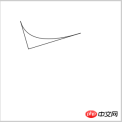
plus the starting point, which means three points control a curve. In fact, this is similar to the usage of arcTo. The difference is that arcTo needs to specify the radius of the arc, because it is one of the two lines. Draw a curve formed by the tangent point of a circle and a straight line. What is the principle of drawing this quadratic Bezier curve? Let’s draw a picture together: 
The general rule of the quadratic Bezier curve: starting from the starting point, the closer the curve is to the control point, the steeper the curve, and then slowly Moving away from the control point, the curve becomes smoother and smoother until it reaches the end point, and this curve will be tangent to the starting point and the end point.
Is this control point a bit like a magnet, attracting this curve? Sports, as the saying goes, hearing is worse than seeing. Let’s try it:
ctx.moveTo(50,50);
ctx.lineTo(70,120);
ctx.lineTo(200,80);
ctx.stroke();
ctx.beginPath();
ctx.moveTo(50,50);
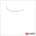
ctx.quadraticCurveTo(70,120,200,80);
ctx.stroke();


## and see. Is this the case? Of course, there is a formula for the degree of curvature of a curve, but we don’t need to care. We just need to remember one thing: the closer the curve is to the control point, the steeper the curve, and the farther away from the control point, the flatter the curve. Oh!
A reminder again, do you understand the difference between arcTo and quadraticCurveTo now?
Now let’s introduce the cubic Bezier curve:
bezierCurveTo(cpx1,cpy1,cpx2,cpy2,x,y) Cubic Bezier curve
Parameters: cpx1, cpy1 represents the first control point, cpx2, cpy2 represents the second control point x, y represents the end point
Including the starting point, 4 points are used to determine a curve. This is similar to Quadratic Bezier The principle of the curve is the same, with just one more control point. The essence is still the same sentence: the curve is closer to the control point, the steeper the curve, and the curve is farther away from the control point, the flatter the curve.
Let’s start with a simple example. (Make a U shape):
ctx.moveTo(20,20);
ctx.bezierCurveTo(20,100,200,100,200,20);
ctx.stroke();

 ##As shown in the picture above, the first one It is a rendering, and the second one is a schematic diagram. The curve starts from the starting point, and there is a control point below. The steeper the curve, the position of the tangent line between the second control point and the curve, because it is affected by the two control points. Affected, the curve begins to gradually become flat, because the two control points are just symmetrical, so at the middle point, the curve becomes horizontal, and then continues to be affected by the two control points, and the effect of the second control point becomes larger and larger. You know The position of the tangent point between the first control point and the curve. The curve continues to be affected by the second control point and receives force in the opposite direction. When it reaches the end point, um, I don’t understand, okay, just don’t understand if you don’t understand. Remember That concluding sentence will do!
The classic example is the sinusoidal diagram (using two Bezier curves, one positive U and one reverse U):
ctx.beginPath();
ctx.moveTo(20,150);
ctx.bezierCurveTo(20,50,150,50,150,150);
ctx.stroke();
ctx.beginPath();
ctx.moveTo(150,150);
ctx.bezierCurveTo(150,250,280,250,280,150);
ctx.stroke();

 Of course, I don’t know that cubic Bezier curves can draw U-shaped diagrams, but any curve can be drawn, as long as you can’t think of it, there is nothing you can’t draw, haha , let’s expand our imagination!
It is said that those who paint should not always do ink paintings. I like colors, colorful colors. Well, canvas can also be used. Canvas can set gradients like css3, so First of all, the rainbow is not far away, hee hee
Let’s first look at how to set the gradient of CSS3, and then compare the gradient of canvas. We all know that gradients are divided into linear gradients and radial gradients. To gradient, let’s compare one by one:
Linear gradient:
.box1{
    width:500px;
    height:50px;
    background: -webkit-linear-gradient(left, red 0%, #0F0 20%,rgb(51,102,255) 50%, rgba(204,255,0,0.8) 100%);
}

css3可以指定颜色,支持各种颜色格式,且可以指定颜色所在位置,不仅如此,css3还可以指定渐变的方向:
.box1{
    width:500px;
    height:50px;
    background: -webkit-linear-gradient(45deg , red 0%, #0F0 20%,rgb(51,102,255) 50%, rgba(204,255,0,0.8) 100%);
}
方向可以用角度来定义,45度角是从左下到右上进行渐变
径向渐变:
.box2{
    width:300px;
    height:200px;
    background:-webkit-radial-gradient(red 0%, #0F0 20%,rgb(51,102,255) 50%, rgba(204,255,0,0.8) 100%);
}
渐变原点为中心,渐变颜色为百分百之间的颜色渐变
可以看出,径向渐变是以中心为原点,一圈一圈向外扩散,同样支持自定义颜色,支持各种颜色格式,支持指定位置,也是可以设置原点和渐变方式(圆形,椭圆):
.box2{
    width:300px;
    height:200px;
    background:-webkit-radial-gradient(bottom left, ellipse,red 0%, #0F0 20%,rgb(51,102,255) 50%, rgba(204,255,0,0.8) 100%);
}
原点左下,渐变形状为椭圆
.box2{
    width:300px;
    height:200px;
    background:-webkit-radial-gradient(bottom left, circle,red 0%, #0F0 20%,rgb(51,102,255) 50%, rgba(204,255,0,0.8) 100%);
}
原点左下,渐变形状为圆形
以上只是简单列举一下css3的渐变样式,当然css3的渐变肯定不止这些,这里主要是想对比一下canvas的渐变样式,顺便科普一下!
canvas的渐变相对要简单一些,没有那么多的花花肠子:
createLinearGradient(x1,y1,x2,y2) 创建线性渐变
参数:x1,y1 表示渐变起始点 x2,y2 表示渐变结束点
createRadialGradient(x1,y1,r1,x2,y2,r2) 创建径向渐变
参数:x1,y1 表示渐变开始圆心坐标,r1表示渐变开始圆的半径 x2,y2 表示渐变结束圆心坐标,r2表示渐变结束圆的半径
gradient.addColorStop(stop,color) 规定gradient 对象中的颜色和位置
参数: stop 取值0-1之间,表示渐变中开始与结束之间的位置 color表示渐变颜色
注意,这里添加渐变颜色的对象并不是context,而是gradient
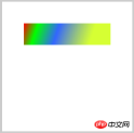
怎么用呢?看线性渐变一个小例子:
这个科普一个误区:
ctx.fillRect(50,50,200,50);
var line = ctx.createLinearGradient(50,50,200,50);
line.addColorStop(0,'red');
line.addColorStop(0.2 ,'#0F0');
line.addColorStop(0.5 ,'rgb(51,102,255)');
line.addColorStop(1 ,'rgba(204,255,0,0.8)');
这样是错误的,什么都出不来!
照理说,应该是先创建一个图像,然后给这个图形加渐变色,一般的规律都如此,比如画画,比如css,但是canvas不一样,重点来了:canvas凡是设置样式的,必须放在绘图前面 ,怎么理解这句话?
绘图的方法: fill() , fillRect() , stroke() , strokeRect() , rect()
那设置:比如文字类字体,字体大小,字体颜色,字体阴影,渐变色 路径类如线条,矩形,圆形,背景,渐变等等
所以正确的格式是:
var line = ctx.createLinearGradient(50,50,200,50);
        line.addColorStop(0,'red');
        line.addColorStop(0.2 ,'#0F0');
        line.addColorStop(0.5 ,'rgb(51,102,255)');
        line.addColorStop(1 ,'rgba(204,255,0,0.8)');

        ctx.fillStyle = line;
        ctx.fillRect(50,50,200,50);
可以看到canvas一样可以自定义颜色,支持各种颜色格式,支持指定位置(用0-1的数,跟百分比类似),相比css3之下,我觉得canvas的渐变颜色区域更加准确!
好了,既然canvas能像css3一样设置渐变样式,那可不可以设置方向呢?怎么设?以上面的代码为例,我们画一张图:
图可能画的有点蒙啊,解释一下,第一张图表示我们上面的代码显示的效果,渐变方向是(50,50)——> (200,50),是一条水平线,表示方向是从左到右渐变,要是我将坐标方向设为(50,50)——> (200,100),如第二张图,那么渐变是否是从左上角到右下角呢?我们试一下:
var line = ctx.createLinearGradient(50,50,200,100);
line.addColorStop(0,'red');
line.addColorStop(0.2 ,'#0F0');
line.addColorStop(0.5 ,'rgb(51,102,255)');
line.addColorStop(1 ,'rgba(204,255,0,0.8)');

ctx.fillStyle = line;
ctx.fillRect(50,50,200,50);

可以看出角度是正确的,createLinearGradient的2个坐标就是为了指明渐变方向的,那么canvas的径向渐变会不会跟css3相同呢?我们写一个小例子:
var line = ctx.createRadialGradient(150,150,0,150,150,200);
line.addColorStop(0,'red');
line.addColorStop(0.2 ,'#0F0');
line.addColorStop(0.5 ,'rgb(51,102,255)');
line.addColorStop(1 ,'rgba(204,255,0,0.8)');

ctx.fillStyle = line;
ctx.fillRect(50,50,200,150);
可以看到,如果图形即使不是一个正方形,径向渐变的圆依然是正圆,与css3的渐变机制有点不一样(css3是椭圆,看上面的css3图),并且渐变区域是根据两个圆来决定的,我们改一下这2个圆的区域看看:
var line = ctx.createRadialGradient(150,150,50,150,150,100);
line.addColorStop(0,'red');
line.addColorStop(0.2 ,'#0F0');
line.addColorStop(0.5 ,'rgb(51,102,255)');
line.addColorStop(1 ,'rgba(204,255,0,0.8)');

ctx.fillStyle = line;
ctx.fillRect(50,50,200,150);
比对上面的图可以看出,下图在50-100的区间里是有渐变的,其他地方则是首尾的颜色填充,那么圆心在边角上呢?
var line = ctx.createRadialGradient(50,50,0,50,50,200);
line.addColorStop(0,'red');
line.addColorStop(0.2 ,'#0F0');
line.addColorStop(0.5 ,'rgb(51,102,255)');
line.addColorStop(1 ,'rgba(204,255,0,0.8)');

ctx.fillStyle = line;
ctx.fillRect(50,50,200,150);
效果跟css3的样式一样,颜色更加准确,如果2圆的圆心不一样,会有什么反应?
var line = ctx.createRadialGradient(50,50,0,150,150,200);
line.addColorStop(0,'red');
line.addColorStop(0.2 ,'#0F0');
line.addColorStop(0.5 ,'rgb(51,102,255)');
line.addColorStop(1 ,'rgba(204,255,0,0.8)');

ctx.fillStyle = line;
ctx.fillRect(50,50,200,150);
一个圆心在左上角,一个圆心在中间
咦,什么鬼,算了,如果想要正常的径向渐变,还是同圆心吧,不同圆心太诡异,hold 不住啊!
那径向渐变能像css3一样可以设置椭圆吗?咳咳,我只能借用一句台词:臣妾做不到啊!
我们来一个炫酷的渐变应用:
ctx.font = "40px 微软雅黑";
var line = ctx.createLinearGradient(10,100,200,100);
line.addColorStop(0,'red');
line.addColorStop(0.2 ,'#0F0');
line.addColorStop(0.5 ,'rgb(51,102,255)');
line.addColorStop(1 ,'rgba(204,255,0,0.8)');
ctx.fillStyle = line;
ctx.fillText("狂拽炫酷吊炸天",10,100);
下面我们介绍另外一个与颜色有关的属性——透明!
globalAlpha = num 参数:num取值0-1之间 设置或返回绘图的当前透明值
有同学会问,按这个词的意思是全局透明,那么它是全局的吗?我也想问,那我们试一下:
ctx.fillStyle = "red";
ctx.fillRect(50,50,100,100);
ctx.globalAlpha = 0.5;
ctx.fillStyle = "green";
ctx.fillRect(100,100,100,100);
ctx.fillStyle = "blue";
ctx.fillRect(150,150,100,100);

可以看到,第一个没有变透明,后面2个变透明了,那么如果我将路径闭合,是否还会出现这样的效果:
ctx.beginPath();
ctx.fillStyle = "red";
ctx.fillRect(50,50,100,100);
ctx.closePath();

ctx.globalAlpha = 0.5;

ctx.beginPath();
ctx.fillStyle = "green";
ctx.fillRect(100,100,100,100);
ctx.closePath();

ctx.beginPath();
ctx.fillStyle = "blue";
ctx.fillRect(150,150,100,100);
ctx.closePath();
结果是一样的,说明它是”人“如其名啊,果然是全局的,那么将它放入闭合路径中,会污染其他的路径吗?
ctx.beginPath();
ctx.globalAlpha = 0.5;
ctx.fillStyle = "red";
ctx.fillRect(50,50,100,100);
ctx.closePath();

ctx.beginPath();
ctx.fillStyle = "green";
ctx.fillRect(100,100,100,100);
ctx.closePath();

ctx.beginPath();
ctx.fillStyle = "blue";
ctx.fillRect(150,150,100,100);
ctx.closePath();
马蛋,简直是严重的核污染啊,穿透力如此之强?如果我只想让第一个透明,后面的不透明?我要怎么弄呢?
为了解决这个问题,我们需要引入2个方法,同样是一对活宝啊:
context.save() 保存当前环境的状态
context.restore() 返回之前保存过的路径状态和属性
怎么理解这对活宝呢?
可以这么理解:当设置了save()方法,就相当于将后面的绘图放在一个堆栈中,与世隔绝,知道看到restore(),就返回到原来的位置,举个例子哈,就像是一堆糖果,save()就是将一部分糖果装进盒子,restore()就是封闭盒子,继续捡糖果,但是盒子里的糖果就不会与其他糖果混合了,恩,可以这么理解,特别注意的是,restore()方法必须要有save()才起作用,你想啊,都没有盒子装糖果,怎么能封闭盒子呢
那咱们来看看他们的神奇技能:
ctx.save();
ctx.beginPath();
ctx.globalAlpha = 0.5;
ctx.fillStyle = "red";
ctx.fillRect(50,50,100,100);
ctx.closePath();
ctx.restore();

ctx.beginPath();
ctx.fillStyle = "green";
ctx.fillRect(100,100,100,100);
ctx.closePath();

ctx.beginPath();
ctx.fillStyle = "blue";
ctx.fillRect(150,150,100,100);
ctx.closePath();
哎呀,瞬间觉得整个世界都完美了!在面对凶悍的全局变量,属性或方法时,我们可以用上面的这对活宝来避免它们对我们需要的部分的侵害(这里为什么要说侵害,会让人想污的),确实是好技能!
回到globalAlpha,它的用处还是有很多的,路径,图形,文字都可以设置透明,那我们来一个文字透明看看:
ctx.font = "40px 微软雅黑";
var line = ctx.createLinearGradient(10,100,200,100);
line.addColorStop(0,'red');
line.addColorStop(0.2 ,'#0F0');
line.addColorStop(0.5 ,'rgb(51,102,255)');
line.addColorStop(1 ,'rgba(204,255,0,0.8)');
ctx.fillStyle = line;
ctx.globalAlpha = 0.3;
ctx.fillText("狂拽炫酷吊炸天",10,100);
恩,今天就介绍到这里吧,后面的内容比较复杂,需要认真的准备,就这样吧!
以上就是canvas API ,通俗的canvas基础知识(三) 的内容,更多相关内容请关注PHP中文网(www.php.cn)!
相关文章:
canvas API 介绍,常见的canvas基础知识(一)
 H5: How It Enhances User Experience on the WebApr 19, 2025 am 12:08 AM
H5 improves web user experience with multimedia support, offline storage and performance optimization. 1) Multimedia support: H5 and elements simplify development and improve user experience. 2) Offline storage: WebStorage and IndexedDB allow offline use to improve the experience. 3) Performance optimization: WebWorkers and elements optimize performance to reduce bandwidth consumption.
 Deconstructing H5 Code: Tags, Elements, and AttributesApr 18, 2025 am 12:06 AM
HTML5 code consists of tags, elements and attributes: 1. The tag defines the content type and is surrounded by angle brackets, such as. 2. Elements are composed of start tags, contents and end tags, such as contents. 3. Attributes define key-value pairs in the start tag, enhance functions, such as. These are the basic units for building web structure.
 Understanding H5 Code: The Fundamentals of HTML5Apr 17, 2025 am 12:08 AM
HTML5 is a key technology for building modern web pages, providing many new elements and features. 1. HTML5 introduces semantic elements such as, , etc., which enhances web page structure and SEO. 2. Support multimedia elements and embed media without plug-ins. 3. Forms enhance new input types and verification properties, simplifying the verification process. 4. Offer offline and local storage functions to improve web page performance and user experience.
 H5 Code: Best Practices for Web DevelopersApr 16, 2025 am 12:14 AM
Best practices for H5 code include: 1. Use correct DOCTYPE declarations and character encoding; 2. Use semantic tags; 3. Reduce HTTP requests; 4. Use asynchronous loading; 5. Optimize images. These practices can improve the efficiency, maintainability and user experience of web pages.
 H5: The Evolution of Web Standards and TechnologiesApr 15, 2025 am 12:12 AM
Web standards and technologies have evolved from HTML4, CSS2 and simple JavaScript to date and have undergone significant developments. 1) HTML5 introduces APIs such as Canvas and WebStorage, which enhances the complexity and interactivity of web applications. 2) CSS3 adds animation and transition functions to make the page more effective. 3) JavaScript improves development efficiency and code readability through modern syntax of Node.js and ES6, such as arrow functions and classes. These changes have promoted the development of performance optimization and best practices of web applications.
 Is H5 a Shorthand for HTML5? Exploring the DetailsApr 14, 2025 am 12:05 AM
H5 is not just the abbreviation of HTML5, it represents a wider modern web development technology ecosystem: 1. H5 includes HTML5, CSS3, JavaScript and related APIs and technologies; 2. It provides a richer, interactive and smooth user experience, and can run seamlessly on multiple devices; 3. Using the H5 technology stack, you can create responsive web pages and complex interactive functions.
 H5 and HTML5: Commonly Used Terms in Web DevelopmentApr 13, 2025 am 12:01 AM
H5 and HTML5 refer to the same thing, namely HTML5. HTML5 is the fifth version of HTML, bringing new features such as semantic tags, multimedia support, canvas and graphics, offline storage and local storage, improving the expressiveness and interactivity of web pages.
 What Does H5 Refer To? Exploring the ContextApr 12, 2025 am 12:03 AM
H5referstoHTML5,apivotaltechnologyinwebdevelopment.1)HTML5introducesnewelementsandAPIsforrich,dynamicwebapplications.2)Itsupportsmultimediawithoutplugins,enhancinguserexperienceacrossdevices.3)SemanticelementsimprovecontentstructureandSEO.4)H5'srespo


Hot AI Tools

Undresser.AI Undress
AI-powered app for creating realistic nude photos

AI Clothes Remover
Online AI tool for removing clothes from photos.

Undress AI Tool
Undress images for free

Clothoff.io
AI clothes remover

Video Face Swap
Swap faces in any video effortlessly with our completely free AI face swap tool!

Hot Article

Hot Tools

MinGW - Minimalist GNU for Windows
This project is in the process of being migrated to osdn.net/projects/mingw, you can continue to follow us there. MinGW: A native Windows port of the GNU Compiler Collection (GCC), freely distributable import libraries and header files for building native Windows applications; includes extensions to the MSVC runtime to support C99 functionality. All MinGW software can run on 64-bit Windows platforms.

Dreamweaver Mac version
Visual web development tools

Safe Exam Browser
Safe Exam Browser is a secure browser environment for taking online exams securely. This software turns any computer into a secure workstation. It controls access to any utility and prevents students from using unauthorized resources.

SublimeText3 Mac version
God-level code editing software (SublimeText3)

ZendStudio 13.5.1 Mac
Powerful PHP integrated development environment


