Home >Web Front-end >CSS Tutorial >Use CSS3 box-reflect to create reflection effects
Use CSS3 box-reflect to create reflection effects
- 高洛峰Original
- 2017-02-16 13:17:051337browse
Compatibility
Since it is a property of CSS3, of course we have to take a look at the compatibility: http://caniuse.com/css-reflections/embed
Next, let’s go Understand how to use box-reflect?
The syntax is as follows:
  -webkit-box-reflect:none | <direction> <offset>? <mask-box-image>?
  box-reflect:none | <direction> <offset>? <mask-box-image>?</mask-box-image></offset></direction></mask-box-image></offset></direction>
Attribute description:
none: This value is the default value , indicating no reflection;
direction: the direction of generating reflection
above: specifies the reflection above the object below: specifies the reflection below the object left: specifies the reflection above The left side of the object right: Specifies that the reflection is on the right side of the object
offset: The distance between the picture and the reflection
length: Use the length value to define the distance between the reflection and the object. Can be a negative value percentage: Use percentage to define the interval between the reflection and the object. Can be a negative value
mask-box-image: used to set the mask effect of reflection;
The value can be:
none: No mask image url: Specify the mask image using an absolute or relative address. linear-gradient: Create a mask image using a linear gradient. radial-gradient: Create a mask image using a radial (radial) gradient. repeating-linear-gradient: Use a repeating linear gradient to create a backmask image. repeating-radial-gradient: Creates a mask image using a repeating radial (radial) gradient.
Just talking on paper is not enough, we still have to see the effect through examples.
Direction of reflection
In this example, I made three img:
<p>
  <img  src="/static/imghwm/default1.png" data-src="http://7s1r1c.com1.z0.glb.clouddn.com/t_sdfsdfs123.jpg" class="lazy" alt="Use CSS3 box-reflect to create reflection effects" >
</p>
<p>
  <img  src="/static/imghwm/default1.png" data-src="http://7s1r1c.com1.z0.glb.clouddn.com/t_sdfsdfs123.jpg" class="lazy" alt="Use CSS3 box-reflect to create reflection effects" >
</p>
<p>
  <img  src="/static/imghwm/default1.png" data-src="http://7s1r1c.com1.z0.glb.clouddn.com/t_sdfsdfs123.jpg" class="lazy" alt="Use CSS3 box-reflect to create reflection effects" >
</p>
css As follows:
.box1,.box2,.box3{
  width:120px;
  float:left;
  margin-right:180px;
}
img{
  width:100%;
}
.box1 img{
  -webkit-box-reflect:right;
  box-reflect:right;
}
.box2 img,.box3 img{
  -webkit-box-reflect: above;
  box-reflect:above;
}
.box3{
  padding-top:200px;
}
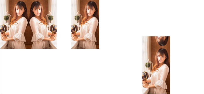
The rendering is as follows:

There is a question here, in box2 and box3 All the pictures have box-reflect:above, which generates projection on the top. Why can’t box2 see the effect? The reason is that I set padding-top:200px for box3, but not for box2. It is initially estimated that it is because there is no space for it to display the generated reflection.
The distance between the reflection and the object
After understanding the direction of generating the reflection, let’s look at the second attribute, or look at the example:
Still using three pictures, but change the style:
.box1 img{
  -webkit-box-reflect:below 30px;
  box-reflect:below 30px;
}
.box2 img{
  -webkit-box-reflect:below -30px;
  box-reflect:below -30px;
}
.box3 img{
  -webkit-box-reflect:below 5%;
  box-reflect:below 5%;
}
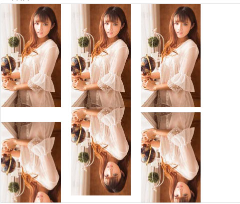
The rendering is as follows:

Next we learn the last attribute.
Mask effect
(1) Use gradient to add a mask effect to the reflection
  .box1 img{
  -webkit-box-reflect:below 0 -webkit-linear-gradient(top,rgba(250,250,250,0),rgba(250,250,250,.0) 30%,rgba(250,250,250,.3));
  box-reflect:below 0 linear-gradient(top,rgba(250,250,250,0),rgba(250,250,250,.0) 30%,rgba(250,250,250,.3));
}
The effect is as follows :

Use the background image to add a masking effect to the reflection
First we need a png picture of a five-pointed star:

.box2 img{
  -webkit-box-reflect:below 0 url(http://7s1r1c.com1.z0.glb.clouddn.com/t_star.png);
  box-reflect:below 0 url(http://7s1r1c.com1.z0.glb.clouddn.com/t_star.png);
}
The effect is as follows:

More using CSS3 box-reflect For articles related to creating reflection effects, please pay attention to the PHP Chinese website!

