Home >Web Front-end >PS Tutorial >PS Web Design Tutorial XIX – Create an Elegant Portfolio Web Layout in Photoshop
PS Web Design Tutorial XIX – Create an Elegant Portfolio Web Layout in Photoshop
- 高洛峰Original
- 2017-02-13 09:19:262385browse
As a coder, my art foundation is weak. We can refer to some mature web PS tutorials to improve our design capabilities. To paraphrase a sentence, "If you are familiar with three hundred Tang poems, you can recite them even if you don't know how to compose them."
The tutorials in this series come from online PS tutorials, all from abroad, and all in English. I try to translate these excellent tutorials. Due to limited translation capabilities, the details of the translation still need to be worked out. I hope that netizens will give you some advice.
Convention:
1. The software used in this article is Photoshop CS5 version
2. The screenshots of the original tutorial are in English. I took them again based on the re-production. Chinese version of Figure
3. Some operations in the original text do not give parameters. I measured some parameters through repeated testing, which are shown in red text. For some wrong parameters, the correct parameters are displayed directly in red text
For example: (90, 22, 231, 77) , indicating that the coordinates of the upper left corner of the rectangle are (90, 22) , width 231, height 77
For example: (90,22), indicating that the coordinates of the upper left corner of the rectangle are (90,22), the other two parameters of the rectangle have been specified in the tutorial
4. My own experience will be attached at the end of the tutorial. Some are optimizations of some steps in the tutorial, etc.
In this Photoshop web design tutorial, I would like to show you how to create a clean and elegant portfolio web layout that has numerous areas for common content types such as an area that displays a blog post excerpt, a nice PS Web Design Tutorial XIX – Create an Elegant Portfolio Web Layout in Photoshop slider for featured works, social media information, and a thumbnail gallery. We will cover plenty of professional-grade web designing techniques in this Photoshop tutorial.
In this Photoshop web design tutorial , I want to show you how to create a clean, elegant portfolio layout. There are many areas for common content areas, such as displaying blog post excerpts, a nice PS Web Design Tutorial XIX – Create an Elegant Portfolio Web Layout in Photoshop slider, social media information, and a thumbnail gallery. In this Photoshop tutorial, we'll cover a ton of professional-grade web design techniques.
Step 1: Create a New Document
Step 1: Create a new document
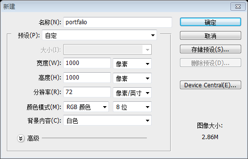
Start by creating a new document (Ctrl/Cmd + N) in Photoshop. Make the document 1000px by 1000px and with a White background.
First create a new document in PS (Ctrl/Cmd + N). Document size: 1000px*1000px, with white background
Step 2: Add Photoshop Guides
Step 2: Add PS guide lines
Now add guides on the canvas in order to ensure proper alignment of the various web layout components. You can create guides Accurately by going to View > New Guide.
Now add guides on the canvas to ensure proper alignment of the various web layout components. You can create guides accurately by clicking: View > New Guide.
Create vertical guides at 50px, 500px and 950px.
You can create vertical guides at 50px, 500px, 950px
Create horizontal guides at 75px, 467px, 651px and 943px.
#Step 3: Creating the Background
Step 3: Creating the background
Double- click on the default Background layer, which will be locked and uneditable; the New Layer dialog window will open. I renamed the layer to "BG" and then pressed OK. Doing this also unlocks the Background layer, making it editable.
Double-click the default background layer, which is originally locked and cannot be edited; the window for creating a new layer will be opened. I rename the layer to BG and press OK. You do this to unlock the background layer so it can be edited.
Let's create a new group called "Background" (Layer > New > Group) that will contain all layers associated with our layout's background. Move the "BG" layer into this group .Create a new group Background (Layer > New > Group), which will contain the background of all layouts. Move the BG layer into this group Now, set your foreground color to teal (#547980) and fill your "BG" layer with the foreground color by pressing Alt/Option + Backspace.Now, set your foreground color to teal (#547980) and press Alt/Option + Backspace to fill the BG layer with the foreground color
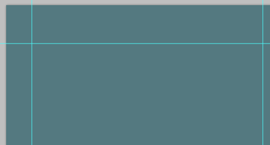
Now add some noise to our background by going to Filter > Noise > Add Noise. In the Add Noise dialog window, set the Amount to 1%, Distribution to Uniform and check the Monochromatic option. Click OK to apply the filter.
Now add some noise to the background, click: Filter > Noise > Add noise. In the window to add noise, set the amount to 1%, select average distribution, and check Single Color

##Now set your foreground color to black (#000000), create a new layer (Shift + Ctrl/Cmd + N) and name it "Dark sections".
Repeat the process for the middle section and bottom section so that you end up with three horizontal bars running across the canvas.
Repeat the same process for the middle section and bottom section so that you end up with three horizontal bars running across the canvas. and the bottom selection, at the end you have 3 horizontal sections across the entire canvasNow reduce the "Dark sections" layer's Opacity to 15%.
 Step 4: Creating Inset spider Lines
Step 4: Create inset divider lines
Now create a new group inside the "Background" layer group , above the "BG" and "Dark sections" layers. Let us call this group "Lines".
Create a new group in the Background group, above the BG and Drak sections layers. Let's name it Line Create a new layer inside the group called "Dark". Make sure that your foreground color is still set to black (#000000) and, with the Pencil Tool (B) set at 1px Master Diameter, draw a solid horizontal line above the first guide at the top. Create a new layer in the group and name it Dark. Make sure your foreground color is still black (#000000) and use the Pencil Tool with a Main Diameter of 1pxto draw a horizontal line above the first horizontal guide at the top (the PS Web Design Tutorial XIX – Create an Elegant Portfolio Web Layout in Photoshop below is zoomed in to 800% )
You can also use theStraight line tool to draw a horizontal line (0, 74, 1000, 1), color: #000000
Create another layer inside the "Line" group named "Bright". Change your foreground color to white (#FFFFFF) and use the Pencil Tool again to draw a line right below the black one.
Create another layer in the Line group and name it Bright. Change your foreground color to white (#FFFFFF) and use the  Pencil Tool
Straight Line Tool to draw a horizontal line (0, 75, 1000, 1), color: #FFFFFF

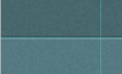
Collapse the "Line" group by clicking on the small triangle next to the group's name so that we're keeping our Layers Panel manageable. Reduce the group's Opacity to 12% .
Click the small triangle in front of the group name to collapse the Line group and keep our layer panel manageable. Adjust the opacity of the group to 12% (the PS Web Design Tutorial XIX – Create an Elegant Portfolio Web Layout in Photoshop below is enlarged to 800%)
Now duplicate the "Line" group (right-click on it in the Layers Panel and choose Duplicate Group from the contextual menu that appears) and rename the duplicate to "Line 2".
Duplicate Line Group (right-click in the Layers Panel and select from the menu that appears) Copy group ), and then name the copied group Line 2
Move "Line 2" on our second horizontal guide using the Move Tool (V).
Use Move Tool moves Line 2 to the second horizontal guide line
Repeat the above method for creating two more inset spider lines on the 3rd and 4th horizontal guides.
Repeat the above method Method to create 2 indented dividing lines at the 3rd and 4th horizontal reference lines

Step 5: Create the Layout's Header
Step 5: Create the header area of the layout
Before we go on, I would like to note that in this layout, we will be working with plenty of layers, which is good so that our work is flexible. However, this also leads to a Layers Panel that can become quite large and unwieldy. Therefore, whenever we are finished with a component of our web design, we should collapse its layer group as well as ensure that we are naming our layers and layer groups intuitively. So let's go ahead and collapse the "Background" group since we are now done with that component.
Before we continue, I want to note that in this layout we will be using a lot of layers so that our work is flexible, which is nice. However, this also results in the Layers panel becoming very large and unwieldy. Therefore, whenever we complete a component of our web design, we should collapse groups to ensure that we can name layers and groups intuitively. So, let's move on because we now have the background and collapsed Background group.
Create a new layer group called "Header" on top of the "Background" group.
Create a new group Header above the Background group
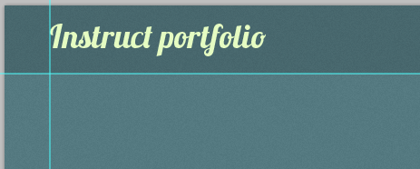
Let us make the site's logo — it will simply be a text-based logo that has a slick and stylish layer style. To begin, choose the Horizontal Type Tool (T) and set it to Lobster font at 36pt. Set the text color to light green (#E5FCC2) then write your site name. In this instance I wrote, "Instruct portfolio".
Let's create the website's LOGO - this is very simple text LOGO, with smooth and stylish layer styles. To begin, select the Horizontal Type Tool (T) and set the font to Lobster, 36pt. Set the text color to bright green (#E5FCC2) and write the name of your website. In this example, I write Instruct portfolio
With the text layer selected in the Layers Panel, go to Layer > Layer Style > Blending Options. We will give our logo a Drop Shadow, Gradient Overlay, and Stroke.
Select the text layer in the Layers panel and click:Layer> Layer Style> Blending Options. We are going to add drop shadow, gradient overlay, and stroke layer styles to our LOGO


Gradient editor, the dividing line between black and white is at 53% position


The following PS Web Design Tutorial XIX – Create an Elegant Portfolio Web Layout in Photoshop shows the result of our layer style. Quick and simple, but beautiful, don't you think?
The following PS Web Design Tutorial XIX – Create an Elegant Portfolio Web Layout in Photoshop shows the result of our layer style. the final result. Quick and easy, but beautiful, don’t you think?

Use the Horizontal Type Tool again for writing out the main navigation menu items. This time, set your text color to a light green color (#E5FCC2) and font size at 18pt. I wrote "Home", "About", "Blog", "Work", and "Contact" — but of course, you should feel free to write out other links.
Use again Horizontal text toolWrite the text of the main navigation menu. This time, set your text color to bright green (#E5FCC2) and font size to 18pt. I write Home, About, Blog, Work, Contact - of course, you are free to write some other links
Once done, use the Move Tool (V) to place the navigation menu text at the top right side of the header area.
When finished, use the Move tool to position the navigation menu to the right side of the top header area

We will copy the layer style we applied to the logo to the navigation menu text. Right-click on the "Instruct portfolio" layer in the Layers Panel and choose Copy Layer Style from the menu that appears. Next, right-click on the navigation menu text layer and choose Paste Layer Style.
We want to copy the layer style of the LOGO to the navigation menu. Right-click on the Instruct portfolio layer in the layer panel and select Copy Layer Style in the menu that appears. Next, right-click on the navigation menu text layer and select Paste Layer Style

Now we will create the active link's background to indicate what page the user is on. It can also serve as our hover state (i.e. we display it when the user mouses over an inactive link).
Now we need to create the background of the active link to show which page the user is on superior. He can also represent the hover state of the page (that is, displayed when our mouse moves over an inactive link)
Create a new layer called "Button" (because the active link item's background looks like a UI button). This layer should be beneath the navigation menu text layer because it will act as its background.
Create a new layer Button (because the background of the active link looks like a UI button). This layer is below the navigation menu text because it acts as a background for the links.
Select the Rounded Rectangle Tool (U), set the Radius to 5px and draw the button behind your text. Shown below is the active link's background shape drawn behind the "Home" navigation menu text.
Select Take the Rounded Rectangle Tool (U), set the Radius to 5px, and draw the button behind the text. As shown below, the background of the active link is drawn behind the Home navigation menu text.

Double-click on the "Button" layer in the Layers Panel to access the Layer Style dialog window. Let's give our active link's background shape a Drop Shadow, Gradient Overlay and Stroke.
Double-click the Button layer in the Layers Panel to open the Layer Style window. Add shadow, gradient overlay and stroke styles to the background of the active link

The dividing position of the gradient overlay is 50%


After applying the layer style, simply lower the "Button" layer's Opacity to 10%. The opacity of the Button layer is 10%

##Step 6: Create the "Featured Work" Area
Step 6: Create Featured Work area
Time to move on to another component of our layout. Remember: Collapse the "Header" layer group in the Layers Panel so that it's out of our way.It's time to move to another layout component. Remember: collapsing the Header layer group in the layer panel means that we have left our process Next, create a new layer group called "Work". This group will contain the featured works in a 3D PS Web Design Tutorial XIX – Create an Elegant Portfolio Web Layout in Photoshop slider.Next, create a new group Work. This group will contain a 3D Image Slider Featured Work What we want to do first is locate three PS Web Design Tutorial XIX – Create an Elegant Portfolio Web Layout in Photoshops (look through your work and pick ones you like) and open them in Photoshop . For this tutorial, what I did was simply use the final results from several Web Design tutorials here on Design Instruct, namely:First decide on the 3 PS Web Design Tutorial XIX – Create an Elegant Portfolio Web Layout in Photoshops to be placed (look at your past work and pick your favorite picture) and open it in PS. In this tutorial, I'm going to end up placing PS Web Design Tutorial XIX – Create an Elegant Portfolio Web Layout in Photoshops from the Web Design tutorial Place your selected PS Web Design Tutorial XIX – Create an Elegant Portfolio Web Layout in Photoshops inside the "Work" group as separate layers. Use Free Transform (Ctrl/ Cmd + T) to resize the PS Web Design Tutorial XIX – Create an Elegant Portfolio Web Layout in Photoshops as needed.Place your selected PS Web Design Tutorial XIX – Create an Elegant Portfolio Web Layout in Photoshops on separate layers in the Work group. Use the Free Transform Tool (Ctrl/Cmd + T) to resize your PS Web Design Tutorial XIX – Create an Elegant Portfolio Web Layout in Photoshop to the appropriate size Here is the first PS Web Design Tutorial XIX – Create an Elegant Portfolio Web Layout in Photoshop placed at the middle of the canvas: This is my first picture placed in the center of the canvas: (
The size of the picture is 400px*300px, and the position is (300, 127)
)
 Place the other two PS Web Design Tutorial XIX – Create an Elegant Portfolio Web Layout in Photoshops below the middle PS Web Design Tutorial XIX – Create an Elegant Portfolio Web Layout in Photoshop and at either sides of it.
Place the other two PS Web Design Tutorial XIX – Create an Elegant Portfolio Web Layout in Photoshops below the middle PS Web Design Tutorial XIX – Create an Elegant Portfolio Web Layout in Photoshop and at either sides of it.
Note: The tutorial does not explain the placement process of the pictures on both sides, please add the complete ones here
Use Rectangle ToolCreate a new rectangle (130, 127, 400, 300), the rectangle is below the middle picture

Place another picture in PS, lock the aspect ratio, adjust the width to 400px, and position the picture at (300, 127)

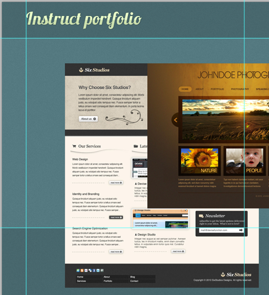
Right-click on the PS Web Design Tutorial XIX – Create an Elegant Portfolio Web Layout in Photoshop layer and select Create Clipping Mask

Select the rectangle layer and the picture layer, right-click and select Convert to Smart Object, and right-click on the new layer Select Rasterized Layer, and name the new layer Left Picture
Use the same method to place a picture on the right, with a rectangle of (470 , 127, 400, 300), the position of the picture is (470, 127)

Click on the "Right picture" layer in the Layers Panel to make it our active layer. Go to Edit > Transform > Perspective and transform the PS Web Design Tutorial XIX – Create an Elegant Portfolio Web Layout in Photoshop (as shown below) so that it looks as if it is 3-dimensional.
Click on the Layers Panel In the Right Picture layer, make sure the layer is activated. Click: Edit> Transform> Perspective, transform the picture (as shown below), it will look like a 3D effect


When complete, this is how the featured PS Web Design Tutorial XIX – Create an Elegant Portfolio Web Layout in Photoshops should look:

Blur
Tool(R) use a 100px soft-edged round brush to blur the side closest to the main PS Web Design Tutorial XIX – Create an Elegant Portfolio Web Layout in Photoshop. Note: If the effect is not obvious, you can apply it repeatedly. Also, the best effect is along the left edge of the main PS Web Design Tutorial XIX – Create an Elegant Portfolio Web Layout in Photoshop
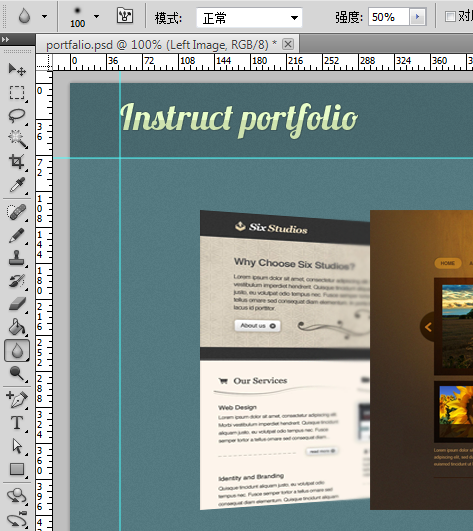
Do the same thing with the featured PS Web Design Tutorial XIX – Create an Elegant Portfolio Web Layout in Photoshop on the right. Do the same thing.
 We will now create a shadow being cast by the main PS Web Design Tutorial XIX – Create an Elegant Portfolio Web Layout in Photoshop using a quick and easy technique. To start, create a new layer under the " Main picture" layer.
Now we will create a shadow of the main PS Web Design Tutorial XIX – Create an Elegant Portfolio Web Layout in Photoshop, using a quick and simple technique. First, create a new layer below the Main Picture.
Ellipse tool from the tool panel
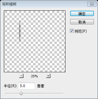
(U), then draw a black (#000000) ellipse(294, 297, 12, 300) just to the left. If done correctly, you should only see the left half of the oval. Now click on: Filter > Blur > Gaussian Blur, set the Radius to 5px and press OK to apply the added filter.
J)
and then use theMove Tool (V) to place it on the right.
 Now I want to create a slick reflective effect on the main PS Web Design Tutorial XIX – Create an Elegant Portfolio Web Layout in Photoshop — it's really simple to do. Start by duplicating the "Main picture" layer (Ctrl/ Cmd + J). Then press Ctrl/Cmd + T to enter Free Transform mode and set the Height option in the Options Bar to -100%. This flips the PS Web Design Tutorial XIX – Create an Elegant Portfolio Web Layout in Photoshop vertically (you could also use Transform > Flip Vertical as an alternative) .
Now I want to create a nice reflection effect of the main PS Web Design Tutorial XIX – Create an Elegant Portfolio Web Layout in Photoshop - this is a very simple thing.
Duplicate the Main Picture
J) . Then press Ctrl/Cmd + T to enter Free Transform mode and set the Height option. Fill in the option bar with: -100% to flip the PS Web Design Tutorial XIX – Create an Elegant Portfolio Web Layout in Photoshop vertically (you can also use: Edit> ; Transform> Vertical Flip as an alternative).

Switch to the Move Tool (V) so that you can move the duplicated PS Web Design Tutorial XIX – Create an Elegant Portfolio Web Layout in Photoshop down below the original PS Web Design Tutorial XIX – Create an Elegant Portfolio Web Layout in Photoshop. Leave a 1px gap between the original PS Web Design Tutorial XIX – Create an Elegant Portfolio Web Layout in Photoshop and the flipped duplicated PS Web Design Tutorial XIX – Create an Elegant Portfolio Web Layout in Photoshop.
Switch to theMove Tool
(V) so you can move the duplicated PS Web Design Tutorial XIX – Create an Elegant Portfolio Web Layout in Photoshop lower than the original. Keep a 1px gap between the original PS Web Design Tutorial XIX – Create an Elegant Portfolio Web Layout in Photoshop and the flipped copied PS Web Design Tutorial XIX – Create an Elegant Portfolio Web Layout in Photoshop (To be precise, you can move the copied layer to (300, 428)).
We don't need the entire duplicated PS Web Design Tutorial XIX – Create an Elegant Portfolio Web Layout in Photoshop; we are just interested in the top part of it. So use the Rectangular Marquee Tool (M) to select the area that is below the guide we created earlier on, and then press Delete to remove the selected area.We don't need the entire copied PS Web Design Tutorial XIX – Create an Elegant Portfolio Web Layout in Photoshop, we only care about the top half of it. So, using the Rectangular Marquee Tool (M), select the part below the guide we created earlier and press the Delete key to delete the selected area.
So now, we only have a little bit of the duplicated PS Web Design Tutorial XIX – Create an Elegant Portfolio Web Layout in Photoshop. Next, we need a layer mask on it (click the Add layer mask button at the bottom of the Layers Panel, shown in red).
"
Add Layer Mask" button at the bottom of the layers panel, it will appear in red).
Make sure that the layer mask is the active layer. Switch to the Gradient Tool (G). Select a linear gradient that goes from black (#000000) to transparent. Apply the gradient from the bottom to the top. To finish off the reflection, reduce the layer's Opacity to 40%.
Make sure the layer mask is activated (press Ctrl/Cmd + D before deselecting
) . Switch to the
(G). Select a linear gradient from black (#000000) to transparent. Ease of application from bottom to top. To complete the reflection effect, lower the layer's opacity to 40%.
What we want to do now is to stylize the main PS Web Design Tutorial XIX – Create an Elegant Portfolio Web Layout in Photoshop further by applying a simple glossy reflection on its surface. Start by creating a new layer above the " Main picture" layer called "Gloss".
Use the Polygonal Lasso Tool (L) to make a selection similar to the one shown below:
USEPolygonal Lasso
Tool (L) Select a selection similar to the following:
Fill your polygonal lasso selection with white (#FFFFFF). Next , hold down Ctrl/Cmd and click on the "Main picture" layer's thumbnail in the Layers Panel to place a selection around it. Your "Gloss" layer should still be your active layer, and if not, switch back to it without deselecting your current selection. Go to Select > Inverse (Shift + Ctrl/Cmd + I) to invert the current selection. Press Delete to remove the selected area. This ensures that our gloss remains within the PS Web Design Tutorial XIX – Create an Elegant Portfolio Web Layout in Photoshop. You can now deselect your selection (Ctrl /Cmd + D).
Create a new layer, set the foreground color to #FFFFFF, press Alt + Backspace to fill the selection with the foreground color
). Next, hold Ctrl/
on the main picturelayer's thumbnail in the Layers panel to form a selection around it. Your Gloss layer should still be your active layer, if not, switch back to not deselecting the current selection. Click: Select > Inverse Selection (Shift + Ctrl / Cmd + I) to achieve reverse selection. Press the Delete key to delete the selected area. This ensures that our gloss stays within the main PS Web Design Tutorial XIX – Create an Elegant Portfolio Web Layout in Photoshop. Now you can deselect (Ctrl/Cmd+ D) .
To finish off the effect, just set the "Gloss" layer's Opacity to 7%.
To finish off the effect, Just set the opacity of the Gloss layer to 7%.

Moving on, we are now going to create the arrows that will control the movement of the 3D slider. Inside our "Works" layer group, create a new layer named " Right arrow". Set your foreground color to dark gray (#1E1E1E) and pick the Custom Shape Tool (U) from the Tools Panel. In the Options Bar, there should be a Shape option dropdown menu. Locate the custom shape named Arrow 2 (this shape comes with Photoshop by default) and use it to draw the right arrow (shown below).
Continuing on, we are now going to create the arrow that will control the movement of the 3D slider. In our Works group, create a new layer and name it Right Arrow. Set the foreground color to dark gray (#1E1E1E) and select the Custom Shape Tool (U) from the Tools panel. On the options bar, there should be a drop-down menu of custom shapes. Find the custom shape named Arrow 2 (this shape comes by default in Photoshop) and use it to draw the right arrow (as shown in the PS Web Design Tutorial XIX – Create an Elegant Portfolio Web Layout in Photoshop below).

Give the right arrow a Drop Shadow and Inner Shadow Layer style (suggested settings for each layer effect shown below).
Add a drop shadow and inner shadow layer style to the right arrow (it is recommended to set the effect for each layer as shown below).


Reduce the "Right arrow" layer's Opacity to 15% .
Adjust the opacity of the Right arrow layer to 15%

##Well, we will need a left arrow also but — no worries — we can just duplicate the "Right arrow" layer (Ctrl/Cmd + J) and move the copy to the left side of the PS Web Design Tutorial XIX – Create an Elegant Portfolio Web Layout in Photoshops. Then, similarly to the reflection of the main PS Web Design Tutorial XIX – Create an Elegant Portfolio Web Layout in Photoshop, we will use Free Transform (Ctrl/Cmd + T) to flip it horizontally. To do this, we just set the Width option in the Options Bar to -100%. (You should rename the duplicated layer to "Left arrow" to keep our layer organization maintained).
J) and move the copy to the left side of the PS Web Design Tutorial XIX – Create an Elegant Portfolio Web Layout in Photoshop. Then, to do the same flip with respect to the main PS Web Design Tutorial XIX – Create an Elegant Portfolio Web Layout in Photoshop, we will use the Free Transform Tool (Ctrl/Cmd + T) to flip it horizontally. To do this, we're going to set the width option in the options bar to -100%. (You should rename the duplicated layer to Left Arrow to make our layer organization clear).

Step 7: Create the Social Media Area
Step 7: Create social media area Area
We are done with the "Work" layer group, so you can collapse it in the Layers Panel now.We are done Work group, so you can now collapse it in the Layers panel,.
Go to Layer > New > Group and create a new layer group called "Social media". Set your foreground color to black (#000000) and then create a new layer called "Bubble" inside the new group. Pick the Rounded Rectangle Tool (U), set its Radius option to 5px and draw a rounded rectangle on the "Bubble" layer (as shown below). This rectangular box will contain your most recent Tweet.
Click: Layer> New> Group, and create a new group Social media. Set the foreground color to black (#000000) and create a new layer Bubble inside a new group. Select the Rounded Rectangle Tool (U), set the radius to 5px, and draw a rounded rectangle (50, 489, 427, 97) (as shown in the picture below) on the Bubble layer . This rectangular box will contain the latest Tweets.

Now pick the Custom Shape Tool (U) and set the Shape option in the Options Bar to Talk 10 (this custom shape comes bundled with Photoshop by default) . Draw the shape on the lower right corner of the rounded rectangle box.
Now select theCustom Shape Tool(U), set the shape options in the options bar, select Talk 10 (in Select the line box in Photoshop and use this custom shape). Draw in the lower right corner of the rounded rectangle.

I want to flip the tail of the talk bubble so that it is facing towards the right of the canvas. We will just use the same technique as before: Free Transform (Ctrl/Cmd + T) then changing the Width option to -100%.
I'm going to flip the tail of the talk box so that it faces the canvas. the right side of. We'll use the same technique as before, Free Transform (Ctrl/Cmd + T) , and then change the Width option to: -100%.
After that, select both the "Bubble" and "Talk 10" layers in the Layers Panel. Right-click on one of them and choose Merge Layers ( Ctrl/Cmd + E) to combine the two layers. To finish off the talk bubble, just reduce the merged layer's Opacity to 15%.
After that, select the Bubble and Talk 10 layers in the Layers panel. Right-click on one of them and select Merge Layers (Ctrl/Cmd + E) to merge the two layers. To complete the call box, adjust the opacity of the merged layer to 15%.

Now set the foreground color to light green (#E5FCC2) and pick the Horizontal Type Tool (T) from the Tools Panel. Set your font to 18pt, Georgia (Italic). Then write up the Twitter message for our comp.
Set the foreground color to light green (#E5FCC2) and select theHorizontalText tool from the tool panel (T). Set the font to 18pt, Georgia (italic). Write a Twitter message for our dialog box.

Then right-click on the Twitter message text layer in the Layers Panel and choose Blending Options from the menu that appears. Let's give our Tweet text layer a Drop Shadow layer style (which we can recreate using the CSS3 text-shadow property in our HTML/CSS template).
Right-click on the Twitter message text layer in the Layers panel , then select a blending option from the menu that appears. Let's give the Tweet text layer a drop shadow layer style (this uses the CSS3 text-shadow property in our HTML/CSS template, which we can recreate as an object).

Let's incorporate some social media icons. For this web layout, I chose to go with the awesome and free Function Icon Set. Download that now and locate the following files:
Let’s add some social media icons to the web layout , I chose the awesome and free Function Icon Set. Download now and find the following file:
Open the first icon (twitter_48.png) in Photoshop and place it into our main document. Again, we should maintain our work's neatness by renaming the social media layers to "Twitter", "Twitter Boxed", "Flickr", and so on.
First one opened in Photoshop icon (twitter_48.png) and place it in our main document. Once again, we should keep our work tidy by renaming the social media layer to Twitter, Twitter Boxed, Flickr, etc.
Place the Twitter bird icon below the tail of our talk bubble using the Move Tool (V).
(V) Move the Twitter bird icon to the bottom of the dialog box.
 Before designing our social media icons, let's create a heading on the right-hand side of the talk bubble. To start, first switch your foreground color to a green color (#9DE0AD), select the Horizontal Type Tool and then set it at 24pt, Georgia (Italic) font. Type something for your heading, such as "Add Me on These Social Networks…".
Design Before we get to the social media icons, let’s create a title on the right side of the dialog box.
First switch to the green (#9DE0AD) foreground color, select the
, and then set it to 24pt, Georgia (italic) font. Type your title, such as Add Me on These Social Networks….
Let's copy the drop shadow layer style from the Tweet message; just right-click on the Tweet message text layer in the Layers Panel, choose Copy Layer Style, right-click on the heading, and then choose Paste Layer Style.Let’s copy the drop shadow layer style from the Tweet message text layer,Just right-click on the Tweet message text layer in the layers panel Click, select
Copy Layer Style, right-click on the title layer, and select Paste Layer Style.
 Position the other social media icons as shown below.
Position the other social media icons as shown below.
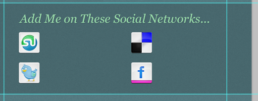 Change the foreground color to light green (#E5FCC2) and select the Horizontal Type Tool again. Set your font to 18pt, Georgia (Italic). Beside the social media icons, write the services' respective names (e.g. "Twitter", "Stumble Upon", etc.).
Horizontal text tool. Set your font to 18pt, Georgia (italic). Write the respective names of the services next to the social media icons (e.g. Twitter, Stumble Upon, etc.).
Again, copy the drop shadow layer style from the heading or the Tweet message text layer and paste it onto the social media text layers.Again, copy the drop shadow layer style from the title or Tweet message text layer and paste it on the social media text layer.
Let's give the texts a rounded rectangle background. You should be familiar with this technique since we have done it with the talk bubble. Change your foreground color to black (#000000 ), choose the Rounded Rectangular Tool and, with the Radius option at 5px, draw a rounded rectangle below each of the text. You must also reduce the rounded rectangles' layer opacities to 15%. Below, you can see that I've performed this method on the "Stumble Upon" text.
Let's add a rounded rectangle background to the text. Because we have done dialog boxes, you should be familiar with this technique. Set the foreground color to black (#000000), select the Rounded Rectangle Tool and set the Radius to 5px, draw a rounded rectangle under each text. You must also adjust the rounded rectangle layer opacity to 15%. Below, you can see that I have added a background to the Stumble Upon text (The position of the rounded rectangle is (592, 530, 130, 32) ).

Now just duplicate the rounded rectangle background's layer (Ctrl/Cmd + J) and move them behind the other remaining texts .
Now duplicate the rounded rectangle background layer (Ctrl/Cmd + J) and move them behind the other remaining text. The positions of the other three rounded rectangles are (819, 530), (592, 592), (819, 592)

Step 8: Designing the "Latest from the Blog" Area
Step 8: Designing the "Latest from the Blog" Area
This web portfolio also has a blog. What we can do is display the most recent post's excerpt in the front page. We can do this on the left column, below the Tweet message.
this The web portfolio also has a blog. What we can do is display recent posting excerpts in the frontend page. , we can do in the left column, below the Tweet message.
You can now collapse the "Social media" layer group. Create a new layer group called "Blog". Change the foreground color to green (#9DE0AD) and choose the Horizontal Type Tool (T). Set your font to 24pt, Georgia (Italic) and write out this section's heading; something like "Latest from the Blog" should do the trick. Copy and paste the drop shadow layer style that we've used in other text layers so that it also has that same consistent design element.
Now you can collapse the Social media group. Create a new group called Blog. Change the foreground color to green (#9DE0AD) and select the Horizontal Type Tool (T). Set your font to 24pt, Georgia (italic), and write out the title of this section; Latest from the Blog layer should also do the same, as we have been using other text As in layers, copy and paste the drop shadow layer style so that they have consistent design elements.

Below the heading of the "Latest from the Blog" area, we will display a thumbnail PS Web Design Tutorial XIX – Create an Elegant Portfolio Web Layout in Photoshop associated with the blog post excerpt. To begin, switch your foreground color to light green (#E5FCC2) and then draw a 90×90px square box for the blog post excerpt's thumbnail background. You can use the Rectangular Tool (U) to draw the background.
Below the title of the Latest from the Blog area we will display the excerpted blog and its associated thumbnail PS Web Design Tutorial XIX – Create an Elegant Portfolio Web Layout in Photoshop. To start with , switch to a light green (#E5FCC2) foreground color, and then draw a 90 × 90px square for the thumbnail background of the blog excerpt. You can use the Rectangle Tool (U) to draw the background rectangle (50, 715) .

After that, right-click on the layer and choose Blending Options to bring up the Layer Style dialog window. Let's give the thumbnail's background an Outer Glow layer effect (settings shown below).
After that, right-click on the layer and select Blending Options to bring up the layer style dialog window. Let’s give the thumbnail background an Outer Glow layer style (settings shown below).

Now find a nice 80×80px thumbnail PS Web Design Tutorial XIX – Create an Elegant Portfolio Web Layout in Photoshop for your blog post (5px smaller on each side compared to the thumbnail's background). I just used and rescaled the thumbnail PS Web Design Tutorial XIX – Create an Elegant Portfolio Web Layout in Photoshop from this Design Instruct tutorial: Design a Skin-Textured Typography Scene in Photoshop.
Now for your blog post (compared to the thumbnail PS Web Design Tutorial XIX – Create an Elegant Portfolio Web Layout in Photoshop Each side of the background is 5px smaller) Find a good 80 x 80px thumbnail PS Web Design Tutorial XIX – Create an Elegant Portfolio Web Layout in Photoshop. I just used thumbnail PS Web Design Tutorial XIX – Create an Elegant Portfolio Web Layout in Photoshops to design the tutorial: Design a Skin-Textured Typography Scene in Photoshop
Note: If the PS Web Design Tutorial XIX – Create an Elegant Portfolio Web Layout in Photoshop is larger, we can still Add an inner glow or stroke layer style to the square, then move the PS Web Design Tutorial XIX – Create an Elegant Portfolio Web Layout in Photoshop above the square, right-click and select Add Clipping Mask so that the PS Web Design Tutorial XIX – Create an Elegant Portfolio Web Layout in Photoshop only shows this part of the square

Using the same foreground color, write your blog post's headline. Use 18pt, Georgia (Italic) for the headline; it should be slightly smaller than the "Latest from the Blog" heading. Like with the other text layers, copy and paste the drop shadow layer style into the headline's text layer.
Using the same foreground color, write your blog post title. The font for the titleUse 18pt, Georgia (italic);It should be slightly smaller than the title of Latest from the Blog. Like other text layers, copy and paste the Drop Shadow layer style into the title's text layer.
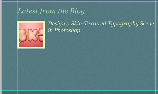
Switch your font settings to 13pt, Arial and write out your post's excerpt. Apply the drop shadow layer style here as well by copying and pasting the layer style from another text layer that has it.
Switch to a font setting of 13pt, arial, and write out your post excerpt. Apply the drop shadow layer style here by copying and pasting the layer style of another text layer from it.

Let us make the "Read more" link. We will change our font settings to 13pt, Georgia (Italic). Write "Read more" at the bottom of the post excerpt and apply the same drop shadow layer style from other text layers onto it. Create a new layer under the "Read more" text layer, change the foreground color to black (#000000) and, using the Rounded Rectangular Tool (T) at 5px Radius, draw a rounded rectangle button background for the "Read more" text. Finish it off by lowering the layer's Opacity to 15% just like with the other rounded rectangle backgrounds we've drawn.
Let's create the Read more link . We set the font to 13pt, Georgia (italic). Write Read more at the bottom of the excerpt and apply the same drop shadow layer style as the other text layers. Create a new layer under the Read more text layer, change the foreground color to black (#000000) and use the Rounded Rectangle Tool (T) with a radius of 5px to draw Read more The rounded rectangle of the text background (415, 904, 85, 19) . Lower the opacity to 15%, just like the opacity of the other rounded rectangles we have drawn.

Step 9: Creating the Thumbnail Gallery Area
Step 9: Create Thumbnail Gallery area
This area of the layout will contain an PS Web Design Tutorial XIX – Create an Elegant Portfolio Web Layout in Photoshop gallery that can contain PS Web Design Tutorial XIX – Create an Elegant Portfolio Web Layout in Photoshops pulled from your Flickr account or other portfolio pieces. Let's go ahead and collapse the "Blog" layer group to get it out of the way, and then create another layer group called "Gallery".
The layout of this area will contain PS Web Design Tutorial XIX – Create an Elegant Portfolio Web Layout in Photoshops from the Gallery which can contain Images from your Flickr account or other portfolio. Let's go ahead and collapse the Blog group, and then create another group Gallery.
We'll start with the section's heading. Change your foreground color to green (#9DE0AD), and use the same settings as the "Latest from the Blog" heading — 24pt, Georgia (Italic) — to write out "Gallery". Then, like before, just copy and paste the drop shadow layer style from another text layer that has it.
We will Start writing the section title. Change the foreground color to green (#9DE0AD) and use the same settings as Latest from the Blog – 24pt, Georgia (italics) – and write Gallery. Then, like before, copy and paste the drop shadow layer style from another text layer.

Create another layer group inside the "Gallery" group called "Gallery item". This group will contain an 80×80px PS Web Design Tutorial XIX – Create an Elegant Portfolio Web Layout in Photoshop and its background. We will reuse the blog post thumbnail PS Web Design Tutorial XIX – Create an Elegant Portfolio Web Layout in Photoshop's background, so expand the "Blog" layer group, locate the thumbnail background, duplicate it (Ctrl/Cmd + J) and then move the duplicated layer into the "Gallery item" group. Find an 80 ×80px photo and place it on top of the thumbnail background.
Create a group called Gallery Item in the Gallery group. The group will contain the 80 x 80px PS Web Design Tutorial XIX – Create an Elegant Portfolio Web Layout in Photoshop and its background. We will be reusing the blog thumbnail PS Web Design Tutorial XIX – Create an Elegant Portfolio Web Layout in Photoshop background, so expand the Blog layer group, position the thumbnail background, duplicate it (Ctrl/Cmd + J), then move the duplicated layer into the Gallery Item group. Location (530,716). Find the 80 × 80px PS Web Design Tutorial XIX – Create an Elegant Portfolio Web Layout in Photoshop and place it on the background of the thumbnail.
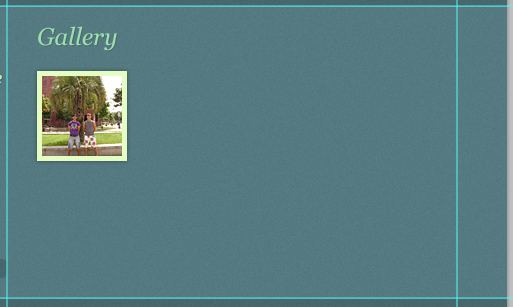
Collapse the "Gallery item" group and make 7 copies of it by right-clicking on the layer group and choosing Duplicate Group from the menu that appears. Position the duplicated gallery items such that you end up with a 2-row by 4-column arrangement.
Collapse the Gallery item group and select Copy Group 7 times by right-clicking the group and selecting Copy Group from the menu that appears. This way you can arrange the copied gallery items for 2 rows and 4 columns.
The positions of the remaining seven squares are (640,716), (750,716), (860,716), (530,833), (640, 833), (750,833), (860,833)

Step 10: Create the Footer Area
Step 10: Create the footer area
This is our last step. Start by collapsing the "Gallery" group and then creating a new group called "Footer". Change the foreground color to a bright green (#E5FCC2) and select the Horizontal Type Tool (T). Set your font settings to 13pt, Arial and write your footer copyright and other information. After that, just paste in the drop shadow layer style from other text layers.
This is our final step. Start the collapsed Gallery group, and then create a new group Footer. Change the foreground color to bright green (#E5FCC2) and select the Horizontal Type Tool (T). Set your font settings to 13pt Arial and write your footer copyright and other information. After this, paste the Drop Shadow layer style from the other text layer.

Tutorial Summary
Congratulations! We've finished our elegant portfolio web design. We covered some useful and trendy techniques like how to create a nice and detailed textured background, inset piders, applying drop shadows manually, a technique for creating PS Web Design Tutorial XIX – Create an Elegant Portfolio Web Layout in Photoshop reflections, creating a nice talk box graphic, and more. I hope that you understood all the steps used, and I' d like to hear your opinion about this tutorial in the comments below!
Tutorial Summary
Congratulations! We have completed the design of our elegant portfolio page. We cover some useful and stylish tips like how to create nice and detailed textured backgrounds, embed dividers, craft, apply drop shadow techniques for creating PS Web Design Tutorial XIX – Create an Elegant Portfolio Web Layout in Photoshops and much more, create a nice conversation box Graphics and more.
The final work


