Home >Web Front-end >PS Tutorial >PS Web Design Tutorial VI – Creating a Food Blog Layout in Photoshop
PS Web Design Tutorial VI – Creating a Food Blog Layout in Photoshop
- 高洛峰Original
- 2017-02-11 09:23:532050browse
As a coder, my art foundation is weak. We can refer to some mature web PS tutorials to improve our design capabilities. To paraphrase a sentence, "If you are familiar with three hundred Tang poems, you can recite them even if you don't know how to compose them."
The tutorials in this series come from online PS tutorials, all from abroad, and all in English. I try to translate these excellent tutorials. Due to limited translation capabilities, the details of the translation still need to be worked out. I hope that the majority of netizens will give me some advice.
Agreement:
1. The software used in this article is the Photoshop CS5 version
2. The screenshots of the original tutorial are in English. I re-screened them based on the re-production. Chinese version of Figure
3. Some operations in the original text do not give parameters. I measured some parameters through repeated testing, which are displayed in red text. For some wrong parameters, the correct parameters are displayed directly in red text
For example: (90, 22, 231, 77) , indicating that the coordinates of the upper left corner of the rectangle are (90, 22) , width 231, height 77
For example: (90,22), indicating that the coordinates of the upper left corner of the rectangle are (90,22), the other two parameters of the rectangle have been specified in the tutorial
4. My own experience will be attached at the end of the tutorial. Some are optimizations of some steps in the tutorial, etc.
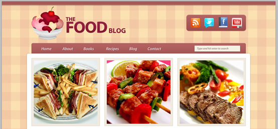
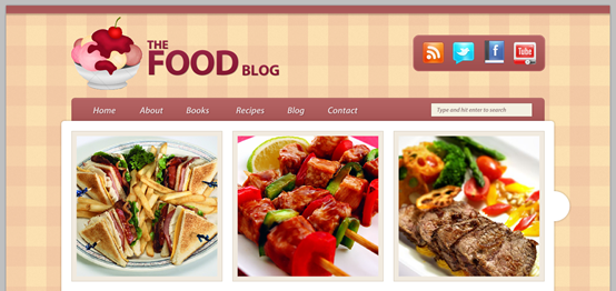
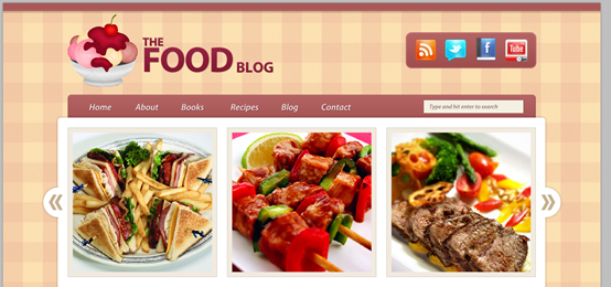
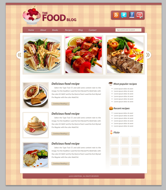
In this tutorial I will show you how to use one of the latest vectors pack from Grafpedia to create a clean and appetizing food blog layout in Photoshop. I'll show you how to create a kitchen tablecloth pattern in Photoshop, how to create an image slider and how to use vectors in a web layout.
In this tutorial, I will show you how to create a refreshing and appetizing food blog website in PS. To use the vector graphics package downloaded from Grafpedia. I'll show you how to create a kitchen tablecloth pattern, how to create a picture slider, and how to use vector graphics in your layout
Introduction
In this tutorial we will use the 960 Grid System. Go ahead, download it and unzip the archive file. Then open the “960_grid_12_col.psd” file in Photoshop (you will find it inside the “photoshop” folder which is located inside the “templates” folder).
Introduction
The 960 layout system will be used in this tutorial. Download and unzip the layout file. Then open 960_grid_12_col.psd in PS (you will find it in the subfolder under templates under the photoshop folder)
After you open the .psd file in Photoshop you will see 12 red bars. That is the grid system that we will be using. You can hide the red bars by clicking on the eye icon of the “12 Col Grid” group.
When you open the psd in PS After file, you will see 12 red horizontal bars. This is used by the layout system. You can hide these bars by clicking on the eye icon in front of the 12 col Grid group
During this tutorial I will ask you to create shapes with certain dimensions. Open the Info panel (Window > Info) and when you create a shape you will see its exact width and height. This .psd file contains some guides as well which will be very useful. To activate them go to View > Show > Guides, or use the shortcut Ctrl/Cmd + ;. I usually hide the red bars and activate the guides whenever I need them.
In this tutorial you will be asked to create a shape with certain dimensions. Open the Info panel (click: Window > Info) and you'll see the exact width and height of a shape when you create it. This .psd file contains some guides that will be useful. To activate them, click: View > Display > Guides, or use the shortcut Ctrl + ;. Generally what I want is to hide the red bars and activate the guides only when I need them.
Now that we covered the basics of using the 960 Grid System, we can move on to creating the actual web layout. Let's get started!
Now in 960 layout Above the system, we are about to start creating actual web page layouts, let's start the tutorial
Note: In this tutorial, the 960 layout system will not be used, for a few reasons Having said that, there is still a little difference between the operation of this translation tutorial and the original tutorial
Step 1
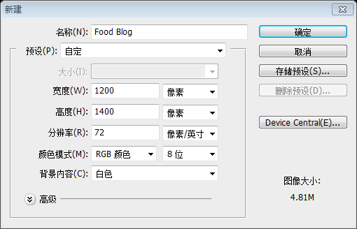
We'll start by increasing the size of our document to give us enough space to work with. Go to Image > Canvas Size and use the settings from the following image.
Step 1
First, adjust the document to the appropriate size. Click: Image>Canvas Size, set as shown below
Since the 960 layout system is not used, this step is to create a new document, size: 1200px*1400px, as shown in the following picture:
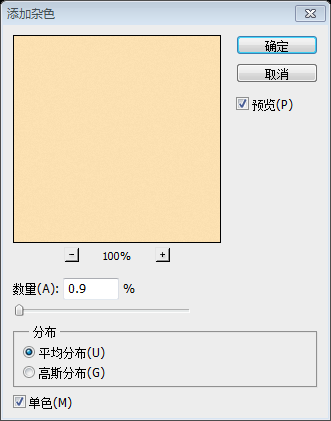
Go to Layer > New Fill Layer > Solid Color and use the color #fbe0b1. Then right-click on this layer and select Convert to Smart Object. Then go to Filter > Noise > Add Noise and use the settings from the image below.
Click: Layers>New Fill Layer>Solid color, color: #fbe0b1. Right-click on the layer and select Convert to Smart Object. Then, click: Filter> Noise> to add noise, and set the parameters as shown below:
Step 2 – Creating a pattern for the background
Step 2 - Creating a background pattern
Create a new document (Ctrl/Cmd + N) with the size 80px by 80px. Select the Rectangle Tool (U) and create a rectangle with the size 80px by 40px and the color #b52a51 at the top of your document. Name this layer “horizontal” and set its opacity to 20%.
Create a new document (Ctrl/cmd+N), size: 80px*80px. Use the rectangle tool to create a new rectangle (0,0) at the top of the document, size: 80px*40px, color: #b52a51. Name the secondary layer horizontal and set the opacity to 20%
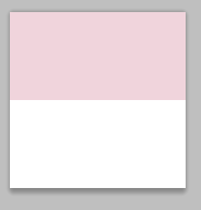
Create another rectangle with the size 40px by 80px in the left side of your document . Name this layer “vertical” and set its opacity to 30%.
Create another rectangle on the left side of the document(0,0), size: 40px*80px, Color: #b52a51, name this layer vertical, set opacity to 30%
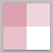
Select these two layers and hit Ctrl/Cmd + G to put them inside a group. Name the group “pattern” and set its opacity to 30%.
Select both layers and hit Ctrl/Cmd + G to put them in a group. Name this group pattern and set the opacity to 30%
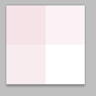
Click on the eye icon of the “Background” layer to hide it. Then go to Edit > Define Pattern, give your pattern a name and click OK. Now you can close this document and go back to the first one.
Click the eye icon in front of the background layer to hide the layer. Then click: Edit > Define Pattern, give your pattern a name and click OK. Then, you can close this document and return to the previous document
Step 3 – Applying the pattern to the background
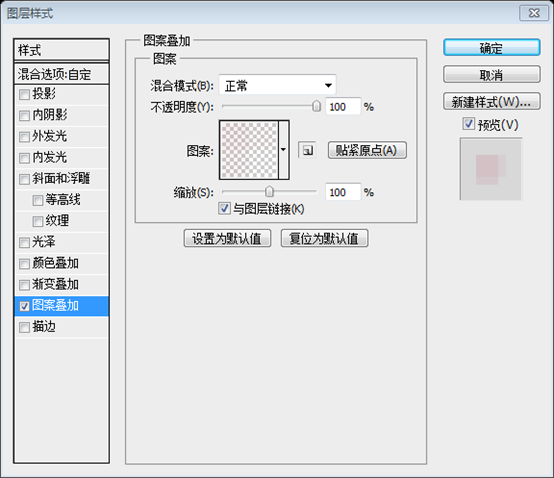
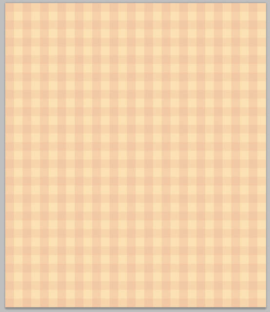
Create a new layer and fill it with white using the Paint Bucket Tool (G). Name this layer “pattern” and set its Fill to 0%. Then double-click on it to open the Layer Style window and use the settings from the following image for Pattern Overlay.
Step 3 - Add a pattern to the background
Create a new layer and fill it with the paint bucket tool with white color. Name this layer pattern and set the fill to 0%. Then double-click to open the layer style window and set the style as shown below
##Step 4
Step 4
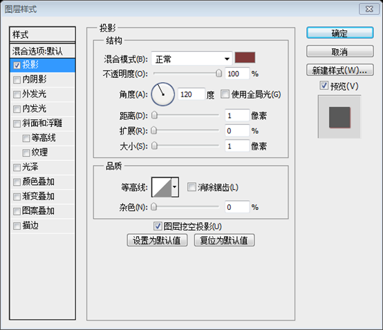
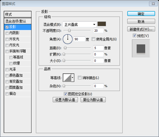
Create a new group and name it “top bar”. Then select the Rectangle Tool (U) and create a rectangle with the dimensions 1200px by 15px and the color #a95858 at the top of your document. Name this layer “top bar”, double-click on it to open the Layer Style window and use the settings from the following image for Drop Shadow. The shadow color is #473e2f.
Create a new top bar group. Then select the rectangle tool and create a new rectangle (0,0) at the top of the document, size: 1200px*15px, color: #a95858. Name this layer top bar. Double-click the layer to open the layer style window and set the style and projection color as shown below: #473e2f


Step 5
Download the Food Vectors Pack and open the .AI file in Adobe Illustrator. Then select the ice cream cup vector using the Selection Tool (V), copy it (Ctrl/Cmd + C), go back to Photoshop and paste it as a smart object (Ctrl/Cmd + V). Name this layer “ice cream icon” and use Free Transform (Ctrl/Cmd + T) to change its size.Step 5
Download Food Vectors Pack then opens the .AI file in Adobe Illustrator. Then select the ice cream cup vector with the selection tool and copy it. Go back to PS and paste as Smart Object (Ctrl/Cmd + V). Name this layer ice cream icon. Then change its size with the Free Transform Tool (Ctrl/Cmd + T)
Since there is no reference line, this step can only be done in a group and name the group. Name operation
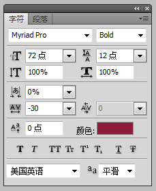
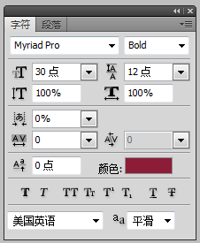
Now select the Type Tool (T) and write the name of your layout using the color #8d1c39. I used three text layers and the font Myriad Pro Black (for the word “food”) and Myriad Pro Bold (for the other two words). To arrange these layers I used the Move Tool (V).Use the text tool to write your layout’s name, color : #8d1c39. I used 3 text layers, the fonts used are Myriad Pro Black (the text food) and Myriad Pro Bold (the other two texts). Use the move tool to align these text layersSince the font Myriad Pro Black was not found, use Myriad Pro Bold instead. The settings of the three texts are as follows:
Settings of the text FOOD
Settings of the text THE
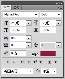
Settings of text BLOG
##Last sample:



Step 6 – Adding some social icons
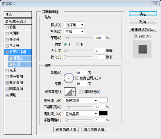
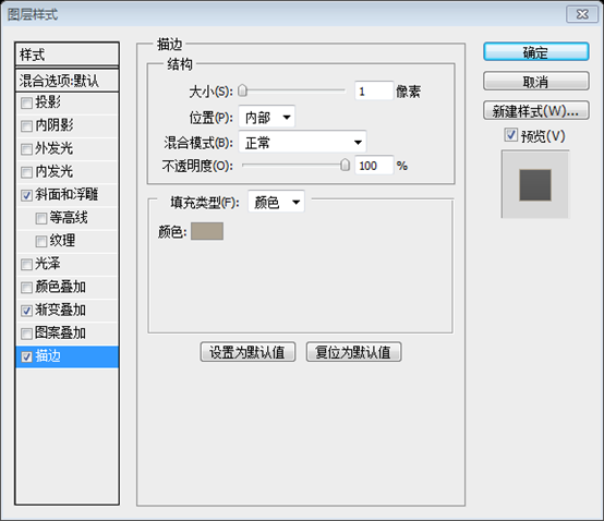
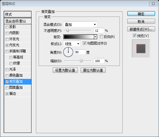
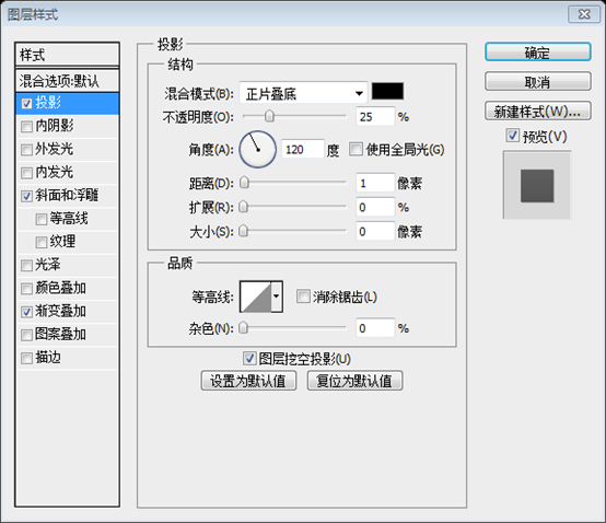
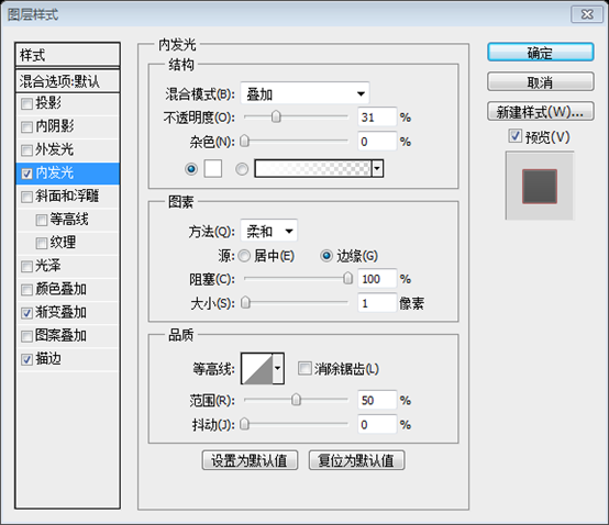
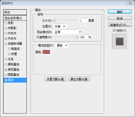
Create a new group and name it “social”. Then select the Rounded Rectangle Tool (U) and create a rounded rectangle with the dimensions 260px by 70px and the color #a95858 in the right side of your layout. Name this layer “social bg”, double- click on it to open the Layer Style window and use the settings from the following image. The stroke color is #a95858.
Create a new social group. Then use the Rounded Rectangle Tool to create a rounded rectangle
(810, 60)on the right side of your layout, size: 260px*70px, color: #a95858. Name this layer social bg, double-click to open the layer style window and set the style as shown below. The stroke color is #a95858

 ##
##
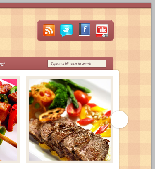
Download this set of icons from Function and open the “rss”, “twitter”, “facebook” and “youtube” icons in Photoshop. Move each of these icons into your first document using the Move Tool (V) and arrange them inside the rounded rectangle you created earlier.
Download the set of icons from Function, then open the rss, twitter, facebook, youtube icons in PS, use the move tool to move each icon into the rounded rectangle and Align them

Step 7 – Creating the background for the content
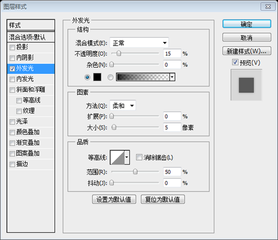
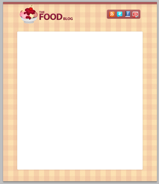
Select the Rounded Rectangle Tool ( U), set the Radius to 6px and create a white rounded rectangle with the dimensions 980px by 1080px. Name this layer “content bg”, double-click on it to open the Layer Style window and use the settings from the following image for Outer Glow.
Step 7 - Create the background of the content area
Use the Rounded Rectangle Tool, set the radius to 6px, and create a white rounded rectangle( 110, 230) , size: 980px*1080px. Name the layer content bg, double-click the layer to open the layer style window, and set the style as shown below
##Step 8 – Creating the navigation bar
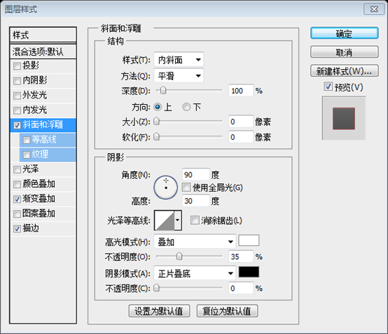
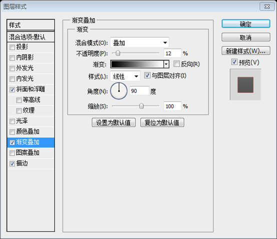
Create a new group (Layer > New > Group), name it “navigation” and put it underneath the “content bg” group. Select the Rounded Rectangle Tool (U) and create a rounded rectangle with the dimensions 938px by 70px and the color #a95858. Make sure that the bottom area of this rectangle is underneath the big white rectangle. Name this layer “navigation bar” , double-click on it and use the settings from the image below. The stroke color is #9c5151.Step 8 - Create a horizontal navigation bar
New navigation group (Layer > New > Group), then move the group below the content bg group(should be the layer) . Use the Rounded Rectangle Tool to create a rounded rectangle (131, 185) , size: 938px*70px, color: #a95858. Make sure the bottom of the rounded rectangle is behind the white rounded rectangle. Name the layer navigation bar, double-click the layer and set the style as shown below. The stroke color is #9c5151


Select the Type Tool (T) and write the name for your navigation menu items using the color #ece2e4 and the font Myriad Pro Semibold Italic. Add a shadow to these layers using the color #803a3a and the settings from the following image.
Step 9Use the text tool to add text for the menu on your navigation bar, Color: #ece2e4, Font: Myriad Pro Semibold Italic,
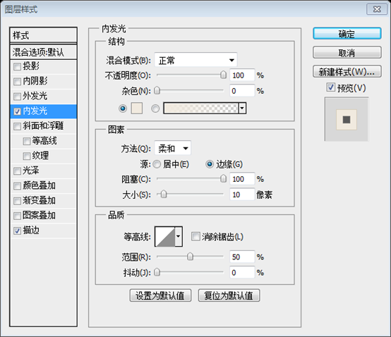
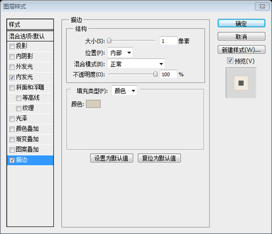
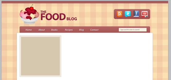
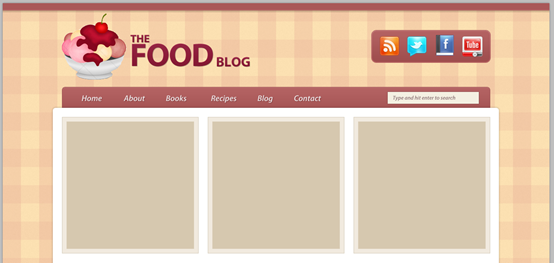
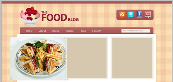
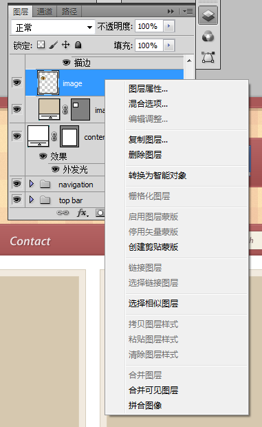
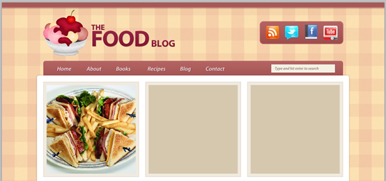
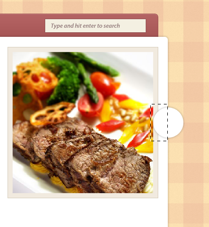
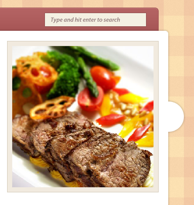
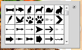
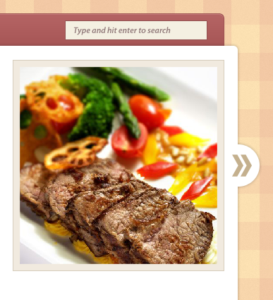
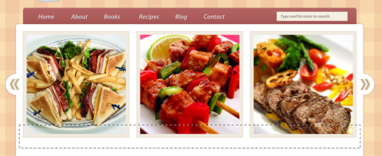
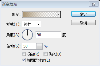
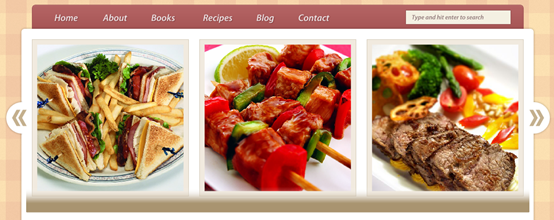
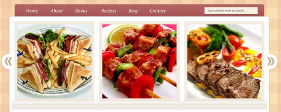
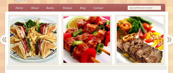
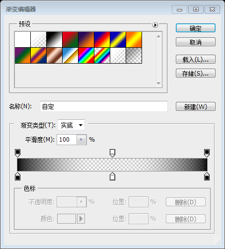
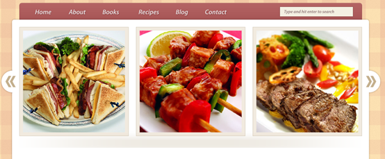
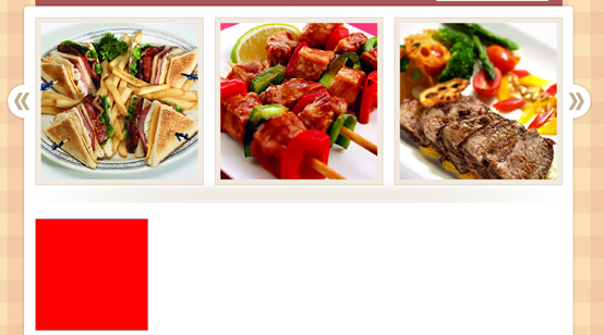
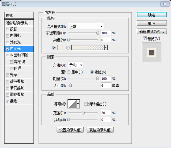
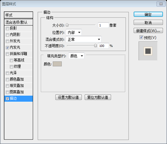
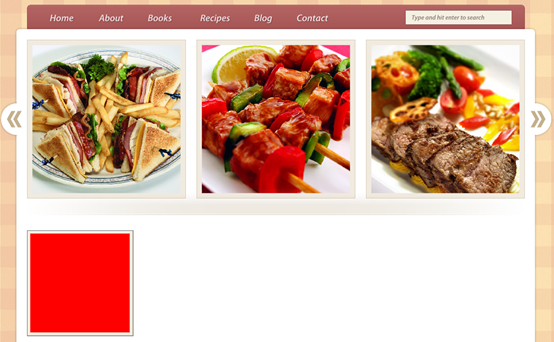
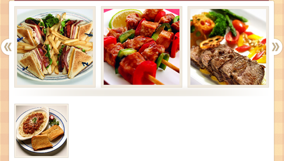
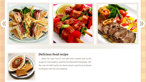
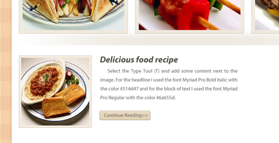
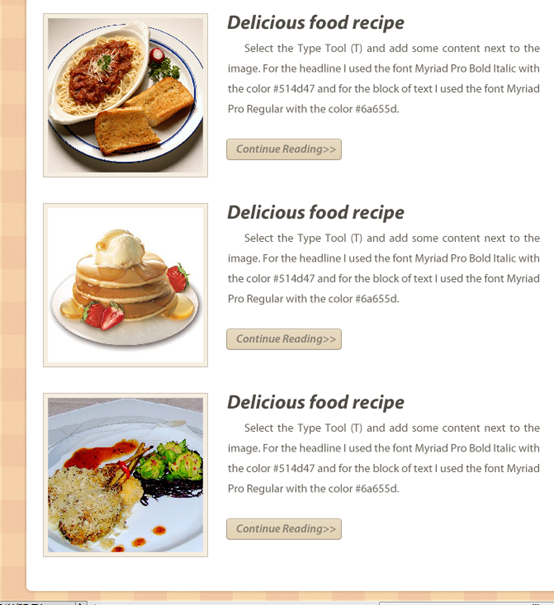
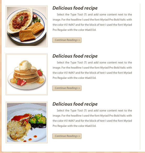
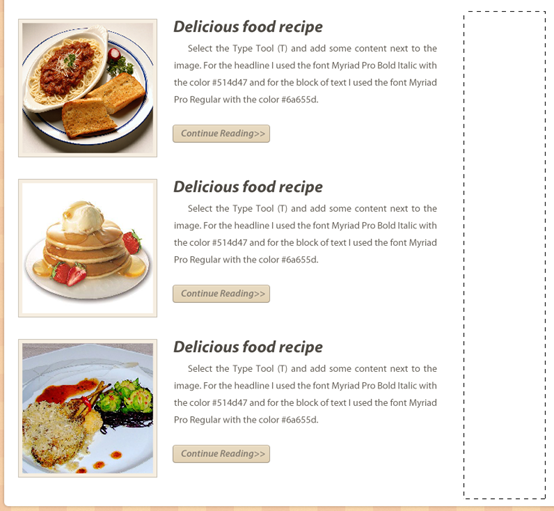
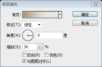
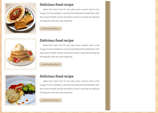
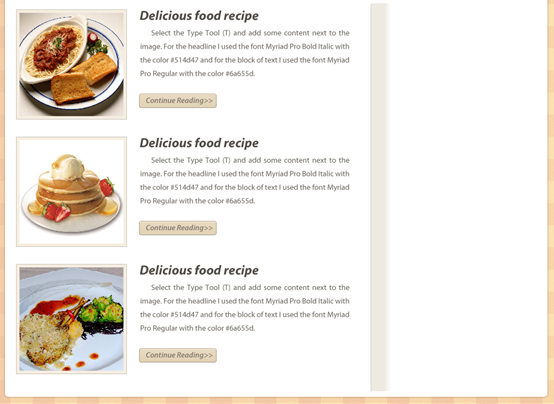
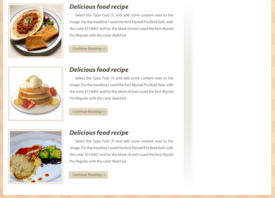
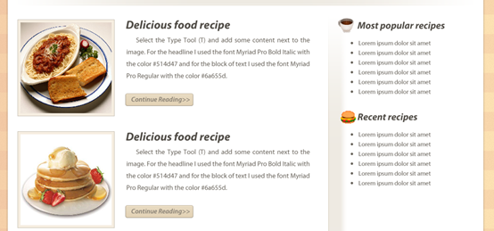
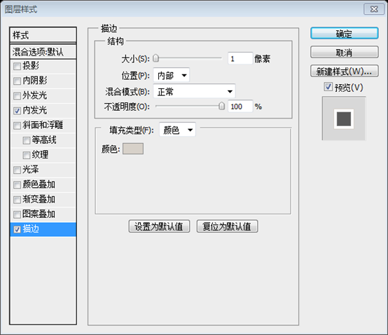
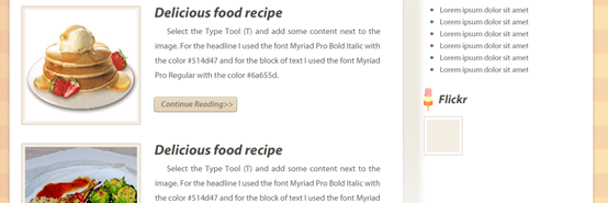
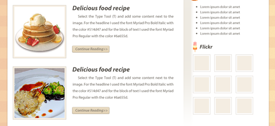
Font size: 18 point. Add the following style and drop shadow color to these text layers: #803a3a Step 10 – Creating the search bar Create a new group and name it “search bar”. Then select the Rectangle Tool (U) and create a rectangle with the dimensions 200px by 26px and the color #f4f0e2. Name this layer “search bar”, put it in the right hand side of your navigation bar and add a 1px stroke to it using the color #925050. Step 10 - Create the search bar Create a new search bar group. Then use the rectangle tool to create a rectangle (845, 195) , size: 200px*26px, color: #f4f0e2. Name this layer search bar, move the rectangle to the right of your navigation bar, then add a 1px stroke with the stroke color: #925050 Select the Type Tool (T) and write the words “Type and hit enter to search” inside your search bar using the color #917a7a. Use the text tool to add text Type in your search box and hit enter to search, Color: #917a7a, Font size: 12 points Step 11 – Creating an image slider Create a new group (Layer > New > Group) above the “content bg” layer and name it “image slider”. Then select the Rectangle Tool (U) and create a square with the dimensions 300px by 300px and the color #d6c8af. Name this layer “image_holder”, double-click on it and use the settings from the following image. The inner glow color is #f1eadf and the stroke color is #d6cdbc. Step 11 - Create an image slider Create a new image slider group above the content bg layer (Layer > New > Group). Then use the rectangle tool to create a square (130,250), size: 300px*300px, color: #d6c8af. Name this layer image_holder, double-click the layer and set the style as shown below. The color of the inner glow: #f1eadf, the color of the stroke: #d6cdbc Duplicate this layer two times (Ctrl/Cmd + J) and use the Move Tool (V) to arrange these layers as you see in the following image. Leave a distance of 20px from the bottom of the navigation bar. Activate the guides to help you arrange these layers better. Duplicate this layer twice (Ctrl/Cmd + J) and use the Move tool Align these squares as shown below. 20px from the bottom of the navigation bar. Activate guides to help you better align the squares. In fact, through calculation, we know that the positions of the three squares are (130, 250), (450, 250), (770, 250) Step 12 Open a food image in Photoshop and move it into your first document. Put this image above the middle square that you created at the previous step. Name this layer “image”, right-click on it and select Create Clipping Mask to make it visible only inside the middle square. Step 12 Open the food image in PS, and then move the image above the square you just created. Name this layer image, then right-click and select Create Clipping Mask so that the image can only be displayed in that part of the square Add two more images inside the other two “image_holder” layers using the same technique. I used some food images from sxc.hu. Use the same technique to add images to the other two image_holder layers. I downloaded some pictures from sxc.hu ##Step 13 – Creating two arrows for the image slider Step 13 - Create two image slider arrows (1060, 370) , size: 60px*60px. Name this layer circle and move it to the right-hand side of the image slider. Double-click the layer and set the style as shown below. Step 14 Step 14 It may be a PS version problem. I directly converted the circle layer in PS CS5 to Smart objects, the effect is the same. ##Then go to Layer > Layer Mask > Hide Selection. Then go to Layer > Layer Mask Version> Hide selection. Step 15 Select the Custom Shape Tool (U), right-click on your image and select an arrow shape. Then create an arrow inside your white circle using the color #c4b08e. Name this layer “arrow”, duplicate it (Ctrl/Cmd + J) and move the new arrow next to the first one. Step 15 Select the Custom Shape Tool, right-click on your image and select an arrow shape. Then create a new arrow inside your white circle, color: #c4b08e. Name this layer arrow, duplicate the layer (Ctrl/Cmd + J) and move the new arrow next to the original one Step 16 Create another arrow in the left side of the image slider just like you created the right arrow. Step 16 Use the same method to create another arrow on the left side of the picture slider The simple method is to directly copy the right arrow group and name the new group left arrow, move it to the appropriate position on the left, and click: Edit > Transform > Flip Horizontal. Step 17 – Creating a separator underneath the image slider Steps 17 - Create a separator below the image slider Create a new group and name it “separator”. Then select the Line Tool (U), set the Weight to 1px and create a horizontal line underneath the image slider using the color #d6cdbc (1). Leave a distance of 30px between this line and the images above. Create a new separator group. Using the Line Tool with a thickness of 1px, create a horizontal line (120, 580, 960, 1) below the image slider, color: #d6cdbc. The distance between the straight line and the image is 30px. Use the Rectangular Marquee Tool (U) to create a selection like the one you see in the following image (2). Use the rectangular selection tool to create a selection as shown below. Then go to Layer > New Fill Layer > Gradient and use the settings from the following image (3). I created a #a99470 -to-transparent gradient. Note that while the Gradient Fill window is opened, you can click on your image and move the gradient around. Then click: Layer>New Fill Layer>Gradient, press Set up as shown below. I'm going to create a #a99470 gradient to transparent. Note that when the gradient window is open, you can click on your image to move your gradient. Set the opacity of this layer to 20% (4). Set the opacity of this layer to 20% Select the Move Tool (V) and leave a distance of 1px between the gradient and the line you created earlier. Use the Move Tool Move the gradient layer 1px away from the horizontal line Step 18 Add a mask to the “separator” group (Layer > Layer Mask > Reveal All). Then select a black-to-transparent gradient (G), hold down the Shift key and drag a gradient from left to right, starting from the left side of the separator. This will make the separator to gradually fade away. Then drag another gradient from right to left starting from the right side of the separator. Take a look at the following image for reference. Step 18 Add a mask to the separator group (Layer> Layer Mask> Show All). Select the black to transparent gradient, hold down the Shift key and drag the gradient from the left to the right of the separator. This will give the separator a fade-in effect. Then drag the gradient from the right side of the separator to the left. Just like the picture below There is no need to drag twice. After setting the gradient as shown below, you only need to drag the gradient once. Before dragging the gradient, be sure to click on the mask of the middle group. Version. Step 19 – Creating the blog posts Step 19 - Create a blog announcement list Create a new group and name it “blog”. Create another group inside the previous one and name it “post #1″. Create a new blog group. Create a new post #1 group in it. Select the Rectangle Tool (U), hold down the Shift key and create a square with the dimensions 200px by 200px. Move this square in the left side of your layout and 30px underneath the horizontal separator. Activate the guides to help you position this layer. Use the rectangle tool, hold down the Shift key to create a square (130, 610), size: 200px*200px. Move the square to the left of the layout, 30px away from the horizontal divider, and activate guides to help you position it better. In order to be eye-catching, the color is expressed in red. Name this layer “image_holder”, double-click on it and use the settings from the following image. For the inner glow I used the color #f6eee1 and for the stroke I used #c9c2b6. Name this layer image_holder, double-click the layer to set the style as shown below. Inner glow color: #f6eee1, stroke color: #c9c2b6 Open a food image in Photoshop, move it into your first document and use Free Transform (Ctrl/Cmd + T) to change its size. Name this layer “image” and put it above the “image_holder” layer. Then right-click on it and select Create Clipping Mask. Open the image of the food in PS and move it above the image_holder layer. Change its size with the Free Transform Tool (Ctrl/Cmd + T). Name this layer image. Then right-click on the layer and select Create Clipping Mask. The operation of this step is the same as that of step 12 Step 20 Select the Type Tool (T) and add some content next to the image. For the headline I used the font Myriad Pro Bold Italic with the color #514d47 and for the block of text I used the font Myriad Pro Regular with the color #6a655d. Step 20 Use the text tool to add content next to the image. For the title line, use the font Myriad Pro Bold Italic , color: #514d47, font size: 24 point , text block uses font Myriad Pro Regular, color: #6a655d, font size: 14 point, line spacing set to automatic Step 21 – Creating a “Continue Reading” button Create a new group and name it “button” . Then select the Rounded Rectangle Tool (U), set the Radius to 4px and create a rounded rectangle with the dimensions 140px by 26px and the color #e5d6bb. Name this layer “button”, double-click on it to open the Layer Style window and use the settings from the following image. The stroke color that I used is #aca291. Step 21 - Create a Continue Reading button New button group and then Use the Rounded Rectangle Tool, set the radius to 4px, and create a rounded rectangle (350, 764) , size: 140px*26px, color: #e5d6bb. Name this layer button, double-click the layer to open the layer style window and set the style and stroke color as shown below: #aca291 Step 22 – Adding more blog posts Step 22 - Add Other Food Blog Announcements Copy the post #1 group twice (right-click on the group and select Copy Group), you can use the move tool to move the post below the original, making sure the distance between them is 30px, you can replace the other two Food pictures in announcement #Step 23 – Creating a separator for the sidebar Create a new group and name it “sidebar”. Then create another group and name it “separator”. Step 23 - Create the separator for the sidebar New sidebar group . ThenIn itNewCreate a separator group Select the Line Tool (U), set the Weight to 1px and create a vertical line next to the blog posts (1). Name this layer “1px line”. Use the straight line tool, set the thickness to 1px, and create a vertical straight line on the right side of the blog announcement. Color: #d6cdbc, name this layer 1px line Use the Rectangular Marquee Tool (M) to create a selection like the one from the following image (2). Use the rectangular selection tool to select the selection as shown below ##Set the opacity of this layer to 20% (4). SET The opacity of this layer is 20% Still call Just drag the previous gradient once, just like the previous horizontal separator (step 17)
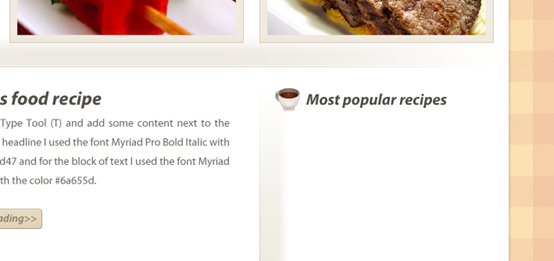
Step 24 – Adding the content for the sidebar Step 24 – Adding content to the sidebar Switch to Adobe Illustrator, copy the coffee cup vector from the Food Vectors Pack and paste it into your Photoshop document as a smart object. Name this layer “coffee cup icon” and use Free Transform (Ctrl/Cmd + T) to change its size and move it in front of the headline. Switch to Adobe Illustrator, copy coffee cup from Food Vectors Pack, paste in PS as The smart object, named coffee cup icon, is resized using the Free Transform tool and moved in front of the title row. Select the Type Too (T) and add a list of blog post names underneath the headline. Use the font Myriad Pro Regular with the color # 6a655d and the size 13pt. Then select the Ellipse Tool (U), hold down the Shift key and create dots with the dimensions 5px by 5px in front of each line of your list. Group these dot layers together (Ctrl/Cmd + G) and name the group “dots”. Use the text tool below the title line to add a blog announcement list. Font: Myriad Pro Regular, Color: #6a655d, Size: 13 point. Select the Ellipse Tool, hold down the Shift key, and create a point before each row of the list, with dimensions: 5px*5px. Group the layers of these points into a group (Ctrl/Cmd + G) and name the group dots Step 25 Add one more list for recent recipes. Use another vector from the vectors pack you downloaded. Step 25 Add a list of recent recipes . Before the title line, use another vector icon from the downloaded vectors pack. Step 26 Create a new group and name it “flickr”. Then copy the ice cream vector from Illustrator and paste it in Photoshop as a smart object. Name this layer “ice cream icon” and change its size using Free Transform (Ctrl/Cmd + T). Select the Type Tool (T) and write the word “Flickr ” next to the icon. Step 26 Create a new flickr group. Then copy the ice cream vector from Illustrator, paste it as a smart object in PS, name this layer ice cream icon, then use the Free Transform Tool (Ctrl/Cmd + T) to adjust the size, and then use the text tool to write next to the icon Text Flickr Select the Rectangle Tool (U), hold down the Shift key and create a square with the dimensions 65px by 65px and the color # f4ede2. Double-click on this layer to open the Layer Style window and use the settings from the following image. The Inner Glow color is #fdfdfd and the Stroke color is #d7d1c9. Select the Rectangle tool and hold down Shift key to create a square (805,1025), size: 65px*65px, color: #f4ede2. Double-click the layer to open the layer style window and set the style as shown below. The inner glow color: #fdfdfd, and the stroke color: #d7d1c9. Duplicate this layer 8 times (Ctrl/Cmd + J) and use the Move Tool (V) to arrange all the squares as you see in the image below . Leave a distance of 15px between squares. Put all the square layers inside a group and name it “squares”. Duplicate this layer 8 times (Ctrl/Cmd + J) and use the Move tool as shown below Align these squares. The distance between the squares is 15px. Merge these square layers into a group and name the group squares Step 27 – Creating the footer Step 27 - Create Footer Create a new group, name it “footer” and put it underneath the “content bg” layer. Then select the Rounded Rectangle Tool (U), set the Radius to 6px and create a rounded rectangle with the dimensions 938px by 70px at the bottom of your layout. Make sure that the upper half of this layer is hidden underneath the big white rectangle. Name this layer “footer”, double-click on it and use the settings from the following image. The stroke color that I used is #a95858. Create a new footer group and place it on the content bg layer below. Then select the Rounded Rectangle Tool, set the radius to 6px, create a rounded rectangle (131, 1280) at the bottom of your layout, color: #a95858, size 938px*70px, make sure your circle The upper half of the corner rectangle is behind the large white rectangle. Name this layer footer. Double-click the layer to set the style as shown below. The stroke color is: #a95858 Final Result
Experience: The techniques in this tutorial and PS Web Design Tutorial IV - How to Create a Professional Blog Website Layout in Photoshop are exactly the same. It is guessed that they are written by the same designer. The tutorials have the following in common 1. Use masking technology to achieve special effects, such as cropping pictures through masks, and achieving separator gradient effects through masks 2. Using layer styles The inner glow and stroke styles achieve the effect of double strokes 3. Precise positioning. By setting the size of each rectangle, you will find that in fact, the size of each object in the tutorial is carefully calculated. , which makes the margin control quite good and the overall feeling is strong. For more PS web design tutorial VI - Create a food blog layout in Photoshop For related articles, please pay attention to the PHP Chinese website! 