






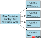
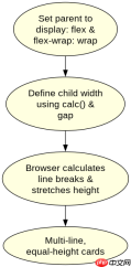
在css3中实现多行等高卡片流式排版,核心做法是父容器设置 display: flex 并开启 flex-wrap: wrap,同时为子元素设置 flex: 1 1 calc(33.33% - 20px)(假设三列布局)及 margin-bottom。由于flexbox默认主轴方向为水平,且 align-items 默认为 stretch,同一行内的卡片会自动拉伸至相同高度。若需处理跨行间距,通常通过负外边距技巧或grid布局优化,但纯flex方案下,每行内部等高,行间自然换行。
如何确保卡片在不同屏幕宽度下保持等高且自动换行?
要实现这一效果,必须明确父容器的 flex-direction 为 row(默认值),并利用 flex-wrap: wrap 允许子项换行。关键在于子项的宽度计算:使用 calc() 减去间隙值,确保每行能容纳指定数量的卡片。当一行填满后,剩余空间会被忽略,下一行新起一行,且该行内的所有卡片因 align-items: stretch 而自动等高。
/* CSS 代码 */
.container {
  display: flex;
  flex-wrap: wrap;
  gap: 20px; /* 现代浏览器推荐用gap替代margin */
}
.card {
  flex: 1 1 calc(33.33% - 20px);
  min-width: 250px; /* 防止过度压缩 */
  background: #f0f0f0;
  padding: 20px;
}
上述代码中,gap: 20px 是现代CSS解决间距问题的最佳实践,它自动处理了内外边距,避免了传统负margin hack的复杂性。flex: 1 1 calc(...) 表示卡片可以增长、收缩,基准宽度为计算后的百分比。当窗口变窄,卡片会自动减少每行数量并换行,始终保持同行内等高。
如果内容高度不一致,如何避免最后一行出现巨大空白?
Flexbox的 align-items: stretch 仅对“当前行”生效。因此,最后一行若不足三个卡片,它们仍会拉伸填满该行高度,这可能导致视觉上的不协调。要解决此问题,通常不建议强制最后一行也拉伸,而是接受这种自然行为,或通过JavaScript动态调整。但在纯CSS中,更常见的做法是使用 align-content: start 配合 flex-wrap,但这会影响所有行。实际上,对于卡片流,我们通常希望每行独立等高,而最后一行保持其自然高度。此时,应移除 align-items: stretch 或显式设置为 start,但这会导致非最后一行也不等高。因此,标准做法是保留 stretch,并接受最后一行的拉伸,或者使用Grid布局的 auto-rows 特性来更好地控制。


/* 改进版 CSS */
.container {
  display: flex;
  flex-wrap: wrap;
  align-items: stretch; /* 确保同行等高 */
  gap: 20px;
}
.card {
  flex: 1 1 calc(33.33% - 20px);
  /* 其他样式 */
}
在实际开发中,若对最后一行对齐有严格要求,可考虑使用 display: grid 并设置 grid-template-columns: repeat(auto-fit, minmax(250px, 1fr)) 和 grid-auto-rows: minmax(0, 1fr),这样每行的高度由该行最高卡片决定,且不会强制拉伸最后一行到与前面行一样高(除非所有行都填满)。但对于Flex方案,上述代码已能满足大多数“多行等高”需求,即每行内部等高,行间自然流动。
基于 flex: 1 1 calc(33.33% - 20px) 输入,当屏幕宽度为800px时,每行显示几张卡片?
当屏幕宽度为800px时,假设 gap 为20px,每张卡片的基准宽度为 calc(33.33% - 20px)。33.33% of 800px is approximately 266.64px. Subtracting 20px gives ~246.64px per card. Three cards would require 3 * 246.64 + 2 * 20 (gaps between them) = 739.92 + 40 = 779.92px, which fits within 800px. Therefore, three cards will fit in one row. If the screen width were smaller, say 600px, 33.33% is 200px, minus 20px is 180px. Three cards need 3*180 + 40 = 580px, still fitting. At 500px, 33.33% is 166.65px, minus 20px is 146.65px. Three cards need 3*146.65 + 40 = 479.95px, still fitting. The break happens when 3*(width/3 - 20) + 40 > width. Simplifying, width - 60 + 40 > width => -20 > 0, which is never true for positive width. This indicates that with calc(33.33% - 20px), three cards will always try to fit unless the container is extremely narrow or the gap is large relative to the percentage. In practice, min-width on the card prevents this infinite shrinking. With min-width: 250px as in the example, at 800px, each card wants to be ~246px, but min-width forces it to 250px. 3*250 + 40 = 790px, which fits. So, three cards per row.
前端入门到VUE实战笔记:立即使用
在学习笔记中,你将探索 前端 的入门与实战技巧!