





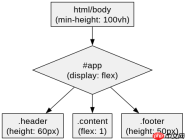
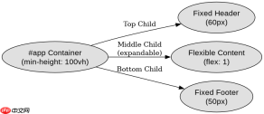
在css3中利用flex和min-height实现满屏自适应骨架,核心做法是设置根元素为flex容器并指定`min-height: 100vh`,子项通过`flex: 1`自动填充剩余空间。这样即使内容不足也能撑开屏幕,内容超出时则自然滚动。
如何设置根容器以占据整个视口高度
要让页面骨架占满屏幕,需将`html`和`body`设为flex布局,并赋予`min-height: 100vh`属性。这确保容器至少与视口等高,多余空间由子元素分配。
    <meta charset="UTF-8"><title>Full Screen Skeleton</title><style>
        html, body {
            margin: 0;
            padding: 0;
            height: 100%;
        }
        #app {
            display: flex;
            flex-direction: column;
            min-height: 100vh;
        }
        .header {
            background: #ddd;
            height: 60px;
        }
        .content {
            flex: 1;
            background: #eee;
        }
        .footer {
            background: #ddd;
            height: 50px;
        }
    </style><div id="app">
        <div class="header">Header</div>
        <div class="content">Content</div>
        <div class="footer">Footer</div>
    </div>
如何让中间内容区域自动填充剩余空间
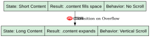
在根容器已设置`min-height: 100vh`的前提下,中间内容区域只需添加`flex: 1`样式即可自动占据剩余垂直空间。无论内容多少,该区域都会填满可用高度。
<!-- 接上文代码 -->
<style>
    /* 关键样式 */
    #app {
        display: flex;
        flex-direction: column;
        min-height: 100vh;
    }
    .content {
        flex: 1; /* 自动填充剩余空间 */
    }
</style>
当内容超过视口高度时布局会如何表现
当`.content`内部内容高度超过剩余空间时,由于父容器使用了`min-height`而非固定`height`,整体布局会自动扩展,出现垂直滚动条。此时`.content`区域仍保持`flex: 1`特性,但实际高度由内容决定,不再强制拉伸。
前端入门到VUE实战笔记:立即使用
在学习笔记中,你将探索 前端 的入门与实战技巧!