Home >Web Front-end >CSS Tutorial >box-shadow implements projection from different angles
box-shadow implements projection from different angles
- 高洛峰Original
- 2016-11-15 14:17:471852browse
Let’s take a look at the parameter description of box-shadow first:

In order to achieve projection at different angles, four parameters are needed. The core principle is to increase the blur distance and reduce the size of the shadow
Top projection
width: 100px;
height: 100px;
background: #f1f1f1;
margin: 20px ;
box-shadow: #000 0 -5px 5px -5px;

Right projection
width: 100px;
height: 100px;
background: #f1f1f1;
margin: 20px ;
box-shadow: #000 5px 0 5px -5px;

Bottom projection
width: 100px;
height: 100px;
background: #f1f1f1;
margin: 20px ;
box-shadow: #000 0 5px 5px -5px;
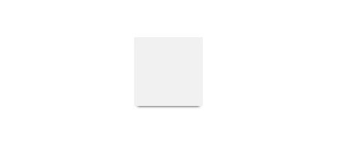
Left projection
width: 100px;
height: 100px;
background: #f1f1f1;
margin: 200px ;
box-shadow: #000 -5px 0 5px -5px;

Bilateral projection
width: 100px;
height: 100px;
background: #f1f1f1;
margin: 20px ;
box-shadow: 5px 0 5px -5px #000,-5px 0 5px -5px #000;

Statement:
The content of this article is voluntarily contributed by netizens, and the copyright belongs to the original author. This site does not assume corresponding legal responsibility. If you find any content suspected of plagiarism or infringement, please contact admin@php.cn

