Home >Web Front-end >CSS Tutorial >CSS implements three-column image layout with equal width and equal spacing
CSS implements three-column image layout with equal width and equal spacing
- 大家讲道理Original
- 2016-11-09 17:13:072103browse

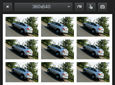
Each image block floats left, width 30%, left margin 2.5%:
100%=(2.5%+30%)+(2.5%+30%)+(2.5%+30%)+2.5 %
<!DOCTYPE html>
 <html>
 <head>
 <meta charset="utf-8">
 <meta name="viewport" content="width=device-width,initial-scale=1,maximum-scale=1,user-scalable=0">
 <title>三列图片等宽布局</title>
 <style>
 * {
     margin: 0;
     padding: 0;
 }
 img {
     display: block;
     width: 30%;
     margin: 2.5% 0 0 2.5%;
     float: left;
 }
 </style>
 </head>
 <body>
 <div>
 <img  src="byd.jpg" / alt="CSS implements three-column image layout with equal width and equal spacing" ><img  src="byd.jpg" / alt="CSS implements three-column image layout with equal width and equal spacing" ><img  src="byd.jpg" / alt="CSS implements three-column image layout with equal width and equal spacing" >
 <img  src="byd.jpg" / alt="CSS implements three-column image layout with equal width and equal spacing" ><img  src="byd.jpg" / alt="CSS implements three-column image layout with equal width and equal spacing" ><img  src="byd.jpg" / alt="CSS implements three-column image layout with equal width and equal spacing" >
 <img  src="byd.jpg" / alt="CSS implements three-column image layout with equal width and equal spacing" ><img  src="byd.jpg" / alt="CSS implements three-column image layout with equal width and equal spacing" ><img  src="byd.jpg" / alt="CSS implements three-column image layout with equal width and equal spacing" >
 </div>
 </body>
 </html>
The simple and practical percentage layout is still very suitable for mobile WAP page layout:
min-width:320px;
 max-width:420px;
 width:100%;
 overflow-x: hidden;
 margin: 0 auto;
The minimum width is 320px, the maximum width is 420px, and it automatically adapts to the width between 320px and 420px. It looks okay.
In the tag You only need to set the width attribute percentage value, such as width="40%", without setting the height attribute, so that the image can be scaled according to the original proportion.
The blocks in the container can also be laid out using percentages, such as 60% on the left and 60% on the right 40%.
Related articles
See more- Creating Fluid Typography with the CSS clamp() Function
- How to Rotate Background Images in CSS3 Using Transforms | SitePoint' data-gatsby-head='true'/>
- Quick Tip: How to Add Gradient Effects and Patterns to Text
- How to Implement Pagination with HTML, CSS and JavaScript' data-gatsby-head='true'/>
- How to Use the CSS gap Property

