
 Backend DevelopmentPHP TutorialMenu writing example of DrawerLayout drawer effect in Android App_php skills
Menu writing example of DrawerLayout drawer effect in Android App_php skills

Navigation menu with drawer effect
After looking at many applications, I think this side-sliding drawer effect menu is very good.
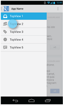
There is no need to switch to another page or press the hardware button of the menu. Just click a button on the interface and the menu will slide out, and it feels like it can hold a lot of things.
Library reference:
First of all, the DrawerLayout class is in the Support Library, and the android-support-v4.jar package needs to be added.
Then import android.support.v4.widget.DrawerLayout;
If you cannot find this class, first use the SDK Manager to update the Android Support Library, then find android-support-v4.jar in the Android SDKextrasandroidsupportv4 path, copy it to the libs path of the project, and add it to Build Path.
Code 1
Layout:
<RelativeLayout xmlns:android="http://schemas.android.com/apk/res/android"
  xmlns:tools="http://schemas.android.com/tools"
  android:layout_width="match_parent"
  android:layout_height="match_parent" >

  <android.support.v4.widget.DrawerLayout
    xmlns:android="http://schemas.android.com/apk/res/android"
    android:id="@+id/drawer_layout"
    android:layout_width="match_parent"
    android:layout_height="match_parent" >

    <!-- The main content view -->
    <!-- main content must be the first element of DrawerLayout because it will be drawn first and drawer must be on top of it -->

    <FrameLayout
      android:id="@+id/content_frame"
      android:layout_width="match_parent"
      android:layout_height="match_parent" />

    <!-- The navigation drawer -->

    <ListView
      android:id="@+id/left_drawer"
      android:layout_width="240dp"
      android:layout_height="match_parent"
      android:layout_gravity="left"
      android:background="#111"
      android:choiceMode="singleChoice"
      android:divider="@android:color/transparent"
      android:dividerHeight="0dp" />
  </android.support.v4.widget.DrawerLayout>

</RelativeLayout>
The first child element of DrawerLayout is the main content, that is, the layout displayed when the drawer is not opened. A FrameLayout is used here, with nothing in it.
The second child element of DrawerLayout is the content in the drawer, that is, the drawer layout. A ListView is used here.
Main Activity (taken from official examples):
package com.example.hellodrawer;
import android.os.Bundle;
import android.app.Activity;
import android.content.res.Configuration;
import android.view.MenuItem;
import android.view.View;
import android.widget.AdapterView;
import android.widget.AdapterView.OnItemClickListener;
import android.widget.ArrayAdapter;
import android.widget.ListView;
import android.support.v4.app.ActionBarDrawerToggle;
import android.support.v4.view.GravityCompat;
import android.support.v4.widget.DrawerLayout;
public class HelloDrawerActivity extends Activity
{
private String[] mPlanetTitles;
private DrawerLayout mDrawerLayout;
private ActionBarDrawerToggle mDrawerToggle;
private ListView mDrawerList;
@Override
public void onCreate(Bundle savedInstanceState)
{
super.onCreate(savedInstanceState);
setContentView(R.layout.activity_hello_drawer);
mDrawerLayout = (DrawerLayout) findViewById(R.id.drawer_layout);
// init the ListView and Adapter, nothing new
initListView();
// set a custom shadow that overlays the main content when the drawer
// opens
mDrawerLayout.setDrawerShadow(R.drawable.drawer_shadow,
GravityCompat.START);
mDrawerToggle = new ActionBarDrawerToggle(this, mDrawerLayout,
R.drawable.ic_drawer, R.string.drawer_open,
R.string.drawer_close)
{
/** Called when a drawer has settled in a completely closed state. */
public void onDrawerClosed(View view)
{
invalidateOptionsMenu(); // creates call to
// onPrepareOptionsMenu()
}
/** Called when a drawer has settled in a completely open state. */
public void onDrawerOpened(View drawerView)
{
invalidateOptionsMenu(); // creates call to
// onPrepareOptionsMenu()
}
};
// Set the drawer toggle as the DrawerListener
mDrawerLayout.setDrawerListener(mDrawerToggle);
// enable ActionBar app icon to behave as action to toggle nav drawer
getActionBar().setDisplayHomeAsUpEnabled(true);
// getActionBar().setHomeButtonEnabled(true);
// Note: getActionBar() Added in API level 11
}
private void initListView()
{
mDrawerList = (ListView) findViewById(R.id.left_drawer);
mPlanetTitles = getResources().getStringArray(R.array.planets_array);
// Set the adapter for the list view
mDrawerList.setAdapter(new ArrayAdapter<String>(this,
R.layout.list_item, mPlanetTitles));
// Set the list's click listener
mDrawerList.setOnItemClickListener(new OnItemClickListener()
{
@Override
public void onItemClick(AdapterView<?> parent, View view,
int position, long id)
{
// Highlight the selected item, update the title, and close the
// drawer
mDrawerList.setItemChecked(position, true);
setTitle(mPlanetTitles[position]);
mDrawerLayout.closeDrawer(mDrawerList);
}
});
}
@Override
protected void onPostCreate(Bundle savedInstanceState)
{
super.onPostCreate(savedInstanceState);
// Sync the toggle state after onRestoreInstanceState has occurred.
mDrawerToggle.syncState();
}
@Override
public void onConfigurationChanged(Configuration newConfig)
{
super.onConfigurationChanged(newConfig);
mDrawerToggle.onConfigurationChanged(newConfig);
}
@Override
public boolean onOptionsItemSelected(MenuItem item)
{
// Pass the event to ActionBarDrawerToggle, if it returns
// true, then it has handled the app icon touch event
if (mDrawerToggle.onOptionsItemSelected(item))
{
return true;
}
// Handle your other action bar items...
return super.onOptionsItemSelected(item);
}
}
What is more confusing is the use of an API of Level 11, so the minSdkVersion is limited and cannot be too low.
Picture resources are available for download from the sample on the Android official website.
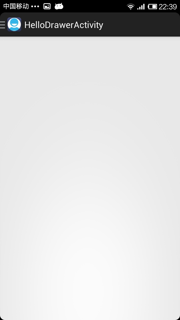
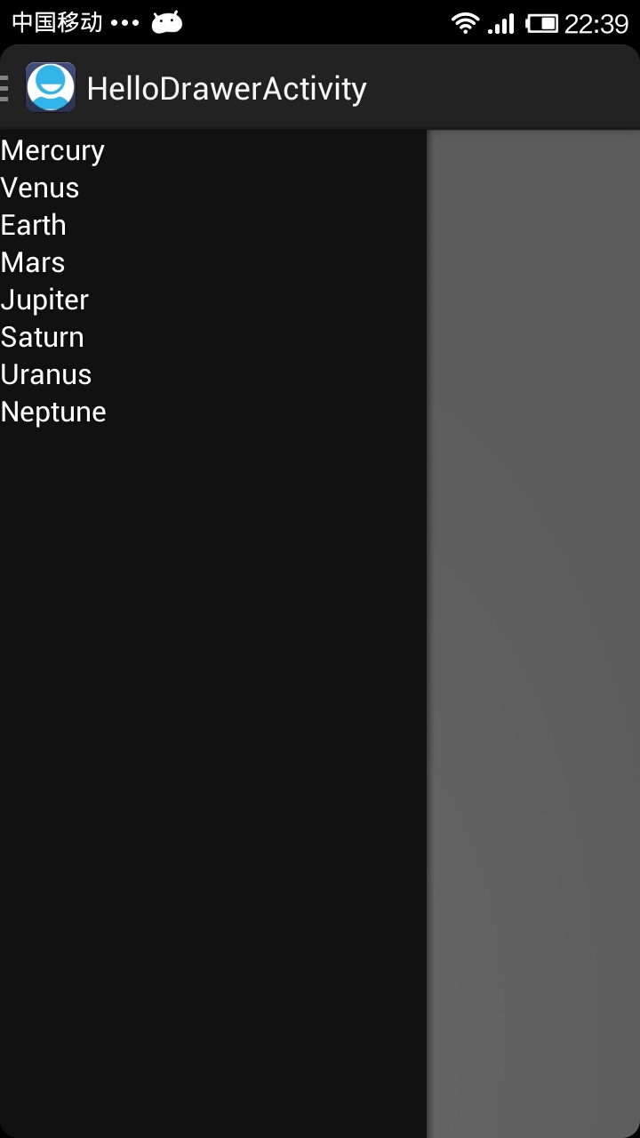
The effect after running the program is as follows:
Before drawer opening:
After the drawer is opened:
Code 2
Today I took another look at the DrawerLayout class and found that there are many methods that can be used directly.
I tried it again. In fact, it doesn’t have to be as troublesome as the above. You can just define a button to control the opening of the drawer:
Layout:
<RelativeLayout xmlns:android="http://schemas.android.com/apk/res/android"
  xmlns:tools="http://schemas.android.com/tools"
  android:layout_width="match_parent"
  android:layout_height="match_parent"
  android:paddingBottom="@dimen/activity_vertical_margin"
  android:paddingLeft="@dimen/activity_horizontal_margin"
  android:paddingRight="@dimen/activity_horizontal_margin"
  android:paddingTop="@dimen/activity_vertical_margin"
  tools:context=".DrawerActivity" >

  <android.support.v4.widget.DrawerLayout
    android:id="@+id/drawer_layout"
    android:layout_width="match_parent"
    android:layout_height="match_parent" >

    <!-- The main content view -->

    <FrameLayout
      android:id="@+id/content_frame"
      android:layout_width="match_parent"
      android:layout_height="match_parent" >

      <Button
        android:id="@+id/btn"
        android:layout_width="match_parent"
        android:layout_height="wrap_content"
        android:text="open"
        />
    </FrameLayout>

    <!-- The navigation drawer -->

    <ListView
      android:id="@+id/left_drawer"
      android:layout_width="240dp"
      android:layout_height="match_parent"
      android:layout_gravity="start"
      android:background="#111"
      android:choiceMode="singleChoice"
      android:divider="@android:color/transparent"
      android:dividerHeight="0dp" />
  </android.support.v4.widget.DrawerLayout>

</RelativeLayout>
Main code:
package com.example.hellodrawer;

import android.os.Bundle;
import android.app.Activity;
import android.support.v4.widget.DrawerLayout;
import android.view.Gravity;
import android.view.View;
import android.view.View.OnClickListener;
import android.widget.Button;

public class DrawerActivity extends Activity
{
  private DrawerLayout mDrawerLayout = null;

  @Override
  protected void onCreate(Bundle savedInstanceState)
  {
    super.onCreate(savedInstanceState);
    setContentView(R.layout.activity_drawer);

    mDrawerLayout = (DrawerLayout) findViewById(R.id.drawer_layout);

    Button button = (Button) findViewById(R.id.btn);
    button.setOnClickListener(new OnClickListener()
    {

      @Override
      public void onClick(View v)
      {
        // 按钮按下,将抽屉打开
        mDrawerLayout.openDrawer(Gravity.LEFT);

      }
    });
  }

}
Use Toolbar DrawerLayout to quickly realize high-end menu sliding
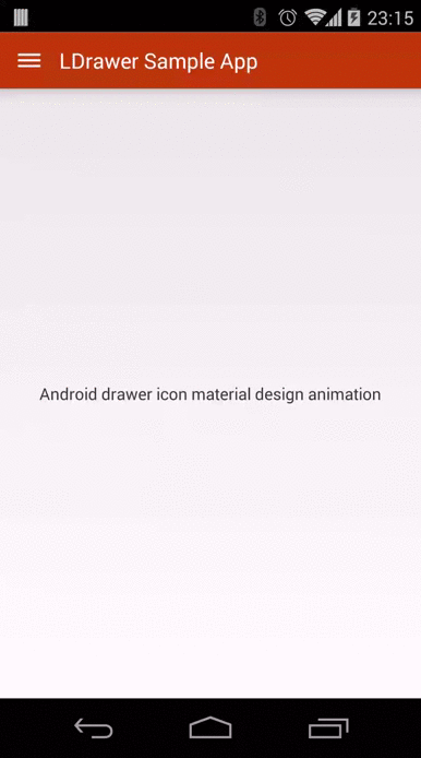
If you are paying attention to some applications that follow the latest Material Design design specifications (if not, assuming you are!), you may find that many use side-sliding menu animation effects that look very comfortable and elegant. , the example is as follows (via reference 2):
Today, let’s use the official support library to quickly achieve this type of effect. You need to use Toolbar and DrawerLayout. The detailed steps are as follows: (If you don’t know these two Widgets, Google them first~)
First you need to add appcompat-v7 support:
If the project is created on Android Studio 1.0 RC4, appcompat-v7 support has been added by default. If it is not the latest version of AS, you need to add the following code to build.gradle:
dependencies {
  ...//其他代码
  compile 'com.android.support:appcompat-v7:21.0.2'
}
After adding, you need to synchronize gradle
Add Toolbar:
Since Toolbar inherits from View, you can add Toolbar directly to the main layout file like other standard controls. However, in order to improve the reuse efficiency of Toolbar, you can create a custom_toolbar.xml code in the layout as follows:
<?xml version="1.0" encoding="utf-8"?>
<android.support.v7.widget.Toolbar xmlns:android="http://schemas.android.com/apk/res/android"
xmlns:app="http://schemas.android.com/apk/res-auto"
android:id="@+id/tl_custom"
android:layout_width="match_parent"
android:layout_height="wrap_content"
android:background="?attr/colorPrimary"
android:minHeight="?attr/actionBarSize"
android:popupTheme="@style/ThemeOverlay.AppCompat.Light"
app:theme="@style/ThemeOverlay.AppCompat.ActionBar">
</android.support.v7.widget.Toolbar>
Description:
android.support.v7.widget.Toolbar - Of course, if you only use Toolbar in Lollipop, you can use the Toolbar directly without adding v7 support
xmlns:app - Customized xml naming control, res-auto can be specified directly in AS without using the full package name
Both android:background and android:minHeight can be declared in styles.xml
Add DrawerLayout:
Similar to Toolbar, in order to improve code reuse efficiency, you can create a custom_drawerlayout.xml code in the layout as follows:
<?xml version="1.0" encoding="utf-8"?>
<android.support.v4.widget.DrawerLayout xmlns:android="http://schemas.android.com/apk/res/android"
android:id="@+id/dl_left"
android:layout_width="match_parent"
android:layout_height="match_parent">
<!--主布局-->
<LinearLayout
android:layout_width="match_parent"
android:layout_height="match_parent">
<ImageView
android:id="@+id/iv_main"
android:layout_width="100dp"
android:layout_height="100dp" />
</LinearLayout>
<!--侧滑菜单-->
<LinearLayout
android:layout_width="match_parent"
android:layout_height="match_parent"
android:background="#fff"
android:layout_gravity="start">
<ListView
android:id="@+id/lv_left_menu"
android:layout_width="match_parent"
android:layout_height="match_parent"
android:divider="@null"
android:text="DrawerLayout" />
</LinearLayout>
</android.support.v4.widget.DrawerLayout>
There are two child nodes in the Drawerlayout tag, one is the left menu and the other is the main layout. In addition, the starting position of the left menu needs to be set to android:layout_gravity="start"
Implement activity_main.xml:
<LinearLayout xmlns:android="http://schemas.android.com/apk/res/android"
  xmlns:tools="http://schemas.android.com/tools"
  android:layout_width="match_parent"
  android:layout_height="match_parent"
  android:orientation="vertical"
  tools:context=".MainActivity">
    <!--Toolbar-->
    <include layout="@layout/custom_toolbar" />
    <!--DrawerLayout-->
    <include layout="@layout/custom_drawerlayout" />
</LinearLayout>
Use the include tag directly, concise and clear
Improve Java code:
public class MainActivity extends ActionBarActivity {
//声明相关变量
private Toolbar toolbar;
private DrawerLayout mDrawerLayout;
private ActionBarDrawerToggle mDrawerToggle;
private ListView lvLeftMenu;
private String[] lvs = {"List Item 01", "List Item 02", "List Item 03", "List Item 04"};
private ArrayAdapter arrayAdapter;
private ImageView ivRunningMan;
private AnimationDrawable mAnimationDrawable;
@Override
protected void onCreate(Bundle savedInstanceState) {
super.onCreate(savedInstanceState);
setContentView(R.layout.activity_main);
findViews(); //获取控件
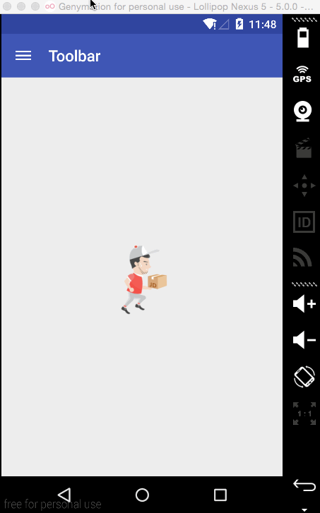
//京东RunningMan动画效果,和本次Toolbar无关
mAnimationDrawable = (AnimationDrawable) ivRunningMan.getBackground();
mAnimationDrawable.start();
toolbar.setTitle("Toolbar");//设置Toolbar标题
toolbar.setTitleTextColor(Color.parseColor("#ffffff")); //设置标题颜色
setSupportActionBar(toolbar);
getSupportActionBar().setHomeButtonEnabled(true); //设置返回键可用
getSupportActionBar().setDisplayHomeAsUpEnabled(true);
//创建返回键,并实现打开关/闭监听
mDrawerToggle = new ActionBarDrawerToggle(this, mDrawerLayout, toolbar, R.string.open, R.string.close) {
@Override
public void onDrawerOpened(View drawerView) {
super.onDrawerOpened(drawerView);
mAnimationDrawable.stop();
}
@Override
public void onDrawerClosed(View drawerView) {
super.onDrawerClosed(drawerView);
mAnimationDrawable.start();
}
};
mDrawerToggle.syncState();
mDrawerLayout.setDrawerListener(mDrawerToggle);
//设置菜单列表
arrayAdapter = new ArrayAdapter(this, android.R.layout.simple_list_item_1, lvs);
lvLeftMenu.setAdapter(arrayAdapter);
}
private void findViews() {
ivRunningMan = (ImageView) findViewById(R.id.iv_main);
toolbar = (Toolbar) findViewById(R.id.tl_custom);
mDrawerLayout = (DrawerLayout) findViewById(R.id.dl_left);
lvLeftMenu = (ListView) findViewById(R.id.lv_left_menu);
}
}
Of course the more important ones are styles.xml and colors.xml, the details are as follows:
<resources>
<style name="AppTheme" parent="Theme.AppCompat.Light.NoActionBar">
<!--状态栏颜色-->
<item name="colorPrimaryDark">@color/Indigo_colorPrimaryDark</item>
<!--Toolbar颜色-->
<item name="colorPrimary">@color/Indigo_colorPrimary</item>
<!--返回键样式-->
<item name="drawerArrowStyle">@style/AppTheme.DrawerArrowToggle</item>
</style>
<style name="AppTheme.DrawerArrowToggle" parent="Base.Widget.AppCompat.DrawerArrowToggle">
<item name="color">@android:color/white</item>
</style>
</resources>
<?xml version="1.0" encoding="utf-8"?>
<resources>
<color name="Indigo_colorPrimaryDark">#303f9f</color>
<color name="Indigo_colorPrimary">#3f51b5</color>
<color name="Indigo_nav_color">#4675FF</color>
</resources>
At this point, the side-sliding menu on Gaodao has been realized, and the final effect is as follows (Note: It seems that directly recording the mobile phone screen does not work on Yosemite, and the animation cannot be real-time due to the frame rate, so let’s watch it like this first~)

 PHP Performance Tuning for High Traffic WebsitesMay 14, 2025 am 12:13 AM
ThesecrettokeepingaPHP-poweredwebsiterunningsmoothlyunderheavyloadinvolvesseveralkeystrategies:1)ImplementopcodecachingwithOPcachetoreducescriptexecutiontime,2)UsedatabasequerycachingwithRedistolessendatabaseload,3)LeverageCDNslikeCloudflareforservin
 Dependency Injection in PHP: Code Examples for BeginnersMay 14, 2025 am 12:08 AM
You should care about DependencyInjection(DI) because it makes your code clearer and easier to maintain. 1) DI makes it more modular by decoupling classes, 2) improves the convenience of testing and code flexibility, 3) Use DI containers to manage complex dependencies, but pay attention to performance impact and circular dependencies, 4) The best practice is to rely on abstract interfaces to achieve loose coupling.
 PHP Performance: is it possible to optimize the application?May 14, 2025 am 12:04 AM
Yes,optimizingaPHPapplicationispossibleandessential.1)ImplementcachingusingAPCutoreducedatabaseload.2)Optimizedatabaseswithindexing,efficientqueries,andconnectionpooling.3)Enhancecodewithbuilt-infunctions,avoidingglobalvariables,andusingopcodecaching
 PHP Performance Optimization: The Ultimate GuideMay 14, 2025 am 12:02 AM
ThekeystrategiestosignificantlyboostPHPapplicationperformanceare:1)UseopcodecachinglikeOPcachetoreduceexecutiontime,2)Optimizedatabaseinteractionswithpreparedstatementsandproperindexing,3)ConfigurewebserverslikeNginxwithPHP-FPMforbetterperformance,4)
 PHP Dependency Injection Container: A Quick StartMay 13, 2025 am 12:11 AM
APHPDependencyInjectionContainerisatoolthatmanagesclassdependencies,enhancingcodemodularity,testability,andmaintainability.Itactsasacentralhubforcreatingandinjectingdependencies,thusreducingtightcouplingandeasingunittesting.
 Dependency Injection vs. Service Locator in PHPMay 13, 2025 am 12:10 AM
Select DependencyInjection (DI) for large applications, ServiceLocator is suitable for small projects or prototypes. 1) DI improves the testability and modularity of the code through constructor injection. 2) ServiceLocator obtains services through center registration, which is convenient but may lead to an increase in code coupling.
 PHP performance optimization strategies.May 13, 2025 am 12:06 AM
PHPapplicationscanbeoptimizedforspeedandefficiencyby:1)enablingopcacheinphp.ini,2)usingpreparedstatementswithPDOfordatabasequeries,3)replacingloopswitharray_filterandarray_mapfordataprocessing,4)configuringNginxasareverseproxy,5)implementingcachingwi
 PHP Email Validation: Ensuring Emails Are Sent CorrectlyMay 13, 2025 am 12:06 AM
PHPemailvalidationinvolvesthreesteps:1)Formatvalidationusingregularexpressionstochecktheemailformat;2)DNSvalidationtoensurethedomainhasavalidMXrecord;3)SMTPvalidation,themostthoroughmethod,whichchecksifthemailboxexistsbyconnectingtotheSMTPserver.Impl


Hot AI Tools

Undresser.AI Undress
AI-powered app for creating realistic nude photos

AI Clothes Remover
Online AI tool for removing clothes from photos.

Undress AI Tool
Undress images for free

Clothoff.io
AI clothes remover

Video Face Swap
Swap faces in any video effortlessly with our completely free AI face swap tool!

Hot Article
Hot Tools

VSCode Windows 64-bit Download
A free and powerful IDE editor launched by Microsoft

Notepad++7.3.1
Easy-to-use and free code editor

SecLists
SecLists is the ultimate security tester's companion. It is a collection of various types of lists that are frequently used during security assessments, all in one place. SecLists helps make security testing more efficient and productive by conveniently providing all the lists a security tester might need. List types include usernames, passwords, URLs, fuzzing payloads, sensitive data patterns, web shells, and more. The tester can simply pull this repository onto a new test machine and he will have access to every type of list he needs.

PhpStorm Mac version
The latest (2018.2.1) professional PHP integrated development tool

EditPlus Chinese cracked version
Small size, syntax highlighting, does not support code prompt function

