


How to make a graph in Excel
To create a graph in Excel, follow these detailed steps:
- Prepare Your Data: Ensure your data is organized in columns or rows with clear headers. Each column or row should represent a series of data you want to plot.
- Select Your Data: Click and drag to highlight the data you want to include in your graph. If you want to include headers, make sure to select those as well.
- Insert a Graph: Go to the "Insert" tab on the Excel ribbon. In the "Charts" group, you will see various chart types. Click on the chart type you want to use, such as "Column," "Line," or "Pie." A dropdown menu will appear with different subtypes. Click on the specific subtype you want.
- Choose a Chart Layout: Once the chart appears on your worksheet, you can customize its layout. Click on the chart, and you will see three additional tabs on the ribbon: "Design," "Layout," and "Format." Under the "Design" tab, you can choose from several predefined chart layouts.
- Add Chart Elements: You can add titles, legends, and data labels by clicking on the chart and using the "Chart Elements" button (the plus sign icon) that appears next to it. Check the elements you want to add.
- Position Your Chart: Click and drag the chart to position it where you want on the worksheet. You can also adjust its size by dragging the corners.
By following these steps, you will have successfully created a graph in Excel.
What types of graphs can I create in Excel?
Excel offers a variety of graph types to visualize data in different ways. Here are some of the main types of graphs you can create in Excel:
- Column Chart: Useful for comparing values across categories. Vertical bars represent data values.
- Bar Chart: Similar to column charts but with horizontal bars. Good for comparing large text categories.
- Line Chart: Ideal for displaying trends over time. Data points are connected with a line.
- Pie Chart: Useful for showing the proportion of each category to the whole. Each slice represents a category.
- Area Chart: Similar to a line chart but the area below the line is filled, emphasizing the magnitude of change.
- Scatter Plot: Used to show the relationship between two numerical values. Points are plotted without connecting lines.
- Bubble Chart: A variation of the scatter plot where the size of the bubbles represents a third variable.
- Stock Chart: Specifically designed for financial data, showing trends in stock prices over time.
- Surface Chart: Useful for finding optimal combinations between two sets of data. Colors and patterns indicate values.
- Doughnut Chart: Similar to a pie chart but can display multiple data series.
- Radar Chart: Useful for comparing multiple variables. Data points are plotted on axes starting from the same point.
Each type serves different purposes, allowing you to choose the most effective way to display your data.
How can I customize the appearance of my graph in Excel?
Customizing the appearance of your graph in Excel can help in making it more visually appealing and effective. Here are several ways to customize your graph:
- Change Chart Style: Under the "Design" tab, you can select from various chart styles and colors that change the overall look of your graph.
- Modify Chart Elements: Use the "Chart Elements" button (the plus sign icon) to add or remove elements such as titles, legends, and data labels. You can click on these elements to further customize them.
- Adjust Colors and Fonts: Click on any part of the graph, such as bars, lines, or text, and use the "Format" tab to change colors, fonts, and other styling options.
- Change Axis Options: Click on an axis to customize its scale, labels, and formatting. You can do this under the "Format Axis" pane.
- Add Data Labels: Right-click on a data series and select "Add Data Labels" to show the values on the graph. You can then format these labels for clarity.
- Use the "Format" Tab: This tab allows detailed customization of selected elements. For instance, you can adjust the fill and border of bars, change line styles, and more.
- Create a Chart Template: If you frequently use a specific style, you can save your customized chart as a template. Go to the "Design" tab, click "Save as Template," and use it for future graphs.
By using these customization options, you can tailor your graph to meet your specific needs and preferences.
What are the steps to update data in an existing Excel graph?
Updating data in an existing Excel graph is straightforward. Here are the steps:
- Locate Your Data: Identify the source data range that is currently linked to your graph. This is usually the data you selected when you initially created the graph.
- Modify Your Data: Change the data in the cells directly. You can add, remove, or edit values as needed.
- Refresh the Graph: As you change the data, the graph should update automatically. If it doesn't, you might need to manually refresh it by right-clicking on the graph, selecting "Select Data," and ensuring the correct data range is selected.
- Adjust Data Range: If you've added new rows or columns that you want to include in your graph, click on the graph, go to the "Design" tab, and click "Select Data." In the "Select Data Source" dialog box, you can adjust the data range to include the new data.
- Check for Errors: After updating, review your graph to ensure it accurately represents the new data. Check for any formatting issues or data labels that may need to be adjusted.
- Save Your Changes: Finally, save your Excel file to preserve the updated graph and data.
By following these steps, you can easily keep your Excel graphs up to date with the latest data.
The above is the detailed content of how to make a graph in excel. For more information, please follow other related articles on the PHP Chinese website!

 MEDIAN formula in Excel - practical examplesApr 11, 2025 pm 12:08 PM
This tutorial explains how to calculate the median of numerical data in Excel using the MEDIAN function. The median, a key measure of central tendency, identifies the middle value in a dataset, offering a more robust representation of central tenden
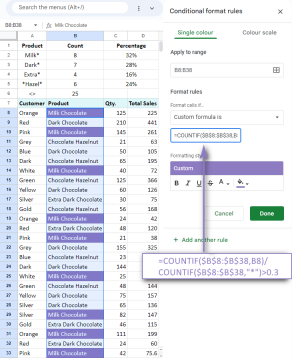 Google Spreadsheet COUNTIF function with formula examplesApr 11, 2025 pm 12:03 PM
Master Google Sheets COUNTIF: A Comprehensive Guide This guide explores the versatile COUNTIF function in Google Sheets, demonstrating its applications beyond simple cell counting. We'll cover various scenarios, from exact and partial matches to han
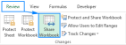 Excel shared workbook: How to share Excel file for multiple usersApr 11, 2025 am 11:58 AM
This tutorial provides a comprehensive guide to sharing Excel workbooks, covering various methods, access control, and conflict resolution. Modern Excel versions (2010, 2013, 2016, and later) simplify collaborative editing, eliminating the need to m
 How to convert Excel to JPG - save .xls or .xlsx as image fileApr 11, 2025 am 11:31 AM
This tutorial explores various methods for converting .xls files to .jpg images, encompassing both built-in Windows tools and free online converters. Need to create a presentation, share spreadsheet data securely, or design a document? Converting yo
 Excel names and named ranges: how to define and use in formulasApr 11, 2025 am 11:13 AM
This tutorial clarifies the function of Excel names and demonstrates how to define names for cells, ranges, constants, or formulas. It also covers editing, filtering, and deleting defined names. Excel names, while incredibly useful, are often overlo
 Standard deviation Excel: functions and formula examplesApr 11, 2025 am 11:01 AM
This tutorial clarifies the distinction between standard deviation and standard error of the mean, guiding you on the optimal Excel functions for standard deviation calculations. In descriptive statistics, the mean and standard deviation are intrinsi
 Square root in Excel: SQRT function and other waysApr 11, 2025 am 10:34 AM
This Excel tutorial demonstrates how to calculate square roots and nth roots. Finding the square root is a common mathematical operation, and Excel offers several methods. Methods for Calculating Square Roots in Excel: Using the SQRT Function: The
 Google Sheets basics: Learn how to work with Google SpreadsheetsApr 11, 2025 am 10:23 AM
Unlock the Power of Google Sheets: A Beginner's Guide This tutorial introduces the fundamentals of Google Sheets, a powerful and versatile alternative to MS Excel. Learn how to effortlessly manage spreadsheets, leverage key features, and collaborate


Hot AI Tools

Undresser.AI Undress
AI-powered app for creating realistic nude photos

AI Clothes Remover
Online AI tool for removing clothes from photos.

Undress AI Tool
Undress images for free

Clothoff.io
AI clothes remover

Video Face Swap
Swap faces in any video effortlessly with our completely free AI face swap tool!

Hot Article
Hot Tools

SublimeText3 Chinese version
Chinese version, very easy to use

VSCode Windows 64-bit Download
A free and powerful IDE editor launched by Microsoft

EditPlus Chinese cracked version
Small size, syntax highlighting, does not support code prompt function

WebStorm Mac version
Useful JavaScript development tools

MinGW - Minimalist GNU for Windows
This project is in the process of being migrated to osdn.net/projects/mingw, you can continue to follow us there. MinGW: A native Windows port of the GNU Compiler Collection (GCC), freely distributable import libraries and header files for building native Windows applications; includes extensions to the MSVC runtime to support C99 functionality. All MinGW software can run on 64-bit Windows platforms.

