


Key Takeaways
- Visual Studio Community 2015 allows users to implement an email signup form, contact and about pages to their site. The email signup form can be placed on the homepage using a form from MailChimp.
- The UI can be polished using Bootstrap to format the form and get everything aligned properly. Custom classes such as not-bold, transparent-background, and soft-border-radius can be created in site.css to modify the form’s appearance.
- Additional pages like a ‘Thank You’ page and ‘Contact’ page can be created for better user interaction. These pages can be designed to match the color scheme and theme of the home page, providing a consistent user experience across the site.
This article was sponsored by Microsoft. Thank you for supporting the sponsors who make SitePoint possible.
Welcome back to our series of articles using Microsoft’s modern IDE: Visual Studio Community 2015 to quickly design and build an attractive, functional site for a client. If you missed the last instalment, check it out here.
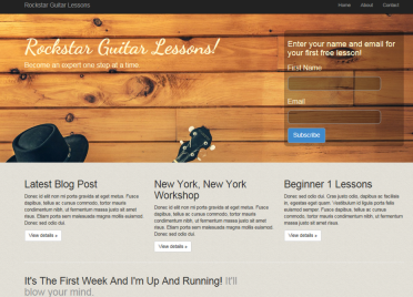
Now that Andy has the website front page available, he can begin building out the site a little more. This will involve implementing an email signup form, as well as contact and about pages.
We’ll start with an email signup form then move into creating some additional pages. The email signup form will be front and center on the homepage. It will be placed on the right side of the jumbotron, where there is some empty space available.
For the email signup form, we’ll use a form from MailChimp. Andy is using his client’s MailChimp account and will use an existing list for the homepage. Everyone that signs up on the homepage will go into this list.
Our signup form will be designed to look like this:
Getting Code from MailChimp
Once logged into MailChimp, select the list you want people added to. Click Signup Forms. Click embedded forms. Classic style is fine. The client wants to capture first name and email address. MailChimp actually has these as the default so we can leave things as they are.
Your screen in MailChimp should look like the following:

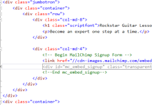
Copy the HTML. This is what we’ll paste into the jumbotron. In the jumbotron under this line:
<span title="&"><p><a class="btn btn-primary btn-lg" href="#" role="button">Learn more &raquo;</a></p></span>
Add the MailChimp form code. If you run the app, it should look like the following:
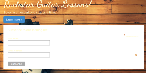
Obviously this isn’t what we want it to look like but this is good a starting point. From here, we’ll format the form using Bootstrap and get everything aligned properly.
Modifying Signup Form With Bootstrap
With the current formatting, we’ve lost our responsive design. The site title needs to be left while the signup form goes to the right. They should also be on the same row. Bootstrap will help us get things back in order.
We can add a couple of columns. Surround the jumbotron with a
and the MailChimp code with a . This formatting means the site title text will take up 2/3 of the jumbotron while the signup format takes up 1/3.Your code should look like the following:
Remember, Bootstrap is using a 12 grid system. 8 4 = 12 and you can see from these numbers how we get 2/3 and 1/3.
If you run the site, you’ll see we have two columns and our responsive web design is back.
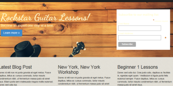
Next, we’ll begin polishing the signup form UI so it blends in better with the site.
UI Polishing
Rather than going through lots of little steps, it will be easier to display what the finished MailChimp modifications should look like. Then we can step through. Replace your current MailChimp code with the following:
<span title="&"><p><a class="btn btn-primary btn-lg" href="#" role="button">Learn more &raquo;</a></p></span>
I’ve added a few lines of space in the code to better help break up the form for discussion.
There are a few custom classes that we’ll create, which include not-bold, transparent-background, and soft-border-radius. We define these classes in site.css.
Since most of the MailChimp code is the same as what we copied from MailChimp, let’s discuss what’s going on with these custom classes.
not-bold is defined as follows:
<span title="&"><!-- Begin MailChimp Signup Form --> </span><span title="&"><link href="//cdn-images.mailchimp.com/embedcode/classic-081711.css" rel="stylesheet" type="text/css"> </span><span title="&"><div id="mc_embed_signup" class="transparent-background soft-border-radius"> </span><span title="&"><form action="#" method="post" id="mc-embedded-subscribe-form" name="mc-embedded-subscribe-form" class="validate" target="_blank" novalidate> </span> <span title="&"><div id="mc_embed_signup_scroll"> </span> <span title="&"><h3>Enter your name and email for<br /> your first FREE lesson!</h3> </span> <span title="&"><div class="mc-field-group"> </span> <span title="&"><label for="mce-FNAME" class="not-bold">First Name </label> </span> <span title="&"><input type="text" value="" name="FNAME" class="transparent-background soft-border-radius" id="mce-FNAME"> </span> <span title="&"></div> </span> <span title="&"><div class="mc-field-group"> </span> <span title="&"><label for="mce-EMAIL" class="not-bold">Email </label> </span> <span title="&"><input type="email" value="" name="EMAIL" class="required email transparent-background soft-border-radius" id="mce-EMAIL"> </span> <span title="&"></div> </span> <span title="&"><div id="mce-responses" class="clear"> </span> <span title="&"><div class="response" id="mce-error-response" style="display:none"></div> </span> <span title="&"><div class="response" id="mce-success-response" style="display:none"></div> </span> <span title="&"></div> </span> <span title="&"><!-- real people should not fill this in and expect good things - do not remove this or risk form bot signups--> </span> <span title="&"><div style="position: absolute; left: -5000px;"><input type="text" name="b_f27f671242f9376d66eb9034e_a5f924c1e8" tabindex="-1" value=""></div> </span> <span title="&"><input type="submit" class="btn btn-primary btn-lg" value="Subscribe" name="subscribe" /> </span> <span title="&"></div> </span> <span title="&"></form> </span><span title="&"></div> </span><span title="&"><!--End mc_embed_signup--></span>
It simply removes bold letters. This is used to de-emphasize the form field labels. Our call to action is bolded. If the form field labels are also bolded, the eye will struggle a little to figure out where to focus. Worse case scenario: people simply give up and bypass our signup form.
The screenshot below shows the use of .not-bold

transparent-background provides semi transparency to the form background and input fields, providing a little more depth to our design. It is defined as:
<span><span>.not-bold</span> {
</span>    <span>font-weight:normal;
</span><span>}</span>
rgba simply means red, green, blue and alpha. Alpha sets opacity. The lower this value, the more transparent. Values can range from 0 to 1.
soft-border-radius makes our form and input fields express a little elegant detail with rounded corners. This class is defined as:
<span><span>.transparent-background</span> {
</span>   <span>background-color: <span>rgba(0, 0, 0, 0.25)</span>
</span><span>}</span>
Finally, we have a full-width blue button. .max-width helps us here. Not only does the blue provide great contrast and brings the eye right to it, but the large size makes it irresistible for clicking. .max-width is defined as:
<span title="&"><p><a class="btn btn-primary btn-lg" href="#" role="button">Learn more &raquo;</a></p></span>
Adding the above classes to site.css and pasting in the above form code should result in the same signup form as shown above.
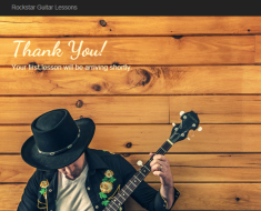
Thank You Page
When users sign up, it’s usually nice to provide a confirmation page to let them know everything went well. How many times have you signed up to someone’s list only to be greeted by an extremely unimaginative thank you page?
Andy knows his client is a true artist and wants to go the extra mile. This means not skimping by using a some stock thank you page. However, we’ll keep things consistent by using the same color scheme and theme from the home page.
To create the thank you page, open Controllers/HomeController.cs. Add the following:
<span title="&"><!-- Begin MailChimp Signup Form --> </span><span title="&"><link href="//cdn-images.mailchimp.com/embedcode/classic-081711.css" rel="stylesheet" type="text/css"> </span><span title="&"><div id="mc_embed_signup" class="transparent-background soft-border-radius"> </span><span title="&"><form action="#" method="post" id="mc-embedded-subscribe-form" name="mc-embedded-subscribe-form" class="validate" target="_blank" novalidate> </span> <span title="&"><div id="mc_embed_signup_scroll"> </span> <span title="&"><h3>Enter your name and email for<br /> your first FREE lesson!</h3> </span> <span title="&"><div class="mc-field-group"> </span> <span title="&"><label for="mce-FNAME" class="not-bold">First Name </label> </span> <span title="&"><input type="text" value="" name="FNAME" class="transparent-background soft-border-radius" id="mce-FNAME"> </span> <span title="&"></div> </span> <span title="&"><div class="mc-field-group"> </span> <span title="&"><label for="mce-EMAIL" class="not-bold">Email </label> </span> <span title="&"><input type="email" value="" name="EMAIL" class="required email transparent-background soft-border-radius" id="mce-EMAIL"> </span> <span title="&"></div> </span> <span title="&"><div id="mce-responses" class="clear"> </span> <span title="&"><div class="response" id="mce-error-response" style="display:none"></div> </span> <span title="&"><div class="response" id="mce-success-response" style="display:none"></div> </span> <span title="&"></div> </span> <span title="&"><!-- real people should not fill this in and expect good things - do not remove this or risk form bot signups--> </span> <span title="&"><div style="position: absolute; left: -5000px;"><input type="text" name="b_f27f671242f9376d66eb9034e_a5f924c1e8" tabindex="-1" value=""></div> </span> <span title="&"><input type="submit" class="btn btn-primary btn-lg" value="Subscribe" name="subscribe" /> </span> <span title="&"></div> </span> <span title="&"></form> </span><span title="&"></div> </span><span title="&"><!--End mc_embed_signup--></span>
Because this is an MVC app, when someone types in /Home/ThankYou, it will hit the above method. Of course, we aren’t expecting anyone to type in the thank you page since this will be produced as a confirmation from signing up to our client’s email list.
We need a view for this method to serve up. Open the Views/Home folder and make a copy of Contact.cshtml. Rename the copied file to ThankYou.cshtml.
Our thank you page will basically be the jumbotron from the home page. Clear out the code in ThankYou.cshtml, leaving only the ViewBag code at the top. Paste in the following:
<span><span>.not-bold</span> {
</span>    <span>font-weight:normal;
</span><span>}</span>
Making a copy of the Contact page allows us to take full advantage of the existing page structure. We’ll have our familiar navigation and footer without needing to do anything.
You probably noticed the class jumbotron-tall. This is a new class, which adds some extra height to the thank you page. Otherwise, we’d end up with a fairly short strip running across the top. It wouldn’t have been too impressive.
The larger image looks great and gives some additional air time to our artist (i.e. client).
jumbotron-tall is defined as:
<span><span>.transparent-background</span> {
</span>   <span>background-color: <span>rgba(0, 0, 0, 0.25)</span>
</span><span>}</span>
Your final thank you page should look like the following:
Contact Page
We want to give potential customers an opportunity to contact our client directly through his site. This is where the contact page will come. We’ll follow the basic outline as above to create the contact page. Our final page will look like the following:
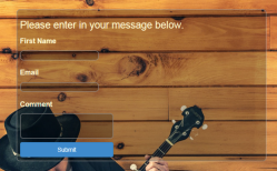
Open Views/Home and you’ll notice there is already a Contact.cshtml. Just as we did earlier with the thank you page, clear out everything except the top ViewBag code. We’re going to use the jumbotron again. We’ll use two columns as before except the right side will be empty. This lets our contact form align more to the left.
There are a few new CSS classes we’re going to introduce that will also effect our homepage. The first class is:
<span title="&"><p><a class="btn btn-primary btn-lg" href="#" role="button">Learn more &raquo;</a></p></span>
This is specifically for the blue button at the bottom of the form. Adding this class will create a wider button and add a little space between the top of the button and bottom of the comment box. We can also apply this class to our homepage button.
Next up is a modification to an existing class:
<span title="&"><!-- Begin MailChimp Signup Form --> </span><span title="&"><link href="//cdn-images.mailchimp.com/embedcode/classic-081711.css" rel="stylesheet" type="text/css"> </span><span title="&"><div id="mc_embed_signup" class="transparent-background soft-border-radius"> </span><span title="&"><form action="#" method="post" id="mc-embedded-subscribe-form" name="mc-embedded-subscribe-form" class="validate" target="_blank" novalidate> </span> <span title="&"><div id="mc_embed_signup_scroll"> </span> <span title="&"><h3>Enter your name and email for<br /> your first FREE lesson!</h3> </span> <span title="&"><div class="mc-field-group"> </span> <span title="&"><label for="mce-FNAME" class="not-bold">First Name </label> </span> <span title="&"><input type="text" value="" name="FNAME" class="transparent-background soft-border-radius" id="mce-FNAME"> </span> <span title="&"></div> </span> <span title="&"><div class="mc-field-group"> </span> <span title="&"><label for="mce-EMAIL" class="not-bold">Email </label> </span> <span title="&"><input type="email" value="" name="EMAIL" class="required email transparent-background soft-border-radius" id="mce-EMAIL"> </span> <span title="&"></div> </span> <span title="&"><div id="mce-responses" class="clear"> </span> <span title="&"><div class="response" id="mce-error-response" style="display:none"></div> </span> <span title="&"><div class="response" id="mce-success-response" style="display:none"></div> </span> <span title="&"></div> </span> <span title="&"><!-- real people should not fill this in and expect good things - do not remove this or risk form bot signups--> </span> <span title="&"><div style="position: absolute; left: -5000px;"><input type="text" name="b_f27f671242f9376d66eb9034e_a5f924c1e8" tabindex="-1" value=""></div> </span> <span title="&"><input type="submit" class="btn btn-primary btn-lg" value="Subscribe" name="subscribe" /> </span> <span title="&"></div> </span> <span title="&"></form> </span><span title="&"></div> </span><span title="&"><!--End mc_embed_signup--></span>
For this form, we’ll be using a structure similar to the MailChimp form code. But we aren’t going to use MailChimp’s CSS since we aren’t using their signup form.
One thing the MailChimp CSS provided was darker borders around the input fields. That is now gone. To compensate, we’re adding a border inside soft-border-radius, which will have the same effect.
In the contact form, we’ve added a comment textarea box. This box can have scrollbars, which by default will be fairly white. This brighter color will create a large contrast with our darker colors. To help the scrollbars blend in better, we need to modify the textarea:
<span><span>.not-bold</span> {
</span>    <span>font-weight:normal;
</span><span>}</span>
Notice the color of fffad5, which changes our comment field text from black to a brighter yellow. We’re doing the same for the input field:
<span><span>.transparent-background</span> {
</span>   <span>background-color: <span>rgba(0, 0, 0, 0.25)</span>
</span><span>}</span>
All of the above CSS classes go into site.css.
Now we can move on to the form code.
<span><span>.soft-border-radius</span> {
</span>  <span>border-radius: 10px;
</span><span>}</span>
You might notice some similarities with the MailChimp form. This is actually a modified version of that form. The contact form sits in the left column, which is col-md-8 wide. This creates a 2/3 wide column since our right column is col-md-4. Remember, 8 4 = 12, which is the number of columns making up our 12 column grid in Bootstrap.
Summary
Andy’s client now has a great looking signup form that’s sure to attract signups. He’s also added a contact form that blends in well with the overall theme of the site. At this point, Andy’s client is off to a great start.
Coming up next, we’ll add a way for customers to purchase lessons. Andy’s client recognizes that mobile is a large part of the web now. He wants to ensure the mobile site provides a great user experience. One part of this is sending notifications once a new lesson is available.
Andy has some exciting features to build out for the website. We’re going to continue following along and watching over his shoulder as everything comes together.
The above is the detailed content of Visual Studio Community 2015: Adding Email and Contact Pages. For more information, please follow other related articles on the PHP Chinese website!

 Top 21 Developer Newsletters to Subscribe To in 2025Apr 24, 2025 am 08:28 AM
Stay informed about the latest tech trends with these top developer newsletters! This curated list offers something for everyone, from AI enthusiasts to seasoned backend and frontend developers. Choose your favorites and save time searching for rel
 Serverless Image Processing Pipeline with AWS ECS and LambdaApr 18, 2025 am 08:28 AM
This tutorial guides you through building a serverless image processing pipeline using AWS services. We'll create a Next.js frontend deployed on an ECS Fargate cluster, interacting with an API Gateway, Lambda functions, S3 buckets, and DynamoDB. Th
 CNCF Arm64 Pilot: Impact and InsightsApr 15, 2025 am 08:27 AM
This pilot program, a collaboration between the CNCF (Cloud Native Computing Foundation), Ampere Computing, Equinix Metal, and Actuated, streamlines arm64 CI/CD for CNCF GitHub projects. The initiative addresses security concerns and performance lim


Hot AI Tools

Undresser.AI Undress
AI-powered app for creating realistic nude photos

AI Clothes Remover
Online AI tool for removing clothes from photos.

Undress AI Tool
Undress images for free

Clothoff.io
AI clothes remover

Video Face Swap
Swap faces in any video effortlessly with our completely free AI face swap tool!

Hot Article
Hot Tools

mPDF
mPDF is a PHP library that can generate PDF files from UTF-8 encoded HTML. The original author, Ian Back, wrote mPDF to output PDF files "on the fly" from his website and handle different languages. It is slower than original scripts like HTML2FPDF and produces larger files when using Unicode fonts, but supports CSS styles etc. and has a lot of enhancements. Supports almost all languages, including RTL (Arabic and Hebrew) and CJK (Chinese, Japanese and Korean). Supports nested block-level elements (such as P, DIV),

SublimeText3 Linux new version
SublimeText3 Linux latest version

MinGW - Minimalist GNU for Windows
This project is in the process of being migrated to osdn.net/projects/mingw, you can continue to follow us there. MinGW: A native Windows port of the GNU Compiler Collection (GCC), freely distributable import libraries and header files for building native Windows applications; includes extensions to the MSVC runtime to support C99 functionality. All MinGW software can run on 64-bit Windows platforms.

WebStorm Mac version
Useful JavaScript development tools

Atom editor mac version download
The most popular open source editor

