


This article is part of a series of articles created in collaboration with SiteGround. Thank you for supporting the partners who made SitePoint possible.
What browsers should websites/apps support? This is a question that customers and developers often ask. The simple answer is to list the top N mainstream applications. But has this strategy become irrelevant?
Key points
- The question of which browsers should a website support is not easy, it depends on various factors such as the target audience, the type of website, and the available resources.
- Despite all kinds of browsers, they all have the same goal: rendering web pages. However, no two browsers are rendered in exactly the same way, which leads to subtle differences that become more obvious when using cutting-edge technology.
- Progressive enhancement technology can help ensure that the website works properly in every browser by establishing a baseline and then enhancing it with CSS and JavaScript when supported. However, this becomes less practical for applications with rich custom interfaces.
- Developers should think of the web as a device-independent platform, adopt defensive development techniques, and test their projects in various applications. They should also be aware that technology is evolving and that more complex websites or applications may require ongoing maintenance.
What are the most commonly used browsers?
According to StatCounter's May 2017 statistics, the top ten desktop browsers are: 1. Chrome - 59.37% market share 2. Firefox - 12.76% 3. Safari - 10.55% 4. IE—8.32% 5. Edge—3.42% 6. Opera—1.99% 7. Android (Tablet) - 1.24% 8. Yandex browser-0.48% 9. UC Browser-0.41% 10. Coc Coc——0.33%
Mobile devices now account for 54.25% of all web page usage, so we also need to check the top ten mobile browsers: 1. Chrome - 49.23% 2. Safari - 17.73% 3. UC Browser-15.89% 4. Samsung Internet--6.58% 5. Opera—5.03% 6. Android - 3.75% 7. IEMobile—0.68% 8. BlackBerry—0.26% 9. Edge—0.15% 10. Nokia—0.12%
Global statistics do not tell the whole story:-The patterns vary greatly in different regions. Yandex, for example, is the second most commonly used browser in Russia (12.7% share). Sogou is the third most commonly used browser in China (6.5%). Opera Mobile/Mini has a 28% share in Africa.
- New browser versions appear regularly. Chrome, Firefox, and Opera receive updates every six weeks; checking versions from a few months ago is impractical.
- The same browser may work differently on different devices and operating systems. Chrome is available for all versions of Windows, macOS, Linux, Android, iOS, and ChromeOS, but it is not the same application anywhere.
- On a variety of devices, including game consoles, e-book readers and smart TVs, there are numerous and diverse old and new versions, unique and exciting browsers.
- The analytical data on your website will never match global statistics.
Is the browser so different?
Although there are many applications, all browsers have the same goal: Represent a web page. They use a rendering engine to achieve this, and there are some cross-uses: 1. Webkit is used for Safari on macOS and iOS. 2. Blink is a branch of Webkit, now used in Chrome, Opera, Vivaldi and Brave. 3. Gecko is used in Firefox. 4. Trident is used in Internet Explorer. 5. EdgeHTML is an updated version of Trident for use in Edge.
Most browsers use one of these engines. They are different projects, with different teams, but these companies (mostly) work together through W3C to ensure that new technologies can be adopted by everyone in the same way. Browsers are closer than ever, with modern smartphone apps matching their desktop apps. However, no two browsers render in exactly the same way. Most of the differences are subtle, but these differences become more obvious as you turn to cutting-edge technology. A particular feature may be fully implemented in one browser, partially implemented in another browser, and not in other browsers.
Can my website run in every browser?
Yes. Technologies such as Progressive Enhancement (PE) establish a baseline (probably HTML only) and then enhance it using CSS and JavaScript when supported. The latest browsers can get modern layouts, animation effects, and interactive widgets. Older browsers may only get HTML that is not styled. All other browsers get content in between. PE is perfect for content websites and applications with basic form-based features. It becomes less practical when you move to applications with rich custom interfaces. Your new collaborative video editing app is unlikely to run in IE7 ten years ago. It may not work on small screen devices on a 3G network. Perhaps an alternative interface could be provided, but the result could be a separate, clumsy application that few people would like to use. Given the size of the legacy browser user base, the cost will be prohibitive.
Site owner's advice
Website owners should understand the following basic principles and constraints of the Web. The web is not printing! Your website/app won't look the same anywhere. Each device has a different operating system, browser, screen size, functions, etc. Features may vary Your website can work for everyone, but the experience and facilities will vary. Even something as basic as the date input field has multiple possibilities, but ideally the core application will remain operational. Evaluate your project to be realistic. It's a content website, a simple app, a desktop-like app, a fast-paced game, and more. Establish a basic level of browser compatibility. For example, it must run in most browsers two years ago, with a screen width of 600 pixels, over a fast Wi-Fi connection. Evaluate your audience and don't rely on global browser statistics. Who are the main users? Are they new to IT or technicians? Is it an individual, a small company or a government organization? Are they sitting at their desks or walking around? No one app works for everyone – focus on core users first. Check the analytical data of existing systems where possible, but understand the underlying data. If your application doesn't run in Opera Mini, you're unlikely to have Opera Mini users. Have you blocked a large portion of the market? Change is happening amazingly, web pages written twenty years ago still work today. It won't necessarily be pretty or available, but the browser is still backward compatible. (Most.<blink></blink> tags are still invalid!) However, technology is constantly evolving. The more complex your website or application, the more likely it is to require ongoing maintenance.
Web developer advice
As long as you pay a little attention, you can support a variety of browsers. Embrace the Web! The Web is a device-independent platform. Content and a simpler interface can run anywhere: modern laptops, feature phones, gaming consoles, IE6 and more. Learn the basics of gradual enhancement. Even if you choose not to use it for your full application, there are still some feature areas where it will become invaluable. Using defensive development techniques to consider this before using recent pre-write modules, libraries, or frameworks. Before you begin, learn what the technology means. Frameworks should provide a list of browser support, as they have been tested in a limited number of applications. Learn about browser restrictions and quirks. For example, if you are considering using SVG charts, note that it may look weird in IE9 to 11 and will fail in IE8 and below. This does not mean that a binary choice must be made between rejecting SVG or abandoning IE support. There are always some trade-offs that won't cause major development efforts. For example:- It's weird to accept SVG rendering, but it's still available
- Show data tables only in IE, or
- Provides SVG downloads that IE users can open elsewhere.
Test early and often test it you can't test every device, but it's futile to develop for just one browser. Continuously test your project in various applications. Saving tests until the end will have catastrophic consequences. We can easily blame the deficiencies of the tools and browsers, but if detected early, most problems can be corrected during development. This is not to say that every browser must run in the exact same way every time. Functional regression is inevitable. For example: - Progressive web apps don't work offline on iPhone and iPad - but online operations are OK.
- IE does not support CSS Grid—but floating, flexbox, or full-width block fallback should be acceptable.
- Firefox's desktop version does not display a calendar for the date field - but users can still enter dates.
Install some browsers on your development PC. Mac and Linux users can obtain Microsoft Edge and IE testing tools at developer.microsoft.com/microsoft-edge/. For Windows and Linux users, testing Safari is more difficult; online testing services such as BrowserStack are the easiest choice. Modern browsers have excellent mobile emulation capabilities, but some real devices can be used to understand touch control and performance on slower hardware and networks. Using HTTPSWeb in your terminal is gradually making HTTPS the preferred protocol, and this trend will continue. Google Chrome has even started marking non-HTTPS sites as insecure, which is a good reason for you to configure your website to use HTTPS. For example, our web hosting partner SiteGround makes it easy for their customers to migrate to HTTPS. To do this, they automatically installed Let's Encrypt SSL certificates for all new WordPress accounts, and for existing accounts they switch to HTTPS with just one click.
You haven't answered this question yet!
Question "What browsers should you support?" has become too strict. Assuming your answer is just "Chrome" :- What devices and operating systems does it run on?
- What range of screen sizes will be supported?
- What version are you referring to? Latest? Chrome 10 and above?
- What happens when a new version of Chrome is released?
- What happens to other browsers when Chrome actually becomes the runtime of your application?
For customer-facing projects, providing a browser support list has become impractical. The best answer might be: "We will develop your project based on assumed user statistics and then test it in as many devices, operating systems, browsers and versions as possible based on budget and time constraints". Even then, you'll miss the old Blackberry that the CEO insists on. For the web development- not the browser.
FAQs about website browser support (FAQ)
What are the most popular web browsers that a website should support?
The most popular web browsers that a website should support include Google Chrome, Mozilla Firefox, Safari, Microsoft Edge, and Internet Explorer. These browsers cover the vast majority of Internet users. However, the specific browsers a website should support may depend on the target audience of the website and its preferred browser.
How to determine which browsers my website should support?
You can determine which browsers the website should support by analyzing the website's traffic data. This data can show which browsers the visitor is using. You can also consider the most popular browsers in your target audience.
Why is it important to support multiple browsers?
Supporting multiple browsers is important because it ensures that as many users as possible can access your website. Different users may prefer different browsers due to personal preferences, device compatibility or other factors. By supporting multiple browsers, you can provide a positive user experience for all visitors.
How to test the compatibility of my website with different browsers?
You can use a variety of tools and services to test the compatibility of your website with different browsers. These tools can simulate the appearance and functionality of your website on different browsers, helping you identify and fix any compatibility issues.
What are the challenges of supporting older browsers?
Supporting legacy browsers can be challenging because they may not support the latest web technologies. This may limit the features and features you can offer on the website. Additionally, maintaining compatibility with older browsers may require additional time and resources.
How often should I update my browser support policy?
You should regularly update your browser support policies to keep up with changes in browser usage and technology. This may happen every few months, depending on how quickly your industry and target audience is changing.
What is progressive enhancement and how does it relate to browser support?
Progressive enhancement is a web design strategy that starts with basic features and then adds more advanced features to browsers that support them. This method ensures that your website can be accessed by all users, regardless of the functionality of their browser.
How is the difference between mobile browser support and desktop browser support?
Mobile browser support is different from desktop browser support in several aspects. Mobile browsers usually have different features and limitations compared to desktop browsers. Additionally, mobile users’ needs and expectations may differ, which may affect your support strategy.
What are some common browser compatibility issues? How to solve these problems?
Common browser compatibility issues include layout issues, feature issues, and performance differences. These problems can often be solved by using cross-browser testing tools, following web development best practices, and regularly updating website code.
How to make sure my website is still accessible to users using older browsers?
You can ensure that your website can still be accessed by users using older browsers by using progressive enhancements, providing alternative versions of the website, or providing messages that encourage users to update their browsers.
The above is the detailed content of Which Browsers Should Your Website Support?. For more information, please follow other related articles on the PHP Chinese website!

 Building a Network Vulnerability Scanner with GoApr 01, 2025 am 08:27 AM
This Go-based network vulnerability scanner efficiently identifies potential security weaknesses. It leverages Go's concurrency features for speed and includes service detection and vulnerability matching. Let's explore its capabilities and ethical
 Top 10 Best Free Backlink Checker Tools in 2025Mar 21, 2025 am 08:28 AM
Website construction is just the first step: the importance of SEO and backlinks Building a website is just the first step to converting it into a valuable marketing asset. You need to do SEO optimization to improve the visibility of your website in search engines and attract potential customers. Backlinks are the key to improving your website rankings, and it shows Google and other search engines the authority and credibility of your website. Not all backlinks are beneficial: Identify and avoid harmful links Not all backlinks are beneficial. Harmful links can harm your ranking. Excellent free backlink checking tool monitors the source of links to your website and reminds you of harmful links. In addition, you can also analyze your competitors’ link strategies and learn from them. Free backlink checking tool: Your SEO intelligence officer
 Another national product from Baidu is connected to DeepSeek. Is it open or follow the trend?Mar 12, 2025 pm 01:48 PM
DeepSeek-R1 empowers Baidu Library and Netdisk: The perfect integration of deep thinking and action has quickly integrated into many platforms in just one month. With its bold strategic layout, Baidu integrates DeepSeek as a third-party model partner and integrates it into its ecosystem, which marks a major progress in its "big model search" ecological strategy. Baidu Search and Wenxin Intelligent Intelligent Platform are the first to connect to the deep search functions of DeepSeek and Wenxin big models, providing users with a free AI search experience. At the same time, the classic slogan of "You will know when you go to Baidu", and the new version of Baidu APP also integrates the capabilities of Wenxin's big model and DeepSeek, launching "AI search" and "wide network information refinement"
 Behind the first Android access to DeepSeek: Seeing the power of womenMar 12, 2025 pm 12:27 PM
The rise of Chinese women's tech power in the field of AI: The story behind Honor's collaboration with DeepSeek women's contribution to the field of technology is becoming increasingly significant. Data from the Ministry of Science and Technology of China shows that the number of female science and technology workers is huge and shows unique social value sensitivity in the development of AI algorithms. This article will focus on Honor mobile phones and explore the strength of the female team behind it being the first to connect to the DeepSeek big model, showing how they can promote technological progress and reshape the value coordinate system of technological development. On February 8, 2024, Honor officially launched the DeepSeek-R1 full-blood version big model, becoming the first manufacturer in the Android camp to connect to DeepSeek, arousing enthusiastic response from users. Behind this success, female team members are making product decisions, technical breakthroughs and users
 DeepSeek's 'amazing' profit: the theoretical profit margin is as high as 545%!Mar 12, 2025 pm 12:21 PM
DeepSeek released a technical article on Zhihu, introducing its DeepSeek-V3/R1 inference system in detail, and disclosed key financial data for the first time, which attracted industry attention. The article shows that the system's daily cost profit margin is as high as 545%, setting a new high in global AI big model profit. DeepSeek's low-cost strategy gives it an advantage in market competition. The cost of its model training is only 1%-5% of similar products, and the cost of V3 model training is only US$5.576 million, far lower than that of its competitors. Meanwhile, R1's API pricing is only 1/7 to 1/2 of OpenAIo3-mini. These data prove the commercial feasibility of the DeepSeek technology route and also establish the efficient profitability of AI models.
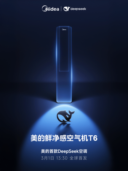 Midea launches its first DeepSeek air conditioner: AI voice interaction can achieve 400,000 commands!Mar 12, 2025 pm 12:18 PM
Midea will soon release its first air conditioner equipped with a DeepSeek big model - Midea fresh and clean air machine T6. The press conference is scheduled to be held at 1:30 pm on March 1. This air conditioner is equipped with an advanced air intelligent driving system, which can intelligently adjust parameters such as temperature, humidity and wind speed according to the environment. More importantly, it integrates the DeepSeek big model and supports more than 400,000 AI voice commands. Midea's move has caused heated discussions in the industry, and is particularly concerned about the significance of combining white goods and large models. Unlike the simple temperature settings of traditional air conditioners, Midea fresh and clean air machine T6 can understand more complex and vague instructions and intelligently adjust humidity according to the home environment, significantly improving the user experience.


Hot AI Tools

Undresser.AI Undress
AI-powered app for creating realistic nude photos

AI Clothes Remover
Online AI tool for removing clothes from photos.

Undress AI Tool
Undress images for free

Clothoff.io
AI clothes remover

AI Hentai Generator
Generate AI Hentai for free.

Hot Article
Hot Tools

WebStorm Mac version
Useful JavaScript development tools

DVWA
Damn Vulnerable Web App (DVWA) is a PHP/MySQL web application that is very vulnerable. Its main goals are to be an aid for security professionals to test their skills and tools in a legal environment, to help web developers better understand the process of securing web applications, and to help teachers/students teach/learn in a classroom environment Web application security. The goal of DVWA is to practice some of the most common web vulnerabilities through a simple and straightforward interface, with varying degrees of difficulty. Please note that this software

SublimeText3 Linux new version
SublimeText3 Linux latest version

Safe Exam Browser
Safe Exam Browser is a secure browser environment for taking online exams securely. This software turns any computer into a secure workstation. It controls access to any utility and prevents students from using unauthorized resources.

MantisBT
Mantis is an easy-to-deploy web-based defect tracking tool designed to aid in product defect tracking. It requires PHP, MySQL and a web server. Check out our demo and hosting services.

