
Home >Web Front-end >CSS Tutorial >Using SVG with Media Queries
Using SVG with Media Queries

- Joseph Gordon-LevittOriginal
- 2025-02-10 08:26:12869browse
This article explores the power of CSS in styling and manipulating Scalable Vector Graphics (SVGs), enabling responsive design and dynamic visual effects. We'll cover key differences between SVGs and HTML, techniques for applying CSS to SVGs, animation strategies, and leveraging media queries for responsive vector graphics.

Understanding SVG and its Advantages
Unlike raster images (JPEG, PNG, GIF), SVGs are resolution-independent vector images. They describe shapes and paths, maintaining crispness at any size. This scalability is crucial for responsive web design. SVGs are also easily manipulated with JavaScript and, as we'll see, CSS.
Applying CSS to SVGs: Methods and Considerations
Similar to HTML, CSS can be applied to SVGs using the style attribute, embedded <style></style> tags, or linked external stylesheets. However, SVG doesn't adhere to the CSS box model and lacks a positioning scheme, relying on a coordinate system. Many standard CSS properties won't apply; instead, SVG-specific properties like fill, stroke, and transform are used.
Styling SVG Elements with CSS
We can use CSS selectors (ID, class, type) to style SVG elements. Properties like fill (for shape color) and stroke (for outline) can be easily manipulated. While some SVG attributes are accessible as CSS properties (e.g., x, y, width, height for <rect></rect>), others require attribute manipulation directly within the SVG code.
Animating and Transitioning SVG Properties
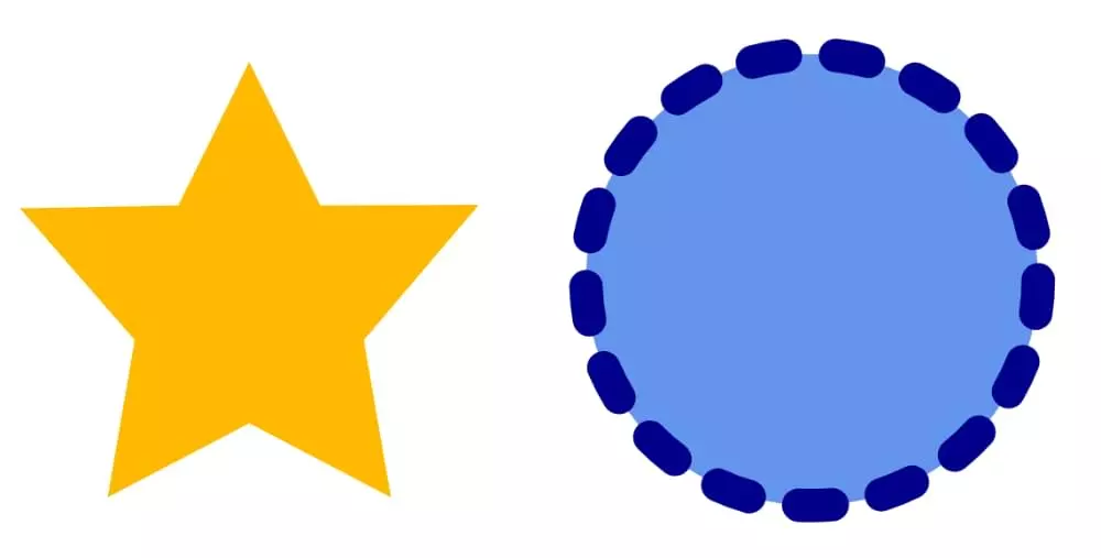
CSS animations and transitions work seamlessly with SVG properties that support interpolation. We can animate fill-opacity, transform, and stroke-dasharray to create dynamic effects like twinkling stars or drawing animations. Note that animating complex path data (d attribute) currently has limited browser support.
Responsive SVGs with Media Queries
Media queries allow us to modify SVG appearance based on viewport size. We can show/hide elements or adjust the viewBox attribute to control the visible portion of the SVG, ensuring optimal display across various screen sizes. Remember to distinguish between the HTML document viewport and the SVG document viewport, especially when using <iframe></iframe>, <object></object>, or img elements to embed the SVG. The matchMedia API provides a robust way to handle viewport changes dynamically.
Using background-size for Responsive SVG Backgrounds
SVGs can also be used as background images. The background-size CSS property offers control over how the SVG scales within its container, providing another avenue for responsive design.
Conclusion
Combining CSS with SVG unlocks powerful capabilities for creating dynamic and responsive vector graphics. By understanding the nuances of SVG styling, animation, and media queries, developers can craft visually engaging and adaptable web experiences.


(Note: Image alt text should be added for accessibility.)
The above is the detailed content of Using SVG with Media Queries. For more information, please follow other related articles on the PHP Chinese website!