


Quick Links
- Treemap Chart
- Sunburst Chart
- Map
- Stock Chart
- Box and Whisker Chart
- Waterfall Chart
- Funnel Chart
Of the 17 different types of charts in Excel, I'd confidently speculate that only a few are used frequently. Actually, they all have their benefits in different circumstances and allow you to display your data in diverse ways.
Once you've mastered some of the more straightforward Excel charts, try using some that offer more specific functions and data visualization.
To create a chart, select your data, open the "Insert" tab, and click the icon in the corner of the Charts group.

Treemap Chart
Treemaps are useful for showing hierarchy, patterns, and relationships between variables. They can also condense very large numbers into a small space, handy if you're including them somewhere else, like in a Word document or a PowerPoint presentation.
Treemaps are best used when there is a large data variance, a clear hierarchy, up to three or four categories, and no negative numbers.
Let's say we sell a product to several countries across three continents. Using a treemap chart lets us see how the sales compare not only among continents but also among countries within those continents. In this example, even a quick glance will tell you that the sales are the highest overall in North America, and our sales in Olympia have contributed to this significantly.

Sunburst Chart
Sunburst charts also clearly show hierarchical levels, but where they might be preferred over treemap charts is in their ability to display links between the main categories and the smallest data points.
The inner circles represent the largest categories, and the outer circles show us how those main categories are divided into smaller ones. As with treemaps, sunburst charts are helpful if you want to convey large numbers in a small chart, and they are also good for making comparative and hierarchical analyses.
Here, we've listed sales totals based on the continent, country, and area. We can clearly see that Asia is the second-highest-selling continent, and that we made nearly as much money in one region in India as we have in two regions in China. We can also see that, compared to Wisconsin and Olympia, sales totals in Washington have underperformed.

For the sunburst chart to work, you must order your data by the largest category (the innermost circle). So, in the example above, the table is sorted by the continent column.
Map
I only recently discovered that you can create colored maps in Excel, probably because the option to do so is not in the usual Charts drop-down menu. Instead, select your data, and click "Maps" in the Insert tab.

However, before you go ahead and create your map, there is an important formatting change you should make to your data. In the example below, you can see that the word "China" is misspelled. As a result, if I were to create the map from this data, it would not apply any data to China. You'll also see a warning in the top-right corner of the chart to tell you that there might be an issue.

To overcome this potential issue, select all the geographical items in your chart, and click "Geography" in the Data tab on the ribbon.

This will force Excel to scan your selection, and either autocorrect any minor typos or alert you if one of the data points isn't recognizable as a geographical location. You'll also see that the map no longer has a warning tag in the corner, and each of your table's data points is clearly labeled as a formatted geographical location.

This is different to creating a heat map in Excel, which uses color scales and conditional formatting to color cells based on their values. Heat maps are great for using color indicators in tables or with customized shapes.
Stock Chart
Stock charts track changes in prices over time, a very niche chart type for company leaders, investors, and traders. There are four types of stock charts in Excel:
- High-low-close
- Open-high-low-close
- Volume-open-high-low-close
- Volume-open-high-low-close
Which type of stock chart you choose will depend on the data you have. However, it's really important to create your table column headers in the same order as the name of the chart you're going for. In the example below, we wanted to use an open-high-low-close stock chart, so our column headers mimic this order.

Here are some tips for interpreting a stock chart:
- The box in the center of the vertical line represents the opening and closing stock values.
- These boxes will be colored differently according to whether the opening price is higher or lower than the closing price. In the example above, the closing price was higher than the opening price in January, so the box is white. In February, the stock values dropped, so the box is shaded black.
- The vertical line shows you the stock price range.
Box and Whisker Chart
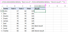
Also known as a box plot, box and whisker charts show you the distribution of data and any outliers. They're also good for comparing data, and—once you understand how to read them—let you make conclusions quickly.
Here's how to read a box plot:
- The bottom whisker marks the minimum value.
- The bottom of the box marks the first quartile (or 25th percentile).
- The line within the box marks the median (central) value.
- The top of the box marks the third quartile (or 75th percentile).
- The top whisker marks the maximum value.
- The X marks the mean (average) value.
- Dots represent outliers.
In this example, we're plotting seven schools' scores across five different subjects. Among other things, the chart instantly tells us that the schools scored lowest in physics, including one school achieving a low-outlier score. Also, English resulted in the highest average score and the smallest range, and lots of schools scored highly in biology.
For the box and whisker chart to work properly, you need to prepare your data into one column (B), with your group labels next to the data (column A).

Waterfall Chart
Waterfall charts display how an initial value is affected by subsequent values to reach a final value.
In the example below, blue columns represent increases, while orange columns represent decreases. On day one, when we started at £0, we made £2,500. Then, on day two, we lost £2,000, bringing our total down to £500. On day three, we jumped back up to £1,500, and so on.
To read these columns, you need to look at the top of the "increase" (blue) bars, and the bottom of the "decrease" (orange) bars. So, after day nine, our total is just over £3,500, and after day ten, our total is just over £2,000.

To add a total column to your chart, first add the total to your table. To do this, drag your preformatted table handle down one row (this will ensure your chart captures your data), and type Total into the new column A cell. Then, in the new column B cell, calculate the total. In our case, we'll type the following formula into cell B12:
=SUM(B2:B11)
You might prefer to use Excel's built-in Total Row function to force Excel to calculate the total automatically.
You will then see the total appear as a new column in your chart. To turn this into a total column, double-click the column, and check "Set As Total" in the Format Data Point pane to the right.

Adding the total column to your waterfall chart makes it easier to see the overall data change over time, while the other columns show how you got there.

Funnel Chart
Funnel charts are called funnel charts because the data they convey usually diminishes, representing a funnel shape.
They can be used to display the different stages of a recruitment process, how marketing strategies translate to sales, or other similar processes whereby numbers become smaller over time. Using this type of chart lets you see where the numbers dropped off the most rapidly. For example, in Chart 2 below, it's clear that the biggest drop-off was from the marketing email being viewed to the link being clicked, so the company needs to focus on improving its email content.

After you have finished creating your charts, add a dashboard to your Excel workbook to display the most important data in one place.
The above is the detailed content of 7 of the Least-Known Excel Charts and Why You Should Use Them. For more information, please follow other related articles on the PHP Chinese website!

 How to use SUMIF function in Excel with formula examplesMay 13, 2025 am 10:53 AM
This tutorial explains the Excel SUMIF function in plain English. The main focus is on real-life formula examples with all kinds of criteria including text, numbers, dates, wildcards, blanks and non-blanks. Microsoft Excel has a handful o
 IF function in Excel: formula examples for text, numbers, dates, blanksMay 13, 2025 am 10:50 AM
In this article, you will learn how to build an Excel IF statement for different types of values as well as how to create multiple IF statements. IF is one of the most popular and useful functions in Excel. Generally, you use an IF statem
 How to sum a column in Excel - 5 easy waysMay 13, 2025 am 09:53 AM
This tutorial shows how to sum a column in Excel 2010 - 2016. Try out 5 different ways to total columns: find the sum of the selected cells on the Status bar, use AutoSum in Excel to sum all or only filtered cells, employ the SUM function
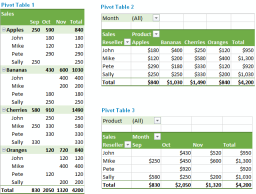 How to make and use Pivot Table in ExcelMay 13, 2025 am 09:36 AM
In this tutorial you will learn what a PivotTable is, find a number of examples showing how to create and use Pivot Tables in all version of Excel 365 through Excel 2007. If you are working with large data sets in Excel, Pivot Table comes
 Excel SUMIFS and SUMIF with multiple criteria – formula examplesMay 13, 2025 am 09:05 AM
This tutorial explains the difference between the SUMIF and SUMIFS functions in terms of their syntax and usage, and provides a number of formula examples to sum values with multiple AND / OR criteria in Excel 365, 2021, 2019, 2016, 2013,
 How You Can Use Wildcards in Microsoft Excel to Refine Your SearchMay 13, 2025 am 01:59 AM
Excel wildcards: a powerful tool for efficient search and filtering This article will dive into the power of wildcards in Microsoft Excel, including their application in search, formulas, and filters, and some details to note. Wildcards allow you to perform fuzzy matching, making it more flexible to find and process data. *Wildcards: asterisks () and question marks (?)** Excel mainly uses two wildcards: asterisk (*) and question mark (?). *Asterisk (): Any number of characters** The asterisk represents any number of characters, including zero characters. For example: *OK* Match the cell containing "OK", "OK&q
 Excel IF function with multiple conditionsMay 12, 2025 am 11:02 AM
The tutorial shows how to create multiple IF statements in Excel with AND as well as OR logic. Also, you will learn how to use IF together with other Excel functions. In the first part of our Excel IF tutorial, we looked at how to constru
 How to calculate percentage in Excel - formula examplesMay 12, 2025 am 10:28 AM
In this tutorial, you will lean a quick way to calculate percentages in Excel, find the basic percentage formula and a few more formulas for calculating percentage increase, percent of total and more. Calculating percentage is useful in m


Hot AI Tools

Undresser.AI Undress
AI-powered app for creating realistic nude photos

AI Clothes Remover
Online AI tool for removing clothes from photos.

Undress AI Tool
Undress images for free

Clothoff.io
AI clothes remover

Video Face Swap
Swap faces in any video effortlessly with our completely free AI face swap tool!

Hot Article
Hot Tools

SublimeText3 Mac version
God-level code editing software (SublimeText3)

Zend Studio 13.0.1
Powerful PHP integrated development environment

Safe Exam Browser
Safe Exam Browser is a secure browser environment for taking online exams securely. This software turns any computer into a secure workstation. It controls access to any utility and prevents students from using unauthorized resources.

SublimeText3 English version
Recommended: Win version, supports code prompts!

PhpStorm Mac version
The latest (2018.2.1) professional PHP integrated development tool

