


Excel chart formatting skills: improve data visualization effect
This article will share some practical tips to improve the visualization of Excel charts to help you create clearer and more attractive charts. Excel has built-in multiple chart styles, but for the best results, we recommend custom formatting.
1. Add a chart background
The charts need not be boring. Appropriate background can enhance the attractiveness of the chart and make the data clearer and easier to understand.
You can add pictures or colors as backgrounds. For example, using architectural pictures and sunset backgrounds makes the chart more visually impactful.

Even subtle color adjustments can make the chart stand out. The key is to have sufficient contrast between the background and the data points to ensure that the chart is easy to read.

How to operate: Double-click the edge of the chart and select the "Fill" menu in the "Format Chart" pane.

Select the fill type, such as "Solid Color Fill" to select the color and adjust the transparency; or select "Picture or Texture Fill" to insert the picture.


Remember, chart legibility is crucial. Avoid using too bright colors or complex textured backgrounds.
2. Adjust the minimum and maximum values of the coordinate axis
A clever adjustment of the axis range can make the chart data more efficient in making use of space, avoiding too dense data or unnecessary blanks.


How to operate: Double-click the axis and in the "Format Chart" pane, modify the minimum and maximum values in "Borders".


When data changes, the axis range needs to be readjusted to ensure that the chart accurately reflects the data. You can also adjust the Primary Unit and Secondary Units to control the intervals of the axis scales.
3. Reduce the spacing between bar charts or bar charts
The data point spacing in the Excel chart is expressed as percentages. The default spacing may be too large, affecting data comparison.


How to operate: Right-click the data point, select "Set Data Series Format", and adjust "Space Width" in the "Set Chart Format" pane.

4. Use visual elements in moderation
Avoid excessive complexity of charts. Not all Excel tools are required. Select the right element to achieve the best results.


You can use the chart element button (" sign) to select the desired element.

Or use the Reset to match style button to restore the default style.

5. Delete the worksheet grid line
Worksheet grid lines may affect the readability of the chart, especially if the chart background is transparent or translucent.

Uncheck "Grid Lines" in the View tab to make the chart clearer.

6. Save the chart design as a template
After the chart is finished formatting, save it as a template for reuse in the future.


The key to chart formatting is to optimize readability and maintain consistency. Apart from common pie charts and bar charts, don't forget to try other types of charts such as waterfall charts and sunburst charts.
The above is the detailed content of The 6 Best Tips For Formatting Your Excel Charts. For more information, please follow other related articles on the PHP Chinese website!

 How to use SUMIF function in Excel with formula examplesMay 13, 2025 am 10:53 AM
This tutorial explains the Excel SUMIF function in plain English. The main focus is on real-life formula examples with all kinds of criteria including text, numbers, dates, wildcards, blanks and non-blanks. Microsoft Excel has a handful o
 IF function in Excel: formula examples for text, numbers, dates, blanksMay 13, 2025 am 10:50 AM
In this article, you will learn how to build an Excel IF statement for different types of values as well as how to create multiple IF statements. IF is one of the most popular and useful functions in Excel. Generally, you use an IF statem
 How to sum a column in Excel - 5 easy waysMay 13, 2025 am 09:53 AM
This tutorial shows how to sum a column in Excel 2010 - 2016. Try out 5 different ways to total columns: find the sum of the selected cells on the Status bar, use AutoSum in Excel to sum all or only filtered cells, employ the SUM function
 How to make and use Pivot Table in ExcelMay 13, 2025 am 09:36 AM
In this tutorial you will learn what a PivotTable is, find a number of examples showing how to create and use Pivot Tables in all version of Excel 365 through Excel 2007. If you are working with large data sets in Excel, Pivot Table comes
 Excel SUMIFS and SUMIF with multiple criteria – formula examplesMay 13, 2025 am 09:05 AM
This tutorial explains the difference between the SUMIF and SUMIFS functions in terms of their syntax and usage, and provides a number of formula examples to sum values with multiple AND / OR criteria in Excel 365, 2021, 2019, 2016, 2013,
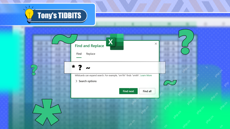 How You Can Use Wildcards in Microsoft Excel to Refine Your SearchMay 13, 2025 am 01:59 AM
Excel wildcards: a powerful tool for efficient search and filtering This article will dive into the power of wildcards in Microsoft Excel, including their application in search, formulas, and filters, and some details to note. Wildcards allow you to perform fuzzy matching, making it more flexible to find and process data. *Wildcards: asterisks () and question marks (?)** Excel mainly uses two wildcards: asterisk (*) and question mark (?). *Asterisk (): Any number of characters** The asterisk represents any number of characters, including zero characters. For example: *OK* Match the cell containing "OK", "OK&q
 Excel IF function with multiple conditionsMay 12, 2025 am 11:02 AM
The tutorial shows how to create multiple IF statements in Excel with AND as well as OR logic. Also, you will learn how to use IF together with other Excel functions. In the first part of our Excel IF tutorial, we looked at how to constru
 How to calculate percentage in Excel - formula examplesMay 12, 2025 am 10:28 AM
In this tutorial, you will lean a quick way to calculate percentages in Excel, find the basic percentage formula and a few more formulas for calculating percentage increase, percent of total and more. Calculating percentage is useful in m


Hot AI Tools

Undresser.AI Undress
AI-powered app for creating realistic nude photos

AI Clothes Remover
Online AI tool for removing clothes from photos.

Undress AI Tool
Undress images for free

Clothoff.io
AI clothes remover

Video Face Swap
Swap faces in any video effortlessly with our completely free AI face swap tool!

Hot Article
Hot Tools

WebStorm Mac version
Useful JavaScript development tools

mPDF
mPDF is a PHP library that can generate PDF files from UTF-8 encoded HTML. The original author, Ian Back, wrote mPDF to output PDF files "on the fly" from his website and handle different languages. It is slower than original scripts like HTML2FPDF and produces larger files when using Unicode fonts, but supports CSS styles etc. and has a lot of enhancements. Supports almost all languages, including RTL (Arabic and Hebrew) and CJK (Chinese, Japanese and Korean). Supports nested block-level elements (such as P, DIV),

MantisBT
Mantis is an easy-to-deploy web-based defect tracking tool designed to aid in product defect tracking. It requires PHP, MySQL and a web server. Check out our demo and hosting services.

SublimeText3 Chinese version
Chinese version, very easy to use

ZendStudio 13.5.1 Mac
Powerful PHP integrated development environment

