


Excel Chart Format Guide: Multiple Ways to Easily Control
The Excel chart formatting options are dazzling. This article will guide you to gradually master the various methods of Excel chart formatting and focus on labeling the main operations, so that you can quickly search.
The tabs in some screenshots may vary depending on the Excel version. If you cannot find some tabs, right-click any tab, select Custom Ribbon, and add the required tabs, groups, and commands. This article uses the Microsoft 365 subscriber version of the Excel desktop application.
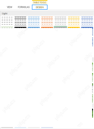
Graphic Design Tab
When the chart is selected, the "Chart Design" tab will appear in the ribbon.

In this tab, you can:
- Add a chart element: such as axes labels, grid lines, or legends.
- Select Tag Layout: Quickly add chart tags.
- Change the chart style: For example, change the bar pattern, color, add shadow background, etc.
- Select the data source or switch the X-axis and Y-axis.
- Change the chart type: For example, change the bar chart to a bar chart.
- Move charts to other worksheets.
Format Tab
Another dedicated menu Format tab appears after you click the chart and is used to personalize the appearance of the chart.
Before making any formatting changes, make sure you click the section of the chart you want to modify, or select it from the drop-down list of the Current Selection group. The Format tab will be updated accordingly.

To the left side of this tab, you can:

- Reset chart format as the default design of the style.
- Add or change shape : The most practical option is to add text boxes to add more tags.
- Change the appearance of the chart part: For example, add outlines, fill colors, or add effects.
To the right of this tab, you can:

- Use Art-style text formatting , you can use preset styles or custom text formatting.
- Add alternative text for screen reader users.
- Resize the alignment or size of the chart or parts of it.
Format Chart Pane
Although the tab provides most chart formatting tools, I prefer to use Excel's Format Chart Pane because it contains more customization options. You can start it in two ways: (1) Right-click the edge of the chart and select "Format Chart Area", or (2) Select the chart and click "Set options" in the "Format" tab of the ribbon Format".

The drop-down menu in the upper left corner of the pane displays the section of the chart you are about to format. The more elements of the chart, the more options will be displayed after expanding this drop-down menu.
For example, if there are grid lines on the chart, the option to format grid lines will be displayed here.

I personally prefer to directly click on different parts on the chart to select, and Excel will automatically launch the corresponding formatting options in the pane. For example, I selected the legend and the pane automatically launched the "Format Legend" option.

After selecting the part of the chart to format, Excel displays a series of icons.

- Paint bucket icon Used to format color fills or borders, or to use picture backgrounds.
- Pentagonal Star Icon Used to add effects such as shadows, glows, and softens edges.
- Measurement icon Used to resize, align, and other properties of items.
- Three Column Chart Icon Used to change the parameters of the chart, such as the minimum and maximum values or increments on the axis, and the gap width between the bars and columns.

When the chart is selected, some buttons appear outside the chart border, which are a simplified version of the Chart Design tab discussed earlier.

- " icon is used to show, hide, or adjust the label (or element) of a chart, similar to the Add Chart Element icon in the Chart Design tab.
- The brush icon is used to change the style or color of the chart, and you can also do this in the Chart Style group of the Chart Design tab. The
- filter button is used to select the data displayed by the chart, with the same options as the Select Data icon in the Chart Design tab.
Right-click menu of charts
You can also change the format of the chart through the right-click menu.
The menu content depends on where you right-clicked. Right-click on the edge of the chart to get the most options because it contains everything in the chart. For example, clicking Fonts and selecting a different font will affect all text in the chart.

Right-click on the internal part of the chart, you can choose to delete and reset individual elements, as well as change the chart type and restart the Format Chart Pane for more options.
Text Format
While you can format text through the Format tab and the Format Chart Pane, I found the easiest way to do this is through the Start tab on the ribbon. Simply select the text you want to format, and use the Font group in the Start tab to change the font, font color, and font size, as well as bold, italic, and underscore.

Now that you have the best place to get different chart formatting options for Excel, you can explore the most commonly used charts in your program and their uses.
The above is the detailed content of How to Format Your Chart in Excel. For more information, please follow other related articles on the PHP Chinese website!

 How to change Excel table styles and remove table formattingApr 19, 2025 am 11:45 AM
This tutorial shows you how to quickly apply, modify, and remove Excel table styles while preserving all table functionalities. Want to make your Excel tables look exactly how you want? Read on! After creating an Excel table, the first step is usual
 Subtotals in Excel: how to insert, use and removeApr 19, 2025 am 10:26 AM
This tutorial shows you how to use Excel's Subtotal feature to efficiently summarize data within groups of cells. Learn how to sum, count, or average, display or hide details, copy only subtotals, and remove subtotals altogether. Large datasets can
 Calculate CAGR in Excel: Compound Annual Growth Rate formulasApr 19, 2025 am 10:25 AM
This tutorial explains the Compound Annual Growth Rate (CAGR) and provides multiple ways to calculate it in Excel. CAGR measures the average annual growth of an investment over a specific period, offering a clearer picture than simple year-to-year g
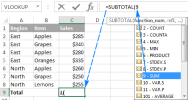 Excel SUBTOTAL function with formula examplesApr 19, 2025 am 09:59 AM
The tutorial explains the specificities of the SUBTOTAL function in Excel and shows how to use Subtotal formulas to summarize data in visible cells. In the previous article, we discussed an automatic way to insert subtotals in Excel by us
 The new Excel IFS function instead of multiple IFApr 19, 2025 am 09:54 AM
This tutorial introduces the Excel IFS function, a streamlined alternative to nested IF statements. It simplifies creating formulas with multiple conditions and improves readability. Available in Excel 365, 2021, and 2019, IFS significantly reduces
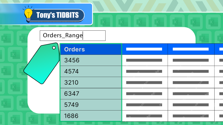 I Always Name Ranges in Excel, and You Should TooApr 19, 2025 am 12:56 AM
Improve Excel efficiency: Make good use of named regions By default, Microsoft Excel cells are named after column-row coordinates, such as A1 or B2. However, you can assign more specific names to a cell or cell range, improving navigation, making formulas clearer, and ultimately saving time. Why always name regions in Excel? You may be familiar with bookmarks in Microsoft Word, which are invisible signposts for the specified locations in your document, and you can jump to where you want at any time. Microsoft Excel has a bit of a unimaginative alternative to this time-saving tool called "names" and is accessible via the name box in the upper left corner of the workbook. Related content #
 Insert checkbox in Excel: create interactive checklist or to-do listApr 18, 2025 am 10:21 AM
This tutorial shows you how to create interactive Excel checklists, to-do lists, reports, and charts using checkboxes. Checkboxes, also known as tick boxes or selection boxes, are small squares you click to select or deselect options. Adding them to
 Excel Advanced Filter – how to create and useApr 18, 2025 am 10:05 AM
This tutorial unveils the power of Excel's Advanced Filter, guiding you through its use in retrieving records based on complex criteria. Unlike the standard AutoFilter, which handles simpler filtering tasks, the Advanced Filter offers precise contro


Hot AI Tools

Undresser.AI Undress
AI-powered app for creating realistic nude photos

AI Clothes Remover
Online AI tool for removing clothes from photos.

Undress AI Tool
Undress images for free

Clothoff.io
AI clothes remover

AI Hentai Generator
Generate AI Hentai for free.

Hot Article
Hot Tools

SecLists
SecLists is the ultimate security tester's companion. It is a collection of various types of lists that are frequently used during security assessments, all in one place. SecLists helps make security testing more efficient and productive by conveniently providing all the lists a security tester might need. List types include usernames, passwords, URLs, fuzzing payloads, sensitive data patterns, web shells, and more. The tester can simply pull this repository onto a new test machine and he will have access to every type of list he needs.

EditPlus Chinese cracked version
Small size, syntax highlighting, does not support code prompt function

Zend Studio 13.0.1
Powerful PHP integrated development environment

SublimeText3 English version
Recommended: Win version, supports code prompts!

PhpStorm Mac version
The latest (2018.2.1) professional PHP integrated development tool

