


I grew up in India and moved to the USA when I was about 14. After moving, we didn’t visit India for almost 6–7 years. Recently, my family decided to go back during the summer, from May to July 2023. When we arrived, one thing stood out to me immediately: it felt much hotter than I remembered. As I looked around, I realized why—much of the greenery I had grown up seeing was gone, replaced by towering buildings and sprawling apartment complexes. It was a stark reminder of how much the landscape had changed and left me thinking about the impact of rapid urbanization on the environment and the climate.
Let’s get started with the details!
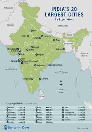
During my recent visit to India, I decided to explore the Urban Heat Island (UHI) effect by analyzing the Land Surface Temperatures (LST) of Ahmedabad and Delhi—two cities close to my heart. Below is a snapshot of these cities to set the stage:
The timeline I chose for this analysis was:
2013: My starting point, marking a 10-year study period.
2016: The year I left India for the USA.
2023: My most recent visit, which inspired this project.
For this study, I relied on two main data sources:
- Satellite data from Google Earth Engine to retrieve cloud and temperature data.
- Weather records from airport meteorological databases for cross-validation.
Part 1: Data collection and preparation:
For this project, I used data from different sources to study the Urban Heat Island (UHI) effect in Ahmedabad and Delhi. My main focus was on Land Surface Temperature (LST) and cloud data, which I collected using Google Earth Engine, and weather records from airports.
Using Google Earth Engine
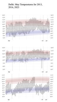
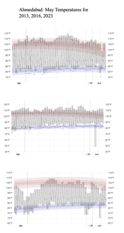
I collected temperature data from WeatherSpark, a platform that provides detailed historical weather records. Using data specific to Ahmedabad and Delhi, I focused on the month of May—from 2013 to 2023—since May is typically the hottest month of the year in both cities. This allowed me to analyze how temperatures have evolved during the peak of summer over the last decade.
-
weatherspark.com
Delhi's May Temperature: 2013, 2016, 2023
Ahmedabad's May Temperature: 2013, 2016, 2023
I also used cloud data to make sure my temperature results were accurate. Clouds can block satellite readings and make it harder to get correct land surface temperatures. To fix this, I used Google Earth Engine to filter out areas with heavy clouds. This helped me clean up the data and focus only on clear readings, making my results more reliable.
Here’s an example of the code I used to extract cloud data. If you plan to use this code in Google Earth Engine, make sure to adjust the longitude and latitude, the date range (out of 365 days), and the buffer zone according to your preferences:
//area of study
var ahmedabad = ee.Geometry.Point([72.5713621, 23.022505]).buffer(30000); // buffer zone
var delhi = ee.Geometry.Point([77.1025, 28.7041]).buffer(30000); //buffer zone

//Date
var DATE_RANGE = ee.Filter.dayOfYear(121, 151);
var YEAR_RANGE = ee.Filter.calendarRange(2013, 2023, 'year');

var L8 = ee.ImageCollection('LANDSAT/LC08/C02/T1_L2') //Might want to change statelite according to your needs
  .select(['ST_B10', 'QA_PIXEL']) // Temperature and QA bands
  .filter(DATE_RANGE)
  .filter(YEAR_RANGE);

// Cloud masking function
function cloudMask(image) {
  var qa = image.select('QA_PIXEL');
  var mask = qa.bitwiseAnd(1


<p><strong>Below is the picture of Cloud coverage Data</strong></p>

<h6>


  Delhi's May Cloud Data: Overview (2013, 2023, and 10-Year Analysis)
</h6>

<p><img src="/static/imghwm/default1.png" data-src="https://img.php.cn/upload/article/000/000/000/173562105595654.jpg?x-oss-process=image/resize,p_40" class="lazy" alt="Land Surface Temperature Trends: Ahmedabad vs. Delhi ()"></p>

<h6>


  Ahmedabad's May Cloud Data: Overview (2013, 2023, and 10-Year Analysis)
</h6>

<p><img src="/static/imghwm/default1.png" data-src="https://img.php.cn/upload/article/000/000/000/173562106196801.jpg?x-oss-process=image/resize,p_40" class="lazy" alt="Land Surface Temperature Trends: Ahmedabad vs. Delhi ()"></p>

<p><strong>Using Weather Records</strong><br>
To make sure the satellite data was correct, I compared it with weather records from airports in Ahmedabad and Delhi. These records gave me real temperature readings, which helped me confirm that the satellite data was accurate.</p>

<h2>


  <strong>Part 2: Visualizing Data with ArcGIS Pro</strong>
</h2>

<p>After processing the cloud and temperature data in Google Earth Engine, the next step was to bring this data into ArcGIS Pro for advanced visualization. This was an essential part of the project because raw data can be difficult to interpret, but creating heat maps makes it easier for everyone to understand.</p>

<p>To create the visualizations, I first imported the cloud-filtered Land Surface Temperature (LST) data from Google Earth Engine into ArcGIS Pro. This data, which included detailed temperature readings, had already been refined to remove interference caused by cloud cover. This preprocessing ensured that the data was clean and reliable for creating accurate visualizations.</p><p>Once the data was imported, I used ArcGIS Pro to generate heat maps. These maps were created by applying a color gradient to represent different temperature ranges. For example, cooler areas were marked with colors like orange (≤70°F), light blue (≤80°F), and green (≤90°F). As the temperatures increased, warmer colors were used, such as yellow (≤120°F) and red for temperatures exceeding 140°F. The key, or legend, provided with the maps clearly showed these color-coded temperature ranges, making the visualizations easy to interpret.</p>

<p><strong>Below is the picture of the Legend</strong></p>

<p><img src="/static/imghwm/default1.png" data-src="https://img.php.cn/upload/article/000/000/000/173562106554078.jpg?x-oss-process=image/resize,p_40" class="lazy" alt="Land Surface Temperature Trends: Ahmedabad vs. Delhi ()"></p>

<p>I created heat maps for Ahmedabad and Delhi to show how temperatures vary across each city. Built-up areas, like industrial zones or city centers, appeared much hotter and were shown in red, while parks and green spaces were cooler and displayed in green or blue. These heat maps clearly highlighted the impact of urbanization and greenery on surface temperatures.</p>

<p>I then refined the heat maps using ArcGIS Pro by adjusting the temperature colors and adding a north arrow for direction. These changes made it easier to understand the distribution of heat across Ahmedabad and Delhi.</p>

<p><strong>Below is the picture of the Ahmedabad's visualization</strong></p>

<p><img src="/static/imghwm/default1.png" data-src="https://img.php.cn/upload/article/000/000/000/173562106896879.jpg?x-oss-process=image/resize,p_40" class="lazy" alt="Land Surface Temperature Trends: Ahmedabad vs. Delhi ()"></p>

<p><strong>Below is the picture of the Delhi's visualization</strong></p>

<p><img src="/static/imghwm/default1.png" data-src="https://img.php.cn/upload/article/000/000/000/173562107184037.jpg?x-oss-process=image/resize,p_40" class="lazy" alt="Land Surface Temperature Trends: Ahmedabad vs. Delhi ()"></p>

<h2>


  <strong>Conclusion: Ahmedabad and Delhi Heat Trends</strong>
</h2>

<p>The results of this project showed that Ahmedabad has become much hotter over the past 10 years, especially in May, the hottest month of the year. Using heat maps in ArcGIS Pro, I found that areas with lots of buildings and little greenery were the hottest, shown in dark red, while parks and green spaces were cooler, shown in green or blue. The temperatures were analyzed in Fahrenheit.</p>

<p>Ahmedabad is particularly hot because it is a growing city with rapid urbanization and shrinking green spaces. One noticeable feature in the heat map is the Sabarmati River, visible as a cooler blue line cutting through the city. In contrast, Delhi, as the capital, is more developed and shows slightly lower temperatures, though it remains densely populated and heavily built-up. Both cities show dense urbanization and large populations, as seen in the images included in the poster.</p><p>The data also highlighted how green spaces and vegetation help cool cities. On clear days without clouds, temperatures were higher, especially in areas without trees or parks. This shows how important greenery is for keeping cities cooler.</p>

<p>In conclusion, Ahmedabad is becoming hotter as it grows, while Delhi remains warm due to its dense population and infrastructure. To make cities more livable, we need to focus on creating more parks, planting trees, and protecting green spaces. These steps can help reduce heat and improve quality of life in urban areas.</p>

<p><strong>Below is the Poster of the results</strong></p>

<p><img src="/static/imghwm/default1.png" data-src="https://img.php.cn/upload/article/000/000/000/173562107763927.jpg?x-oss-process=image/resize,p_40" class="lazy" alt="Land Surface Temperature Trends: Ahmedabad vs. Delhi ()"></p>
The above is the detailed content of Land Surface Temperature Trends: Ahmedabad vs. Delhi (). For more information, please follow other related articles on the PHP Chinese website!

 Javascript Data Types : Is there any difference between Browser and NodeJs?May 14, 2025 am 12:15 AM
JavaScript core data types are consistent in browsers and Node.js, but are handled differently from the extra types. 1) The global object is window in the browser and global in Node.js. 2) Node.js' unique Buffer object, used to process binary data. 3) There are also differences in performance and time processing, and the code needs to be adjusted according to the environment.
 JavaScript Comments: A Guide to Using // and /* */May 13, 2025 pm 03:49 PM
JavaScriptusestwotypesofcomments:single-line(//)andmulti-line(//).1)Use//forquicknotesorsingle-lineexplanations.2)Use//forlongerexplanationsorcommentingoutblocksofcode.Commentsshouldexplainthe'why',notthe'what',andbeplacedabovetherelevantcodeforclari
 Python vs. JavaScript: A Comparative Analysis for DevelopersMay 09, 2025 am 12:22 AM
The main difference between Python and JavaScript is the type system and application scenarios. 1. Python uses dynamic types, suitable for scientific computing and data analysis. 2. JavaScript adopts weak types and is widely used in front-end and full-stack development. The two have their own advantages in asynchronous programming and performance optimization, and should be decided according to project requirements when choosing.
 Python vs. JavaScript: Choosing the Right Tool for the JobMay 08, 2025 am 12:10 AM
Whether to choose Python or JavaScript depends on the project type: 1) Choose Python for data science and automation tasks; 2) Choose JavaScript for front-end and full-stack development. Python is favored for its powerful library in data processing and automation, while JavaScript is indispensable for its advantages in web interaction and full-stack development.
 Python and JavaScript: Understanding the Strengths of EachMay 06, 2025 am 12:15 AM
Python and JavaScript each have their own advantages, and the choice depends on project needs and personal preferences. 1. Python is easy to learn, with concise syntax, suitable for data science and back-end development, but has a slow execution speed. 2. JavaScript is everywhere in front-end development and has strong asynchronous programming capabilities. Node.js makes it suitable for full-stack development, but the syntax may be complex and error-prone.
 JavaScript's Core: Is It Built on C or C ?May 05, 2025 am 12:07 AM
JavaScriptisnotbuiltonCorC ;it'saninterpretedlanguagethatrunsonenginesoftenwritteninC .1)JavaScriptwasdesignedasalightweight,interpretedlanguageforwebbrowsers.2)EnginesevolvedfromsimpleinterpreterstoJITcompilers,typicallyinC ,improvingperformance.
 JavaScript Applications: From Front-End to Back-EndMay 04, 2025 am 12:12 AM
JavaScript can be used for front-end and back-end development. The front-end enhances the user experience through DOM operations, and the back-end handles server tasks through Node.js. 1. Front-end example: Change the content of the web page text. 2. Backend example: Create a Node.js server.
 Python vs. JavaScript: Which Language Should You Learn?May 03, 2025 am 12:10 AM
Choosing Python or JavaScript should be based on career development, learning curve and ecosystem: 1) Career development: Python is suitable for data science and back-end development, while JavaScript is suitable for front-end and full-stack development. 2) Learning curve: Python syntax is concise and suitable for beginners; JavaScript syntax is flexible. 3) Ecosystem: Python has rich scientific computing libraries, and JavaScript has a powerful front-end framework.


Hot AI Tools

Undresser.AI Undress
AI-powered app for creating realistic nude photos

AI Clothes Remover
Online AI tool for removing clothes from photos.

Undress AI Tool
Undress images for free

Clothoff.io
AI clothes remover

Video Face Swap
Swap faces in any video effortlessly with our completely free AI face swap tool!

Hot Article
Hot Tools

SAP NetWeaver Server Adapter for Eclipse
Integrate Eclipse with SAP NetWeaver application server.

MinGW - Minimalist GNU for Windows
This project is in the process of being migrated to osdn.net/projects/mingw, you can continue to follow us there. MinGW: A native Windows port of the GNU Compiler Collection (GCC), freely distributable import libraries and header files for building native Windows applications; includes extensions to the MSVC runtime to support C99 functionality. All MinGW software can run on 64-bit Windows platforms.

Zend Studio 13.0.1
Powerful PHP integrated development environment

ZendStudio 13.5.1 Mac
Powerful PHP integrated development environment

mPDF
mPDF is a PHP library that can generate PDF files from UTF-8 encoded HTML. The original author, Ian Back, wrote mPDF to output PDF files "on the fly" from his website and handle different languages. It is slower than original scripts like HTML2FPDF and produces larger files when using Unicode fonts, but supports CSS styles etc. and has a lot of enhancements. Supports almost all languages, including RTL (Arabic and Hebrew) and CJK (Chinese, Japanese and Korean). Supports nested block-level elements (such as P, DIV),

