Home >Web Front-end >CSS Tutorial >How We Created a Futuristic Newsletter Sign-Up Form with Premium UI/UX
How We Created a Futuristic Newsletter Sign-Up Form with Premium UI/UX
- DDDOriginal
- 2024-11-25 07:04:14360browse
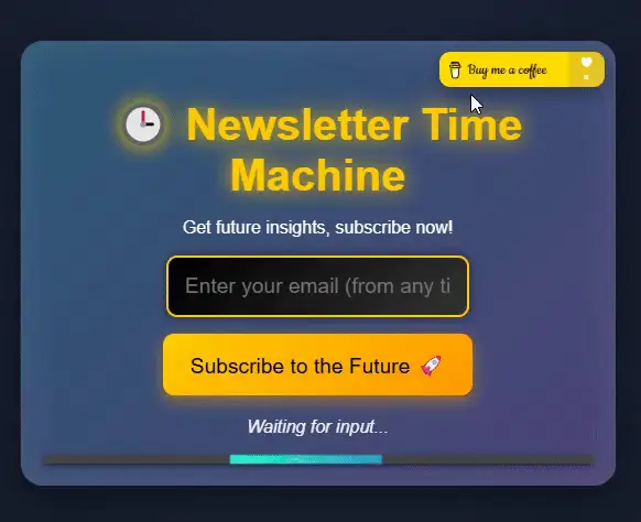
Creating an engaging, visually stunning, and functional newsletter sign-up form is no small feat. For this project, we set out to break away from the typical designs, aiming for something truly innovative: a futuristic, time-machine-inspired sign-up form. Here’s how we brought it to life.
Vision and Concept
The goal was simple: to make a newsletter sign-up form that:
- Captures attention immediately.
- Feels fun, interactive, and premium.
- Demonstrates the power of creative UI/UX design.
We wanted users to feel like they were stepping into a time machine when subscribing. With glowing neon effects, animated transitions, and a fully responsive layout, the design needed to stand out while remaining functional.

Step 1: The Core Structure
We started by structuring the form in HTML. This included:
Header Section:
- A title and subtitle to set the theme (time travel!).
Form Body:
- An email input field.
- A “Subscribe” button that triggers interactive animations.
Footer Section:
- A status message for feedback.
- A loading bar for visual progress after submission.
To make it more engaging, we added a “Buy Me a Coffee” button at the top-right corner, subtly encouraging users to support the project.
<div>


<p>Step 2: Styling for a Futuristic Look</p>

<p>The design needed to feel high-tech, so we focused on:</p>

<ul>
<li>Neon Colors: Bright, glowing colors for a sci-fi vibe.</li>
<li>Smooth Transitions: Subtle animations to make the UI feel alive.</li>
<li>Responsive Design: Ensuring the form looked great on all devices.</li>
</ul>

<p>Key styles included:</p>

<p>A glowing neon effect using text-shadow.<br>
Background animations with @keyframes to create a dynamic atmosphere.<br>
Button hover effects for an interactive feel.</p>

<p>CSS Code<br>
</p>

<pre class="brush:php;toolbar:false">body {
  font-family: 'Orbitron', sans-serif;
  background: radial-gradient(circle, #1b2735, #090a0f);
  color: #fff;
  margin: 0;
  padding: 0;
  overflow: hidden;
  animation: backgroundGlow 10s infinite alternate;
}

@keyframes backgroundGlow {
  0% {
    background: radial-gradient(circle, #1b2735, #090a0f);
  }
  100% {
    background: radial-gradient(circle, #202d42, #0d0f1a);
  }
}

.newsletter-container {
  position: relative;
  width: 80%;
  max-width: 500px;
  margin: 100px auto;
  background: linear-gradient(135deg, #2b5876, #4e4376);
  border-radius: 20px;
  padding: 20px;
  box-shadow: 0 15px 50px rgba(0, 0, 0, 0.5), inset 0 0 30px rgba(255, 255, 255, 0.1);
}

.coffee-button {
  position: absolute;
  top: 10px;
  right: 10px;
  display: inline-block;
  transition: transform 0.3s ease, box-shadow 0.3s ease;
}

.coffee-button img {
  width: 150px;
  border-radius: 10px;
  box-shadow: 0 5px 15px rgba(0, 0, 0, 0.3);
}

.coffee-button:hover img {
  transform: scale(1.1);
  box-shadow: 0 10px 30px rgba(255, 223, 0, 0.5);
}
Step 3: Adding Interactivity
We wanted the form to feel alive and responsive, so we used JavaScript to:
- Validate the email field.
- Display dynamic messages (error, success, loading).
- Animate a loading bar for visual feedback.
JavaScript Code
const subscribeBtn = document.getElementById('subscribe-btn');
const emailInput = document.getElementById('email');
const statusMessage = document.querySelector('.status-message');

subscribeBtn.addEventListener('click', () => {
  const email = emailInput.value.trim();

  if (!email) {
    statusMessage.textContent = '⛔️ Please enter a valid email address!';
    statusMessage.style.color = '#ff4d4d';
    return;
  }

  statusMessage.textContent = '⏳ Calculating time coordinates...';
  statusMessage.style.color = '#ffc107';

  setTimeout(() => {
    statusMessage.textContent = '✅ Coordinates verified! Welcome to the future.';
    statusMessage.style.color = '#00ff99';
    emailInput.value = '';
  }, 3000);
});
Step 4: Testing and Deployment
To ensure a smooth experience:
- We tested on different browsers and devices for responsiveness.
- We optimized the code for performance (minimizing CSS and JS).
Finally, we published the project on CodePen to showcase it to the community.
Key Takeaways
- Innovative Design Sells: A unique theme like time travel can elevate a simple form into something extraordinary.
- Interactivity is Key: Engaging animations and dynamic feedback keep users invested.
- Premium Feel: Glowing neon effects and smooth transitions give the form a high-end look.
Check It Out!
Explore the live demo here: Futuristic Newsletter Sign-Up Form on https://codepen.io/HanGPIIIErr/pen/oNKKXqg
For more creative designs and fun projects, visit https://gladiatorsbattle.com/ and dive into the world of gladiator-themed mini-games and premium designs. ?

The above is the detailed content of How We Created a Futuristic Newsletter Sign-Up Form with Premium UI/UX. For more information, please follow other related articles on the PHP Chinese website!

