Home >Web Front-end >JS Tutorial >Mastering Compound Components: Building Flexible and Reusable React Components
Mastering Compound Components: Building Flexible and Reusable React Components
- DDDOriginal
- 2024-11-23 07:22:141068browse
Introduction
Something that is very useful and comprehensive in the world of React are its design patterns, as they help keep the code scalable and add meaning to the components we create.
There are several patterns, and in this article we will talk about Compound Components, an advanced pattern that is especially useful for creating flexible and composite interfaces.
What is Compound Components?
Compound Components is an advanced pattern in React. It aims to create a more flexible design, allowing the sharing of state and logic between a group of components, where communication between the parent component and child components must be done in a flexible way.
Components must work together to perform some behavior without creating embarrassing prop trees or logic that is too complex to be refactored or understood in the future.
This pattern helps us eliminate prop flaming, where we have to pass a prop tree between components. This injection of props is a problem, as it can cause several unnecessary re-renders with each state that is updated, as each state will update all child components.
We have an example of Compound Components in the structure of select and option tags in HTML:

The select works as an interface state manager, while the options are configured in how the select should work.
Example using Compound Components
In this example, we will create a Modal, which is divided into two composite components: Toggle and Content. Where they will share the state of opening and closing the modal between them.
Let's see what it would be like to create this component step by step:
We can start by creating the context responsible for managing the state of opening and closing the modal

Creating the base of the Modal component

Notice that we are using children, to get the components that will be inserted into the Modal, we will want to use it like this:

Now we need to create the toggle component, which will be responsible for opening the Modal

We also need the content component that will be responsible for displaying the Modal's content

Finally, we can assign both to our Modal component and that’s it (:

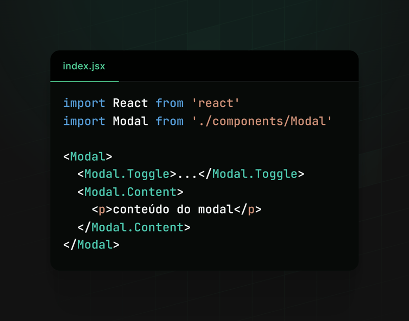
Using

Result

This way, we make the creation and use of modals extremely flexible and reusable. Modal.Toggle is responsible for activating the modal display, while Modal.Content must display the content of our modal.
This framework allows developers to easily customize the behavior and content of modals according to the specific needs of their applications, making the code cleaner and more organized.
Other examples
We can also use Compound Components in other contexts, for example:
Accordion Components:

Menu Components:

All are flexible and adaptable, facilitating the development, scalability and use of the component.
Conclusion
We saw how writing components in the Compound Components pattern can be useful in our applications, we also saw how to use it and some examples where this pattern can fit.
Feel free to explore and play around creating components with Compoud Components, use it wisely and see if it really makes sense to apply it in your context, sometimes, if it is not applied well, it can be more of a hindrance than a help.
NOTE: I posted this same content on react4noobs, a repository designed to group articles created by developers in the react universe. It's worth checking out =).
The above is the detailed content of Mastering Compound Components: Building Flexible and Reusable React Components. For more information, please follow other related articles on the PHP Chinese website!
Related articles
See more- An in-depth analysis of the Bootstrap list group component
- Detailed explanation of JavaScript function currying
- Complete example of JS password generation and strength detection (with demo source code download)
- Angularjs integrates WeChat UI (weui)
- How to quickly switch between Traditional Chinese and Simplified Chinese with JavaScript and the trick for websites to support switching between Simplified and Traditional Chinese_javascript skills

