Home >Web Front-end >CSS Tutorial >Drawing Togo&#s Flag with CSS
Drawing Togo&#s Flag with CSS
- Susan SarandonOriginal
- 2024-11-22 11:54:14391browse
Checking the Wikipedia page for the Flag of Togo, it describes it as:
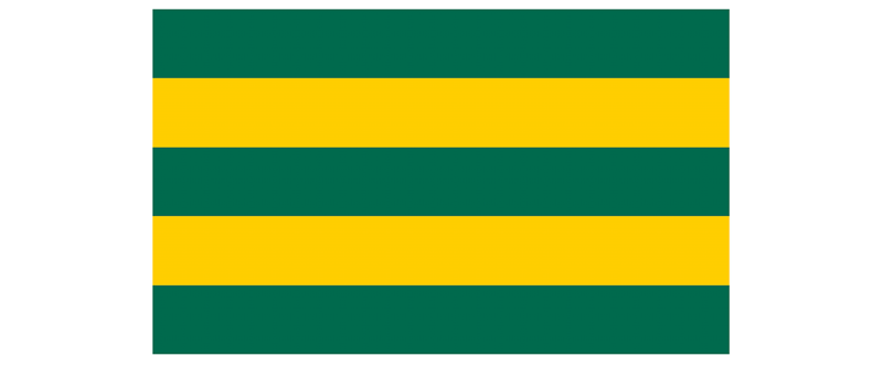
- Five horizontal stripes alternating between green and yellow
- A squared red field on the top left corner
- A five-pointed white star on the red field
- It has a 3:5 proportion (5 width units for each 3 height units)

As for the colors, we will use:
- #006a4e for the green
- #ffce00 for the yellow
- #d21034 for the red
- #fff for the white
HTML
We will code this flag using a single HTML element:
<div role="img" aria-label="Flag of Togo">


<p>For accessibility reasons, we added a couple of attributes:<br>
role="img" to indicate the element represents an image.<br>
aria-label="Flag of Togo" so assistive technologies can announce the image as Togo's flag.</p>

<p>Maybe it would be better to have a second visually-hidden element with the flag's "alternative text" linked with an aria-labelledby, but we'll keep it as a single element for simplicity.</p>
<h2>


  CSS
</h2>

<p>Let's start by setting the flag properties that will be needed:<br>
</p>

<pre class="brush:php;toolbar:false">.flag.togo {
  aspect-ratio: 5 / 3;
  position: relative;
}
With aspect-ratio we set the flag's proportion (width goes first in this case). And we set a relative position because we will draw the star using an absolute-positioned pseudo-element and we want to keep it within the flag container.
For the background, we need five horizontal strips: green, yellow, green, yellow, and green. This is a repetitive pattern of greens and yellows that can be easily coded using a repeating linear gradient:
.flag.togo {
  aspect-ratio: 5 / 3;
  position: relative;
  background: repeating-linear-gradient(#006a4e 0 20%, #ffce00 0 40%);
}

Now that we have the bars, we need the red square at the top left. We could use a pseudo-element, but instead, we will add another gradient to the background:
.flag.togo {
  aspect-ratio: 5 / 3;
  position: relative;
  background:
    linear-gradient(#d21034 0 0) 0 0 / 36% 60% no-repeat,
    repeating-linear-gradient(#006a4e 0 20%, #ffce00 0 40%);
}
This new gradient will be completely red (#d21034 0 0), positioned at the top left of the flag (0 0), with a width of 36% and a height of 60% of the flag (36% 60%) so it keeps the 3:5 proportion that will make it a square (36 = 60 * 3 / 5). And we need to make sure that it doesn't repeat (no-repeat), otherwise, it will occupy the whole container and everything will be red.

With this, we have the base for the flag, and we need to draw the star. We could do it with conic gradients, but that would be a small pain in the neck. Instead, we will use a pseudo-element and then crop it into the star shape using clip-path:
.flag.togo::before {
  content: "";
  width: 20%;
  aspect-ratio: 1;
  position: absolute;
  /* half of the size of the red square */
  left: 18%;
  top: 30%;
  /* translated half its size to top and left to center it */
  transform: translate(-50%, -50%);
  background: #fff;
  clip-path: polygon(50% 2%, 62% 39%, 100% 39%, 69% 61%, 81% 98%,
                     50% 75%, 19% 98%, 31% 61%, 0% 39%, 38% 39%);
}
Note: These are approximate points for the star. We could use trigonometry to make it perfect. But this will work as a good enough approximation.
With that, we are done! The whole CSS code for the flag of Togo would be:
.flag.togo {
  aspect-ratio: 5 / 3;
  position: relative;
  background:
    linear-gradient(#d21034 0 0) 0 0 / 36% 60% no-repeat,
    repeating-linear-gradient(#006a4e 0 20%, #ffce00 0 40%);

  &::before {
    content: "";
    width: 20%;
    aspect-ratio: 1;
    position: absolute;
    left: 18%;
    top: 30%;
    background: #fff;
    clip-path: polygon(50% 2%, 62% 39%, 100% 39%, 69% 61%, 81% 98%,
                       50% 75%, 19% 98%, 31% 61%, 0% 39%, 38% 39%);
  }
}

Some Thoughts
If we add a display: inline-block to the flag's styles, we will be able to have it in line with the text. In that case, we will need to set a height or a width so the aspect-ratio property can do its magic and automatically set the other value.
By drawing this flag, we have practiced:
- Positioning: relative and absolute
- Gradients: linear and repeating linear
- Aspect ratios: to set the flag and star's sizes
- Clip-paths: to shape the star
- Pseudo-elements: to create the star itself
I hope you enjoyed this short tutorial. I plan to release a new one shortly with other flags, explaining how the different gradients work –not only the linear ones. Keep an eye out for it!
The above is the detailed content of Drawing Togo&#s Flag with CSS. For more information, please follow other related articles on the PHP Chinese website!

