
Home >Web Front-end >CSS Tutorial >I Like to Move It, Move It (Part 2)
I Like to Move It, Move It (Part 2)

- WBOYWBOYWBOYWBOYWBOYWBOYWBOYWBOYWBOYWBOYWBOYWBOYWBOriginal
- 2024-08-19 20:31:30580browse
Welcome back! If you've been following week to week, you may have noticed that this series took a short break! If you've been following along, I'm very sorry!
Some of my work on a personal project took up a significant portion of my attention, plus I just got married, so I'm going to use that as an excuse. If you want to see what I've been working on check out the Build In Public: Roast, series that documents my process from concept to deployment for an app that tracks your home roasts.
Alright, alright. Stop self-promoting, let's get back to moving our boxes around the screen!
Get Your CodePen!
Just like in part one, you'll be able to follow along with your CodePen template! If you haven't read Part 1, check it out here. And if you need a new template, click here.
What is the Display Property?
With display and position properties, it may seem like they're affecting the same thing: where something appears on the web page. But, they do have a subtle difference. Positioning properties control how an element is positioned within the document that contains it. Either in normal flow, relative to other elements, or ignoring everything!
Display is different in that it is affecting the way that layout is interpreted: the display type. The display property for CSS is a bit of a bear at first, because it not only sets the display type for the element it's applied to (an outer display type), but it also sets the display behaviors for elements contained within the element the property is applied to (an inner display type).
Inline vs. Block
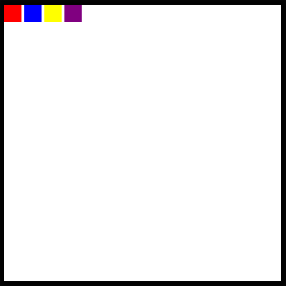
Most elements that we have used so far have a default outer display type of block. This means that no other elements will occupy the same vertical space as that element, effectively, any new element added will create a "new line".
Not all elements are this way. For example,
Well, regardless of the defaults for the element, you can change this property by setting:
display: block
display: inline-block
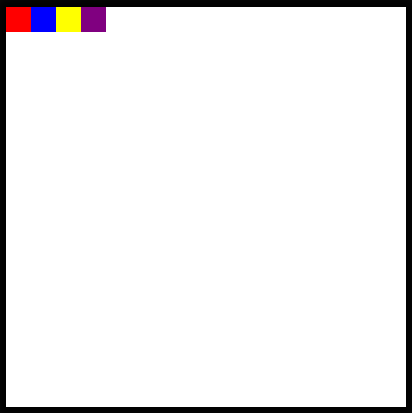
Now in your code pen, change the .box ruleset to make all of the boxes appear side by side.
Flexbox and Grid
As for the inner display types, we have a couple more options about how to position things. We can turn our element into a flexbox or a grid, which will affect how its children are laid out.
Display: Flex
Each of these concepts deserves an entire post for its own, but basically, a flex box will "flexibly" position elements contained within a parent element inline. The flexbox is more adaptive to different screen sizes since it places items relative to one another and the containing element rather than relative to the window.
To see this in action, take a look at the .frame ruleset in the Codepen.
Uncomment the following line of code:
display: flex;
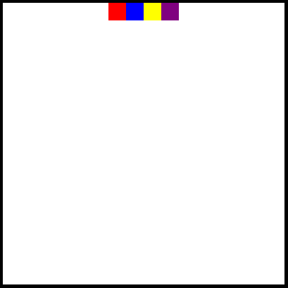
It looks very similar to having four inline-blocks right? By default, a flex container justifies its items to the start of the flexbox, or the left, but, this can be changed too!
Below the declaration of the flexbox, add this:
justify-content: center;
And now we should see all of the boxes appear at the middle of the screen!
But, what if we don't want them to be stuck at the top like that? Let's also add:
align-items: center;
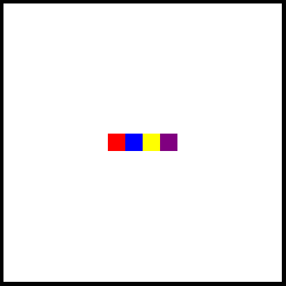
Great!
Display: Grid
Note: Before moving on in the CodePen, make sure that you comment out or remove the lines containing display: flex and the justify-content or align-items properties that you added.
In addition to the flexbox, we also have the option to turn our entire element into a grid, where we can place items!
I wont get much into the details of this code here, but know that it is possible by declaring the element to be a grid, providing a grid template and then placing items within the grid!
Uncomment the following lines in the .frame ruleset!
display: grid;
  grid-template: 1fr 1fr / 1fr 1fr;
  align-items: center;
  justify-items: center;
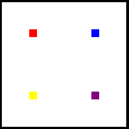
Now, you should see each of the boxes positioned each in the center of a quadrant of the frame!
Use Your Newfound Skills!
As with last article, here are a series of challenges. You will want to delete or re-comment the lines of code creating the grid layout before attempting!
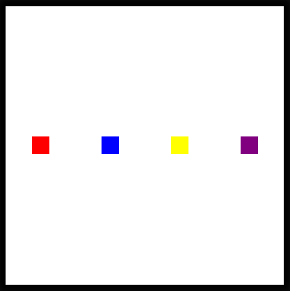
Challenge #1: Search MDN for the correct justify-content property to display each of the blocks evenly on the horizontal plane without touching the sides and in the center vertically as pictured below.
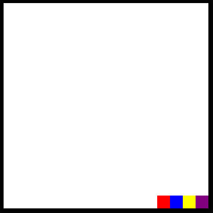
Challenge #2: Still in a flex container, see if you can group all of the boxes together and place them in the bottom right-hand corner! (What properties will you have to adjust for this?)
Challenge #3: Can you find a flex property that will reverse the display order of the elements?

Congratulations on completing these challenges! See you next week for more HTML and CSS!
The above is the detailed content of I Like to Move It, Move It (Part 2). For more information, please follow other related articles on the PHP Chinese website!