Home >Web Front-end >CSS Tutorial >Navigating CSS Responsive Design.
Navigating CSS Responsive Design.
- WBOYWBOYWBOYWBOYWBOYWBOYWBOYWBOYWBOYWBOYWBOYWBOYWBOriginal
- 2024-08-15 06:43:12543browse
One major responsibility of a front-end developer is to create a responsive design layout. This is also one of their challenges.
You may have believed, as I did, that "it's time to start building responsive designs" when working on projects using HTML/CSS and JavaScript, or you may find it difficult to make your designs responsive.
Whatever the situation, let's get right in and learn how to navigate CSS responsive design, Sailor.
What is Responsive Web Design(RWD)?
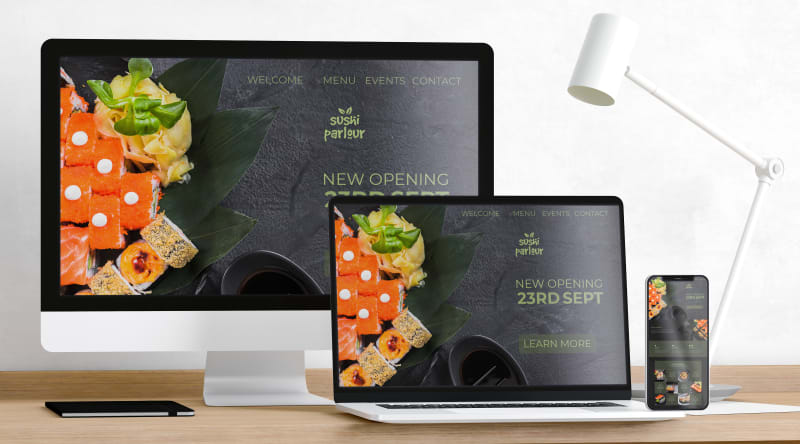
The right-hand side of the cover image says it all.

Responsive Design involves creating websites to adapt to a user's device, ensuring a consistent experience regardless of the device or the screen size. Responsive design is all about accessibility and usability, making sure your website is accessible and easily navigable.
We implement responsive design using HTML and CSS. Let's go over how we can achieve that.
Implementing Responsive Web Design ?.
1. Viewport: Viewport is a meta tag in HTML located within the
tag.<!DOCTYPE html> <html lang="en"> <head> ... <meta name="viewport" content="width=device-width, initial-scale=1.0" /> ... </head>
It is the area of a webpage in which the content is visible to the user. It varies with the device, the content would be smaller on a mobile phone than on a computer.
This tag informs the browser on how to control the page's dimensions and scaling.
content="width=device-width
This tells the browser to render the webpage to match the width of the screen currently used, letting the page reflow its content to match different screen sizes.
initial-scale=1.0"
This specifies the initial zoom level when the browser first loads the page.
Make sure your HTML file has a viewport meta tag.
2. Images: An image is responsive when it scales correctly on different browser sizes. To achieve a responsive image it is recommended you give all images a max-width: 100%
This ensures that your image shrinks to fit the available space while preventing it from increasing or stretching beyond its original size.
img{
max-width: 100%;
height: auto;
display: block;
}
3.Layouts: A layout represents the structure of a webpage achieved through elements like;
- Flexbox: CSS Flexbox is a one-dimensional layout mechanism for arranging elements in rows or columns. It provides flexibility in distributing space and aligning items within a container. Here's a simple example:
.container {
  display: flex;
  flex-direction: row; /* or column */
  justify-content: space-between; /* Distributes space evenly between elements */
  align-items: center; /* Aligns items vertically in the center */
}
Flexbox shines when you need to create a layout where items should automatically adjust their size to fit the available space, making it perfect for responsive designs.
- CSS Grid: While Flexbox is excellent for one-dimensional layouts, CSS Grid is a powerful two-dimensional layout mechanism, allowing you to create complex grid-based layouts with ease. You can define rows and columns, and place items precisely within this grid. Here's a simple example:
.grid-container {
  display: grid;
  grid-template-columns: repeat(3, 1fr); /* Creates 3 equal-width
  columns */
  grid-gap: 10px; /* Adds space between grid items */
}
CSS Grid is ideal for creating layouts that require both row and column alignment, like a gallery or a full-page layout.
4.Media Queries: Media queries are the cornerstone of responsive web design. They allow you to apply different styles based on the screen size, orientation, and other characteristics of the device. Here's an example:
/* Default styles */
body {
  font-size: 16px;
}

/* Styles for devices with a width of 768px or more */
@media (min-width: 768px) {
  body {
    font-size: 18px;
  }
}

/* Styles for devices with a width of 1200px or more */
@media (min-width: 1200px) {
  body {
    font-size: 20px;
  }
}
This code adjusts the font size based on the device's width, ensuring that the text remains readable on different screen sizes. Media queries are essential for fine-tuning your design across various devices.
5.Fluid Typography: Fluid typography allows your text to scale smoothly between different viewport sizes. You can achieve this using the clamp() function in CSS:
h1 {
  font-size: clamp(1.5rem, 2vw + 1rem, 3rem);
}
This line of code ensures that your h1 elements are never smaller than 1.5rem or larger than 3rem, and within those bounds, the size will adjust based on the viewport width.
6.Testing and Debugging: Responsive design isn't complete without thorough testing. Tools like Chrome's DevTools, Browser extension like Mobile Simulator, responsive design mode in Firefox, and online emulators like BrowserStack can help you simulate various devices and screen sizes to ensure your design works flawlessly everywhere.
Conclusion?.
Responsive design is not just a trend but a necessity in today's multi-device world. By mastering CSS techniques like Flexbox, Grid, media queries, and fluid typography, you can create websites that provide an optimal user experience on any device. Remember, the key to success in responsive design is constant testing and refining your layout as you build.
Now that you know the ropes, go ahead and make your designs as responsive as the best of them.
Happy Coding!?
The above is the detailed content of Navigating CSS Responsive Design.. For more information, please follow other related articles on the PHP Chinese website!

