Home >Web Front-end >CSS Tutorial >Mastering Responsive Layouts: Achieving Complex Designs with CSS Grid
Mastering Responsive Layouts: Achieving Complex Designs with CSS Grid
- 王林Original
- 2024-07-18 17:34:371204browse
Creating responsive layouts is a common challenge for web developers. In this blog, we'll explore how to achieve a specific responsive design using different CSS techniques, focusing on why CSS Grid is the best approach for this particular layout.

The Challenge
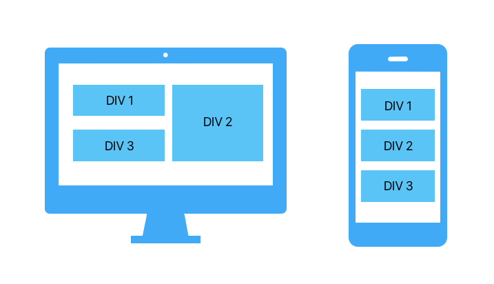
We need to create a layout where:
Desktop View:
- DIV 1 and DIV 3 stack vertically on the left, each taking 50% of the left column.
- DIV 2 takes up the full height of the right column.
Mobile View:
- All three divs stack vertically.
Why Flexbox Falls Short
Flexbox is excellent for one-dimensional layouts but struggles with complex two-dimensional layouts like ours. Here's why:
 <div class="container">
   <div class="item">DIV 1</div>
   <div class="item">DIV 2</div>
   <div class="item">DIV 3</div>
 </div>
.container {
    display: flex;
    flex-wrap: wrap;
    gap: 10px;
    padding: 10px;
}

.item {
    background-color: #40c4ff;
    color: white;
    padding: 20px;
    text-align: center;
    box-sizing: border-box;
}

.item:nth-child(1),
.item:nth-child(3) {
    flex: 1 1 calc(50% - 10px);
}

.item:nth-child(2) {
    flex: 1 1 50%;
}

@media (max-width: 768px) {
    .item {
        flex: 1 1 100%;
    }
}
Issues with Flexbox
In this flexbox setup:
- DIV 2 cannot automatically adjust its height to match the combined height of DIV 1 and DIV 3.
- Flexbox is primarily for one-dimensional layouts (either row or column), not complex two-dimensional arrangements.
The CSS Grid Solution
CSS Grid excels at creating two-dimensional layouts, making it perfect for this challenge.
 <div class="container">
   <div class="item">DIV 1</div>
   <div class="item">DIV 2</div>
   <div class="item">DIV 3</div>
 </div>
.container {
    display: grid;
    grid-template-columns: 1fr 1fr;
    grid-template-rows: auto auto;
    gap: 10px;
    padding: 10px;
}

.item {
    background-color: #40c4ff;
    color: white;
    padding: 20px;
    text-align: center;
    box-sizing: border-box;
}

.item:nth-child(1) {
    grid-column: 1 / 2;
    grid-row: 1 / 2;
}

.item:nth-child(2) {
    grid-column: 2 / 3;
    grid-row: 1 / 3;
}

.item:nth-child(3) {
    grid-column: 1 / 2;
    grid-row: 2 / 3;
}

@media (max-width: 768px) {
    .container {
        display: flex;
        flex-direction: column;
    }
    .item {
        width: 100%;
    }
}
Explanation
Grid Layout:
- Defines a grid with two columns and two rows.
- Positions DIV 1 in the first column and first row.
- Positions DIV 2 in the second column, spanning two rows.
- Positions DIV 3 in the first column and second row.
Responsive Design:
- For screens 768px or narrower, the layout switches to flex, stacking items vertically.
Conclusion
While Flexbox is great for simpler, one-dimensional layouts, CSS Grid provides the power and flexibility needed for more complex, two-dimensional designs. By using CSS Grid, we can easily achieve the desired responsive layout with minimal code and maximum control.
Feel free to adapt this example to suit your own projects, and enjoy the benefits of using CSS Grid for your responsive layouts!
The above is the detailed content of Mastering Responsive Layouts: Achieving Complex Designs with CSS Grid. For more information, please follow other related articles on the PHP Chinese website!

