Home >Web Front-end >CSS Tutorial >How to Remove Arrow on Input type Number with Tailwind CSS
How to Remove Arrow on Input type Number with Tailwind CSS
- WBOYWBOYWBOYWBOYWBOYWBOYWBOYWBOYWBOYWBOYWBOYWBOYWBOriginal
- 2024-07-17 07:15:591549browse
When designing forms with Tailwind CSS, you might want to remove the default arrows (also known as spinners) from number input fields. These arrows can interfere with custom designs and are challenging to style consistently across different browsers.
In this tutorial, we'll explore how to achieve this using Tailwind CSS, both with inline styles and through a global CSS approach.
The Problem
By default, browsers add increment and decrement arrows to elements. While functional, these arrows often clash with custom designs and can be difficult to style uniformly across various browsers.

The Solution
We'll use Tailwind CSS utility classes to remove these arrows and create clean, customized number inputs. We'll also look at how to apply this styling globally for larger projects.
Inline Approach
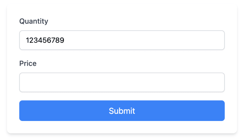
Let's start with an example that uses inline Tailwind classes:
<form class="max-w-md mx-auto mt-8 p-6 bg-white rounded-lg shadow-md">
  <div class="mb-4">
    <label for="quantity" class="block text-sm font-medium text-gray-700 mb-2">Quantity</label>
    <input type="number" id="quantity" name="quantity"
      class="block w-full px-3 py-2 bg-white border border-gray-300 rounded-md text-sm shadow-sm
      focus:outline-none focus:border-sky-500 focus:ring-1 focus:ring-sky-500
      [appearance:textfield] [&::-webkit-outer-spin-button]:appearance-none [&::-webkit-inner-spin-button]:appearance-none">
  </div>

  <div class="mb-4">
    <label for="price" class="block text-sm font-medium text-gray-700 mb-2">Price</label>
    <input type="number" id="price" name="price" step="0.01"
      class="block w-full px-3 py-2 bg-white border border-gray-300 rounded-md text-sm shadow-sm
      focus:outline-none focus:border-sky-500 focus:ring-1 focus:ring-sky-500
      [appearance:textfield] [&::-webkit-outer-spin-button]:appearance-none [&::-webkit-inner-spin-button]:appearance-none">
  </div>

  <button type="submit" class="w-full bg-blue-500 text-white py-2 px-4 rounded-md hover:bg-blue-600 transition-colors">
    Submit
  </button>
</form>
The key classes for removing the arrows are:
- [appearance:textfield]: Removes default styling in Firefox.
- [&::-webkit-outer-spin-button]:appearance-none: Removes outer spin button in WebKit browsers.
- [&::-webkit-inner-spin-button]:appearance-none: Removes inner spin button in WebKit browsers.

Global Approach
For larger projects, you might want to apply this styling to all number inputs. You can do this by adding styles to your global CSS file:
Open your global.css file (or equivalent, like app.css or styles.css) depending on your framework and setup.
Add the following CSS:
/* In your global.css file */
@layer utilities {
  input[type="number"]::-webkit-inner-spin-button,
  input[type="number"]::-webkit-outer-spin-button {
    -webkit-appearance: none;
    margin: 0;
  }

  input[type="number"] {
    -moz-appearance: textfield;
  }
}
- Ensure this CSS file is imported in your main Tailwind CSS file or included in your HTML.
After adding these global styles, you can simplify your HTML:
<form class="max-w-md mx-auto mt-8 p-6 bg-white rounded-lg shadow-md">
  <div class="mb-4">
    <label for="quantity" class="block text-sm font-medium text-gray-700 mb-2">Quantity</label>
    <input type="number" id="quantity" name="quantity"
      class="block w-full px-3 py-2 bg-white border border-gray-300 rounded-md text-sm shadow-sm
      focus:outline-none focus:border-sky-500 focus:ring-1 focus:ring-sky-500">
  </div>

  <div class="mb-4">
    <label for="price" class="block text-sm font-medium text-gray-700 mb-2">Price</label>
    <input type="number" id="price" name="price" step="0.01"
      class="block w-full px-3 py-2 bg-white border border-gray-300 rounded-md text-sm shadow-sm
      focus:outline-none focus:border-sky-500 focus:ring-1 focus:ring-sky-500">
  </div>

  <button type="submit" class="w-full bg-blue-500 text-white py-2 px-4 rounded-md hover:bg-blue-600 transition-colors">
    Submit
  </button>
</form>
Notice that we've removed the arrow-removing classes from individual inputs, as they're now handled by the global CSS.
Adding Custom Arrows
While removing default arrows improves design consistency, you may want to add custom increment/decrement buttons for better user experience. Here's how to create custom arrows that match our form's design:
<div class="mb-4">
  <label for="quantity" class="block text-sm font-medium text-gray-700 mb-2">Quantity</label>
  <div class="relative">
    <input type="number" id="quantity" name="quantity"
      class="block w-full px-3 py-2 bg-white border border-gray-300 rounded-md text-sm shadow-sm
      focus:outline-none focus:border-sky-500 focus:ring-1 focus:ring-sky-500
      [appearance:textfield] [&::-webkit-outer-spin-button]:appearance-none [&::-webkit-inner-spin-button]:appearance-none">
    <div class="absolute inset-y-0 right-0 flex items-center">
      <button type="button" class="px-2 h-full border-l border-gray-300 text-gray-500 hover:text-sky-500 focus:outline-none"
              onclick="document.getElementById('quantity').stepUp()">
        <svg xmlns="http://www.w3.org/2000/svg" fill="none" viewBox="0 0 24 24" stroke-width="1.5" stroke="currentColor" class="w-4 h-4">
          <path stroke-linecap="round" stroke-linejoin="round" d="M4.5 15.75l7.5-7.5 7.5 7.5" />
        </svg>
      </button>
      <button type="button" class="px-2 h-full border-l border-gray-300 text-gray-500 hover:text-sky-500 focus:outline-none"
              onclick="document.getElementById('quantity').stepDown()">
        <svg xmlns="http://www.w3.org/2000/svg" fill="none" viewBox="0 0 24 24" stroke-width="1.5" stroke="currentColor" class="w-4 h-4">
          <path stroke-linecap="round" stroke-linejoin="round" d="M19.5 8.25l-7.5 7.5-7.5-7.5" />
        </svg>
      </button>
    </div>
  </div>
</div>
Let's break down the key components of this implementation:
We wrap the input in a relative-positioned div to allow absolute positioning of our custom buttons.
The input field retains its original styling, including the classes to remove default arrows:
[appearance:textfield] [&::-webkit-outer-spin-button]:appearance-none [&::-webkit-inner-spin-button]:appearance-none
- We add a div with absolute positioning to contain our custom buttons:
<div class="absolute inset-y-0 right-0 flex items-center">
This positions the buttons on the right side of the input and centers them vertically.
- Each button is styled to blend with the input:
<button type="button" class="px-2 h-full border-l border-gray-300 text-gray-500 hover:text-sky-500 focus:outline-none">
- h-full makes the button fill the height of the input.
- border-l adds a subtle separator between buttons.
- text-gray-500 and hover:text-sky-500 provide a color change on hover that matches our form's focus state.
We use SVG icons for the up and down arrows, sized appropriately with w-4 h-4.
The onclick events use JavaScript's stepUp() and stepDown() methods to change the input value:
   onclick="document.getElementById('quantity').stepUp()"
   onclick="document.getElementById('quantity').stepDown()"
Important Considerations
There are a few things that you should consider:
Removing arrows may affect users who rely on them. Consider providing alternative increment/decrement methods if necessary.
This solution works in modern browsers. Older browsers may require additional CSS or JavaScript.
Conclusion
By implementing this, either inline or globally, you can effectively remove the default arrows from number inputs across your project.
For those looking to improve their Tailwind CSS development process further, check out the DevDojo Tails page builder, which can help you create amazing designs with ease.
Happy coding!
The above is the detailed content of How to Remove Arrow on Input type Number with Tailwind CSS. For more information, please follow other related articles on the PHP Chinese website!

