
Home >System Tutorial >Windows Series >Why Is the Windows Interface So Disjointed After These Years
Why Is the Windows Interface So Disjointed After These Years

- WBOYWBOYWBOYWBOYWBOYWBOYWBOYWBOYWBOYWBOYWBOYWBOYWBOriginal
- 2024-07-10 11:58:40928browse
Uniform consistency may not be the pipe dream of an everyday Windows user, but it remains a point of contention for power users. Despite Microsoft’s attempts at unification, the fragmented and inconsistent user interface has plagued the operating system since the launch of Windows 95 and continues with Windows 11. We explore the evolution of Windows UI, issues contributing to the fragmented user interface, and how competitors have demonstrated a more cohesive approach.
Windows' Consistently Inconsistent UI Evolution
The initial Windows design inconsistencies can be traced back to Windows 95. While the successor to Windows 3.1 introduced a more cohesive design language with the Start menu and taskbar, it also marked the beginning of Microsoft's struggle with design inconsistencies due to the need to support legacy apps.
Windows XP, with its visually unified experience, brought Microsoft’s enterprise and consumer line of operating systems under one roof. While security was the biggest concern with XP, the visual overhaul didn't translate across the system, creating inconsistencies.
With Windows Vista, Microsoft updated the look and feel of Windows with a sleek, translucent design. However, some legacy applications and dialog boxes retained the XP-style appearance, including the font, control styles, and more. This visual clash continued with successive Windows upgrades, creating a fragmented user experience.

While hardware limitations slowed Vista’s adoption, the Aero design language found success in Windows 7, offering a familiar experience with better performance, wider hardware capability, and more personalization options.

Windows 8, with its disruptive modern UI (Metro), was the biggest culprit. Designed with a focus on a touch-first interface, the Metro UI received a negative reception from traditional PC users accustomed to keyboard and mouse inputs, and created a stark contrast between legacy and new apps.

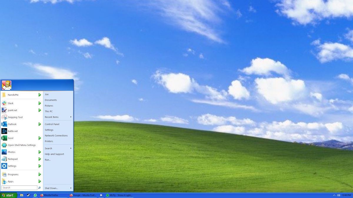
Windows 10 aimed to rectify this by fixing most issues, but some design disparities remained. Despite the introduction of the Fluent Design System and Universal Windows Platforms (UWP) app, the design and functionality of the Start menu were inconsistent with the Modern UI.
Competitors Get It Right
In contrast, other operating systems like macOS have prioritized a more unified and consistent UI. Since its transition from the classic Mac OS to Mac OS X (now macOS), which saw significant design changes, macOS has kept its core design principle intact without compromising modern aesthetics.

Although macOS is not entirely free of inconsistencies, it has fewer visual disparities compared to Windows. This is partly facilitated by the fact that macOS has been developed and tuned to work only with Apple hardware.
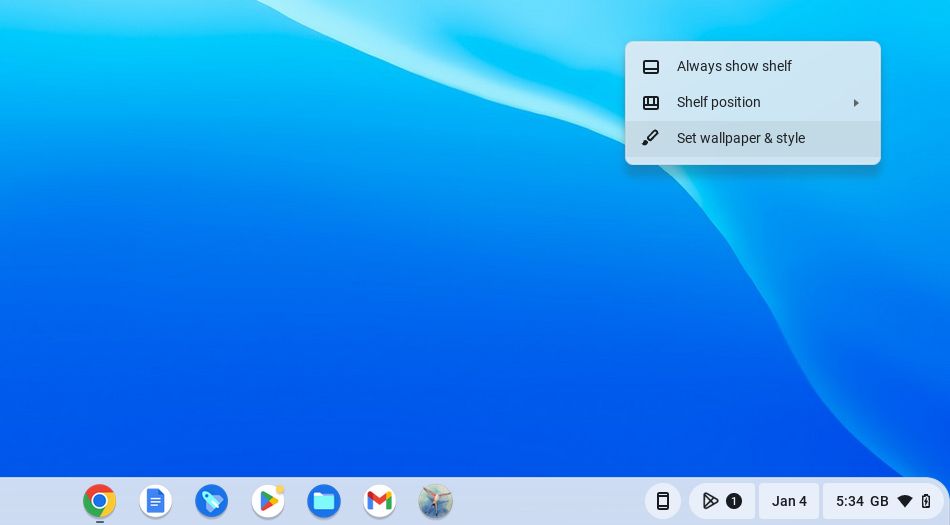
But even many Linux distributions, with their high degree of customization, adhere to specific design guidelines to prioritize a cohesive user experience. Other lightweight operating systems like ChromeOS, with a minimalist design and focus on web applications, offer a more unified experience across different apps and system components.
Windows has made significant UI changes with each major release. Some of these changes are driven by external factors, and some for the sake of innovation. For instance, the rise of touchscreen devices in 2010 prompted Microsoft to redesign its popular operating system with Metro UI for a unified experience across devices. It was, however, a massive gamble that didn't pay off.
Microsoft Still Making the Same Mistakes
Windows 11, built on the success of its predecessor, offers a more streamlined and modern user interface, but some inconsistencies persist. Some of these are part of its transition phase, while others seem like an unfinished job.

Apart from having way too much going on, the new context menu is not consistent throughout the OS and is plagued by rendering issues with certain applications. The improved dark mode now supports more apps, but it isn’t without problems. When activated, it may not apply uniformly across all the apps, especially when the app is open or minimized.
You’ll also find multiple instances of design inconsistencies, with some parts of the system looking like Windows 10 and even Windows 7. For instance, the advanced storage settings and the Windows Recovery Environment retain the old Windows 10 design elements. Dig a little deeper, and you’ll find Windows 7 design elements for File Explorer options, system restore, and Command Prompt.

What's more, Windows 11 still retains both the legacy Control Panel and the Settings app, creating a dual-interface issue. This, however, is expected to be temporary as Microsoft will phase out the older components as more options are transitioned to the new Settings app.
Core apps like the Device Manager and other administrative tools look like they have been repainted to look new with rounded corners. Since these tools cater to advanced users and IT professionals, a comprehensive design overhaul seems unlikely in the near future.
Navigating the Challenges of Legacy and Compatibility
Microsoft’s commitment to backward compatibility, unclear transition points for older technologies, such as its old UX frameworks, and a much larger ecosystem of legacy apps are among the many factors contributing to Windows' fragmented user experience.
Responding to a query on Twitter (now X) in 2013, Mikhail Parakhin, a Microsoft executive, noted that while WinUI 3 is their preferred way to build a premier, advanced UI, they’ll continue supporting and developing popular frameworks that people currently use.
While different apps with different requirements may prefer different frameworks, the coexistence and continued development of multiple UI frameworks can contribute to visual disparities even among native apps. This is a complex issue with no easy solution. Although some blame lies with external factors, Microsoft’s inability to align its modern native apps with its own UI guidelines raises concerns about its commitment to a cohesive design vision.
The Future of Windows UI
While Microsoft has made strides towards a more unified experience with Windows 11, Fluent Design, and Project Reunion, its iterative approach to Windows development means more inconsistencies as new UI elements are added. This is further complicated by its legacy of backward compatibility, the needs of enterprise users, and the scale of the Windows ecosystem.
Microsoft is addressing many of the UI consistency issues with newer updates, but at a slower pace. While it is aggressively prioritizing AI in Windows 11 by adding new copilot features, a dedicated update addressing the operating system's UI inconsistencies can help deliver a unified Windows experience. This would create a balance between Copilot additions and core functional improvements to the operating system.
The above is the detailed content of Why Is the Windows Interface So Disjointed After These Years. For more information, please follow other related articles on the PHP Chinese website!
Related articles
See more- How to solve the problem of Windows 7 desktop rotating 90 degrees
- How to forcefully terminate a running process in Win7
- Win11 Build 25336.1010 preview version released today: mainly used for testing operation and maintenance pipelines
- Win11 Beta preview Build 22621.1610/22624.1610 released today (including KB5025299 update)
- Fingerprint recognition cannot be used on ASUS computers. How to add fingerprints? Tips for adding fingerprints to ASUS computers