
Heim >Web-Frontend >CSS-Tutorial >Detaillierte Erläuterung des CSS-Padding- und Margin-Codes
Detaillierte Erläuterung des CSS-Padding- und Margin-Codes

- 小云云Original
- 2018-02-28 10:06:3422431Durchsuche
Dieser Artikel teilt Ihnen hauptsächlich den inneren Rand und den äußeren Rand von CSS mit. Ich hoffe, dass er allen helfen kann.
Rand:
margin
左边距 margin-left:数值 | autoauto:即距离这个边最远的距离
右边距: margin-right:数值 | auto上边距: margin-top:数值  这里不能用auto下边距: margin-bottom:数值 这里也不能用auto外边距 复合写法1:margin: 0px(上) 0px(右) 0px(下) 0px(左)2:margin: 0px(上) 0px(左右) 0px(下)3:margin: 0px(上下边距) 0px(左右边距)4:margin: 0px(上下左右边距都是0px)
Codebeispiel:
<!DOCTYPE html><html lang="en"><head>
    <meta charset="UTF-8">
    <title>外边距</title>
    <link rel="stylesheet" href="index.css"/>   </head><body>
    <p class="p1">我是p1</p>
    <p class="p2">我是p2</p></body></html>p{
    width: 200px;
    height: 200px;
    background: red;
}
.p1{
    margin-left: 100px;
    margin-top: 100px;
    margin-bottom: 0px;
}
.p2{
    background: blue;
    margin-right: auto;
    margin-left: auto;
    /* margin-left: 300px;
    margin-top: -200px; */
}
Weibo dreispaltiges Layout
模仿页面 简单实现三列<!DOCTYPE html><html lang="en"><head>
    <meta charser="utf-8"/>
    <title>微博三列布局</title>
    <style>
        .content{            width : 900px;            height : 1200px;            background-color:yellow;        }
        .p1{            width:200px;            height:1200px;            background-color:red;        }
        .p2{            width:500px;            height:1200px;            background-color:green;            margin-left:220px;            margin-top:-1200px;        }
        .p3{            width:160px;            height:1200px;            background-color:blue;            margin-left:auto;            margin-top:-1200px;        }
    </style></head><body>
    <p class="content">
        <p class="p1"></p>
        <p class="p2"></p>
        <p class="p3"></p>
    </p></body></html>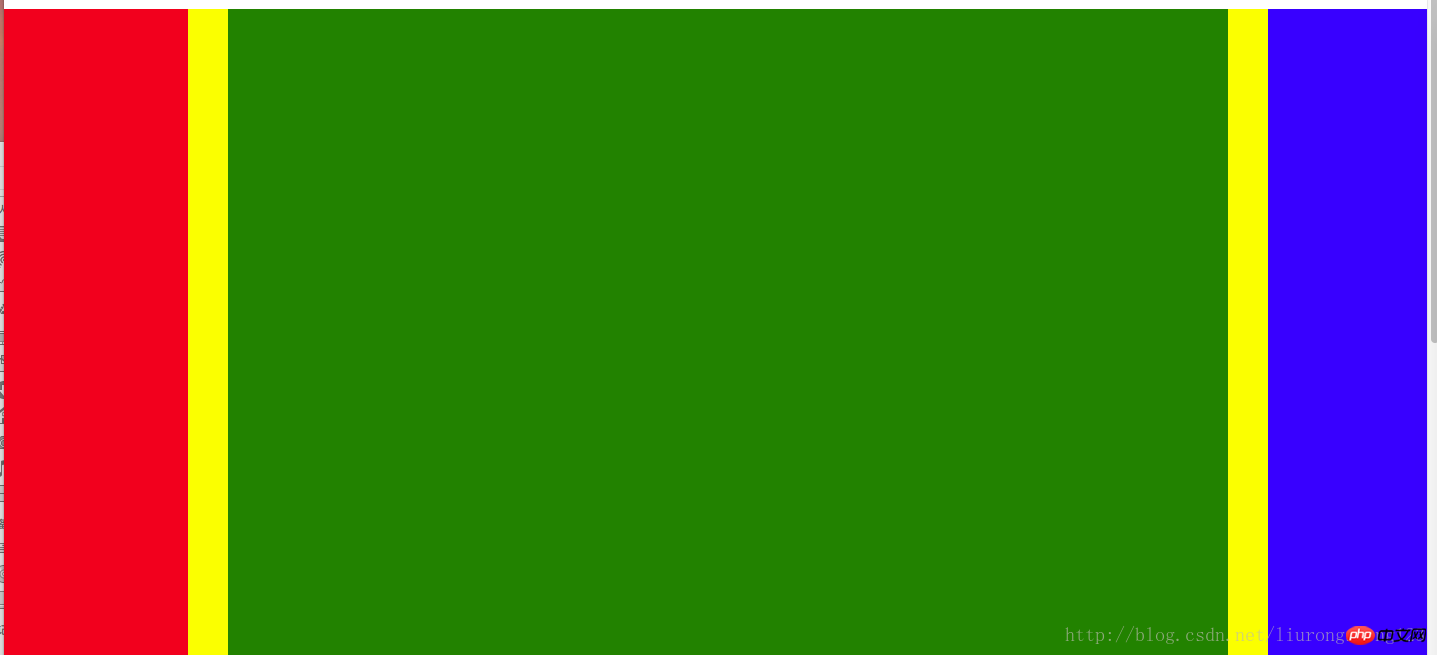
Innerer Rand
<!DOCTYPE html><html lang="en"><head>
    <meta charset="UTF-8">
    <title>内边距</title>
    <link rel="stylesheet" href="index.css"/></head><body>
    <!-- 内边距 padding -->
    <!-- 左内距 padding-left:数值 -->
    <!-- 右内距 padding-right:数值 -->
    <!-- 上内距 padding-top -->
    <!-- 下内距 padding-bottom -->

    <!-- 内边距 复合写法 -->
    <!-- 1:padding: 0px(上) 0px(右) 0px(下) 0px(左) -->
    <!-- 2:padding: 0px(上) 0px(左右) 0px(下) -->
    <!-- 3:padding: 0px(上下边距) 0px(左右边距) -->
    <!-- 4:padding: 0px (上下左右边距都是0px)-->
    <p>xxxx</p></body></html>
Hintergrundfarbstil:
背景样式:background
背景颜色 background-color:颜色值
背景图片 background-image:url("图片路径")
背景图片平铺 backgroud-repeat:repeat-x(沿着x轴平铺) | repeat-y(沿着Y轴平铺) | no-repeat(不平铺)
背景图片定位 background-position: x y
x轴: 支持left center right 支持百分比
y轴: 支持top center bottom 支持百分比
背景图片尺寸 background-size: x y | cover | contain
background:复合写法
background:background-color background-image background-position background-repeat定义多张图片的复合写法
background:url("timg.jpg") 0px 0px/100px 100px repeat, url("timg.jpg") 30% 30%/100px 100px no-repeat,
url("timg.jpg") 60% 60%/100px 100px no-repeat, gold url(timg.jpg) 90% 90%/100px 100px no-repeat;
Äußere Randgrube:
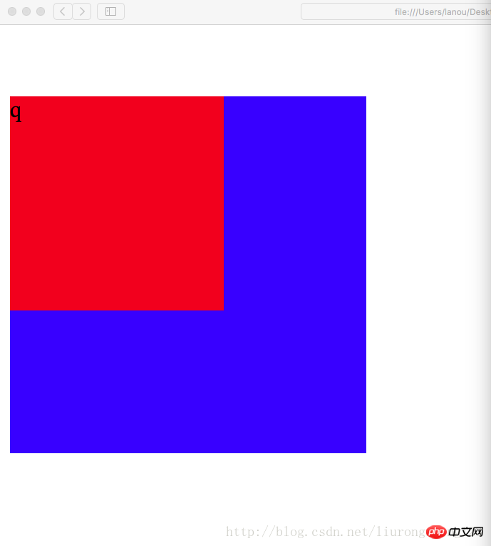
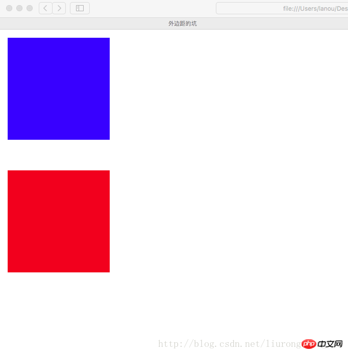
父子同级结构下,父级与子级都设置了上边距的情况下,如果父级没有设置border的情况下,会引起塌陷问题,
即父级框会向下移动一段距离(这段距离是子级设置的上边距的长度)
Zum Beispiel Code ohne Rand:
<!DOCTYPE html><html lang="en"><head>
    <meta charset="utf-8"/>
    <title>外边距的坑</title>
    <style>
        .p1{            width:250px;            height:250px;            margin-top:5px;            background-color:blue;        }
        .p2{            width:150px;            height:150px;            margin-top:50px;            background-color:red;        }
    </style></head><body>
    <p class="p1">
        <p class="p2">
            <p class="p3">q</p>
        </p>
    </p></body></html>
Screenshot der Ergebnisse zu diesem Zeitpunkt:
当设置了border时,这个塌陷问题将得到完美解决,这个塌陷问题是系统的原因,我们只负责解决
解决后的代码:
<!DOCTYPE html><html lang="en"><head>
    <meta charset="utf-8"/>
    <title>外边距的坑</title>
    <style>
        .p1{            width:250px;            height:250px;            margin-top:5px;            background-color:blue;            border:1px gold dashed;        }
        .p2{            width:150px;            height:150px;            margin-top:50px;            background-color:red;        }
    </style></head><body>
        <p class="p1">
            <p class="p2">
                <p class="p3">q</p>
            </p>
        </p></body></html>
Screenshot der Ergebnisse zu diesem Zeitpunkt:
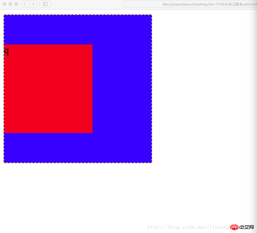
从截图中可以看到,父级的位置恢复为原来的位置(原来位置:即没有创建p2的时候,p1所在的位置),塌陷问题得到解决.
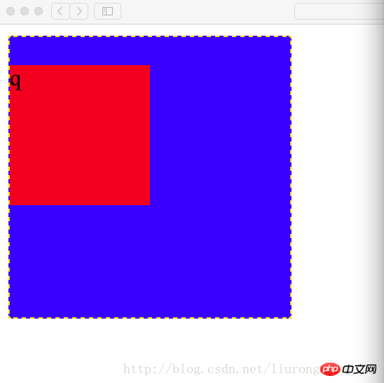
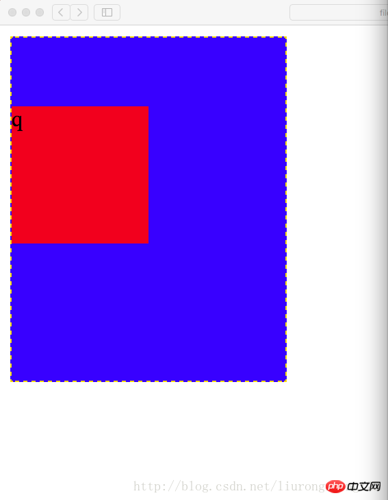
设置内边距问题
一个p即可以设置外边距也可以设置内边距,当设置内边距时,该框体会在该方向上扩大相应的距离
比如初始情况为:
<!DOCTYPE html><html lang="en"><head>
    <meta charset="utf-8"/>
    <title>外边距的坑</title>
    <style>
        .p1{            width:200px;            height:200px;            margin-top:5px;            background-color:blue;            border:1px gold dashed;        }
        .p2{            width:100px;            height:100px;            margin-top:20px;            background-color:red;        }
    </style></head><body>
        <p class="p1">
            <p class="p2">
                <p class="p3">q</p>
            </p>
        </p></body></html>
Screenshot des Ergebnisses: Dieses Ergebnis ist das Ergebnis, wenn die Breite 200 und die Höhe 200 beträgt. Derzeit ist keine Polsterung festgelegt
Code beim Festlegen des Abstands: Stellen Sie zu diesem Zeitpunkt den Abstand am oberen Rand des Randes auf 50 ein
Codebeispiel:
<!DOCTYPE html><html lang="en"><head>
    <meta charset="utf-8"/>
    <title>外边距的坑</title>
    <style>
        .p1{            width:200px;            height:200px;            margin-top:5px;            padding-top:50px;            background-color:blue;            border:1px gold dashed;        }
        .p2{            width:100px;            height:100px;            margin-top:20px;            background-color:red;        }
    </style></head><body>
        <p class="p1">
            <p class="p2">
                <p class="p3">q</p>
            </p>
        </p></body></html>
Screenshot des Ergebnisses: Zu diesem Zeitpunkt beträgt die Höhe des Außenrandes 250 und der Abstand zwischen der Oberkante des Außenrandes und der Oberkante des Innenrandes beträgt 20+50=70 Pixel
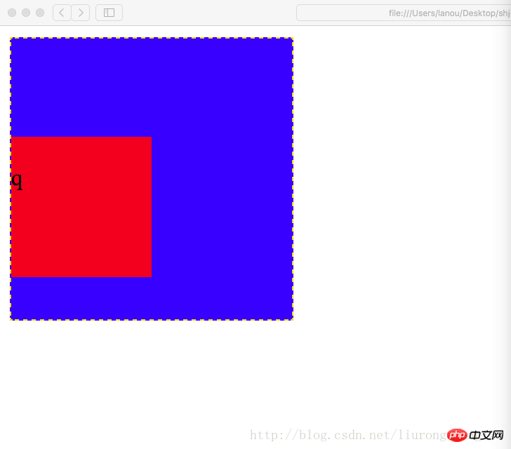
此时要想设置内边距同时又不想改变框体的大小,需要提前从外边框的高度中减去要设置的内边距的长度,即200-50=150,即外边框的属性设置为宽200像素,高150像素
代码示例
<!DOCTYPE html><html lang="en"><head>
    <meta charset="utf-8"/>
    <title>外边距的坑</title>
    <style>
        .p1{            width:200px;            height:150px;            margin-top:5px;            padding-top:50px;            background-color:blue;            border:1px gold dashed;        }
        .p2{            width:100px;            height:100px;            margin-top:20px;            background-color:red;        }
    </style></head><body>
        <p class="p1">
            <p class="p2">
                <p class="p3">q</p>
            </p>
        </p></body></html>
Ergebnis-Screenshot: Das Ergebnis zu diesem Zeitpunkt. Stellen Sie den äußeren Rand wieder in die quadratische Form her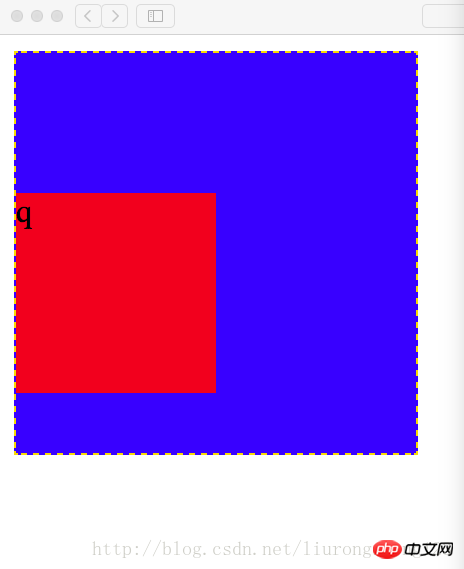
此时如果将子级的上边框也设置内边距,则也需要提前将子级的高减去相应的距离
代码示例:代码中高已经减去相应的内边距;如果子级边框不设置边框顶边的内边距,设置边框底边的内边距,此时为了确保边框不因为内边距为改变,任然需要减去相应的内边距
代码为设置边框定边的内边距
<!DOCTYPE html><html lang="en"><head>
    <meta charset="utf-8"/>
    <title>外边距的坑</title>
    <style>
        .p1{            width:200px;            height:150px;            margin-top:5px;            padding-top:50px;            background-color:blue;            border:1px gold dashed;        }
        .p2{            width:100px;            height:80px;            margin-top:20px;            padding-top:20px;            background-color:red;        }
    </style></head><body>
        <p class="p1">
            <p class="p2">
                <p class="p3">q</p>
            </p>
        </p></body></html>
Screenshot des Ergebnisses: Das Ergebnis ist derzeit nicht offensichtlich
Eine weitere Grube am äußeren Rand:
同级结构下(注意不是父子结构,上面那个坑是父子级结构),外边距冲突的情况下(即两个同级的p,一个在上面,一个在下面,
你设置了外边距即magin-bottom,我也设置了外边距即(magin-top),此时两个外边距在一起会起冲突,
他们两个的距离会是两个边距中的较大者,而不是两个边距的值相加
代码示例:
<!DOCTYPE html><html lang="en"><head>
    <meta charset="utf-8"/>
    <title>外边距的坑</title>
    <style>
        .p1{            width:100px;            height:100px;            margin-bottom:20px;            background-color:blue;        }
        .p2{            width:100px;            height:100px;            margin-top:30px;            background-color:red;        }
    </style></head><body>
    <p class="p1"></p>
    <p class="p2"></p></body></html>
Ergebnis Screenshot:
盒模型的构成需要:<!-- 盒模型:构成:容器尺寸+padding+border+margin -->
Sechs-Ringe-Übung
<!DOCTYPE html><html lang="en"><head>
    <meta charset="UTF-8">
    <title>六环</title>
    <style>
        .p1{            border: 1px dashed black;            width: 600px;            height: 554px;            margin: 0 auto;            padding-top: 46px;        }
        .p2{            border: 4px lightblue solid;            background: gray;            width: 500px;            height: 475px;            margin: 0 auto;            padding-top: 25px;        }
        .p3{            background: pink;            width:450px;            height: 425px;            margin: 0 auto;            padding-top: 25px;        }
        .p4{            border: 1px dotted white;            width: 400px;            height: 380px;            margin: 0 auto;            padding-top: 20px;        }
        .p5{            border: 1px dashed white;            width: 340px;            height: 320px;            margin: 0 auto;            padding: 20px;        }
        .p6{            width:300px;            height:300px;            margin:auto;            background-color: red;        }
    </style></head><body>
    <p class="p1">
        <p class="p2">
            <p class="p3">
                <p class="p4">
                    <p class="p5">
                        <p class="p6"></p>
                    </p>
                </p>
            </p>
        </p>
    </p></body></html>
Verwandte Empfehlungen:
Das obige ist der detaillierte Inhalt vonDetaillierte Erläuterung des CSS-Padding- und Margin-Codes. Für weitere Informationen folgen Sie bitte anderen verwandten Artikeln auf der PHP chinesischen Website!
Stellungnahme:
Der Inhalt dieses Artikels wird freiwillig von Internetnutzern beigesteuert und das Urheberrecht liegt beim ursprünglichen Autor. Diese Website übernimmt keine entsprechende rechtliche Verantwortung. Wenn Sie Inhalte finden, bei denen der Verdacht eines Plagiats oder einer Rechtsverletzung besteht, wenden Sie sich bitte an admin@php.cn
Vorheriger Artikel:Fügen Sie dynamisch die Codefreigabe für Tab-Instanzen hinzuNächster Artikel:Fügen Sie dynamisch die Codefreigabe für Tab-Instanzen hinzu
In Verbindung stehende Artikel
Mehr sehen- Wie erstelle ich horizontale Kastenschatten ohne Bilder oder Tricks?
- Machen Sie mit bei der nächsten Frontend Challenge: Dezember-Ausgabe!
- Wie kann ich CSS3-N-Typ-Selektoren auf bestimmte Klassen beschränken?
- Fügen Sie mithilfe von CSS Schatten zu Elementen hinzu
- Die Anforderungen und Auswirkungen der absoluten Positionierung auf das Webdesign