
Heim >Web-Frontend >js-Tutorial >Zwei Möglichkeiten, ein modales Feld in Angular anzuzeigen
Zwei Möglichkeiten, ein modales Feld in Angular anzuzeigen

- 小云云Original
- 2018-01-09 13:25:104428Durchsuche
Dieser Artikel stellt hauptsächlich zwei Möglichkeiten vor, modale Boxen in Angular zu öffnen. Er ist sehr gut und hat Referenzwert. Ich hoffe, er kann jedem helfen.
Bevor wir mit unserem Blog beginnen, müssen wir zunächst ngx-bootstrap-modal installieren
npm install ngx-bootstrap-modal --save
Andernfalls wird die Wirkung unserer Modalbox hässlich sein und Sie zum Erbrechen bringen
1. Popup-Methode 1 (diese Methode stammt von https://github.com/cipchk/ngx-bootstrap-modal)
1.Alert-Popup-Box
(1 )Demo-Verzeichnis
--------app.component.ts
--------app.component.html
--- -----app .module.ts
--------detail(folder)
------------detail.component. ts
------------detail.component.html
(2)Democode
app.module.ts importiert das erforderliche BootstrapModalModule und ModalModule, und dann registrieren Sie
//app.module.ts
import { BrowserModule } from '@angular/platform-browser';
import { NgModule } from '@angular/core';
//这种模态框只需要导入下面这两个
import { BootstrapModalModule } from 'ngx-bootstrap-modal';
import { ModalModule } from 'ngx-bootstrap/modal';
import { AppComponent } from './app.component';
import { DetailComponent } from './detail/detail.component';
@NgModule({
 declarations: [
 AppComponent,
 DetailComponent
 ],
 imports: [
 BrowserModule,
 BootstrapModalModule
 ],
 providers: [],
 entryComponents: [
 DetailComponent
 ],
 bootstrap: [AppComponent]
})
export class AppModule { }
app.component.html erstellt eine Schaltfläche, die ein modales Feld öffnen kann
<p class="container">
 <p class="row">
 <button type="button" class="btn btn-primary" (click)="showAlert()">alert模态框</button>
 </p>
</p>
app.component.ts schreibt die Aktion showAlert( ) dieser Schaltfläche
import { Component } from '@angular/core';
import { DialogService } from "ngx-bootstrap-modal";
import { DetailComponent } from './detail/detail.component'
@Component({
 selector: 'app-root',
 templateUrl: './app.component.html',
 styleUrls: ['./app.component.css']
})
export class AppComponent {
 title = 'app';
 constructor(public dialogService: DialogService) {
 }
 showAlert() {
  this.dialogService.addDialog(DetailComponent, { title: 'Alert title!', message: 'Alert message!!!' });
 }
}
detail.component.html Schreiben Sie das Layout des Alarm-Popup-Felds
<p class="modal-dialog">
 <p class="modal-content">
  <p class="modal-header">
   <button type="button" class="close" (click)="close()" >×</button>
   <h4 class="modal-title">{{title}}</h4>
  </p>
  <p class="modal-body">
   这是alert弹框
  </p>
  <p class="modal-footer">
   <button type="button" class="btn btn-primary" (click)="close()">取消</button>
   <button type="button" class="btn btn-default">确定</button>
  </p>
 </p>
</p>
detail.component.ts Erstellen Sie eine modale Box-Komponente Um eine Komponente zu erstellen, hilft ngx-bootstrap-model beim Booten
Für diese Komponente müssen Sie die Klasse DialogComponent
T Der Typ von externen Parametern, die an die Modalbox übergeben werden.
Rückgabewerttyp der modalen T1-Box.
Daher sollte DialogService ein Konstruktorparameter von DialogComponent sein.
import { Component } from '@angular/core';
import { DialogComponent, DialogService } from 'ngx-bootstrap-modal';
export interface AlertModel {
 title: string;
 message: string;
}
@Component({
 selector: 'alert',
 templateUrl: './detail.component.html',
 styleUrls: ['./detail.component.css']
})
export class DetailComponent extends DialogComponent<AlertModel, null> implements AlertModel {
 title: string;
 message: string;
 constructor(dialogService: DialogService) {
 super(dialogService);
 }
}
2.Popup-Fenster bestätigen
(1)Demoverzeichnis
--------app.component.ts
- -- -----app.component.html
--------app.module.ts
--------confirm(folder)
---- - -------confirm.component.ts
------------confirm.component.html
(2)Democode
app .module.ts importiert die erforderlichen BootstrapModalModule und ModalModule und registriert sie dann. Dies sind die gleichen wie das Alarm-Popup-Feld, da es sich um die Popup-Methoden der ersten
//app.module.ts
import { BrowserModule } from '@angular/platform-browser';
import { NgModule } from '@angular/core';
//这种模态框只需要导入下面这两个
import { BootstrapModalModule } from 'ngx-bootstrap-modal';
import { ModalModule } from 'ngx-bootstrap/modal';
import { AppComponent } from './app.component';
import { DetailComponent } from './detail/detail.component';
@NgModule({
 declarations: [
 AppComponent,
 DetailComponent
 ],
 imports: [
 BrowserModule,
 BootstrapModalModule
 ],
 providers: [],
 entryComponents: [
 DetailComponent
 ],
 bootstrap: [AppComponent]
})
export class AppModule { }
App handelt .component.html Erstellen Sie ein Popup. Die Schaltfläche der modalen Box
<p class="container">
 <p class="row">
 <button type="button" class="btn btn-primary" (click)="showConfirm()">modal模态框</button>
 </p>
</p>
app.component.ts schreibt die Aktion dieser Schaltfläche showConfirm()
import { Component } from '@angular/core';
import { DialogService } from "ngx-bootstrap-modal";
import { ConfirmComponent } from './confirm/confirm.component'
@Component({
 selector: 'app-root',
 templateUrl: './app.component.html',
 styleUrls: ['./app.component.css']
})
export class AppComponent {
 title = 'app';
 constructor(public dialogService: DialogService,private modalService: BsModalService) {
 }
 showConfirm() {
  this.dialogService.addDialog(ConfirmComponent, {
   title: 'Confirmation',
   message: 'bla bla'
  })
   .subscribe((isConfirmed) => {
   });
 }
}
confirm.component .html schreibt das Layout der Bestätigungs-Popup-Box
<p class="modal-dialog">
 <p class="modal-content">
  <p class="modal-header">
   <button type="button" class="close" (click)="close()" >×</button>
   <h4 class="modal-title">{{title}}</h4>
  </p>
  <p class="modal-body">
   这是confirm弹框
  </p>
  <p class="modal-footer">
   <button type="button" class="btn btn-primary" (click)="close()">取消</button>
   <button type="button" class="btn btn-default">确定</button>
  </p>
 </p>
</p>
confirm.component.ts erstellt eine modale Box-Komponente
import { Component } from '@angular/core';
import { DialogComponent, DialogService } from 'ngx-bootstrap-modal';
export interface ConfirmModel {
 title:string;
 message:any;
}
@Component({
 selector: 'confirm',
 templateUrl: './confirm.component.html',
 styleUrls: ['./confirm.component.css']
})
export class ConfirmComponent extends DialogComponent<ConfirmModel, boolean> implements ConfirmModel {
 title: string;
 message: any;
 constructor(dialogService: DialogService) {
 super(dialogService);
 }
 confirm() {
 // on click on confirm button we set dialog result as true,
 // ten we can get dialog result from caller code
 this.close(true);
 }
 cancel() {
 this.close(false);
 }
}
Eingebaute Popup-Box
(1)Demo-Verzeichnis
--- -----app.component.ts
--------app.component.html
--------app.module.ts
(2)Democode
Das integrierte Popup-Fenster enthält außerdem drei Formen der Aufforderung zur Bestätigung von Warnungen: alle verfügen über einige integrierte Stile
app.module.ts
import { BrowserModule } from '@angular/platform-browser';
import { NgModule } from '@angular/core';
import { BootstrapModalModule } from 'ngx-bootstrap-modal';
import { ModalModule } from 'ngx-bootstrap/modal';
import { AppComponent } from './app.component';
@NgModule({
 declarations: [
 AppComponent
 ],
 imports: [
 BrowserModule,
 BootstrapModalModule,
 ModalModule.forRoot()
 ],
 providers: [],
 bootstrap: [AppComponent]
})
export class AppModule { }
app.component.html ist sehr einfach, nur eine Schaltfläche
<p class="container">
 <p class="row">
 <button type="button" class="btn btn-default" (click)="show()">内置</button>
 </p>
</p>
app.component.ts ist sehr einfach, Sie müssen nicht einmal das Layout der Komponente schreiben, sondern nur einige Parameter wie Symbol, Größe usw. übergeben.
import { Component } from '@angular/core';
import { DialogService, BuiltInOptions } from "ngx-bootstrap-modal";
@Component({
 selector: 'app-root',
 templateUrl: './app.component.html',
 styleUrls: ['./app.component.css']
})
export class AppComponent {
 title = 'app';
 constructor(public dialogService: DialogService) {
 }
 show(){
  this.dialogService.show(<BuiltInOptions>{
   content: '保存成功',
   icon: 'success',
   size: 'sm',
   showCancelButton: false
  })
 }
}
2 Methode zwei (diese Methode stammt von https://valor-software.com/ngx-bootstrap/#/modals)
Immer noch die gleiche wie die vorherige Methode. Zuerst ngx-bootstrap-modal installieren und dann importieren Bootstrap-Stylesheet
1.demo-Verzeichnis
--------app.component.ts
----- ---app.component.html
--------app.module.ts
2.Demo-Code
app.module.ts importiert das entsprechende Modul und registriert es
//app.module.ts
import { BrowserModule } from '@angular/platform-browser';
import { NgModule } from '@angular/core';
import { ModalModule } from 'ngx-bootstrap/modal';
import { AppComponent } from './app.component';
@NgModule({
 declarations: [
 AppComponent
 ],
 imports: [
 BrowserModule,
 ModalModule.forRoot()
 ],
 providers: [],
 entryComponents: [
 ],
 bootstrap: [AppComponent]
})
export class AppModule { }
app.component.ts
import { Component,TemplateRef } from '@angular/core';
import { BsModalService } from 'ngx-bootstrap/modal';
import { BsModalRef } from 'ngx-bootstrap/modal/modal-options.class';
@Component({
 selector: 'app-root',
 templateUrl: './app.component.html',
 styleUrls: ['./app.component.css']
})
export class AppComponent {
 title = 'app';
 public modalRef: BsModalRef;
 constructor(private modalService: BsModalService) {
 }
 showSecond(template: TemplateRef<any>){//传入的是一个组件
  this.modalRef = this.modalService.show(template,{class: 'modal-lg'});//在这里通过BsModalService里面的show方法把它显示出来
 };
}
app.component.html
<p class="container">
 <p class="row">
 <button type="button" class="btn btn-success" (click)="showSecond(Template)">第二种弹出方式</button>
 </p>
</p>
<!--第二种弹出方法的组件-->
<template #Template>
 <p class="modal-header tips-modal-header">
 <h4 class="modal-title pull-left">第二种模态框</h4>
 <button type="button" class="close pull-right" aria-label="Close" (click)="modalRef.hide()">
  <span aria-hidden="true">×</span>
 </button>
 </p>
 <p class="modal-body tips-modal-body">
 <p class="tips-contain"><span>第二种模态框弹出方式</span></p>
 </p>
 <p class="modal-footer">
  <button type="button" class="btn btn-default" (click)="modalRef.hide()">确定</button>
  <button type="button" class="btn btn-default" (click)="modalRef.hide()">取消</button>
 </p>
</template>
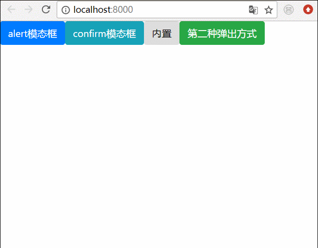
3. Endgültiger Effekt
us Schreiben Sie alle oben genannten Popup-Boxen zusammen , und der Effekt wird so sein
Verwandte Empfehlungen:
BootStrap-Modalbox ist nicht vertikal zentriert So lösen Sie
Bootstrap-Modalbox-Verschachtelung, Tabindex-Attribut und Schattenentfernungsmethode
Detaillierte Erläuterung der Verwendung von Bootstrap3-dialog-master-Modalboxen
Das obige ist der detaillierte Inhalt vonZwei Möglichkeiten, ein modales Feld in Angular anzuzeigen. Für weitere Informationen folgen Sie bitte anderen verwandten Artikeln auf der PHP chinesischen Website!
In Verbindung stehende Artikel
Mehr sehen- Eine eingehende Analyse der Bootstrap-Listengruppenkomponente
- Detaillierte Erläuterung des JavaScript-Funktions-Curryings
- Vollständiges Beispiel für die Generierung von JS-Passwörtern und die Erkennung der Stärke (mit Download des Demo-Quellcodes)
- Angularjs integriert WeChat UI (weui)
- Wie man mit JavaScript schnell zwischen traditionellem Chinesisch und vereinfachtem Chinesisch wechselt und wie Websites den Wechsel zwischen vereinfachtem und traditionellem Chinesisch unterstützen – Javascript-Kenntnisse