
Heim >Web-Frontend >H5-Tutorial >Reines HTML5+CSS3 zum Backen einer Geburtstagstorte (Code ist leicht zu verstehen)
Reines HTML5+CSS3 zum Backen einer Geburtstagstorte (Code ist leicht zu verstehen)

- 黄舟Original
- 2017-02-21 13:20:365887Durchsuche
Lassen Sie mich ohne weitere Umschweife zunächst die Darstellungen zeigen: 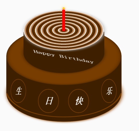
Der Kuchen ist in drei Teile unterteilt, den unteren Kuchen, den oberen Kuchen und den Kerzenteil. Auch die Layoutstruktur von HTML ist nach diesen drei Teilen aufgebaut. Die andere besteht darin, CSS-Positionierung und CSS3-Rotation, innere und äußere Schatten und andere Effekte zu verwenden, um den Stil einiger DOM-Elemente anzupassen. Es ist relativ einfach, ich glaube, alle Programmierer verstehen es.
Ich werde nicht näher auf andere Dinge eingehen.
Der vollständige HTML- und CSS-Code ist unten angegeben
<!DOCTYPE html>
<html>
<head lang="en">
    <meta charset="UTF-8">
    <title></title>
    <style>
        .birthday .container{
            width:600px;
            height:600px;
            margin:0px auto;
            background: #fafafa;
            border-radius:5px;
            position: relative;
        }
        /**
       ** 顶层的
       **/
        .birthday .top-one{
            position: absolute;
            width:280px;
            height: 280px;
            bottom: 200px;
            left:160px;
        }
        .birthday .top-one .bottom{
            position: absolute;
            width:280px;
            height: 280px;
            bottom:-30px;
            border:1px solid #3e2001;
            border-radius: 140px;
            transform: rotateX(60deg);
            z-index: 4;
            background: #3e2001;
            box-shadow: 0px 0px 20px #3e2001;
        }
        .birthday .top-one .top{
            position: absolute;
            width:280px;
            height: 280px;
            top:-50px;
            border-radius: 140px;
            background: #FFFFFF;
            transform: rotateX(60deg);
            box-shadow: 2px 2px 20px #b7b7b7;
            z-index: 6;
            background: -webkit-repeating-radial-gradient(circle, #783d01, #3e2001 10px, #914909 10px,white 20px);
            background: -moz-repeating-radial-gradient(circle, #783d01, #3e2001 10px,#914909 10px,white 20px);
        }
        .birthday .top-one .side{
            position: absolute;
            top:95px;
            width:280px;
            height: 70px;
            border:1px solid #3e2001;
            border-top-width: 0px;
            border-bottom-width: 0px;
            background: #FFFFFF;
            z-index: 5;
            background: #3e2001;
        }
        /**
        ** 底层的
        **/
        .birthday .bottom-one{
            position: absolute;
            width:400px;
            height: 400px;
            bottom: 0px;
            left:100px;
        }
        .birthday .bottom-one .bottom{
            position: absolute;
            width:400px;
            height: 400px;
            bottom:-30px;
            border:1px solid #914909;
            border-radius: 200px;
            transform: rotateX(60deg);
            box-shadow: 2px 2px 20px #914909;
            z-index: 1;
            background: #3e2001;
            overflow: hidden;
        }
        .birthday .bottom-one .line{
            position: absolute;
            width:400px;
            height: 400px;
            border-radius: 200px;
            z-index: 1;
        }
        .birthday .bottom-one .line1{
            bottom: 30px;
            border:5px solid #783d01;
            left:-5px;
            z-index: 1;
        }
        .birthday .bottom-one .top{
            position: absolute;
            width:400px;
            height: 400px;
            top:-100px;
            border:1px solid #3e2001;
            border-radius: 200px;
            background: #FFFFFF;
            transform: rotateX(60deg);
            z-index: 3;
            background: #783d01;
            box-shadow: inset 0px 0px 20px #3e2001;
        }
        .birthday .bottom-one .side{
            position: absolute;
            top:100px;
            width:400px;
            height: 130px;
            border:1px solid #3e2001;
            border-top-width: 0px;
            border-bottom-width: 0px;
            background: #3e2001;
            z-index: 2;
        }
        /**
        ** 底层的文字
        **/
        .birthday .flower{
            position: relative;
            text-align: justify;
            z-index: 9;
            top:200px;
            font-size: 32px;
            font-family: "Helvetica Neue", "Noto Sans CJK SC", "Source Han Sans CN";
            color:#FFFFFF;
            font-weight: bold;
        }
        .birthday .flower:after{
            content:"";
            display:inline-block;
            position: relative;
            width:100%;
        }
        .birthday .flower i{
            position: relative;
            width:80px;
            line-height: 80px;
            display: inline-block;
            border-radius: 50%;
            border:2px solid #783d01;
            text-align: center;
        }
        /**
        ** 顶层的文字
        **/
        .birthday .top-one .text{
            width:100%;
            text-align: center;
            position: absolute;
            top:165px;
            z-index: 9;
            margin:0px auto;
            font-size: 30px;
            color:#FFFFFF;
            transform: rotateX(60deg) skew(10deg,20deg);
        }
        /**
         ** 蜡烛
        **/
        .birthday .candle{
            width:10px;
            height:80px;
            margin:0px auto;
            position: absolute;
            left:295px;
            top:130px;
            z-index: 9;
        }
        .birthday .candle .body{
            width:10px;
            height:70px;
            margin:0px auto;
            background: red;
            border-bottom-width: 0px;
        }
        .birthday .candle .top{
            width:10px;
            height: 10px;
            border-radius: 5px;
            transform: rotateX(60deg);
            position: relative;
            top:5px;
            background: red;
        }
        .birthday .candle .bottom{
            width:10px;
            height: 10px;
            border-radius: 5px;
            transform: rotateX(60deg);
            position: relative;
            bottom:5px;
            background: red;
            box-shadow: 1px 1px 10px red;
        }
        .birthday .candle .fire{
            position: absolute;
            width:6px;
            height: 6px;
            left:2px;
            transform: rotate(45deg);
            background: #ffd507;
            box-shadow: 0px 0px 20px #ffff00, 2px 2px 10px red;
        }
    </style>
</head>
<body>
    <p class="birthday">
        <p class="container">
            <p class="candle">
                <p class="fire"></p>
                <p class="top"></p>
                <p class="body"></p>
                <p class="bottom"></p>
            </p>
            <p class="top-one">
                <p class="top"></p>
                <p class="side"></p>
                <p class="bottom"></p>
                <p class="text">
                    Happy Birthday
                </p>
            </p>
            <p class="bottom-one">
                <p class="top"></p>
                <p class="side"></p>
                <p class="bottom">
                    <p class="line line1"></p>
                </p>
                <p class="flower">
                    <i style="top:-20px;transform: rotateY(50deg)">生</i>
                    <i style="top:15px;transform: rotateY(30deg)">日</i>
                    <i style="top:15px;transform: rotateY(30deg)">快</i>
                    <i style="top:-20px;transform: rotateY(50deg)">乐</i>
                </p>
            </p>
        </p>
    </p>
</body>
</html>
Das Obige ist der Inhalt der Herstellung einer Geburtstagstorte mit reinem HTML5+CSS3 (der Code ist leicht zu verstehen) und mehr Weitere verwandte Inhalte finden Sie auf der chinesischen PHP-Website (www.php.cn)!
In Verbindung stehende Artikel
Mehr sehen- Das Vollbild-Bildlauf-Plug-in AlloyTouch erstellt in 30 Sekunden eine flüssige H5-Seite
- Tatsächlicher HTML5-Kampf und Analyse von Touch-Ereignissen (Touchstart, Touchmove und Touchend)
- Ausführliche Erläuterung der Beispiele für Bildzeichnungen in HTML5 Canvas 9
- Reguläre Ausdrücke und neue HTML5-Elemente
- So kombinieren Sie NodeJS und HTML5, um mehrere Dateien per Drag-and-Drop auf den Server hochzuladen