CSS3 text effects
1. How to use the text-shadow attribute
The method of using the text-shadow attribute is as follows.
text-shadow:length length length color
Among them, the first three lengths refer to the horizontal distance of the shadow from the text, the vertical distance of the shadow from the text and the blur radius of the shadow, color Refers to the color of the shadow.
The following is an example of using the text-shadow attribute. In this example, a block of red text is shaded gray. The horizontal and vertical distances between the shadow and the text are both 5 pixels.
.wrap{
text-shadow:5px 5px 5px gray;
color:red;font-size:50px;
font-weight:bold;
}
2. Specify multiple shadows
You can use the text-shadow attribute to specify multiple shadows for text, and use different colors for each shadow.
When specifying multiple shadows, use commas to separate multiple shadows. So far, only Firefox, Chrome and Opera browsers support this feature.
Sample code
Specifies orange, yellow, and green shadows for the text in sequence, and also specifies the appropriate positions for these shadows.
.wrap {
  text-shadow:10px 10px #f39800,40px 35px #fff100,70px 60px #c0ff00;
color:navy;
font-size:50px;
font-weight:bold;
}
Automatic line wrapping
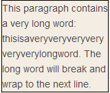
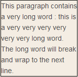
If the word is too long, it may not exceed a certain area:

In CSS3, the word-wrap attribute Allows you to allow text to force text to wrap - even if this means splitting words:

Allows long words to be split and wrapped to the next line:
p {word-wrap:break-word;}
New textProperties
##Properties #Description #CSS
hanging-punctuation Specifies whether punctuation characters are outside the wireframe. 3
# Punch-Trim stipulates whether to trim the punctuation character. 3
Text-Align-Last setting how to align the last line or before the mandatory rune. 3
text-emphasis Applies an emphasis mark and the emphasis mark’s foreground color to the element’s text.
text-justify Specifies the alignment method used when text-align is set to "justify". 3 3
# Text-OVERFLOW stipulates what happens when text overflows the element. 3
Text-shadow add shadows to the text. 3
TEXT-WRAP specifies the rules for changing the text. 3
## This Word-Break regulations stipulate that non-Chinese-Japanese and Korean texts are replaced. 3 3 3 3 Allows to segments and switch to the next line. Next Section