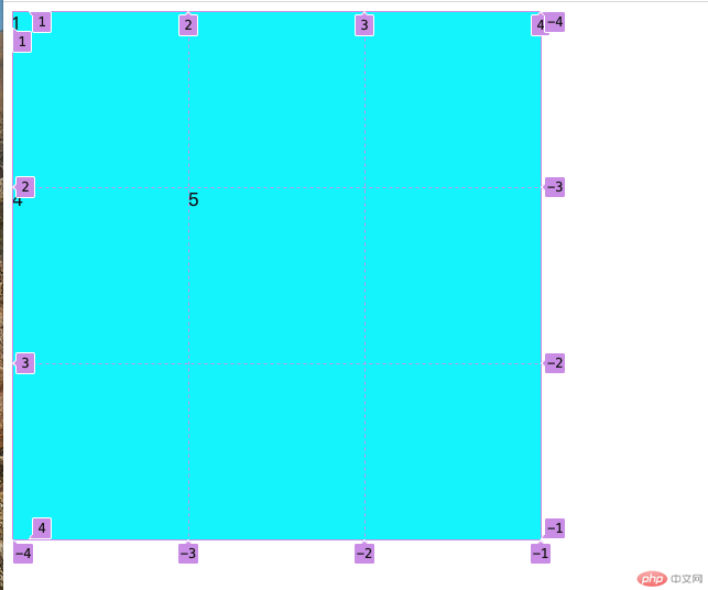
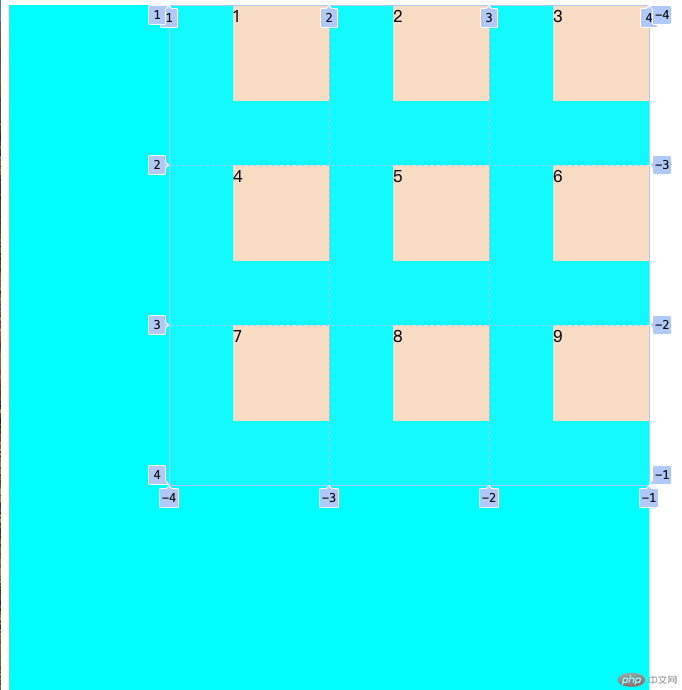
grid容器
grid-template-columns/rows 生成单元格
<div class="container"> <div class="item"></div> <div class="item"></div> <div class="item"></div> <div class="item"></div> <div class="item"></div> </div>
grid-template-columns: 10em 10em 10em; grid-template-rows: 10em 10em 10em;
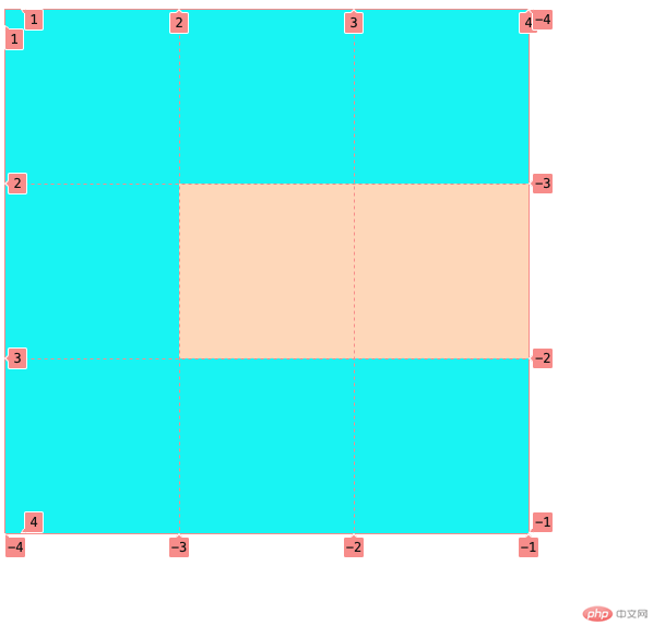
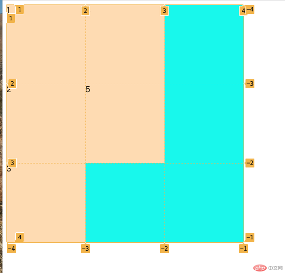
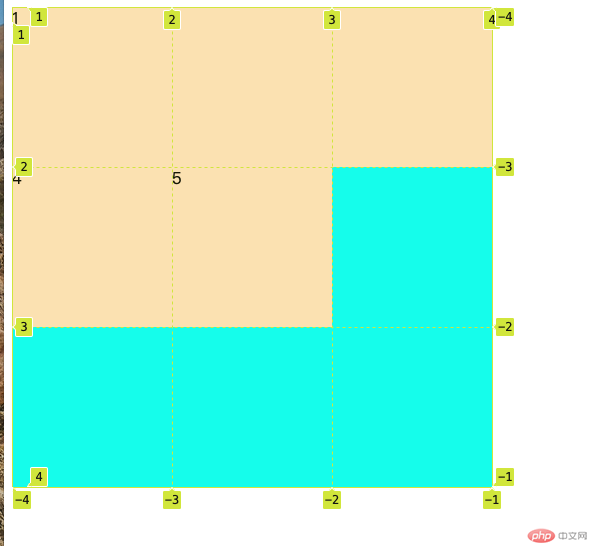
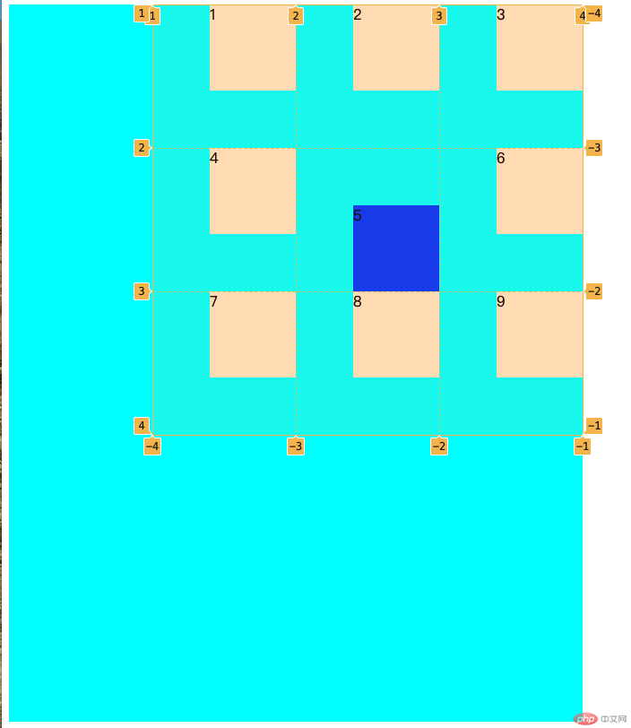
移动 单元格 到指定位置
.container > .item:first-of-type{ background-color: bisque; grid-row: 2 /3; grid-column: 2 /4; }
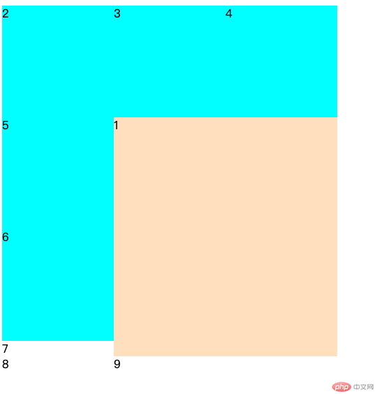
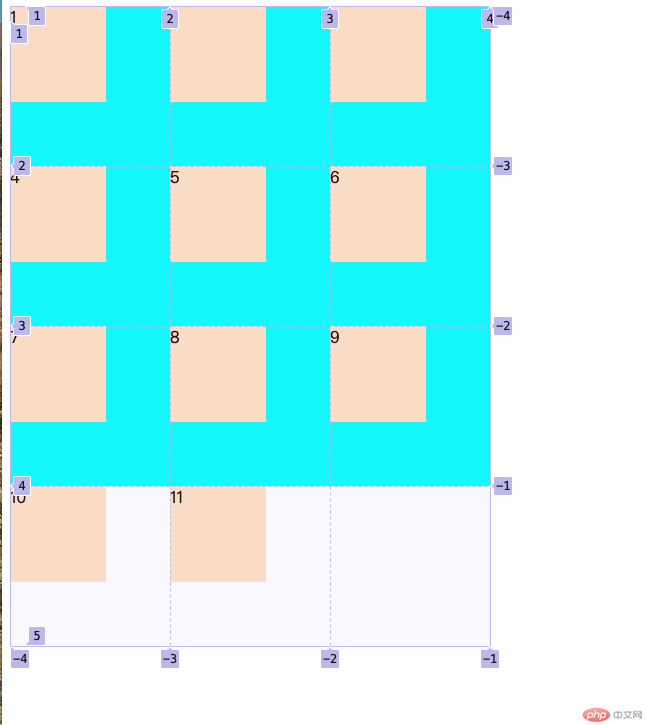
grid-area
grid-area: 2 / 2 / span 3 / span 2;
grid-auto-flow
grid-auto-flow: row; grid-auto-flow: column;
列
行
grid-auto-rows
自动 设置大小
grid-auto-rows: 10em;
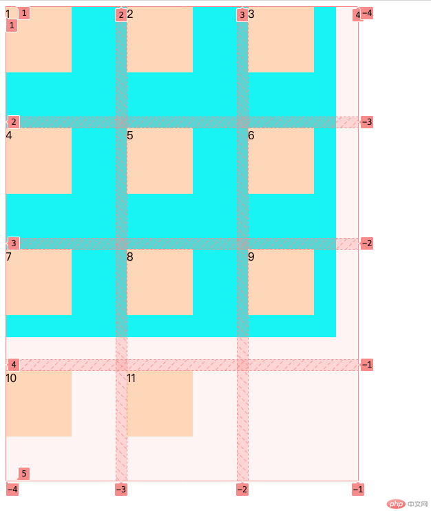
gap
设置行列间距
gap:1em;
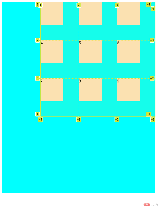
place-content
剩余空间排列
place-content:start right;
place-items
网络 单元格 对齐
place-items: start right;
place-self
指定对齐
place-self:end right;
