
实例演示 BFC 的三个作用
bfc:使当前元素不受当前文档流约束
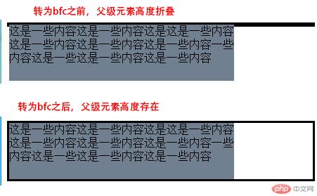
实例演示 BFC 的三个作用:1.能够清除浮动
<!DOCTYPE html><html lang=""><head><meta charset="UTF-8"><meta name="viewport" content="width=device-width, initial-scale=1.0"><title>实例演示BFC的三个作用:1.能够清除浮动 </title><style>* {/* margin: 0;padding: 0; */box-sizing: border-box;}.content{border: 3px solid #000;}.content > .box{width: 20em;height: 5em;background-color: slategrey;float: left;}/* 使用浮动会导致父级容器content的高度折叠/消失 *//* 解决方案: */.content{overflow: hidden;}/* 使用这个方法包含住浮动元素,使父级存在高度 */</style></head><body><div class="content"><div class="box">这是一些内容这是一些内容这是这是一些内容这是一些内容这是一些内容这是一些内容一些内容这是一些这是一些内容这是一些内容</div></div></body></html>
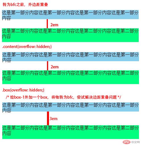
实例演示 BFC 的三个作用:2.能够不使垂直方向上的外边距折叠
<!DOCTYPE html><html lang=""><head><meta charset="UTF-8"><meta name="viewport" content="width=device-width, initial-scale=1.0"><title>实例演示BFC的三个作用:2.能够不使垂直方向上的外边距折叠 </title></head><style>* {/* margin: 0;padding: 0; */box-sizing: border-box;}.box-1{width: 30em;height: 10em;background-color: skyblue;margin-bottom: 1em;}.box-2{width: 30em;height: 10em;background-color: springgreen;margin-top: 2em;}/* 测试显示:box-1中的下外边距和box-2中的上外边距重叠,只显示共计2em的外边距。 */.content{overflow: hidden;}/* 将父级元素content转为bfc,尝试解决边距重叠问题 *//* 结果:失败 */.box{overflow: hidden;}/* 给box-1外加一个box,将他转为bfc,尝试解决边距重叠问题 *//* 结果:成功 */</style><body><div class="content"><div class="box"><div class="box-1">这是第一部分内容这是第一部分内容这是第一部分内容这是第一部分内容</div></div><div class="box-2">这是第二部分内容这是第二部分内容这是第二部分内容这是第二部分内容</div></div></body></html>
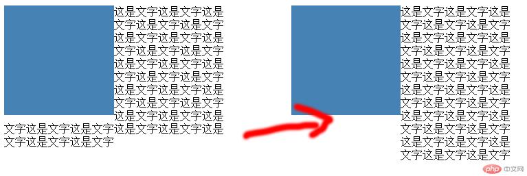
实例演示 BFC 的三个作用:3.不受外部浮动元素的影响
<!DOCTYPE html><html lang=""><head><meta charset="UTF-8"><meta name="viewport" content="width=device-width, initial-scale=1.0"><title>实例演示BFC的三个作用:3.不受外部浮动元素的影响 </title></head><style>* {/* margin: 0;padding: 0; */box-sizing: border-box;}.content{width: 20em;}.img{width: 10em;height: 10em;background-color: steelblue;float: left;}/* 加个浮动,box中文字围绕img进行排列,实现图文混排的效果 *//* bfc的第三个作用就是使后面的元素不受前面浮动的影响 */.box{overflow: hidden;}/* 使box自成bfc,不受外部的浮动元素影响 */</style><body><div class="content"><div class="img"></div><div class="box">这是文字这是文字这是文字这是文字这是文字这是文字这是文字这是文字这是文字这是文字这是文字这是文字这是文字这是文字这是文字这是文字这是文字这是文字这是文字这是文字这是文字这是文字这是文字这是文字这是文字这是文字这是文字这是文字这是文字这是文字</div></div></body></html>
flex 容器常用的四个属性, 并实例演示,配图。
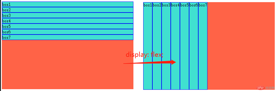
转为 flex 盒子
<!DOCTYPE html><html lang=""><head><meta charset="UTF-8"><meta name="viewport" content="width=device-width, initial-scale=1.0"><title>将盒子转化为flex容器</title><style>.content{width: 30em;height: 20em;background-color: tomato;/* 转为弹性容器 *//* display: flex; *//* 弹性容器中的项目顺着主轴方向进行排列(主轴默认是水平方向的) */}.content > .box{background-color: turquoise;border: blue 1px solid;}</style></head><style></style><body><div class="content"><div class="box">box1</div><div class="box">box2</div><div class="box">box3</div><div class="box">box4</div><div class="box">box5</div><div class="box">box6</div><div class="box">box7</div></div></body></html>
flex 容器常用的四个属性
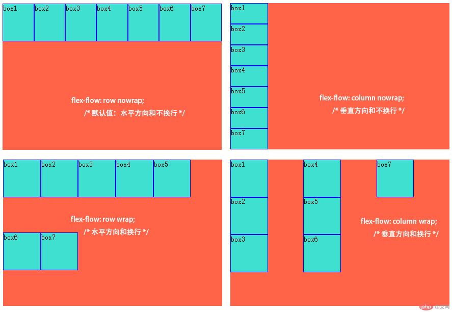
1.flex-flow 主轴方向和换行方式
<!DOCTYPE html><html lang=""><head><meta charset="UTF-8" /><meta name="viewport" content="width=device-width, initial-scale=1.0" /><title>flex容器常用的四个属性, 1.flex-flow主轴方向和换行方式</title><style>.content {width: 30em;height: 20em;background-color: tomato;/* 转为弹性容器 */display: flex;/* 弹性容器中的项目顺着主轴方向进行排列(主轴默认是水平方向的) */}.content > .box {background-color: turquoise;border: blue 1px solid;width: 5em;height: 5em;}.content {flex-flow: row nowrap;/* 默认值:水平方向和不换行 */flex-flow: column nowrap;/* 垂直方向和不换行 */flex-flow: row wrap;/* 水平方向和换行 */flex-flow: column wrap;/* 垂直方向和换行 */}</style></head><style></style><body><div class="content"><div class="box">box1</div><div class="box">box2</div><div class="box">box3</div><div class="box">box4</div><div class="box">box5</div><div class="box">box6</div><div class="box">box7</div></div></body></html>
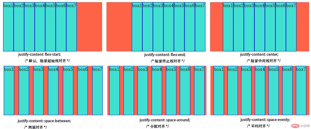
2.项目在主轴上的对齐方式
<!DOCTYPE html><html lang=""><head><meta charset="UTF-8" /><meta name="viewport" content="width=device-width, initial-scale=1.0" /><title>flex容器常用的四个属性:2.项目在主轴上的对齐方式</title><style>.content {width: 20em;height: 10em;background-color: tomato;display: flex;}.content > .box {background-color: turquoise;border: blue 1px solid;}.content {justify-content: flex-start;/* 默认,贴紧起始线对齐 */justify-content: flex-end;/* 贴紧终止线对齐 */justify-content: center;/* 贴紧中间线对齐 */}/* 进行整体分配 */.content {justify-content: space-between;/* 两端对齐 */justify-content: space-around;/* 分散对齐 */justify-content: space-evenly;/* 平均对齐 */}/* 将每个项目作为单独个体进行分配 */</style></head><style></style><body><div class="content"><div class="box">box1</div><div class="box">box2</div><div class="box">box3</div><div class="box">box4</div><div class="box">box5</div><div class="box">box6</div><div class="box">box7</div></div></body></html>
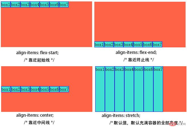
3.项目在交叉轴上的对齐方式
<!DOCTYPE html><html lang=""><head><meta charset="UTF-8" /><meta name="viewport" content="width=device-width, initial-scale=1.0" /><title>flex容器常用的四个属性:3.项目在交叉轴上的对齐方式</title><style>.content {width: 20em;height: 10em;background-color: tomato;/* 转为弹性容器 */display: flex;/* 弹性容器中的项目顺着主轴方向进行排列(主轴默认是水平方向的) */}.content > .box {background-color: turquoise;border: blue 1px solid;}.content {align-items: flex-start;/* 靠近起始线 */align-items: flex-end;/* 靠近终止线 */align-items: center;/* 靠近中间线 */align-items: stretch;/* 默认值,默认充满容器的全部高度 */}</style></head><style></style><body><div class="content"><div class="box">box1</div><div class="box">box2</div><div class="box">box3</div><div class="box">box4</div><div class="box">box5</div><div class="box">box6</div><div class="box">box7</div></div></body></html>
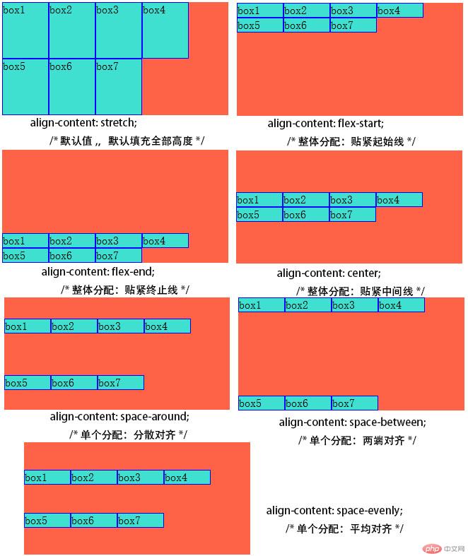
4.项目在多行容器中的对齐方式
<!DOCTYPE html><html lang=""><head><meta charset="UTF-8" /><meta name="viewport" content="width=device-width, initial-scale=1.0" /><title>flex容器常用的四个属性:4.项目在多行容器中的对齐方式</title><style>.content {width: 20em;height: 10em;background-color: tomato;/* 转为弹性容器 */display: flex;/* 弹性容器中的项目顺着主轴方向进行排列(主轴默认是水平方向的) */}.content > .box {width: 4em;background-color: turquoise;border: blue 1px solid;}.content {flex-flow: row wrap;/* 先转为多行文本 */align-content: stretch;/* 默认值,,默认填充全部高度 */align-content: flex-start;/* 整体分配:贴紧起始线 */align-content: flex-end;/* 整体分配:贴紧终止线 */align-content: center;/* 整体分配:贴紧中间线 */align-content: space-around;/* 单个分配:分散对齐 */align-content: space-between;/* 单个分配:两端对齐 */align-content: space-evenly;/* 单个分配:平均对齐 */}</style></head><style></style><body><div class="content"><div class="box">box1</div><div class="box">box2</div><div class="box">box3</div><div class="box">box4</div><div class="box">box5</div><div class="box">box6</div><div class="box">box7</div></div></body></html>