
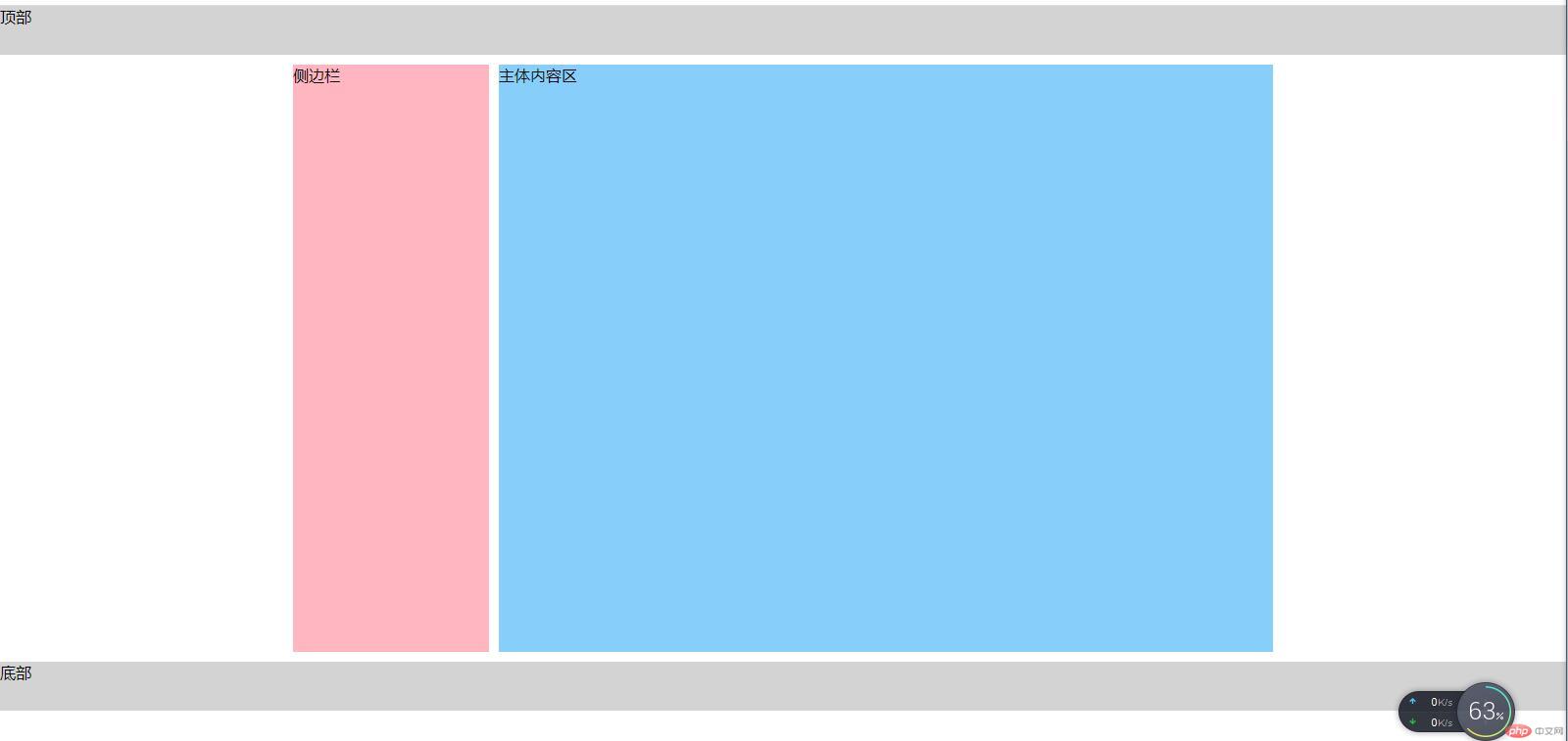
1. 基于浮动的二列布局
示例如下:
<style>/* 初始化 */* {margin: 0;padding: 0;box-sizing: border-box;}/* 给顶部和底部设置一个固定高度 */header,footer {height: 50px;background-color: lightgray;}/* 给侧边栏和主体内容区设置最小高度,把空间撑开 */aside,main {min-height: 600px;}/*设置中间区域父容器的宽度,毕竟中间区域大部分时候不需要那么宽的内容来显示,让父容器的上下外边距为10px,留点间隙,然后水平居中,设置overflow属性,去掉子元素浮动产生的影响*/.container {width: 1000px;margin: 10px auto;overflow: hidden;}/* 侧边栏设置一个固定宽度,然后左浮动 */aside {background-color: lightpink;width: 200px;float: left;}/*主体内容区设置固定宽度,值为父容器宽度-侧边栏宽度-10px,这个10px是用来让两个区域之间产生间隙的,然后右浮动*/main {background-color: lightskyblue;width: 790px;float: right;}</style><body><header>顶部</header><div class="container"><aside>侧边栏</aside><main>主体内容区</main></div><footer>底部</footer></body>
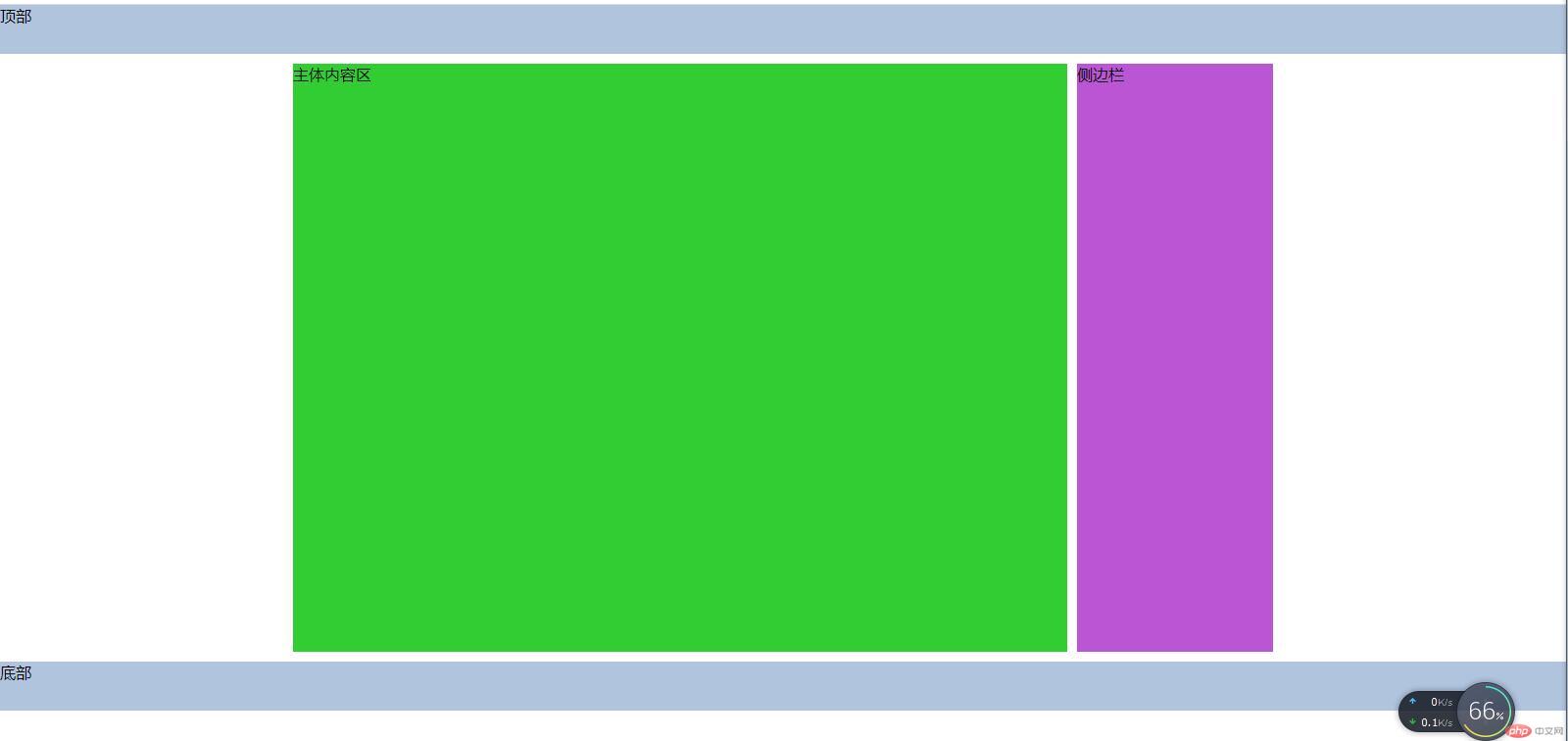
2. 基于定位的二列布局
示例如下:
<style>/* 初始化 */* {margin: 0;padding: 0;box-sizing: border-box;}/* 给顶部和底部设置相同的固定高度 */header,footer {height: 50px;background-color: lightsteelblue;}/*设置中间区域父容器的宽度,上下外边距为10px,留点间隙,水平居中,给父级加上定位特征,便于对子元素使用绝对定位布局,设置父容器最小高度,避免子元素使用绝对定位后产生塌陷现象*/.container {width: 1000px;margin: 10px auto;position: relative;min-height: 600px;}/* 对父容器中的子元素设置最小高度,继承父元素 */main,aside {min-height: inherit;}/*对主体内容区使用绝对定位,默认在父容器的左上角,不要设置偏移量,设置主体内容区的宽度*/main {background-color: limegreen;width: 790px;position: absolute;}/*对侧边栏使用绝对定位,top是默认为0,设置right为0后就显示在右上角了,设置侧边栏宽度,值为父容器宽度-主体内容区宽度-10px,10px是为了留有中间间隙*/aside {background-color: mediumorchid;width: 200px;position: absolute;right: 0;}</style><body><header>顶部</header><div class="container"><main>主体内容区</main><aside>侧边栏</aside></div><footer>底部</footer></body>
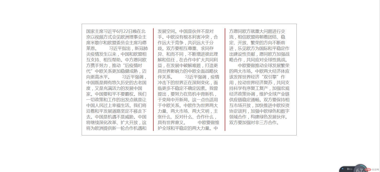
3. 内容的多栏/列显示
示例如下:
<style>/* 初始化 */* {margin: 0;padding: 0;box-sizing: border-box;}/*获取根元素,修改文档中的字体大小和颜色,用html元素选择器获取当然可以,不过习惯用伪元素:root,它不仅可以获取html中的根元素,也可以获取xml的根元素,功能更强大,优先级也更高*//* html */:root {font-size: 18px;color: gray;}/*设置盒子的内边距,边框线,宽度,外边距,水平居中,取值用rem的方式更为规范,也更为简单,表示相对默认字体的倍数,比如:padding:1rem;表示内边距是默认字体大小的一倍,就是18px,若是2rem,就是36px*/div {padding: 1rem;border: 1px solid;width: 50rem;margin: 100px auto;}/* 设置分列显示 */div {/*column-count:表示分几列显示,column-width:表示每列的宽度,这两个属性可以只设置其中一个,另外一个属性取值为auto,若要同时设置,则按CSS层叠样式规则显示*/column-count: 3;column-width: auto;/*column-rule-width:表示分割线的粗细column-rule-style:表示分割线的线条样式,比如实线或者虚线等column-rule-color:表示分割线的颜色*/column-rule-width: 2px;column-rule-style: solid;column-rule-color: red;/* 这是分割线样式的简写属性,和border的用法一样 */column-rule: 2px solid red;/* column-gap:表示每列之间的间距 */column-gap: 2rem;}</style><body><div>国家主席习近平6月22日晚在北京以视频方式会见欧洲理事会主席米歇尔和欧盟委员会主席冯德莱恩。习近平指出,新冠肺炎疫情发生以来,中国和欧盟相互支持、相互帮助。中方愿同欧方携手努力,推动“后疫情时代”中欧关系更加稳健成熟,迈向更高水平。习近平强调,中国既是拥有悠久历史的古老国度,又是充满活力的发展中国家。中国要和平不要霸权。我们一切政策和工作的出发点就是让中国人民过上幸福生活。我们将沿着和平发展道路坚定不移走下去。中国是机遇不是威胁。中国将继续深化改革、扩大开放,这将为欧洲提供新一轮合作机遇和发展空间。中国是伙伴不是对手。中欧没有根本利害冲突,合作远大于竞争,共识远大于分歧。双方要相互尊重、求同存异、和而不同,不断增进彼此理解和信任,在合作中扩大共同利益,在发展中破解难题,打造更具世界影响力的中欧全面战略伙伴关系。习近平强调,疫情冲击下的世界正在深刻变化,面临更多不稳定不确定因素。我曾提出,要努力在危机中育新机,于变局中开新局。这一点也适用于中欧关系。中欧作为世界两大力量、两大市场、两大文明,主张什么、反对什么、合作什么,具有世界意义。中欧要做维护全球和平稳定的两大力量。中方愿同欧方就重大问题进行交流,相信欧盟将朝着团结、稳定、开放、繁荣的方向不断前进,乐见欧方为国际和平稳定作出建设性贡献,愿同欧方加强战略合作,共同应对全球性挑战。中欧要做推动全球发展繁荣的两大市场。中欧两大经济体应该发挥世界经济“双引擎”作用,拉动世界经济复苏,共同支持科学有序复工复产,加强宏观经济政策协调,维护全球产业链供应链稳定通畅。双方要保持相互市场开放,加快推进中欧投资协定谈判,加强中欧绿色和数字领域合作,构建绿色发展伙伴。双方要加强对非三方合作。</div></body>
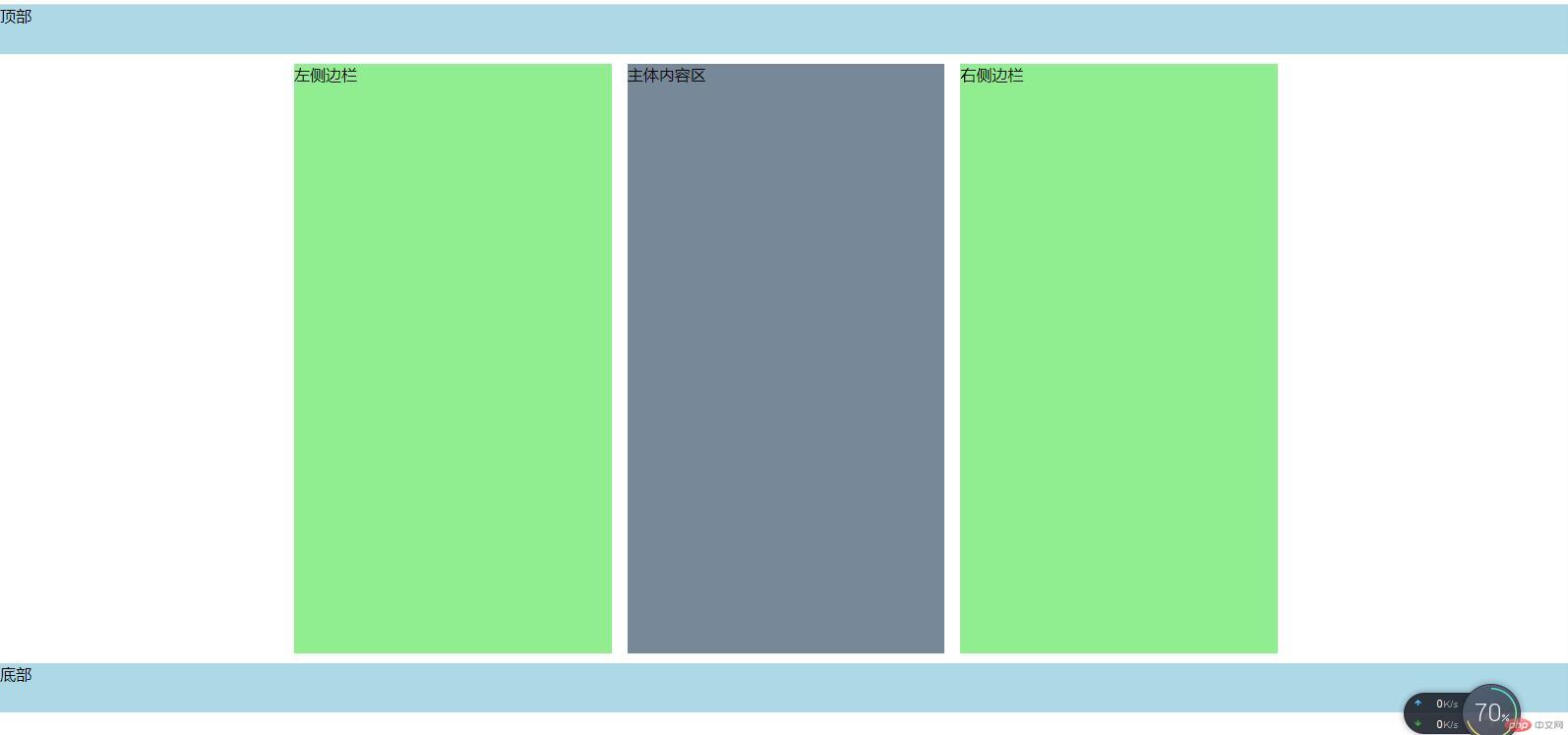
4. 多栏/多列布局页面
这种布局只适合中间内容等宽的情况,示例如下:
<style>/* 初始化 */* {margin: 0;padding: 0;box-sizing: border-box;}/* 设置顶部和底部固定高度 */header,footer {height: 50px;background-color: lightblue;}/* 设置侧边栏和主体内容区最小高度 */aside,main {min-height: 600px;}/*设置中间父容器宽度,上下外边距,水平居中,因为中间区域有三块,所以这里我分三列显示*/.container {width: 1000px;margin: 10px auto;/* 分列显示 */column-count: 3;}aside {background-color: lightgreen;}main {background-color: lightslategray;}</style><body><header>顶部</header><div class="container"><aside>左侧边栏</aside><main>主体内容区</main><aside>右侧边栏</aside></div><footer>底部</footer></body>
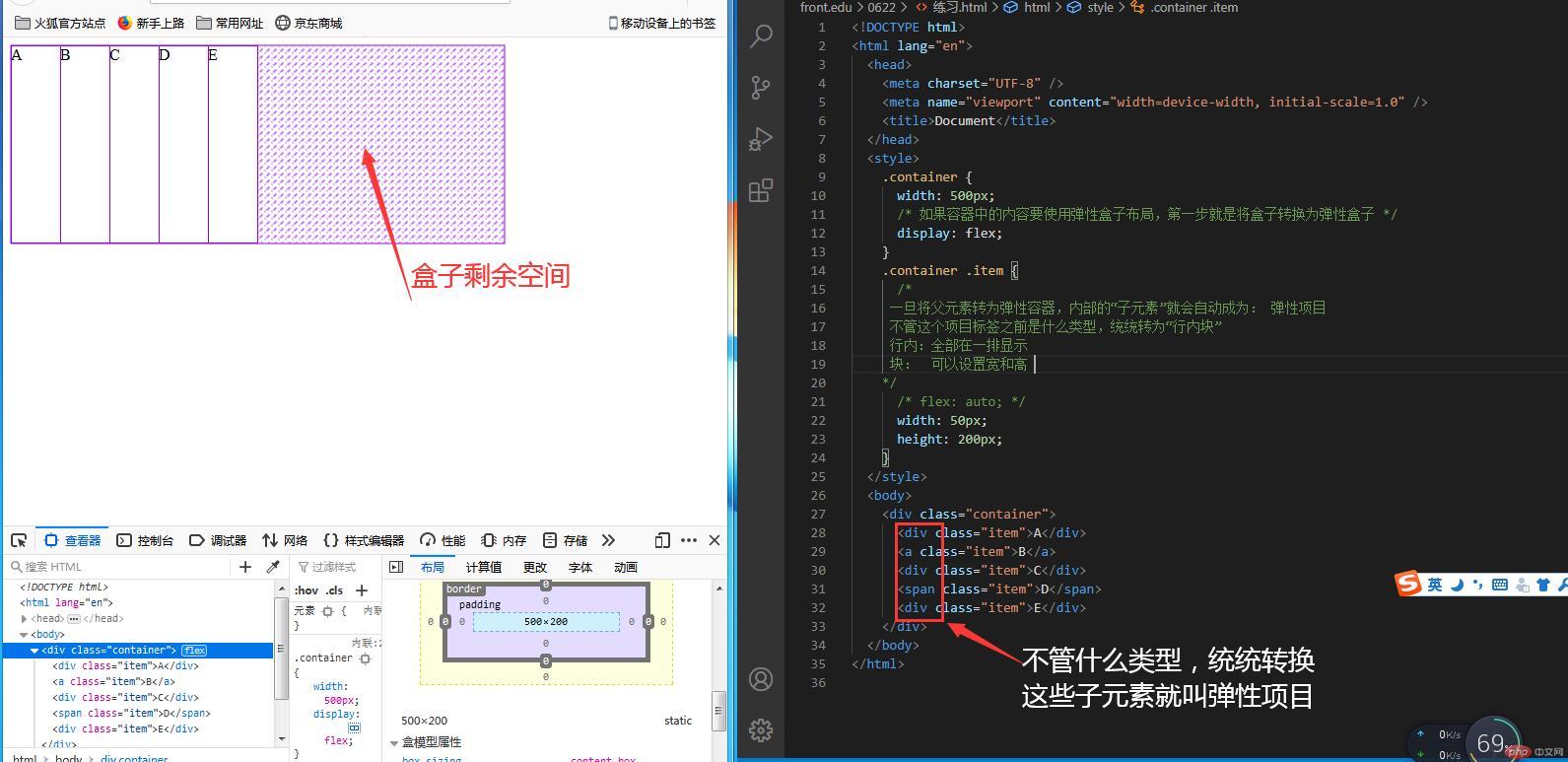
5. Flex Box(弹性盒快速预览)
需要用到火狐浏览器,打开控制台来测试效果,示例如下:
<style>.container {width: 500px;/* 如果容器中的内容要使用弹性盒子布局,第一步就是将盒子转换为弹性盒子 */display: flex;}.container .item {/*一旦将父元素转为弹性容器,内部的“子元素”就会自动成为: 弹性项目不管这个项目标签之前是什么类型,统统转为“行内块”行内:全部在一排显示块: 可以设置宽和高*//* flex: auto; */width: 50px;height: 200px;}</style><body><div class="container"><div class="item">A</div><a class="item">B</a><div class="item">C</div><span class="item">D</span><div class="item">E</div></div></body>
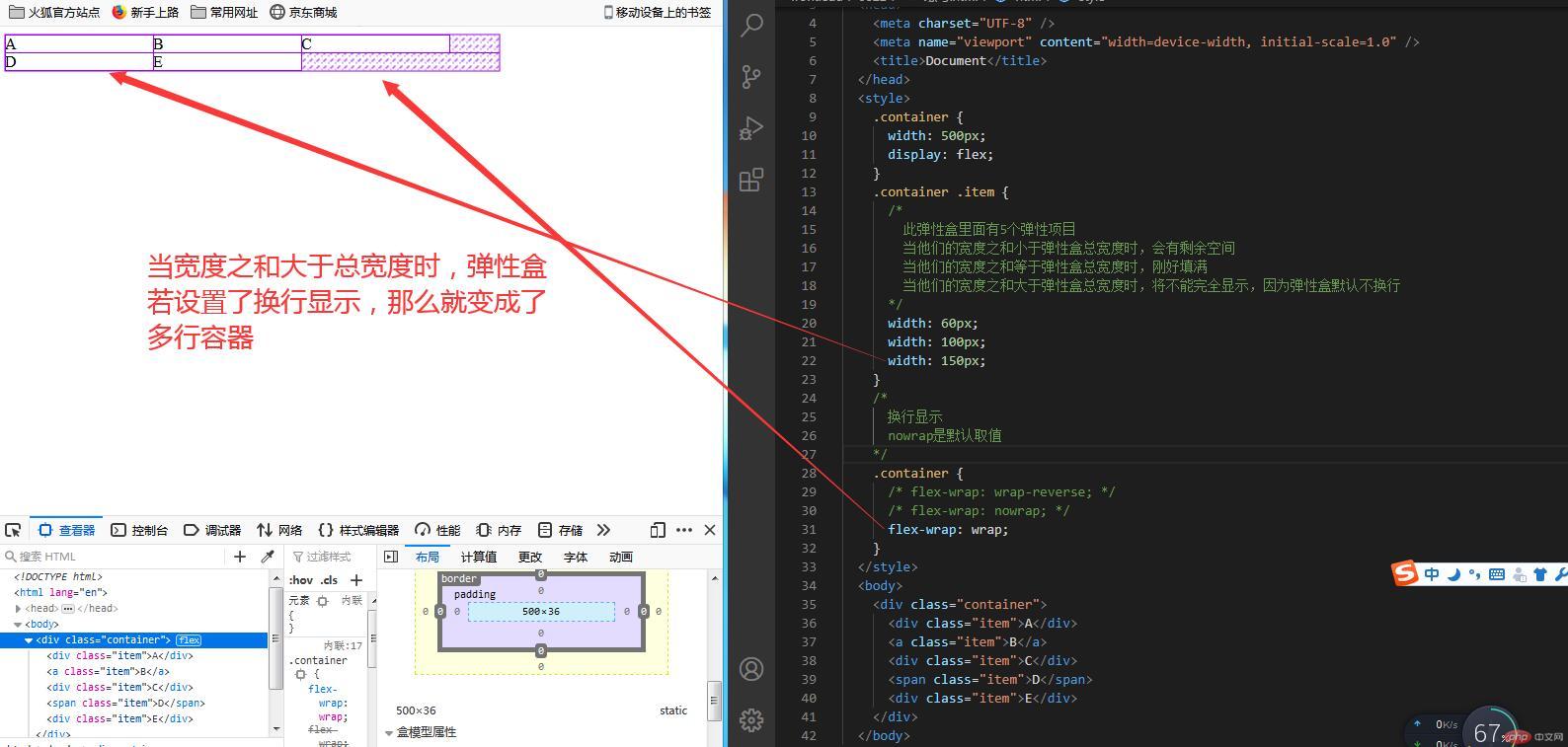
6. Flex Box多行容器
示例如下:
<style>.container {width: 500px;display: flex;}.container .item {/*此弹性盒里面有5个弹性项目当他们的宽度之和小于弹性盒总宽度时,会有剩余空间当他们的宽度之和等于弹性盒总宽度时,刚好填满当他们的宽度之和大于弹性盒总宽度时,将不能完全显示,因为弹性盒默认不换行*/width: 60px;width: 100px;width: 150px;}/*换行显示nowrap是默认取值*/.container {/* flex-wrap: wrap-reverse; *//* flex-wrap: nowrap; */flex-wrap: wrap;}</style><body><div class="container"><div class="item">A</div><a class="item">B</a><div class="item">C</div><span class="item">D</span><div class="item">E</div></div></body>
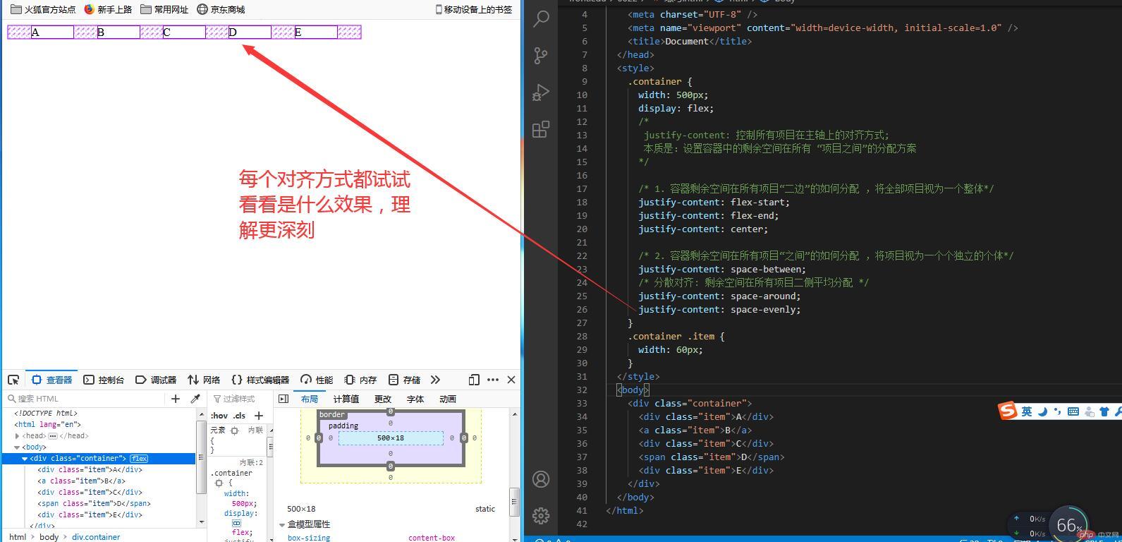
7. 单行容器中的项目对齐方式
示例如下:
<style>.container {width: 500px;display: flex;/*justify-content: 控制所有项目在主轴上的对齐方式;本质是:设置容器中的剩余空间在所有 “项目之间”的分配方案*//* 1. 容器剩余空间在所有项目“二边”的如何分配 ,将全部项目视为一个整体*/justify-content: flex-start;justify-content: flex-end;justify-content: center;/* 2. 容器剩余空间在所有项目“之间”的如何分配 ,将项目视为一个个独立的个体*/justify-content: space-between;/* 分散对齐: 剩余空间在所有项目二侧平均分配 */justify-content: space-around;justify-content: space-evenly;}.container .item {width: 60px;}</style><body><div class="container"><div class="item">A</div><a class="item">B</a><div class="item">C</div><span class="item">D</span><div class="item">E</div></div></body>
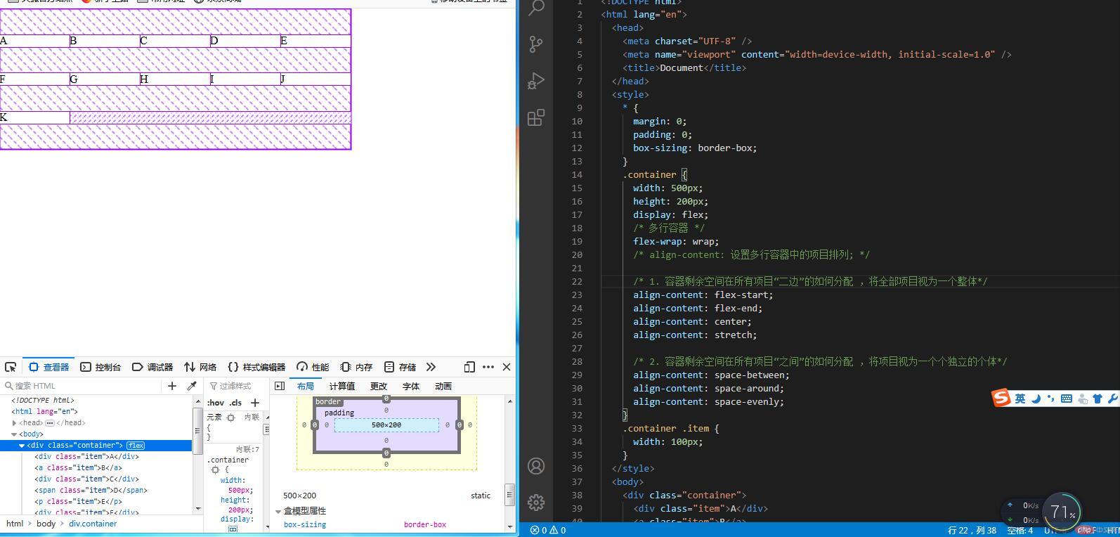
8. 多行容器中的项目对齐方式
示例如下:
<style>* {margin: 0;padding: 0;box-sizing: border-box;}.container {width: 500px;height: 200px;display: flex;/* 多行容器 */flex-wrap: wrap;/* align-content: 设置多行容器中的项目排列; *//* 1. 容器剩余空间在所有项目“二边”的如何分配 ,将全部项目视为一个整体*/align-content: flex-start;align-content: flex-end;align-content: center;align-content: stretch;/* 2. 容器剩余空间在所有项目“之间”的如何分配 ,将项目视为一个个独立的个体*/align-content: space-between;align-content: space-around;align-content: space-evenly;}.container .item {width: 100px;}</style><body><div class="container"><div class="item">A</div><a class="item">B</a><div class="item">C</div><span class="item">D</span><p class="item">E</p><div class="item">F</div><div class="item">G</div><div class="item">H</div><div class="item">I</div><div class="item">J</div><div class="item">K</div></div></body>
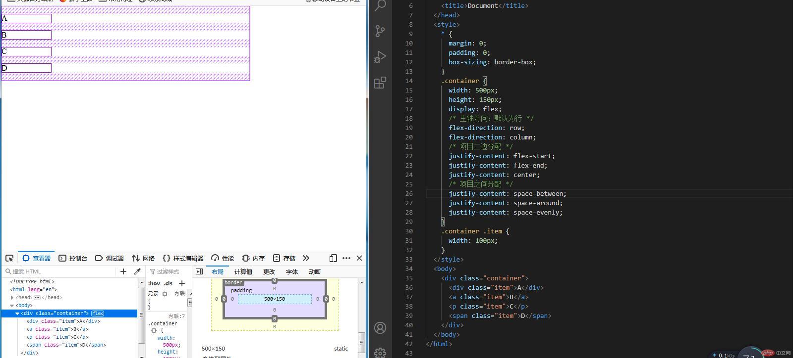
9. 主轴为垂直方向时的项目排列
示例如下:
<style>* {margin: 0;padding: 0;box-sizing: border-box;}.container {width: 500px;height: 150px;display: flex;/* 主轴方向:默认为行 */flex-direction: row;flex-direction: column;/* 项目二边分配 */justify-content: flex-start;justify-content: flex-end;justify-content: center;/* 项目之间分配 */justify-content: space-between;justify-content: space-around;justify-content: space-evenly;}.container .item {width: 100px;}</style><body><div class="container"><div class="item">A</div><a class="item">B</a><p class="item">C</p><span class="item">D</span></div></body>
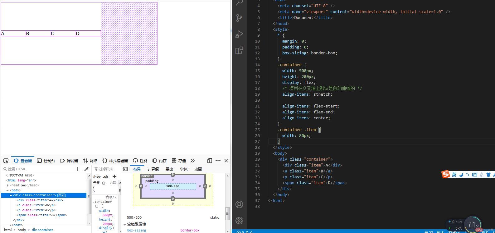
10. 项目在交叉轴上的排列
示例如下:
<style>* {margin: 0;padding: 0;box-sizing: border-box;}.container {width: 500px;height: 200px;display: flex;/* 项目在交叉轴上默认是自动伸缩的 */align-items: stretch;align-items: flex-start;align-items: flex-end;align-items: center;}.container .item {width: 80px;}</style><body><div class="container"><div class="item">A</div><a class="item">B</a><p class="item">C</p><span class="item">D</span></div></body>
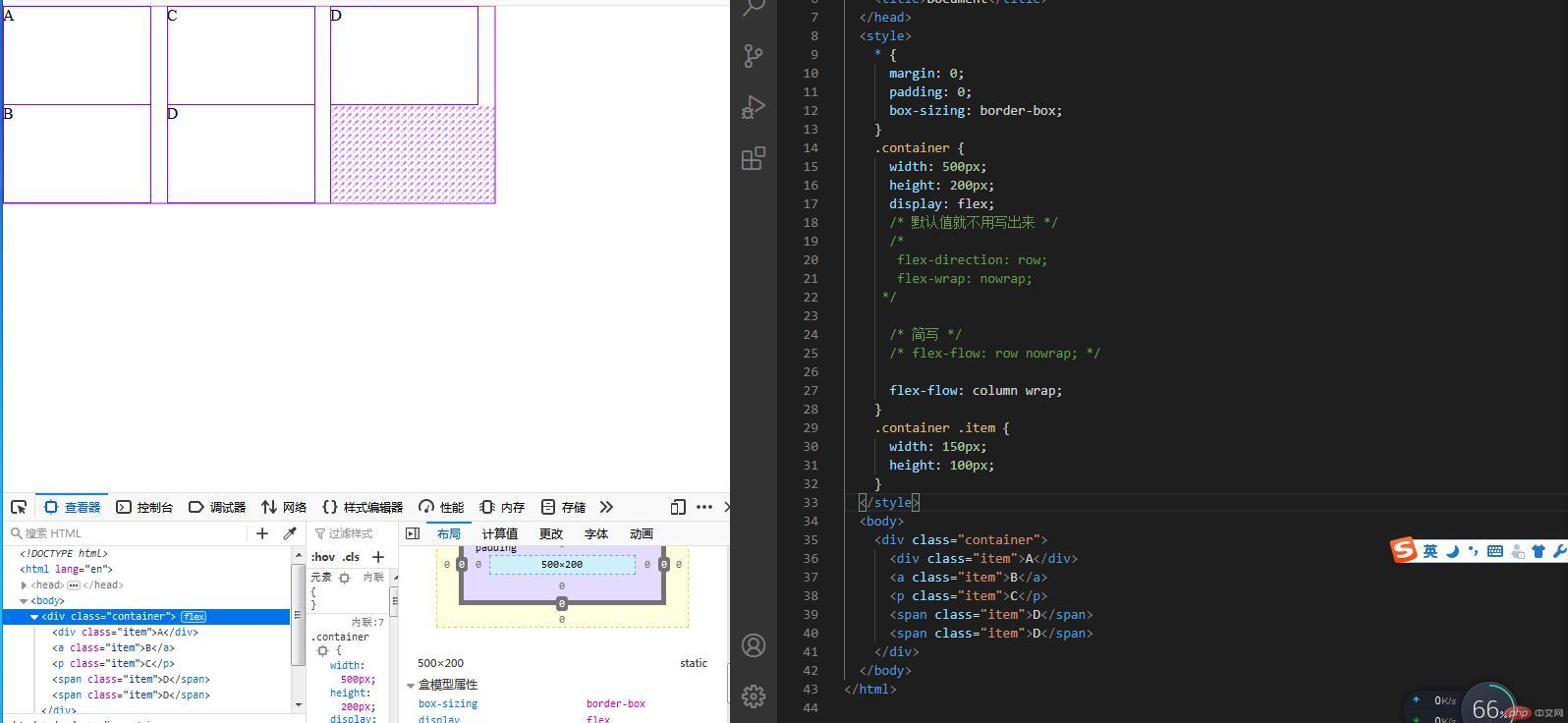
11. 主轴方向与项目排列的简写
示例如下:
<style>* {margin: 0;padding: 0;box-sizing: border-box;}.container {width: 500px;height: 200px;display: flex;/* 默认值就不用写出来 *//*flex-direction: row;flex-wrap: nowrap;*//* 简写 *//* flex-flow: row nowrap; */flex-flow: column wrap;}.container .item {width: 150px;height: 100px;}</style><body><div class="container"><div class="item">A</div><a class="item">B</a><p class="item">C</p><span class="item">D</span><span class="item">D</span></div></body>
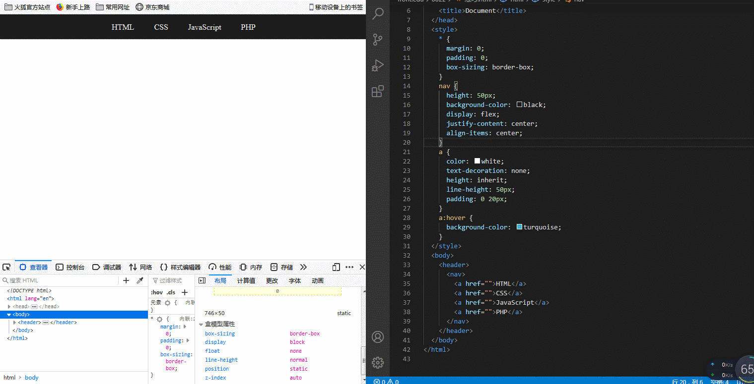
12. flex容器属性实战: 快速撸一个主导航
示例如下:
<style>/* 初始化 */* {margin: 0;padding: 0;box-sizing: border-box;}nav {height: 50px;background-color: black;/* 转为弹性盒子 */display: flex;/* 垂直水平居中 */justify-content: center;align-items: center;}a {color: white;text-decoration: none;height: inherit;line-height: 50px;padding: 0 20px;}a:hover {background-color: turquoise;}</style><body><header><nav><a href="">HTML</a><a href="">CSS</a><a href="">JavaScript</a><a href="">PHP</a></nav></header></body>
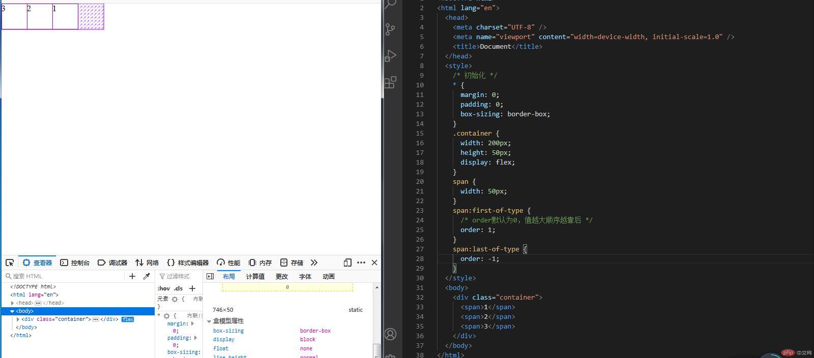
13. 项目属性: order控制项目顺序
示例如下:
<style>/* 初始化 */* {margin: 0;padding: 0;box-sizing: border-box;}.container {width: 200px;height: 50px;display: flex;}span {width: 50px;}span:first-of-type {/* order默认为0,值越大顺序越靠后 */order: 1;}span:last-of-type {order: -1;}</style><body><div class="container"><span>1</span><span>2</span><span>3</span></div></body>
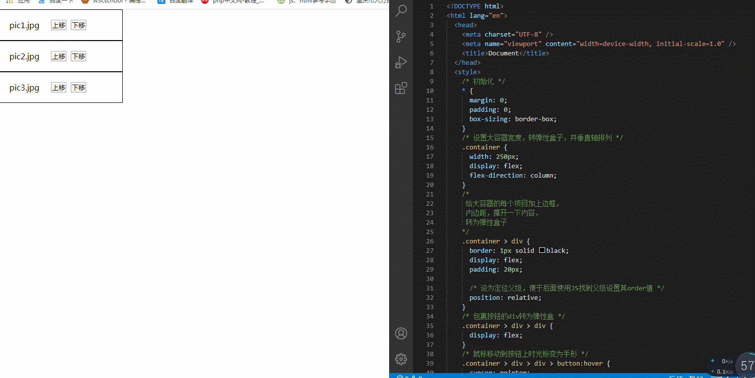
14. order小案例,调整元素顺序,比如小相册
示例如下:
<style>/* 初始化 */* {margin: 0;padding: 0;box-sizing: border-box;}/* 设置大容器宽度,转弹性盒子,并垂直轴排列 */.container {width: 250px;display: flex;flex-direction: column;}/*给大容器的每个项目加上边框,内边距,撑开一下内容,转为弹性盒子*/.container > div {border: 1px solid black;display: flex;padding: 20px;/* 设为定位父级,便于后面使用JS找到父级设置其order值 */position: relative;}/* 包裹按钮的div转为弹性盒 */.container > div > div {display: flex;}/* 鼠标移动到按钮上时光标变为手形 */.container > div > div > button:hover {cursor: pointer;}</style><body><div class="container"><div>pic1.jpg <div><button onclick="up(this)">上移</button> <button onclick="down(this)">下移</button></div></div><div>pic2.jpg <div><button onclick="up(this)">上移</button> <button onclick="down(this)">下移</button></div></div><div>pic3.jpg <div><button onclick="up(this)">上移</button> <button onclick="down(this)">下移</button></div></div></div></body><script>// 点击“上移”按钮时order值变小function up(ele) {ele.offsetParent.style.order -= 1;}// 点击“下移”按钮时order值变大function down(ele) {ele.offsetParent.style.order += 1;}</script>
14.总结:
Flex布局的属性名有很多类似的地方,应用场景都不一样,容易混乱,自己加强记忆,多多练习。这节课中,我觉得重点是了解弹性容器和弹性项目之间的关系,还有弹性容器中的部分属性,还学习了一个弹性项目的属性order。我把这节课学习到的属性总结如下:
- 弹性容器属性:
| 属性名 | 属性含义 |
|---|---|
flex-wrap |
是否换行,可变为多行容器 |
justify-content |
单行容器中,控制弹性项目在主轴上的对齐方式 |
align-items |
控制弹性项目在侧轴的对齐方式 |
align-content |
多行容器中,控制弹性项目在主轴上的对齐方式 |
flex-direction |
控制弹性项目的排列方式,水平排列或垂直排列 |
- 弹性项目属性:
| 属性名 | 属性含义 |
|---|---|
order |
控制项目顺序,其值越小,排序越靠前,可以为负值 |
这节课中,主要就学习了以上属性,其他属性下节课再加进来