
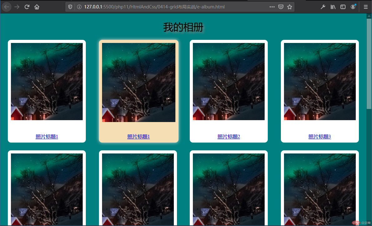
1. 电子相册
<!DOCTYPE html><html lang="en"><head><meta charset="UTF-8"><meta name="viewport" content="width=device-width, initial-scale=1.0"><title>我的相册</title><style>* {border: 0;padding: 0;box-sizing: border-box;}body {background-color:teal;}h1 {text-align: center;font-weight: 400;text-shadow: 5px 5px 5px gray;}.container {min-height: 1000px;display: grid;grid-template-columns: repeat(auto-fill, 250px);grid-template-rows: repeat(auto-fill, 330px);justify-content: space-evenly;align-content: space-around;gap: 25px;}.container .item {background-color: white;padding: 10px;display: flex;flex-flow: column nowrap;justify-content: space-between;align-items: center;border-radius: 10px;}.container .item:hover {width:calc(100%*1.02);box-shadow: 0 0 10px lightgrey;background-color: wheat;}.container .item a:hover {color: red;}.container .item img {width: 100%;}</style></head><body><h1>我的相册</h1><div class="container"><div class="item"><img src="xc.png" alt=""><a href="#">照片标题1</a></div><div class="item"><img src="xc.png" alt=""><a href="#">照片标题1</a></div><div class="item"><img src="xc.png" alt=""><a href="#">照片标题2</a></div><div class="item"><img src="xc.png" alt=""><a href="#">照片标题3</a></div><div class="item"><img src="xc.png" alt=""><a href="#">照片标题4</a></div><div class="item"><img src="xc.png" alt=""><a href="#">照片标题5</a></div><div class="item"><img src="xc.png" alt=""><a href="#">照片标题6</a></div><div class="item"><img src="xc.png" alt=""><a href="#">照片标题7</a></div><div class="item"><img src="xc.png" alt=""><a href="#">照片标题8</a></div><div class="item"><img src="xc.png" alt=""><a href="#">照片标题9</a></div><div class="item"><img src="xc.png" alt=""><a href="#">照片标题10</a></div><div class="item"><img src="xc.png" alt=""><a href="#">照片标题11</a></div><div class="item"><img src="xc.png" alt=""><a href="#">照片标题12</a></div></div></body></html>
运行效果图:
2. 仿格栅布局组件
- 格栅布局组件: /static/css/style.css
/* 把demo1.html中写好的栅格布局样式搬到这里来 *//* 2.设置通用样式 */* {border: 0;padding: 0;box-sizing: border-box;}/* 3.body看做flex布局, 主轴为垂直方向, 宽高等于100视口, 这样可以撑起宽高 */body {display: flex;flex-flow: column nowrap;width: 100vw;height: 100vh;justify-content: start;align-items: center;}/* 4.格栅布局的容器 */.container {/* 4.0.设置容器最小宽度,以撑起空间 */min-width: 1000px;/* 4.1.生成grid容器(感觉设置成flex布局也OK,反正都是部署成一列) */display: grid;/* 4.2.不设置显示生成单元格样式时,grid布局默认是生成一列多行式布局 *//* 4.3.设置网格区域之间的间隙宽度为5px */row-gap: 5px;}/* 5.格栅布局的行 */.row {width: 100%;/* 5.1.设置为grid布局 */display: grid;/* 行优先(默认就是,其实可以省略) */grid-auto-flow: row;/* 5.2.只设置显示生成单元格的列数量,平均分配为12列 */grid-template-columns: repeat(12, 1fr);/* 默认就是,其实可以省略 */grid-template-rows: repeat(1, 1fr);/* 5.3.网格区域之间的间隙 */gap: 5px;}/* 6.栅格中的共通样式 */.item {border: 1px solid;min-height: 50px;}/* 7.设置不同大小栅格(项目)的布局样式 */.col-1 {/* 布局占1列 */grid-column-end: span 1;}.col-2 {/* 布局占2列 */grid-column-end: span 2;}.col-3 {/* 布局占3列 */grid-column-end: span 3;}.col-4 {grid-column-end: span 4;}.col-5 {grid-column-end: span 5;}.col-6 {grid-column-end: span 6;}.col-7 {grid-column-end: span 7;}.col-8 {grid-column-end: span 8;}.col-9 {grid-column-end: span 9;}.col-10 {grid-column-end: span 10;}.col-11 {grid-column-end: span 11;}.col-12 {grid-column-end: span 12;}
- 自定义格栅布局使用 /demo1.html
<!DOCTYPE html><html lang="en"><head><meta charset="UTF-8"><meta name="viewport" content="width=device-width, initial-scale=1.0"><title>自定义格栅布局使用</title><style>@import url('static/css/style.css');</style></head><body><!-- 1.先照bootstrap的山歌布局结构写出HTML结构 --><div class="container"><!-- 创建行 --><div class="row"><!-- 创建列(两列) --><div class="item col-6">6</div><div class="item col-6">6</div></div><!-- 1.END --><!-- 自制山歌布局其他测试 --><!-- 创建行 --><div class="row"><!-- 创建列(三列) --><div class="item col-2">2</div><div class="item col-8">8</div><div class="item col-2">2</div></div><!-- 创建行 --><div class="row"><!-- 创建列(十二列) --><div class="item">1</div><div class="item">2</div><div class="item">3</div><div class="item">4</div><div class="item">5</div><div class="item">6</div><div class="item">7</div><div class="item">8</div><div class="item">9</div><div class="item">10</div><div class="item">11</div><div class="item">12</div></div><!-- 创建行 --><div class="row"><!-- 创建列(不布局完) --><div class="item col-2">2</div><div class="item col-8">8</div></div></div></body></html>
运行效果图:

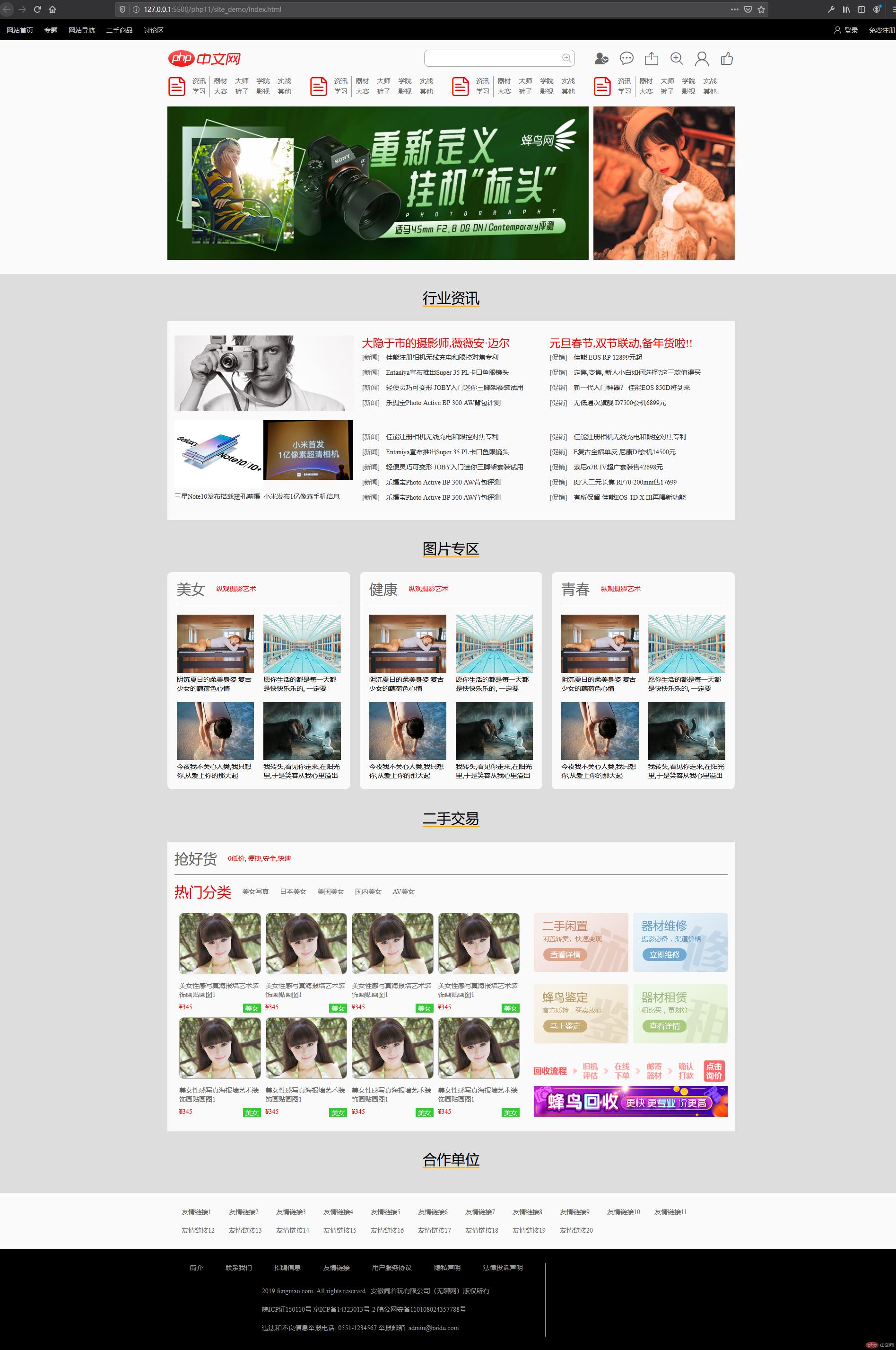
3. 模仿实战项目页面
首页模仿
<!DOCTYPE html><html lang="en"><head><meta charset="UTF-8"><meta name="viewport" content="width=device-width, initial-scale=1.0"><title>Document</title><style>@import url('static/font_icon/iconfont.css');* {margin: 0;padding: 0;box-sizing: border-box;}li {list-style-type: none;}body {font-size: 14px;width: 100vw;height: 100vh;}header {background-color: black;color: #ccc;width: 100%;height: 44px;padding: 0 20px;display: flex;flex-flow: row nowrap;justify-content: space-between;align-items: center;}header a {color: inherit;margin-right: 20px;text-decoration: none;}header>.right a {margin-right: unset;margin-left: 20px;}section{width: 100%;}section:first-of-type, section:nth-of-type(3) {/* width: 100%; */background-color: #fafafa;padding-bottom: 30px;}section:first-of-type>*>* {max-width: 1200px;margin: 0 auto;}section:not(:first-of-type)>* {max-width: 1200px;margin: 0 auto;}section>.top>.top-header {/* max-width: 1050px; *//* margin: 0 auto; */display: flex;flex-flow: row nowrap;justify-content: space-between;align-items: center;}section>.top>.top-header>.right {height: 36px;display: flex;flex-flow: row nowrap;align-items: start;position: relative;}section>.top>.top-header>.right>input {height: 36px;width: 319px;border: 1px solid #aaa;border-radius: 10px;}section>.top>.top-header>.right>input:hover {box-shadow: 0 0 5px #aaa;}section>.top>.top-header>.right>span {position: absolute;font-size: 1.5rem;color: #aaa;top: 4px;left: 290px;cursor: pointer;}section>.top>.top-header>.right>a:first-of-type {margin-left: 40px;}section>.top>.top-header>.right>a:not(:first-of-type) {margin-left: 20px;}section>.top>.top-header>.right>a>span {font-size: 33px;height: 36px;line-height: 36px;display: inline-block;text-decoration: none;color: #666;}section>.top>.nav{/* max-width: 1050px; *//* margin: 0 auto; */display: flex;flex-flow: row nowrap;justify-content: start;align-items:stretch;}section>.top>.nav>.nav-box {display: grid;grid-auto-flow: row;grid-template-columns: repeat(6, 1fr);grid-template-rows: repeat(2, 1fr);margin-right: 30px;flex: 1 1 auto;}section>.top>.nav>.nav-box>span{font-size: 40px;display: inline-block;grid-row-end: span 2;color: red;}section>.top>.nav>.nav-box>a {display: inline-block;text-align: center;text-decoration: none;color: #666;}section>.top>.nav>.nav-box>a:nth-of-type(5n+1) {border-right: 1px solid #999;}section>.top>.lunbo {margin-top: 20px;display:flex;flex-flow: row nowrap;justify-content: space-between;}section>.top>.lunbo>img:first-of-type{width: 75%;flex: 3 3 auto;margin-right: 10px;}section>.top>.lunbo>img:last-of-type {width: 25%;flex: 1 1 auto;}section>.top>.lunbo>img:hover {box-shadow: 0 0 5px #666;}section:nth-of-type(2) {/* width: 100%; */background-color: #ddd;padding-bottom: 10px;}section:nth-of-type(2)>.section-box:first-child {background-color: #fafafa;height: 520px;margin-bottom: 10px;}section>.section-box>.title{background-color: #ddd;height: 100px;line-height: 100px;text-align: center;}section>.section-box>.title> span {border-bottom: 2px solid orange;font-size: 30px;}section>.section-box.news>.box-content{/* height: 420px; */}section>.section-box.pic-site>.box-content {/* height: 470px; */padding: 0;}section>.news>.box-content, section>.pic-site>.box-content {display: grid;grid-auto-flow: row;grid-template-columns: repeat(3, 1fr);grid-template-rows: 1fr;justify-items: stretch;align-items: stretch;padding: 30px 15px;column-gap: 20px;}section>.section-box.news>.box-content:hover, section>.section-box.secondhand-trade>.box-content:hover {box-shadow: 0 0 10px black;}section>.section-box.news>.box-content>.left{display:grid;grid-auto-flow: row;grid-template-columns: repeat(2, 1fr);grid-template-rows: repeat(2, 1fr);}section>.section-box.news>.box-content>.left>a {text-decoration: none;color: #333;}section>.section-box.news>.box-content>.left>a:first-of-type {grid-column-end: span 2;}section>.section-box.news>.box-content>.left>a>div{width: 100%;height: 95%;display: flex;flex-flow: column nowrap;justify-content: space-between;}section>.section-box.news>.box-content>.left>a img{width: inherit;}section>.section-box.news>.box-content>div:not(:first-of-type)>p>a{font-size: 23px;color: red;text-decoration: none;}section>.section-box.news>.box-content>div:not(:first-of-type)>ul:first-of-type {margin-bottom: 40px;}section>.section-box.news>.box-content>div:not(:first-of-type)>ul>li{/* margin: 10px 0; */height: 32px;line-height: 32px;}section>.section-box.news>.box-content>div:not(:first-of-type)>ul>li>span {color: #666;margin-right: 10px;}section>.section-box.news>.box-content>div:not(:first-of-type)>ul>li>a {text-decoration: none;color: #333;}section>.section-box.pic-site>.box-content>div{background-color: #fafafa;border-radius: 10px;/* height: 100%; */}section>.section-box.pic-site>.box-content>div:hover {box-shadow: 0 0 10px black;}section>.section-box.pic-site{height: 570px;}section>.section-box.pic-site>.box-content>div{padding: 20px 20px 0 20px;}section>.section-box.pic-site>.box-content .title{height: 50px;line-height: 30px;border-bottom: 1px solid #999;}section>.section-box.pic-site>.box-content .title>span {font-size: 30px;vertical-align: middle;color: #666;}section>.section-box.pic-site>.box-content .title>a {color: red;margin-left: 20px;text-decoration: none;}section>.section-box.pic-site>.box-content .pic-content{padding: 20px 0;display: grid;grid-template-columns: repeat(2, 1fr);grid-template-rows: repeat(2, 1fr);justify-content: space-between;gap: 20px;}section>.section-box.pic-site>.box-content .pic-content>.pic-box{max-width: 100%;}section>.section-box.pic-site>.box-content .pic-content>.pic-box>img{width: 100%;}section>.secondhand-trade {background-color: #fafafa;margin-bottom: 10px;}section>.secondhand-trade>.box-content {display: grid;grid-auto-flow: row;grid-template-columns: 2fr 1fr;grid-template-rows: 1fr;justify-items: stretch;align-items: stretch;padding: 20px 15px;column-gap: 20px;}section>.secondhand-trade>.box-content>.title{height: 50px;line-height: 30px;border-bottom: 1px solid #666;grid-column-end: span 2;}section>.secondhand-trade>.box-content>.title>span:first-of-type{font-size: 30px;color: #666;vertical-align: middle;}section>.secondhand-trade>.box-content>.title>span:last-of-type {margin-left: 20px;color:red;}section>.secondhand-trade>.box-content>.hot-cats {height: 70px;line-height: 30px;padding-top: 20px;grid-column-end: span 2;}section>.secondhand-trade>.box-content>.hot-cats>span{font-size: 30px;color: red;vertical-align: middle;}section>.secondhand-trade>.box-content>.hot-cats>a {margin-left: 20px;text-decoration: none;color: #666;}section>.secondhand-trade>.box-content>.girl-content{padding: 5px;display: grid;grid-template-columns: repeat(4, 1fr);grid-template-rows: repeat(2, 1fr);}section>.secondhand-trade>.box-content>.girl-content>.girl-box{padding: 5px;display: block;text-decoration: none;}section>.secondhand-trade>.box-content>.girl-content>.girl-box>img{width: 100%;border: 1px solid #aaa;border-radius: 10px;}section>.secondhand-trade>.box-content>.girl-content>.girl-box>p{color: #666;display: inline-block;margin-top: 10px;}section>.secondhand-trade>.box-content>.girl-content>.girl-box>div{display: flex;flex-flow: row nowrap;justify-content: space-between;margin-top: 10px;}section>.secondhand-trade>.box-content>.girl-content>.girl-box>div>span:first-of-type{color: red;}section>.secondhand-trade>.box-content>.girl-content>.girl-box>div>span:last-of-type{background-color:limegreen;color: #fff;padding: 0 5px;}section>.secondhand-trade>.box-content>.secondhand{display: grid;grid-template-columns: repeat(2, 1fr);grid-template-rows: repeat(3, 1fr);padding-top: 10px;gap: 10px}section>.secondhand-trade>.box-content>.secondhand>.secondhand-box {padding:5px;}section>.secondhand-trade>.box-content>.secondhand>.secondhand-box>img{width: 100%;}section>.secondhand-trade>.box-content>.secondhand>.seconhand-box-lg {grid-column-end: span 2;}section>.secondhand-trade>.box-content>.secondhand>.seconhand-box-lg img {width: 100%;}section>.friend-link{padding: 30px 30px 0 30px;display: grid;grid-auto-flow: row;grid-template-columns: repeat(auto-fill, 100px);row-gap: 20px;}section>.friend-link a {text-decoration: none;color: #666;}section>.friend-link a:hover{color: lightskyblue;}footer {background-color: black;color: #999;padding: 30px 30px;}footer>.footer-box{max-width: 1200px;margin: 0 auto;display: grid;grid-auto-flow: row;grid-template-columns: 2fr 1fr;grid-template-rows: 1fr;}footer>.footer-box>.left{display: grid;grid-template-columns: 25% 75%;grid-template-rows: 1fr;row-gap: 20px;border-right: 1px solid #999;}footer>.footer-box>.left>.footer-nav{grid-column-end: span 2;display: flex;flex-flow: row nowrap;justify-content: space-evenly;align-items: center;}footer>.footer-box>.left>.footer-nav>a {color: #999;text-decoration: none;}footer>.footer-box>.left>.banquanxinxi>p {padding: 10px 0;}</style></head><body><header><div class="left"><a href="">网站首页</a><a href="">专题</a><a href="">网站导航</a><a href="">二手商品</a><a href="">讨论区</a></div><div class="right"><a href=""><span class="iconfont icon-yonghu"></span> <span>登录</span></a><a href="">免费注册</a></div></header><section><div class="top"><div class="top-header"><img src="static/images/logo.png" alt="" class="logo"><div class="right"><input type="text" name="" id=""><span class="iconfont icon-icon--"></span><a href=""><span class="iconfont icon-iconfontqz"></span></a><a href=""><span class="iconfont icon-pinglun"></span></a><a href=""><span class="iconfont icon-fasong"></span></a><a href=""><span class="iconfont icon-icon--"></span></a><a href=""><span class="iconfont icon-yonghu"></span></a><a href=""><span class="iconfont icon-dianzan"></span></a></div></div><div class="nav"><div class="nav-box"><span class="iconfont icon-wendang"></span><a href="">资讯</a><a href="">器材</a><a href="">大师</a><a href="">学院</a><a href="">实战</a><a href="">学习</a><a href="">大赛</a><a href="">裤子</a><a href="">影视</a><a href="">其他</a></div><div class="nav-box"><span class="iconfont icon-wendang"></span><a href="">资讯</a><a href="">器材</a><a href="">大师</a><a href="">学院</a><a href="">实战</a><a href="">学习</a><a href="">大赛</a><a href="">裤子</a><a href="">影视</a><a href="">其他</a></div><div class="nav-box"><span class="iconfont icon-wendang"></span><a href="">资讯</a><a href="">器材</a><a href="">大师</a><a href="">学院</a><a href="">实战</a><a href="">学习</a><a href="">大赛</a><a href="">裤子</a><a href="">影视</a><a href="">其他</a></div><div class="nav-box"><span class="iconfont icon-wendang"></span><a href="">资讯</a><a href="">器材</a><a href="">大师</a><a href="">学院</a><a href="">实战</a><a href="">学习</a><a href="">大赛</a><a href="">裤子</a><a href="">影视</a><a href="">其他</a></div></div><div class="lunbo"><img src="static/images/lunbo1.jpg" alt=""><img src="static/images/lunbo2.jpg" alt=""></div></div></section><section><div class="section-box news"><div class="title"><span>行业资讯</span></div><div class="box-content"><div class="left"><a href=""><img src="static/images/news1.jpg" alt=""></a><a href=""><div><img src="static/images/n-2.jpg" alt=""><p>三星Note10发布搭载挖孔前摄</p></div></a><a href=""><div><img src="static/images/n-3.jpg" alt=""><p>小米发布1亿像素手机信息</p></div></a></div><div class="center"><p><a href="">大隐于市的摄影师,薇薇安·迈尔</a></p><ul><li><span>[新闻]</span><a href="">佳能注册相机无线充电和眼控对焦专利</a></li><li><span>[新闻]</span><a href="">Entaniya宣布推出Super 35 PL卡口鱼眼镜头</a></li><li><span>[新闻]</span><a href="">轻便灵巧可变形 JOBY入门迷你三脚架套装试用</a></li><li><span>[新闻]</span><a href="">乐摄宝Photo Active BP 300 AW背包评测</a></li></ul><ul><li><span>[新闻]</span><a href="">佳能注册相机无线充电和眼控对焦专利</a></li><li><span>[新闻]</span><a href="">Entaniya宣布推出Super 35 PL卡口鱼眼镜头</a></li><li><span>[新闻]</span><a href="">轻便灵巧可变形 JOBY入门迷你三脚架套装试用</a></li><li><span>[新闻]</span><a href="">乐摄宝Photo Active BP 300 AW背包评测</a></li><li><span>[新闻]</span><a href="">乐摄宝Photo Active BP 300 AW背包评测</a></li></ul></div><div class="right"><p><a href="">元旦春节,双节联动,备年货啦!!</a></p><ul><li><span>[促销]</span><a href="">佳能 EOS RP 12899元起</a></li><li><span>[促销]</span><a href="">定焦,变焦, 新人小白如何选择?这三款值得买</a></li><li><span>[促销]</span><a href="">新一代入门神器? 佳能EOS 850D将到来</a></li><li><span>[促销]</span><a href="">无低通次旗舰 D7500套机6899元</a></li></ul><ul><li><span>[促销]</span><a href="">佳能注册相机无线充电和眼控对焦专利</a></li><li><span>[促销]</span><a href="">E复古全幅单反 尼康Df套机14500元</a></li><li><span>[促销]</span><a href="">索尼α7R IV超广套装售42698元</a></li><li><span>[促销]</span><a href="">RF大三元长焦 RF70-200mm售17699</a></li><li><span>[促销]</span><a href="">有所保留 佳能EOS-1D X III再曝新功能</a></li></ul></div></div></div><!-- </section><section> --><div class="section-box pic-site"><div class="title"><span>图片专区</span></div><div class="box-content"><div class="left"><div class="title"><span>美女</span><a href="">纵观摄影艺术</a></div><div class="pic-content"><div class="pic-box"><img src="static/images/img1.jpg" alt=""><p>阴沉夏日的柔美身姿 复古少女的藕荷色心情</p></div><div class="pic-box"><img src="static/images/img2.jpg" alt=""><p>愿你生活的都是每一天都是快快乐乐的, 一定要</p></div><div class="pic-box"><img src="static/images/img3.jpg" alt=""><p>今夜我不关心人类,我只想你,从爱上你的那天起</p></div><div class="pic-box"><img src="static/images/img4.jpg" alt=""><p>我转头,看见你走来,在阳光里,于是笑容从我心里溢出</p></div></div></div><div class="center"><div class="title"><span>健康</span><a href="">纵观摄影艺术</a></div><div class="pic-content"><div class="pic-box"><img src="static/images/img1.jpg" alt=""><p>阴沉夏日的柔美身姿 复古少女的藕荷色心情</p></div><div class="pic-box"><img src="static/images/img2.jpg" alt=""><p>愿你生活的都是每一天都是快快乐乐的, 一定要</p></div><div class="pic-box"><img src="static/images/img3.jpg" alt=""><p>今夜我不关心人类,我只想你,从爱上你的那天起</p></div><div class="pic-box"><img src="static/images/img4.jpg" alt=""><p>我转头,看见你走来,在阳光里,于是笑容从我心里溢出</p></div></div></div><div class="right"><div class="title"><span>青春</span><a href="">纵观摄影艺术</a></div><div class="pic-content"><div class="pic-box"><img src="static/images/img1.jpg" alt=""><p>阴沉夏日的柔美身姿 复古少女的藕荷色心情</p></div><div class="pic-box"><img src="static/images/img2.jpg" alt=""><p>愿你生活的都是每一天都是快快乐乐的, 一定要</p></div><div class="pic-box"><img src="static/images/img3.jpg" alt=""><p>今夜我不关心人类,我只想你,从爱上你的那天起</p></div><div class="pic-box"><img src="static/images/img4.jpg" alt=""><p>我转头,看见你走来,在阳光里,于是笑容从我心里溢出</p></div></div></div></div></div><div class="section-box secondhand-trade"><div class="title"><span>二手交易</span></div><div class="box-content"><div class="title"><span>抢好货</span><span href="">0低价, 便捷,安全,快速</span></div><div class="hot-cats"><span>热门分类</span><a href="">美女写真</a><a href="">日本美女</a><a href="">美国美女</a><a href="">国内美女</a><a href="">AV美女</a></div><div class="girl-content"><a href="#" class="girl-box"><img src="static/images/shop1.jpg" alt=""><p>美女性感写真海报墙艺术装饰画贴画图1</p><div><span>¥345</span><span>美女</span></div></a><a href="#" class="girl-box"><img src="static/images/shop1.jpg" alt=""><p>美女性感写真海报墙艺术装饰画贴画图1</p><div><span>¥345</span><span>美女</span></div></a><a href="#" class="girl-box"><img src="static/images/shop1.jpg" alt=""><p>美女性感写真海报墙艺术装饰画贴画图1</p><div><span>¥345</span><span>美女</span></div></a><a href="#" class="girl-box"><img src="static/images/shop1.jpg" alt=""><p>美女性感写真海报墙艺术装饰画贴画图1</p><div><span>¥345</span><span>美女</span></div></a><a href="#" class="girl-box"><img src="static/images/shop1.jpg" alt=""><p>美女性感写真海报墙艺术装饰画贴画图1</p><div><span>¥345</span><span>美女</span></div></a><a href="#" class="girl-box"><img src="static/images/shop1.jpg" alt=""><p>美女性感写真海报墙艺术装饰画贴画图1</p><div><span>¥345</span><span>美女</span></div></a><a href="#" class="girl-box"><img src="static/images/shop1.jpg" alt=""><p>美女性感写真海报墙艺术装饰画贴画图1</p><div><span>¥345</span><span>美女</span></div></a><a href="#" class="girl-box"><img src="static/images/shop1.jpg" alt=""><p>美女性感写真海报墙艺术装饰画贴画图1</p><div><span>¥345</span><span>美女</span></div></a></div><div class="secondhand"><div class="seconhand-box"><a href=""><img src="static/images/sh1.png" alt=""></a></div><div class="seconhand-box"><a href=""><img src="static/images/sh2.png" alt=""></a></div><div class="seconhand-box"><a href=""><img src="static/images/sh3.png" alt=""></a></div><div class="seconhand-box"><a href=""><img src="static/images/sh4.png" alt=""></a></div><div class="seconhand-box-lg"><a href=""><img src="static/images/sh5.png" alt=""></a><a href=""><img src="static/images/sh6.jpg" alt=""></a></div></div></div></div><div class="section-box secondhand-trade"><div class="title"><span>合作单位</span></div></div></section><section><div class="section-box friend-link"><a href="">友情链接1</a><a href="">友情链接2</a><a href="">友情链接3</a><a href="">友情链接4</a><a href="">友情链接5</a><a href="">友情链接6</a><a href="">友情链接7</a><a href="">友情链接8</a><a href="">友情链接9</a><a href="">友情链接10</a><a href="">友情链接11</a><a href="">友情链接12</a><a href="">友情链接13</a><a href="">友情链接14</a><a href="">友情链接15</a><a href="">友情链接16</a><a href="">友情链接17</a><a href="">友情链接18</a><a href="">友情链接19</a><a href="">友情链接20</a></div></section><footer><div class="footer-box"><div class="left"><div class="footer-nav"><a href="">简介</a><a href="">联系我们</a><a href="">招聘信息</a><a href="">友情链接</a><a href="">用户服务协议</a><a href="">隐私声明</a><a href="">法律投诉声明</a></div><div class="logo"><img src="" alt=""></div><div class="banquanxinxi"><p>2019 fengniao.com. All rights reserved . 安徽闹着玩有限公司(无聊网)版权所有</p><p>皖ICP证150110号 京ICP备14323013号-2 皖公网安备110108024357788号</p><p>违法和不良信息举报电话: 0551-1234567 举报邮箱: admin@baidu.com</p></div></div><div class="right"></div></div></footer></body></html>
运行效果:
学习心得
- grid和flex让布局变得简单, 而且学习起来也比较容易理解. 但是到了实战, 总体感觉是自己学会了, 但是却写不出来. 或者一个简单的实现, 需要写很多样式代码才能实现, 有些对齐方式还要靠猜, 说到底应该还是写得少.
- 仿站实战, 感觉还是老问题, css代码太乱, 还没有学会怎样规划样式. 有点像面向过程编码, 样式复用率低. 需要找时间把老师的实战代码通读理解, 主要是学习老师的实现方式和样式规划思想. 如果老师能解读一下就更好了.
- 上班狗, 前端的作业除”0408的盒模型浮动定位”还没写, 其他的都补完了, 挺有成就感的.