

CSS grid 布局
1. 创建一个 grid 布局
1.1 display:grid 声明这是一个 grid 布局
1.2 设置单元格数量及尺寸
grid-template-rows: ...设置 grid 布局的行数及行高
grid-template-columns:...设置列数与列宽
以行为例
1.2.1 三行就写三个行高 grid-template-rows:50px 50px 50px ; 有几行就写几个
1.2.2 当然这个地方可以使用循环数组去写grid-template-rows:repeat(3,50px)
- repeat 里的第一个值为循环次数,跟后面的值用逗号的分离。
repeat 可以循环多个值
repeat(2, 50px 100px)这样生成四个表格 第一个 50px 第二个 100px 第三个 50px 第四个 100px
1.2.3 用百分比设置
比如当前网格容器宽高为 400px
grid-template-rows: 20% 30% 50%即 当前行高第一行为容器高度的 20% (400*0.2=80px)
1.2.4 用比例设置
grid-template-rows:1fr 2fr 3fr行高为 1:2:3 将容器总高度分为六份 第一行占一份 第二行占两份
即 400/6*1 为第一行高度
1.2.5 使用 auto
grid-template-rows:50px auto 50px;
让浏览器自己去计算值 第一行第三行给出固定值,第二行设置为当前容器剩余高度
1.2.6 弹性尺寸
grid-template-rows:repeat(2,minmiax(50px , 100px))行高最大为 100px 最小为 50px
1.2.7 自动填充
grid-template-rows:repeat(auto-fill,100)高度设置 100,然后按照从左到右从上到下的方式填充满当前容器
1.3 grid-auto-flow: 设置 grid 布局的排列方式
grid-auto-flow:row;水平排列grid-auto-flow:column;垂直排列
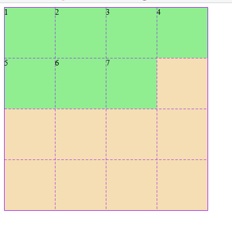
1.4 创建一个 grid 栅格布局
<!DOCTYPE html><html lang="en"><head><meta charset="UTF-8" /><meta name="viewport" content="width=device-width, initial-scale=1.0" /><title>Document</title><style>.container {width: 400px;height: 400px;background-color: wheat;/*声明这是一个grid布局*/display: grid;/*设置布局排列方式为水平排列*/grid-auto-flow: row;/*创建一个四行四列的grid布局*//*四行 每行100px*/grid-template-rows: repeat(4, 100px);/*四列 每列100px*/grid-template-columns: repeat(4, 100px);}.item {background-color: lightgreen;}</style></head><body><div class="container"><div class="item item1">1</div><div class="item item2">2</div><div class="item item3">3</div><div class="item item4">4</div><div class="item item5">5</div><div class="item item6">6</div><div class="item item7">7</div></div></body></html>
效果图
2. 将项目填充到单元格中
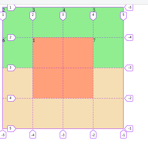
2.1 使用默认网格线划分单元格
默认从左上角开始,从左到右,从上到下,依次从 1 开始编号
如果从右下角开始,从右到左,从下到上,依次从-1 开始编号
根据网格线将项目放到网格线形成的封闭矩形区域中
.item.item1 {/* 将项目一填充到指定单元格中 */background-color: lightsalmon;/* 起始行线 */grid-row-start: 2;/* 结束行线 */grid-row-end: 4;/* 起始列线 */grid-column-start: 2;/* 结束列线 */grid-column-end: 4;}
效果图
2.2 使用命名网格线
- 使用语义化的名称替代容器自动生成的数字网格线编号
- 同一条网格线可以有多个别名
.container {width: 400px;height: 400px;background-color: wheat;display: grid;grid-auto-flow: row;/* 命名网格线 */grid-template-rows: [r1-start]100px[r1-end r2-start]100px[r2-end r3-start]100px[r3-end r4-start]100px[r4-end];grid-template-columns: [c1-start]100px[c1-end c2-start]100px[c2-end c3-start]100px[c3-end c4-start]100px[c4-end];}.item {background-color: lightgreen;}/* 设置开始结束点 */.item.item1 {background-color: violet;grid-row-start: r2-start;grid-row-end: r4-start;grid-column-start: c3-start;grid-column-end: c4-start;}
效果图
此方法不常用,知道就好
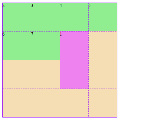
3. 网格区域
- 一个以上的单元格形成的矩形块称为网格区域
- 网格区域一定是一个矩形块
3.1 默认网格区域
设置项目属性grid-area
语法grid-area:row-start/column-start/row-end/column-end;
行开始/列开始/行结束/列结束
当项目从当前位置开始时 可以简化掉 行开始 列开始
/* 设置网格区域 */.item.item1 {background-color: violet;grid-area: span 2 / span 2;}
效果图

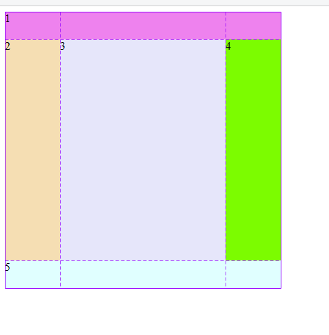
3.2 命名网格区域
可以为每个网格区域设置一个语义化的名称
具有名称的网格区域成为命名区域
名称相同的网格区域会合并,形成更大的区域空间
项目设置区域名称后,会自动填充到对应的命名区域中
.container {width: 400px;height: 400px;background-color: wheat;display: grid;grid-auto-flow: row;grid-template-rows: 40px 1fr 40px;grid-template-columns: 80px 1fr 80px;/* 设置命名网格区域,相同名称的会合并 */grid-template-areas: "header header header" "left main right" "footer footer footer";}.item {background-color: lightgreen;}/* 命名网格区域 */.item.item1 {background-color: violet;grid-area: header;}.item.item2 {background-color: wheat;grid-area: left;}.item.item3 {background-color: lavender;grid-area: main;}.item.item4 {background-color: lawngreen;grid-area: right;}.item.item5 {background-color: lightcyan;grid-area: footer;}
效果图
3.2.1 网格区域占位符
- 当项目默认已经填充到正确区域中,无需设置时可使用”.” 作为占位符
.container {width: 400px;height: 400px;background-color: wheat;display: grid;grid-auto-flow: row;grid-template-rows: 40px 1fr 40px;grid-template-columns: 80px 1fr 80px;/* 设置命名网格区域,相同名称的会合并 */grid-template-areas: "header header header" ". . ." "footer footer footer";}.item {background-color: lightgreen;}/* 命名网格区域 */.item.item1 {background-color: violet;grid-area: header;}.item.item2 {background-color: wheat;/* grid-area: left; */}.item.item3 {background-color: lavender;/* grid-area: main; */}.item.item4 {background-color: lawngreen;/* grid-area: right; */}.item.item5 {background-color: lightcyan;grid-area: footer;}
效果与上面相同
3.3 设置单元格在容器中多个对齐方式
justify-content: 设置所有项目在容器中水平方向的对齐方式align-content: 设置所有项目在容器中垂直方向的对齐方式place-content: 上面二个属性的简写,place-content: 垂直对齐方式 水平对齐方式- 当两个值相同时可以只写一个
| 属性值 | 描述 |
|---|---|
| start | 起始线对齐 |
| end | 终止线对齐 |
| center | 中线对齐 |
| space-around | 分散对齐 |
| space-between | 两端对齐 |
| space-evenly | 平均对齐 |
.container {width: 400px;height: 400px;background-color: wheat;display: grid;grid-auto-flow: row;grid-template-rows: repeat(3, 100px);grid-template-columns: repeat(3, 100px);/* justify-content: space-evenly;align-content: space-evenly; *//* 当两个值相同时 只写一个 */place-content: space-evenly;}
效果图
3.4 设置所有项目在网格区域中的对齐方式
justify-items: 设置所有项目在单元格/网格区域中水平方向的对齐方式align-items: 设置所有项目在单元格/网格区域中垂直方向的对齐方式place-items: 上面二个属性的简写,place-items: 垂直对齐方式 水平对齐方式- 当两个值相同时可以只写一个
| 属性值 | 描述 |
|---|---|
| start | 起始线 |
| end | 终止线 |
| center | 中线 |
| stretch | 默认值 拉伸 |
.container {width: 400px;height: 400px;background-color: wheat;display: grid;grid-auto-flow: row;grid-template-rows: repeat(3, 100px);grid-template-columns: repeat(3, 100px);/* justify-items: center; *//* align-items: center; *//* 两个值相同只写一个 */place-items: center;}.item {background-color: lightgreen;/* 项目给个宽高 */height: 50px;width: 50px;}
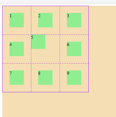
3.5 设置某个项目在单元格中的对齐方式
justify-self: 设置某个项目在单元格/网格区域中水平方向的对齐方式align-self: 设置某个项目在单元格/网格区域中垂直方向的对齐方式place-self: 上面二个属性的简写,place-self: 垂直对齐方式 水平对齐方式
.item.item5 {place-self: start;}
效果图
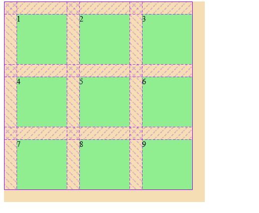
3.6 设置容器中行与列之间的间距/间隙
column-gap: 列间距row-gap: 行间距gap: 行间距 列间距: 简写gap: 值: 行与列相等,可只写一个值
.container {width: 400px;height: 400px;background-color: wheat;display: grid;grid-auto-flow: row;grid-template-rows: repeat(3, 100px);grid-template-columns: repeat(3, 100px);/* 设置行列间距 */gap: 10px;}
效果图

4.总结
grid属性跟flex属性很像,相当于 flex 的扩展,flex 一维,grid 二维。理解了 flex 后,grid 并不难理解。
重点在于多练,多敲几遍,所谓‘书读百遍,其意自见’。