

先写总结:
因为时间问题只能听录播,听完觉得商城仿站完全能听懂,周一开始做中文网仿站,觉得有两个小时应该可以搞定,结果…… 四个小时都做很糟糕,还有一些细节上纠结了半天没敢深究。本来昨天可以交的,网页上测试可以,放服务器上一看,完全蒙了,手机端完全乱的,图片到处乱跑。晚上看孩子稍的又研究了一阵,发现了些问题,今天早上看了会md文档,发现之前思路就根本不清楚,看文档觉得自己茅塞顿开,又看了php中文网的源码觉得有1个小时可以重新布局css了。下午2点整到现在越整越糊涂。完全跟自己想的不一样。昨天主要css选择器搞不清,今天发现问题太多了,还是css的问题。先不深究了,赶紧看grid的视频,不然又要拉下课了,先跟上节奏第一,然后慢慢消化吧。先坐实例熟悉,然后一定要做项目,这样才能真的吃透。
先这样吧。
实例链接
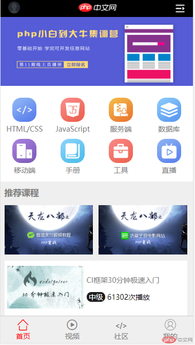
网页上效果图网页上效果图
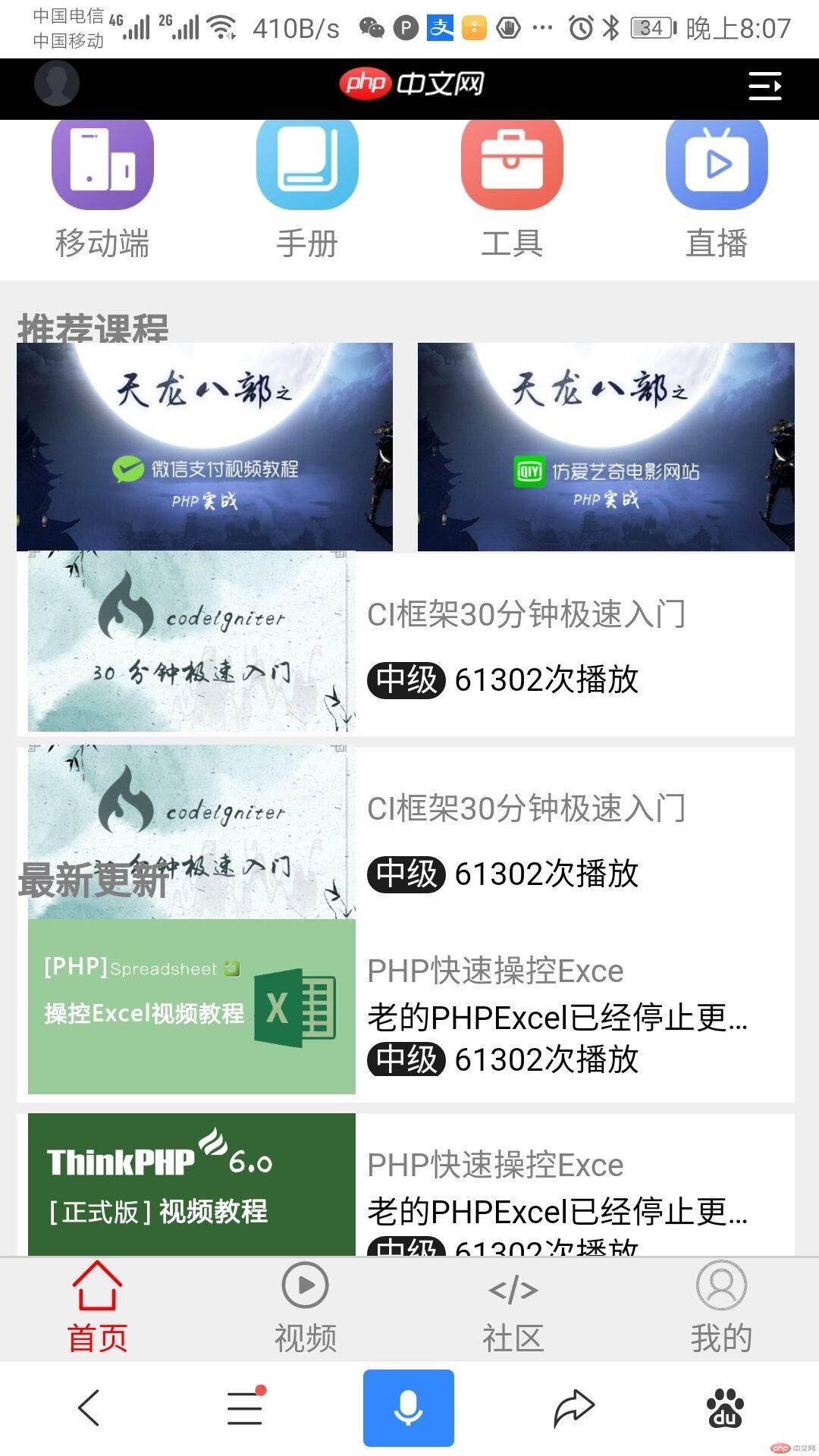
昨晚手机上效果图
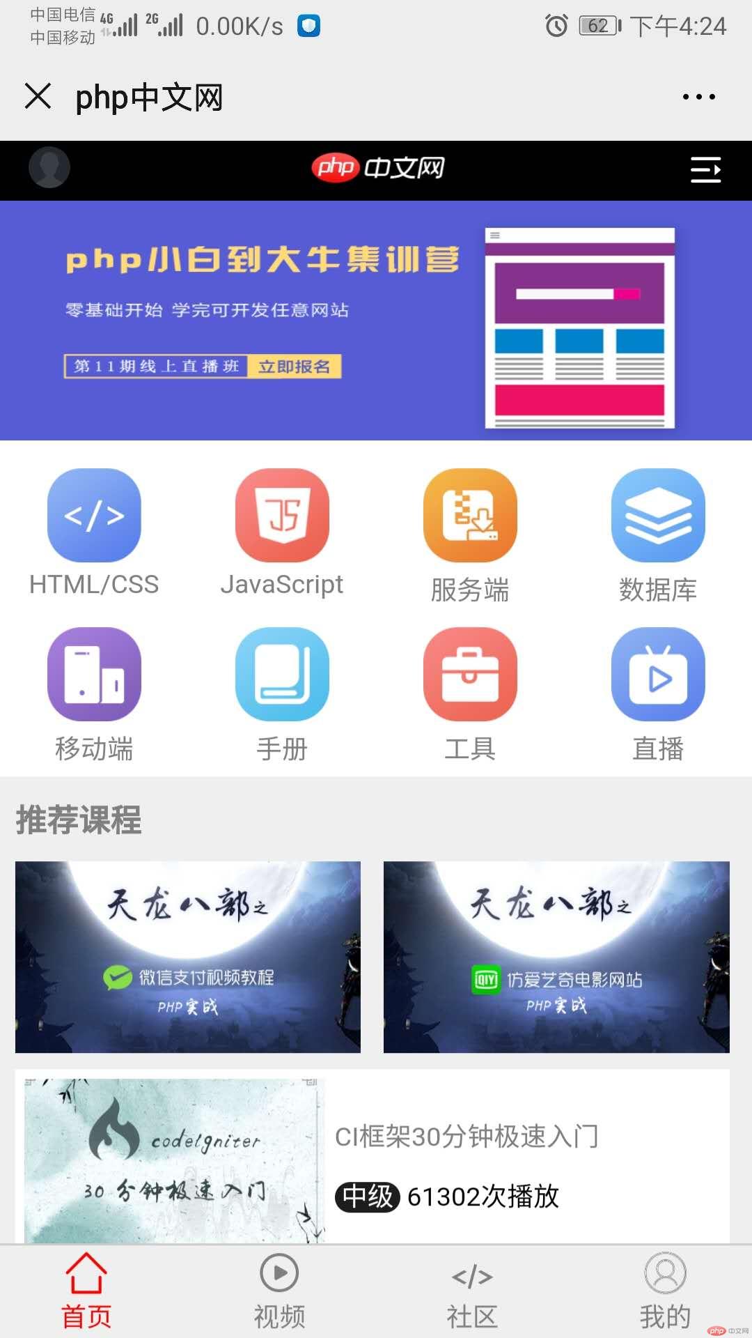
现在手机效果图
截了张长图

html代码
<!DOCTYPE html><html lang="en"><head><meta charset="UTF-8" /><meta name="viewport" content="width=device-width, initial-scale=1.0" /><link rel="stylesheet" href="css/header_footer.css" /><link rel="stylesheet" href="css/body.css" /><link rel="stylesheet" href="css/font_icon.css" /><title>php中文网</title></head><body><!-- 公共头部 --><header><div class="login"><a href=""><img src="images/login.png" alt="" /></a></div><li class="logo"><a href=""><img src="images/logo.png" alt="" /></a></li><li class="menu"><i class="iconfont"></i></li></header><!-- 轮播图 --><div class="slider"><a href=""><img src="images/slider.png" alt="" /></a></div><!-- 主导航区 --><nav><div><a href=""><img src="images/html.png" alt="" /></a><a href="">HTML/CSS</a></div><div><a href=""><img src="images/JavaScript.png" alt="" /></a><a href="">JavaScript</a></div><div><a href=""><img src="images/server.png" alt="" /></a><a href="">服务端</a></div><div><a href=""><img src="images/sql.png" alt="" /></a><a href="">数据库</a></div><div><a href=""><img src="images/app.png" alt="" /></a><a href="">移动端</a></div><div><a href=""><img src="images/manual.png" alt="" /></a><a href="">手册</a></div><div><a href=""><img src="images/tool2.png" alt="" /></a><a href="">工具</a></div><div><a href=""><img src="images/live.png" alt="" /></a><a href="">直播</a></div></nav><!-- 推荐课程 --><div class="course"><h2 class="title">推荐课程</h2><div><a href=""><img src="images/tjkc1.jpg" alt="" /></a><a href=""><img src="images/tjkc2.jpg" alt="" /></a></div><div><a href=""><img src="images/tjkc3.jpg" alt="" /> </a><div><a href=""><span>CI框架30分钟极速入门</span></a><p><span> 中级 </span> 61302次播放</p></div></div><div><a href=""><img src="images/tjkc3.jpg" alt="" /> </a><div><a href=""><span>CI框架30分钟极速入门</span></a><p><span> 中级 </span> 61302次播放</p></div></div></div><!-- 最新更新 --><div class="update"><h2 class="title">最新更新</h2><div><a href=""><img src="images/zxgx1.png" alt="" /> </a><div><a href=""><span>PHP快速操控Exce</span></a><p>老的PHPExcel已经停止更新了!目前最新的是使用phpOffice插件PhpSpreadsheet,用纯php 编写的库,它提供了一组类,允许您读取和写入不同的电子表格文</p><p><span> 中级 </span> 61302次播放</p></div></div><div><a href=""><img src="images/zxgx2.png" alt="" /> </a><div><a href=""><span>PHP快速操控Exce</span></a><p>老的PHPExcel已经停止更新了!目前最新的是使用phpOffice插件PhpSpreadsheet,用纯php 编写的库,它提供了一组类,允许您读取和写入不同的电子表格文</p><p><span> 中级 </span> 61302次播放</p></div></div><div><a href=""><img src="images/zxgx3.jpg" alt="" /> </a><div><a href=""><span>PHP快速操控Exce</span></a><p>老的PHPExcel已经停止更新了!目前最新的是使用phpOffice插件PhpSpreadsheet,用纯php 编写的库,它提供了一组类,允许您读取和写入不同的电子表格文</p><p><span> 中级 </span> 61302次播放</p></div></div></div><!-- 最新文章 --><div class="text"><h2 class="title">最新文章</h2><div><div><a href=""><span>word破折号怎么打出来</span></a><p>发布时间:2020-04-13</p></div><a href=""><img src="images/zxwz1.jpg" alt="" /> </a></div><div><div><a href=""><span>word破折号怎么打出来</span></a><p>发布时间:2020-04-13</p></div><a href=""><img src="images/zxwz2.jpg" alt="" /> </a></div><div><div><a href=""><span>word破折号怎么打出来</span></a><p>发布时间:2020-04-13</p></div><a href=""><img src="images/zxwz3.jpg" alt="" /> </a></div><div class="more">更多内容</div></div><!-- 最新博文 --><div class="text2"><h2 class="title">最新博文</h2><div><a href=""><span>微信的openid和unionid</span></a><p>发布时间:2020-04-13</p></div><div><a href=""><span>微信的openid和unionid</span></a><p>发布时间:2020-04-13</p></div><div><a href=""><span>微信的openid和unionid</span></a><p>发布时间:2020-04-13</p></div><div class="more">更多内容</div></div><!-- 最新问答 --><div class="question"><h2 class="title">最新问答</h2><div><a href=""><span>composer安装问题</span></a><p>发布时间:2020-04-13</p></div><div><a href=""><span>composer安装问题</span></a><p>发布时间:2020-04-13</p></div><div><a href=""><span>composer安装问题</span></a><p>发布时间:2020-04-13</p></div><div class="more">更多内容</div></div><footer><a href=""><span class="iconfont"></span><span>首页</span></a><a href=""><span class="iconfont"></span><span>视频</span></a><a href=""><span class="iconfont"></span><span>社区</span></a><a href=""><span class="iconfont"></span><span>我的</span></a></footer></body></html>
css代码
* {margin: 0;padding: 0;}html {width: 100vw;height: 100vh;font-size: 14px;}a {text-decoration: none;color: grey;}body {min-width: 300px;background-color: #efefef;display: flex;flex-flow: column nowrap;}header {display: flex;height: 5vh;background-color: black;align-items: center;justify-content: space-between;padding: 0px 15px;box-sizing: border-box;position: fixed;width: 100vw;}header > .login > a img {height: 3.5vh;}header > .logo > a img {height: 5.5vh;}header > .menu {font-size: 3vh;color: white;}body > .slider {margin-top: 5vh;height: 20vh;background-color: black;}.slider > a img {width: 100%;height: 100%;}/* 主导航区 */nav {height: 28vh;display: flex;flex-flow: row wrap;align-content: center;background-color: #fff;}nav > div {width: 25vw;display: flex;flex-flow: column nowrap;text-align: center;}nav > div img {margin-top: 10px;width: 50%;}.title {font-size: 1.2rem;color: gray;/* font-weight: normal; */margin: 10px 0;}/* 主推课程 */.course {width: 95vw;height: 56vh;display: flex;flex-flow: column nowrap;margin: 0 2vw;}/* 第一行双图片样式 */.course > div:first-of-type {height: 17vh;display: flex;justify-content: space-between;align-items: center;}/* 第一行图片样式 */.course > div:first-of-type > a > img {width: 46vw;height: 100%;}/* 第二三行容器样式 */.course > div:not(:first-of-type) {height: 17vh;display: flex;justify-content: space-between;background-color: white;align-items: center;padding: 5px;box-sizing: border-box;margin-top: 5px;}/* 第二三行子容器样式 */.course > div > div {width: 60vw;height: 10vh;display: flex;flex-flow: column nowrap;align-items: flex-start;justify-content: space-around;padding: 0 5px;}/* 第二三行图片样式 */.course > div:not(:first-of-type) > a img {width: 40vw;height: 100%;}/* 文字中级的圆角黑色背景 */.course > div > div > p > span:first-of-type {width: 13vw;color: white;background-color: #1d1d1d;border-radius: 10px;}.update {width: 95vw;height: 55vh;display: flex;flex-flow: column nowrap;margin: 0 2vw;}.update > div {height: 15vh;display: flex;justify-content: space-between;background-color: white;align-items: center;padding: 10px;box-sizing: border-box;margin-top: 5px;}.update > div > div {width: 50vw;height: 10vh;display: flex;flex-flow: column nowrap;align-items: flex-start;justify-content: space-around;padding: 5px;}.update > div > a {width: 50vw;height: 10vh;display: flex;flex-flow: column nowrap;align-items: flex-start;justify-content: space-around;padding: 5px;}.update > div > a img {width: 100%;height: 100%;}.update > div > div p {display: inline-block;white-space: nowrap;width: 100%;overflow: hidden;text-overflow: ellipsis;}.update > div > div > p > span:first-of-type {width: 13vw;color: white;background-color: #1d1d1d;border-radius: 10px;}.text {width: 95vw;height: 45vh;display: flex;flex-flow: column nowrap;margin: 0 2vw;}.text > div {height: 10vh;display: flex;justify-content: space-between;background-color: white;align-items: center;padding: 5px;box-sizing: border-box;margin-top: 5px;}.text > div > div {width: 50vw;height: 10vh;display: flex;flex-flow: column nowrap;align-items: flex-start;justify-content: space-around;padding: 5px;}.text > div > a img {width: 40vw;height: 100%;}.text > .more {height: 5vh;width: 95vw;justify-content: center;text-align: center;}.text2 {width: 95vw;height: 33vh;display: flex;flex-flow: column nowrap;margin: 0 2vw;}.text2 > div {height: 6vh;display: flex;justify-content: space-around;background-color: white;align-items: center;padding: 5px;box-sizing: border-box;margin-top: 5px;}.text2 > .more {height: 4vh;width: 95vw;justify-content: center;text-align: center;}.question {width: 95vw;height: 40vh;display: flex;flex-flow: column nowrap;margin: 0 2vw;}.question > div {height: 6vh;display: flex;justify-content: space-around;background-color: white;align-items: center;padding: 5px;box-sizing: border-box;margin-top: 5px;}.question > .more {height: 4vh;width: 95vw;justify-content: center;text-align: center;}footer {display: flex;height: 8vh;color: #666;background-color: #efefef;border-top: 1px solid #ccc;align-items: center;justify-content: space-between;padding: 0 8vw;box-sizing: border-box;position: fixed;width: 100vw;bottom: 0;}footer > a {display: flex;flex-flow: column nowrap;align-items: center;}footer > a:first-of-type {color: red;}footer > a > span:first-of-type {font-size: 1.6rem;}