
flex 容器与项目
1、 display属性
代码实例
<!DOCTYPE html><html lang="en"><head><meta charset="UTF-8" /><meta name="viewport" content="width=device-width, initial-scale=1.0" /><title>flex的display属性</title><style>.container {width: 400px;height: 200px;}.container {display: flex;display:inline-flex;}.item {width: 150px;height: 70px;background-color: cyan;font-size: 1.5rem;}</style></head><body><div class="container"><div class="item">php</div><div class="item">CSS</div><div class="item">HTML</div><div class="item">javascript</div></div></body></html>
" class="reference-link">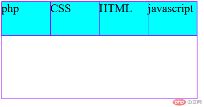
2、 flex-direction属性
代码实例
<!DOCTYPE html><html lang="en"><head><meta charset="UTF-8" /><meta name="viewport" content="width=device-width, initial-scale=1.0" /><title>容器主轴方向</title><style>/* 容器 */.container {width: 400px;height: 200px;}.container {display: flex;}.container {/*flex-direction: row;*/flex-direction: row-reverse;/* flex-direction: column;flex-direction: column-reverse;*/}.item {width: 150px;height: 70px;background-color: cyan;font-size: 1.5rem;}</style></head><body><div class="container"><div class="item">php</div><div class="item">CSS</div><div class="item">HTML</div><div class="item">javascript</div></div></body></html>
" class="reference-link">
3 flex-wrap属性
代码实例
<!DOCTYPE html><html lang="en"><head><meta charset="UTF-8" /><meta name="viewport" content="width=device-width, initial-scale=1.0" /><title>容器主轴方向</title><style>.container {width: 400px;height: 200px;}.container {display: flex;}.container {flex-direction: row;}.container {/*flex-wrap: nowrap;flex-wrap: wrap;*/flex-wrap: wrap-reverse;}.item {width: 150px;height: 70px;background-color: cyan;font-size: 1.5rem;}</style></head><body><div class="container"><div class="item">php</div><div class="item">CSS</div><div class="item">HTML</div><div class="item">javascript</div></div></body></html>
" class="reference-link">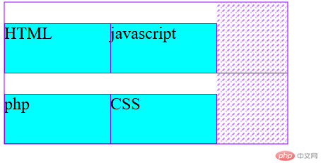
4、 justify-content属性
代码实例
<!DOCTYPE html><html lang="en"><head><meta charset="UTF-8" /><meta name="viewport" content="width=device-width, initial-scale=1.0" /><title>主轴项目对齐方式</title><style>.container {width: 400px;height: 200px;}.container {display: flex;}.container {/*justify-content: flex-start;justify-content: flex-end;justify-content: center;*/justify-content: space-between;/*justify-content: space-around;justify-content: space-evenly;*/}.item {width: 80px;height: 50px;background-color: cyan;font-size: 1.5rem;}</style></head><body><div class="container"><div class="item">php</div><div class="item">CSS</div><div class="item">HTML</div><div class="item">javascript</div></div></body></html>
" class="reference-link">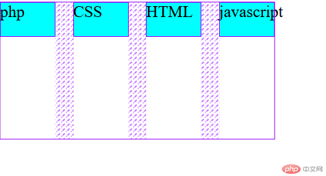
5、 align-items属性
代码实例
<!DOCTYPE html><html lang="en"><head><meta charset="UTF-8" /><meta name="viewport" content="width=device-width, initial-scale=1.0" /><title>交叉轴项目对齐方式</title><style>.container {width: 400px;height: 200px;}.container {display: flex;}.container {/* align-items: flex-start;align-items: flex-end;*/align-items: center;}.item {width: 80px;height: 50px;background-color: cyan;font-size: 1.5rem;}</style></head><body><div class="container"><div class="item">php</div><div class="item">CSS</div><div class="item">HTML</div><div class="item">javascript</div></div></body></html>
" class="reference-link">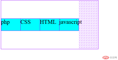
6、 align-content属性
代码实例
<!DOCTYPE html><html lang="en"><head><meta charset="UTF-8" /><meta name="viewport" content="width=device-width, initial-scale=1.0" /><title>交叉轴项目对齐方式</title><style>.container {width: 400px;height: 200px;}.container {display: flex;}.container {flex-flow: row wrap;/*align-content: stretch;align-content: flex-start;align-content: flex-end;align-content: center;align-content: space-between;align-content: space-around;*/align-content: space-evenly;}.item {width: 80px;height: 50px;background-color: cyan;font-size: 1.5rem;}</style></head><body><div class="container"><div class="item">php</div><div class="item">CSS</div><div class="item">HTML</div><div class="item">javascript</div><div class="item">C</div><div class="item">C#</div><div class="item">C++</div><div class="item">java</div></div></body></html>
" class="reference-link">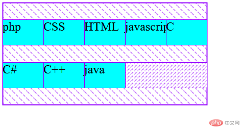
7、 align-self属性
代码实例
<!DOCTYPE html><html lang="en"><head><meta charset="UTF-8" /><meta name="viewport" content="width=device-width, initial-scale=1.0" /><title>项目独立对齐方向</title><style>.container {width: 300px;height: 150px;}.container {display: flex;}.item {width: 50px;height: 50px;background-color: cyan;font-size: 1.5rem;align-self: auto;}.item:first-of-type {align-self: stretch;background-color: lightgreen;}.item:nth-of-type(2) {background-color: lightcoral;align-self: flex-start;}.item:nth-of-type(3) {background-color: wheat;align-self: flex-end;}.item:last-of-type {align-self: center;}</style></head><body><div class="container"><div class="item">php</div><div class="item">CSS</div><div class="item">HTML</div><div class="item">javascript</div></div></body></html>
" class="reference-link">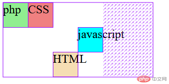
8、 flex-grow属性
代码实例
<!DOCTYPE html><html lang="en"><head><meta charset="UTF-8" /><meta name="viewport" content="width=device-width, initial-scale=1.0" /><title>项目放大因子</title><style>.container {width: 400px;height: 200px;}.container {display: flex;}.item {width: 80px;height: 50px;background-color: cyan;font-size: 1.5rem;flex-grow: initial;flex-grow: 0;}.item:first-of-type {background-color: lightgreen;flex-grow: 1;}.item:nth-of-type(2) {background-color: lightcoral;flex-grow: 2;}.item:last-of-type {background-color: wheat;flex-grow: 3;}</style></head><body><div class="container"><div class="item">php</div><div class="item">CSS</div><div class="item">HTML</div></div></body></html>
" class="reference-link">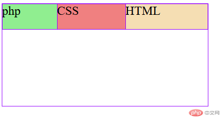
9、 flex-shrink属性
代码实例
<!DOCTYPE html><html lang="en"><head><meta charset="UTF-8" /><meta name="viewport" content="width=device-width, initial-scale=1.0" /><title>项目收缩因子</title><style>.container {width: 300px;height: 150px;}.container {display: flex;flex-flow: row nowrap;}.item {width: 150px;height: 50px;background-color: cyan;font-size: 1.5rem;flex-shrink: 0;}.item:first-of-type {background-color: lightgreen;flex-shrink: 1;}.item:nth-of-type(2) {background-color: lightcoral;flex-shrink: 2;}.item:last-of-type {background-color: wheat;flex-shrink: 3;}</style></head><body><div class="container"><div class="item">php</div><div class="item">CSS</div><div class="item">HTML</div></div></body></html>
" class="reference-link">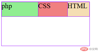
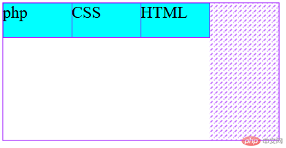
10、 flex-basis属性
代码实例
<!DOCTYPE html><html lang="en"><head><meta charset="UTF-8" /><meta name="viewport" content="width=device-width, initial-scale=1.0" /><title>项目在主轴上的计算宽度</title><style>.container {width: 400px;height: 200px;}.container {display: flex;flex-flow: row wrap;}.item {width: 80px;height: 50px;background-color: cyan;font-size: 1.5rem;}.item {flex-basis: auto;flex-basis: 70px;flex-basis: 20%;flex-basis: 5rem;max-width: 100px;flex-basis: 150px;}</style></head><body><div class="container"><div class="item">php</div><div class="item">CSS</div><div class="item">HTML</div></div></body></html>
11、flex属性 三值语法
代码实例
<!DOCTYPE html><html lang="en"><head><meta charset="UTF-8" /><meta name="viewport" content="width=device-width, initial-scale=1.0" /><title>项目在主轴上的计算宽度</title><style>.container {width: 400px;height: 200px;}.container {display: flex;flex-flow: row wrap;}.item {width: 80px;height: 50px;background-color: cyan;font-size: 1.5rem;}.item {/*flex:0 1 auto;flex:1 1 auto;*/flex: 0 0 auto;}</style></head><body><div class="container"><div class="item">php</div><div class="item">CSS</div><div class="item">HTML</div></div></body></html>
" class="reference-link">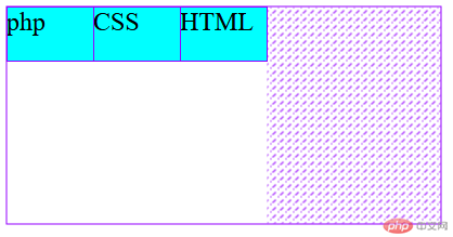
12、 双值语法
代码实例
<!DOCTYPE html><html lang="en"><head><meta charset="UTF-8" /><meta name="viewport" content="width=device-width, initial-scale=1.0" /><title>项目在主轴上的计算宽度</title><style>.container {width: 400px;height: 200px;}.container {display: flex;flex-flow: row wrap;}.item {width: 80px;height: 50px;background-color: cyan;font-size: 1.5rem;}.item {flex: 0 200px;}</style></head><body><div class="container"><div class="item">php</div><div class="item">CSS</div><div class="item">HTML</div></div></body></html>
" class="reference-link">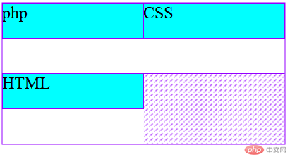
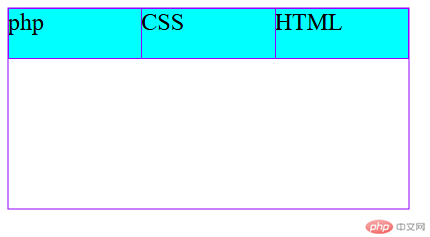
13、 单值语法
代码实例
<!DOCTYPE html><html lang="en"><head><meta charset="UTF-8" /><meta name="viewport" content="width=device-width, initial-scale=1.0" /><title>项目在主轴上的计算宽度</title><style>.container {width: 400px;height: 200px;}.container {display: flex;flex-flow: row wrap;}.item {width: 80px;height: 50px;background-color: cyan;font-size: 1.5rem;}.item {flex:1;}</style></head><body><div class="container"><div class="item">php</div><div class="item">CSS</div><div class="item">HTML</div></div></body></html>
flex容器与项目学习总结
本节课我们学习了flex的属性,通过本节课的学习与之前学到的float相比,flex的布局代码简洁,使用灵活,能够快速的进行页面布局,使我学到了新的前端布局方法,同时增加了我的学习兴趣。