
1/将课堂介绍了三个小案例,自己动手写一遍,再抄一遍
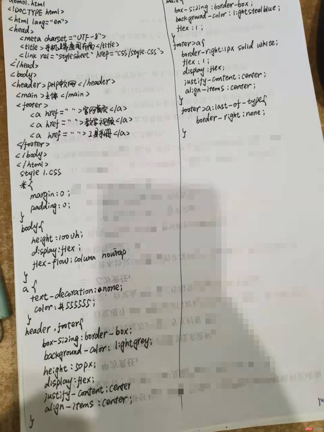
demo1.html
<!DOCTYPE html><html lang="en"><head><meta charset="UTF-8"><title>手机端通用布局</title><link rel="stylesheet" href="css/style1.css"></head><body><header>PHP中文网</header><main>主体</main><footer><a href="">官网首页</a><a href="">教学视频</a><a href="">工具手册</a></footer></body></html>
style1.css
*{margin:0;padding: 0;}a{text-decoration: none;color: #555555;}body{height: 100vh; /*vh:视口高度百分比,让body撑开页面,上下无限翻屏,vw:左右无限翻屏*/display: flex;flex-flow: column nowrap; /*主轴方向垂直排列,宽度超过主轴宽度时不换行*/}header,footer{box-sizing: border-box; /*盒子不受边框和内边距的影响*/background-color: lightgrey;height:50px;display: flex; /*header,footer为body中的弹性元素,要设置header,body中的元素排列方式,要将其再看成时弹性盒子*/justify-content: center; /*元素在主轴上的排列*/align-items: center; /*元素在垂直轴居中*/}main{box-sizing: border-box;background-color: lightsteelblue;flex: 1; /*剩余空间给主体*/}footer>a{border-right:1px solid white;flex: 1;display: flex;justify-content: center;align-items: center;}footer>a:last-of-type{border-right: none;}
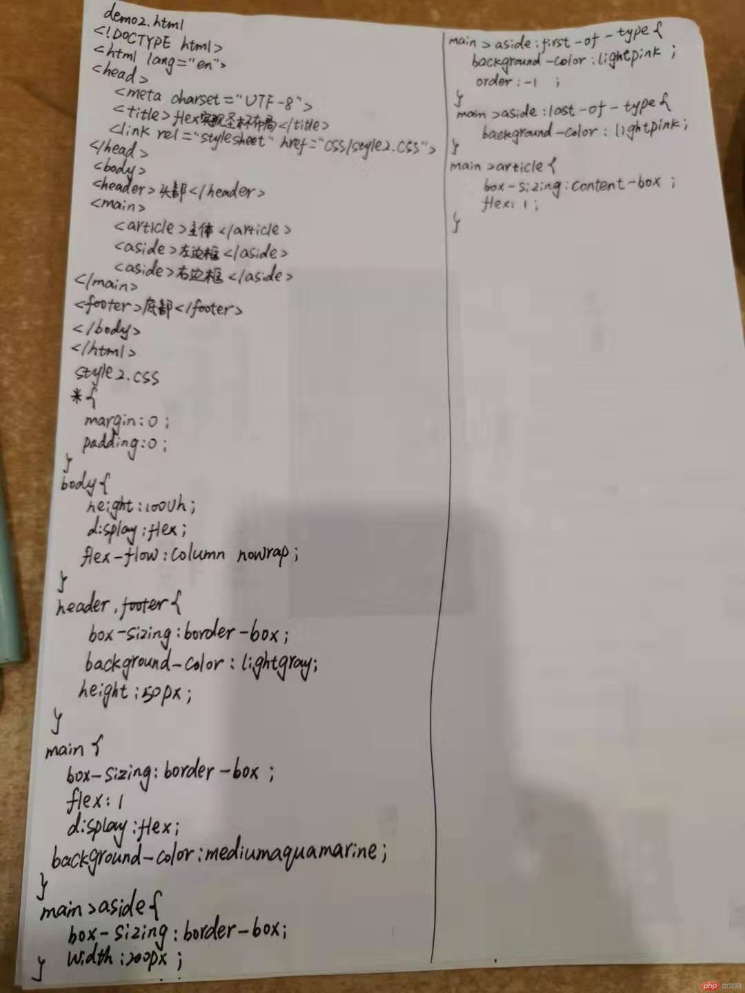
demo2.html
<!DOCTYPE html><html lang="en"><head><meta charset="UTF-8"><title>flex实现圣杯布局</title><link rel="stylesheet" href="css/style2.css"></head><body><header>头部</header><main><article>主体</article><aside>左边框</aside><aside>右边框</aside></main><footer>底部</footer></body></html>
style2.css
*{margin: 0;padding: 0;}body{height: 100vh;display: flex;flex-flow: column nowrap;}header,footer{box-sizing: border-box;background-color: lightgray;height: 50px;}main{box-sizing: border-box;flex: 1;display: flex;background-color: mediumaquamarine;}main>aside{box-sizing: border-box;width: 200px;}main>aside:first-of-type{background-color:lightpink;order: -1; /*调整弹性元素在主轴上的顺序,默认为0,允许负值或其他整数,这里让左边栏到最左边*/}main>aside:last-of-type{background-color: lightpink;}main>article{box-sizing: content-box;flex: 1;}
demo3.html
<!DOCTYPE html><html lang="en"><head><meta charset="UTF-8"><title>弹性布局实现登陆表单</title><link rel="stylesheet" href="css/style3.css"></head><body><div class="container"><h3>管理员登陆</h3><form action=""><div><lable for="email">邮箱:</lable><input type="email" id="email" placeholder="example@email.com"></div><div><label for="password">密码</label><input type="password" id="password" name="password" placeholder="不少于6位"></div><div><button>提交</button></div></form></div></body></html>
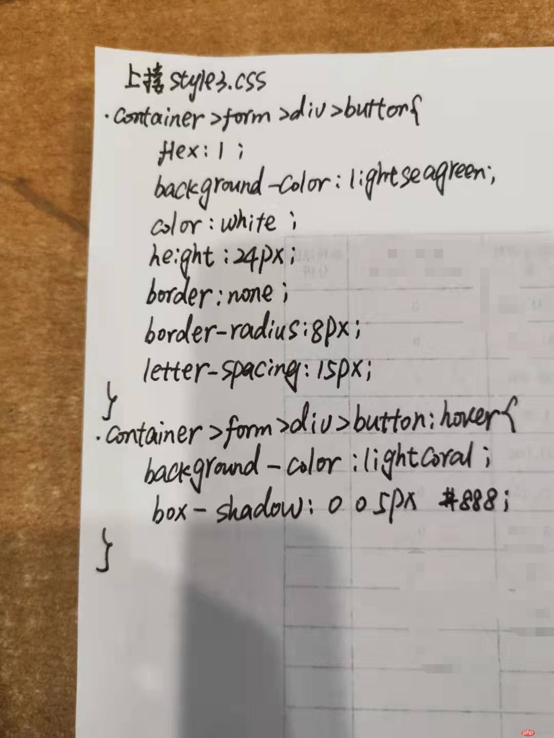
style3.css
*{margin: 0;padding: 0;/*outline: 1px dashed #999999;*/}body{height: 100vh;display: flex;flex-flow: column nowrap;justify-content: center;align-items: center;color: #444;font-weight: lighter;background: linear-gradient(to top,lightcyan,white,lightcyan);}.container{box-sizing: border-box;width: 300px;padding:20px;position: relative;top:-60px}.container>h3{text-align: center;margin-bottom:15px;font-weight: lighter;}.container>form{display: flex;flex-flow: column nowrap;padding: 15px;border:1px solid gray;border-radius: 10px;background: linear-gradient(to right bottom,lightblue,white);}.container>form:hover{background: linear-gradient(to left top,lightcyan,white);box-shadow: 0 0 2px #888;}.container>form>div{margin:10px 0;display: flex;}.container>form>div>input{flex: 1;margin-left: 10px;padding-left: 6px;border:1px solid gray;border-radius: 8px;}.container>form>div>button{flex:1;background-color: lightseagreen;color: white;height: 24px;border:none;border-radius: 8px;letter-spacing: 15px;}.container>form>div>button:hover{background-color: lightcoral;box-shadow: 0 0 5px #888;}

2/自己根据自己情况,自定义一个小案例,使用flex实现,例如网站后台首页
demo4.html
<!DOCTYPE html><html lang="en"><head><meta charset="UTF-8"><title>考试系统管理后台</title><link rel="stylesheet" href="css/style4.css"></head><body><header>考试系统管理后台</header><main><article><div>代办事项</div><div>用户数据分析</div></article><aside><div><a href="">公告管理</a></div><div><a href="">知识库</a></div><div><a href="">系统维护</a></div><div><a href="">权限管理</a></div></aside></main><footer>教育网 copyright©2020</footer></body></html>
style4.css
*{margin: 0;padding: 0;}body{height: 100vh;display: flex;flex-flow: column nowrap;}header,footer{display: flex;box-sizing: border-box;background-color: lightgrey;height: 50px;justify-content: center;align-items: center;}main{display: flex;box-sizing: border-box;flex:1;}main>aside{display: flex;box-sizing: border-box;width: 100px;background-color: lightsteelblue;flex-flow: column nowrap;order: -1;}main>aside>div{display: flex;box-sizing: border-box;flex:1 0 auto}main>aside>div>a{display: flex;box-sizing: border-box;cursor: pointer;text-decoration-line: none;flex: 1 0 auto;justify-content: center;align-items: center;color: black;}main>aside>div>a:hover{background-color: lightslategrey;}main>article{display: flex;box-sizing: border-box;flex: 1;flex-flow: column nowrap;background-color: lightyellow;}main>article>:first-child{display: flex;box-sizing: border-box;flex:30%;background-color: white;}main>article>:last-child{display: flex;box-sizing: border-box;flex: 70%;}