
css 控制加了一个统一类名的p,想让他水平垂直居中显示,但是这个p大小不一样,css就不能写固定,其他同学有什么好的思路没

迷茫2017-06-26 10:54:35
flex布局吧
<!DOCTYPE html>
<html>
<head>
<meta charset="utf-8">
<title></title>
<style>
#main
{
width:220px;
height:300px;
border:1px solid black;
display:flex;
justify-content:center;
align-items:center;
}
#main p
{
}
</style>
</head>
<body>
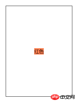
<p id="main">
<p style="background-color:coral;">红色</p>
</p>
</body>
</html>
过去多啦不再A梦2017-06-26 10:54:35
一种是使用flex布局,使子元素水平垂直居中;另一种是使用绝对定位加transform移动位置。
.flex {
display: flex;
align-items: center;
justify-content: center;
}
.one {
position: absolute;
left: 50%;
top: 50%;
transform: translate(-50%, -50%);
}
传送门
过去多啦不再A梦2017-06-26 10:54:35
老生常谈的问题,国外已经有人整理了各种情况的垂直居中:https://css-tricks.com/center...
甚至直接给你生成代码,还考虑是否兼容IE:http://howtocenterincss.com/
也可以看看翻译过的版本:https://github.com/chenjsh36/...
看完再也不怕各种垂直居中问题 23333

巴扎黑2017-06-26 10:54:35
上面使用弹性布局可以,但是不支持低级浏览器,
可以使用绝对定位来使p垂直水平居中
p{
    position: absolute;
    top: 0;
    left: 0;
    bottom: 0;
    right: 0;
    width: 620px;
    height: 618px;
    margin: auto;
    padding: 30px 0;
    box-sizing: border-box;
}

PHP中文网2017-06-26 10:54:35
各种弹层?各种计算?左右居中很简单,只需要
margin:0 auto;
即可,但是上下就稍微麻烦点了。虽然麻烦很多方式啊
1,js判断,这个比较笨重,就不说了,简单会js的朋友都会
2,disable:table. 这个需要两个dom配合,不推荐,主要兼容性也一般
3,利用transfrom,这个如果不考虑兼容,不知道高度,极力推荐。大概方式如下:
.dom{
宽自己定义
position: absolute;
transform: translate(-50%, -50%);
left: 50%;
top: 50%;
}
知道宽度,不知道高度 推荐这个
4,如果知道宽高,那就不用上面了,因为上面不兼容啊,这个狂兼容,代码如下:
.dom{
宽高自己定义
position: absolute;
margin: auto;
top:0;
right: 0;
bottom:0;
left: 0;
}
5,flex 布局,除了兼容,其他都没问题。
<p class="mask">
<p class="mask-con">
    这是文字信息
</p>
</p>
.mask{
position: fixed;
top:0;
left: 0;
width: 100vw;
height: 100vh;
background: rgba(0,0,0,.5);
z-index: 1;
display: flex;
justify-content: center;
align-items: center;
}
.mask-con{
width: 200px;
/*height: 90px;*/
height: auto;
background: #fff;
font-size: 14px;
padding: 20px;
border-radius:10px;
}
6, 如果考虑兼容====>请回看第一条。【都什么年代了 还考虑IE789 主要IE7 DOM1 支持都不大好,所以。。。】
7,其他没啥了。以上几种绝对够用了。有好的,请给予补充
滿天的星座2017-06-26 10:54:35
父元素
{
 position: relative;
}
子元素
{
position:absolute;
top:50%;
left:50%;
transform:(-50%,-50%);
}習慣沉默2017-06-26 10:54:35
再补充三个方法。
采用绝对或固定定位居中一个已知宽度和高度的元素:
.horizontal-and-vertical-center {
    width: 200px;
    height: 200px;
    position: fixed;
    top: 0;
    bottom: 0;
    left: 0;
    right: 0;
    margin: auto;
}
采用 display: table 布局居中元素,支持不确定的宽度和高度,并且兼容 IE8+ 和其他现代浏览器:
.table {
    display: table;
    width: 100%;
    height: 100%;
    position: fixed;
    top: 0;
    left: 0;
}

.cell {
    display: table-cell;
    vertical-align: center;
}

.horizontal-and-vertical-center {
    width: 800px;
    margin: 0 auto;
    /* 如果不定宽度的话用 inline-block 并且外层 text-align: center */
}
:before 伪元素撑开行高 (AmazeUI 在 modal 组件中使用的办法,并且支持不确定的宽度和高度, IE8+):
.am-modal {
    /* ... */
    text-align: center;
    /* ... */
}

.am-modal:before {
    content: "0B";
    display: inline-block;
    height: 100%;
    vertical-align: middle
}

.am-modal-dialog {
    position: relative;
    display: inline-block;
    vertical-align: middle;
    margin-left: auto;
    margin-right: auto;
    /* ... */
}