首页  >  问答  >  正文

javascript - 一个可以上下摆动的html元素

网址 http://zm.163.com/

这个效果怎么实现的

某草草某草草2711 天前555

全部回复(4)我来回复

  • 仅有的幸福

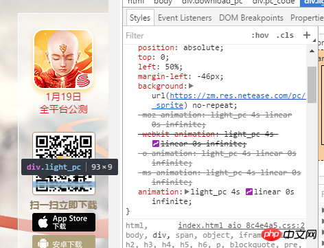
    仅有的幸福2017-05-19 10:46:32

    就是一个简单CSS3 动画

    .light_pc {
            width: 93px;
            height: 9px;
            position: absolute;
            top: 0;
            left: 50%;
            margin-left: -46px;
            background: url(https://zm.res.netease.com/pc/fab/20161226201931/img/light_pc_f3d5dee.png?_sprite) no-repeat;
            -moz-animation: light_pc 4s linear 0s infinite;
            -webkit-animation: light_pc 4s linear 0s infinite;
            -o-animation: light_pc 4s linear 0s infinite;
            -ms-animation: light_pc 4s linear 0s infinite;
            animation: light_pc 4s linear 0s infinite
        }
        
        @-webkit-keyframes light_pc {
            0% {
                top: 0
            }
            50% {
                top: 83px
            }
            100% {
                top: 0
            }
        }
        
        @-moz-keyframes light_pc {
            0% {
                top: 0
            }
            50% {
                top: 83px
            }
            100% {
                top: 0
            }
        }
        
        @-ms-keyframes light_pc {
            0% {
                top: 0
            }
            50% {
                top: 83px
            }
            100% {
                top: 0
            }
        }
        
        @-o-keyframes light_pc {
            0% {
                top: 0
            }
            50% {
                top: 83px
            }
            100% {
                top: 0
            }
        }
        
        @keyframes light_pc {
            0% {
                top: 0
            }
            50% {
                top: 83px
            }
            100% {
                top: 0
            }
        }
    

    回复
    0
  • PHPz

    PHPz2017-05-19 10:46:32

    查看元素,具体了解下css的animation

    回复
    0
  • 伊谢尔伦

    伊谢尔伦2017-05-19 10:46:32

    二维码图片外面有一个p和图片高度大小一致
    用:before
    做出一条横线
    写css3动画移动

    回复
    0
  • PHP中文网

    PHP中文网2017-05-19 10:46:32

    我也晒一下我的动画

      demo {
      transform: translate3d(0, 0, 0);
      animation: bounce 0.8s infinite ease-out;
    }
    @-webkit-keyframes bounce {
      50% {
        transform: translate3d(0, -0.2rem, 0);
      }
    }
    

    回复
    0
  • 取消回复