


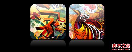
在css3中,直接在图片上使用box-shadow 和 border-radius,浏览器并不能很好的渲染。但是如果把图片作为background-image,添加的样式浏览器可以很好的渲染。我将会介绍如何使用box-shadow, border-radius 和 transition创建不同图片样式效果。
问题
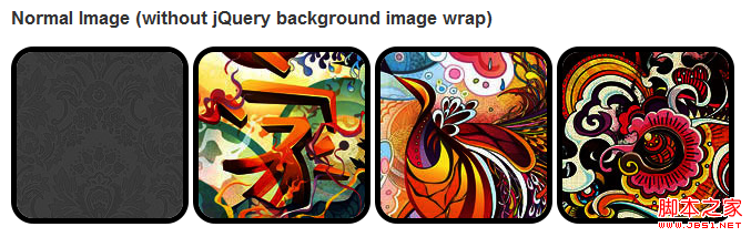
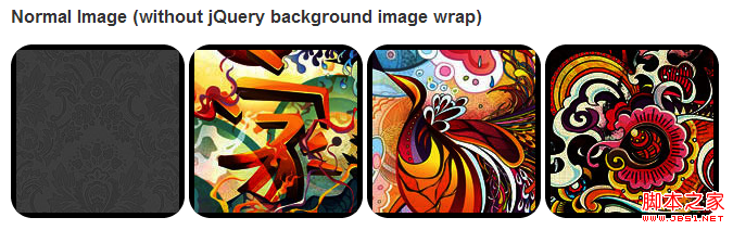
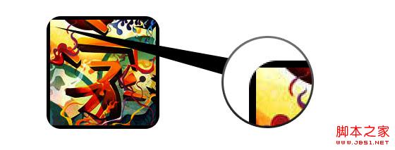
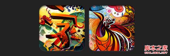
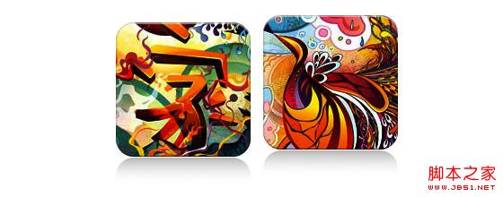
通过查看demo能注意到,我们为第一行图片设置了border-radius 和 内嵌box-shadow。firefox渲染了图片的border-radius,但是没有渲染内嵌box-shadow。chrome和Safari两种效果都没有渲染。
.normal img {
border: solid 5px #000;
-webkit-border-radius: 20px;
-moz-border-radius: 20px;
border-radius: 20px;
-webkit-box-shadow: inset 0 1px 5px rgba(0,0,0,.5);
-moz-box-shadow: inset 0 1px 5px rgba(0,0,0,.5);
box-shadow: inset 0 1px 5px rgba(0,0,0,.5);
}
firefox效果:
chrome/safari
变通方案
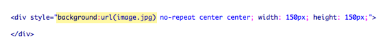
为了使border-radius 和 内嵌box-shadow能够正常工作,我们需要把图片转换成background-image的方式。
动态方式
为了动态完成这一工作,我们需要借助jquery为每一个图片添加背景图片的包装。下面的js代码为每一个图片添加了一个span的包装,span的背景图片路径就是图片的路径。
代码比较简单,我想就没有讲解的必要了。不清楚了可以直接去查jquery的api。
输出
上面的代码会输出如下结果:

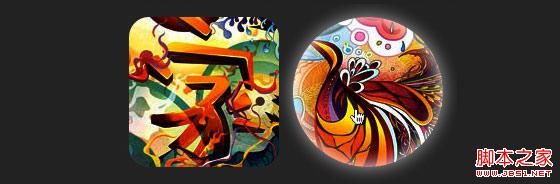
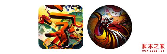
圆形图片
添加我们使用border-radius来实现圆形图片的效果,效果如下:
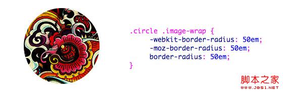
css:
.circle .image-wrap {
-webkit-border-radius: 50em;
-moz-border-radius: 50em;
border-radius: 50em;
}
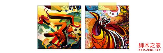
卡片风格
下面是卡片风格的图片,使用了多个内嵌box-shadow。
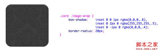
css:
.card .image-wrap {
-webkit-box-shadow: inset 0 0 1px rgba(0,0,0,.8), inset 0 2px 0 rgba(255,255,255,.5), inset 0 -1px 0 rgba(0,0,0,.4);
-moz-box-shadow: inset 0 0 1px rgba(0,0,0,.8), inset 0 2px 0 rgba(255,255,255,.5), inset 0 -1px 0 rgba(0,0,0,.4);
box-shadow: inset 0 0 1px rgba(0,0,0,.8), inset 0 2px 0 rgba(255,255,255,.5), inset 0 -1px 0 rgba(0,0,0,.4);
-webkit-border-radius: 20px;
-moz-border-radius: 20px;
border-radius: 20px;
}
浮雕风格
下面是浮雕效果。
css:
.embossed .image-wrap {
-webkit-box-shadow: inset 0 0 2px rgba(0,0,0,.8), inset 0 2px 0 rgba(255,255,255,.5), inset 0 -7px 0 rgba(0,0,0,.6), inset 0 -9px 0 rgba(255,255,255,.3);
-moz-box-shadow: inset 0 0 2px rgba(0,0,0,.8), inset 0 2px 0 rgba(255,255,255,.5), inset 0 -7px 0 rgba(0,0,0,.6), inset 0 -9px 0 rgba(255,255,255,.3);
box-shadow: inset 0 0 2px rgba(0,0,0,.8), inset 0 2px 0 rgba(255,255,255,.5), inset 0 -7px 0 rgba(0,0,0,.6), inset 0 -9px 0 rgba(255,255,255,.3);
-webkit-border-radius: 20px;
-moz-border-radius: 20px;
border-radius: 20px;
}
柔性浮雕风格
相对于浮雕样式,新样式添加了1px blur属性。
css:
.soft-embossed .image-wrap {
-webkit-box-shadow: inset 0 0 4px rgba(0,0,0,1), inset 0 2px 1px rgba(255,255,255,.5), inset 0 -9px 2px rgba(0,0,0,.6), inset 0 -12px 2px rgba(255,255,255,.3);
-moz-box-shadow: inset 0 0 4px rgba(0,0,0,1), inset 0 2px 1px rgba(255,255,255,.5), inset 0 -9px 2px rgba(0,0,0,.6), inset 0 -12px 2px rgba(255,255,255,.3);
box-shadow: inset 0 0 4px rgba(0,0,0,1), inset 0 2px 1px rgba(255,255,255,.5), inset 0 -9px 2px rgba(0,0,0,.6), inset 0 -12px 2px rgba(255,255,255,.3);
-webkit-border-radius: 20px;
-moz-border-radius: 20px;
border-radius: 20px;
}
抠图风格
使用内嵌box-shadow就可以实现抠图效果。
css:
.cut-out .image-wrap {
-webkit-box-shadow: 0 1px 0 rgba(255,255,255,.2), inset 0 4px 5px rgba(0,0,0,.6), inset 0 1px 0 rgba(0,0,0,.6);
-moz-box-shadow: 0 1px 0 rgba(255,255,255,.2), inset 0 4px 5px rgba(0,0,0,.6), inset 0 1px 0 rgba(0,0,0,.6);
box-shadow: 0 1px 0 rgba(255,255,255,.2), inset 0 4px 5px rgba(0,0,0,.6), inset 0 1px 0 rgba(0,0,0,.6);
-webkit-border-radius: 20px;
-moz-border-radius: 20px;
border-radius: 20px;
}
变形和发光
在这个例子中我们为图片包装添加transition属性,鼠标滑过的时候,他会从圆角变为圆形。然后我们使用多个box-shadow实现发光效果。
css:
.morphing-glowing .image-wrap {
-webkit-transition: 1s;
-moz-transition: 1s;
transition: 1s;
-webkit-border-radius: 20px;
-moz-border-radius: 20px;
border-radius: 20px;
}
.morphing-glowing .image-wrap:hover {
-webkit-box-shadow: 0 0 20px rgba(255,255,255,.6), inset 0 0 20px rgba(255,255,255,1);
-moz-box-shadow: 0 0 20px rgba(255,255,255,.6), inset 0 0 20px rgba(255,255,255,1);
box-shadow: 0 0 20px rgba(255,255,255,.6), inset 0 0 20px rgba(255,255,255,1);
-webkit-border-radius: 60em;
-moz-border-radius: 60em;
border-radius: 60em;
}
高光效果
高光的效果是通过为元素添加 :after 伪类实现的。
css:
.glossy .image-wrap {
-webkit-box-shadow: inset 0 -1px 0 rgba(0,0,0,.5);
-moz-box-shadow: inset 0 -1px 0 rgba(0,0,0,.5);
box-shadow: inset 0 -1px 0 rgba(0,0,0,.5);
-webkit-border-radius: 20px;
-moz-border-radius: 20px;
border-radius: 20px;
}
.glossy .image-wrap:after {
position: absolute;
content: ' ';
width: 100%;
height: 50%;
top: 0;
left: 0;
-webkit-border-radius: 20px;
-moz-border-radius: 20px;
border-radius: 20px;
background: -moz-linear-gradient(top, rgba(255,255,255,0.7) 0%, rgba(255,255,255,.1) 100%);
background: -webkit-gradient(linear, left top, left bottom, color-stop(0%,rgba(255,255,255,0.7)), color-stop(100%,rgba(255,255,255,.1)));
background: linear-gradient(top, rgba(255,255,255,0.7) 0%,rgba(255,255,255,.1) 100%);
}
倒影效果
在这个例子中,我们将高光效果移到底部就实现倒影效果。
css:
.reflection .image-wrap:after {
position: absolute;
content: ' ';
width: 100%;
height: 30px;
bottom: -31px;
left: 0;
-webkit-border-top-left-radius: 20px;
-webkit-border-top-right-radius: 20px;
-moz-border-radius-topleft: 20px;
-moz-border-radius-topright: 20px;
border-top-left-radius: 20px;
border-top-right-radius: 20px;
background: -moz-linear-gradient(top, rgba(0,0,0,.3) 0%, rgba(255,255,255,0) 100%);
background: -webkit-gradient(linear, left top, left bottom, color-stop(0%,rgba(0,0,0,.3)), color-stop(100%,rgba(255,255,255,0)));
background: linear-gradient(top, rgba(0,0,0,.3) 0%,rgba(255,255,255,0) 100%);
}
.reflection .image-wrap:hover {
position: relative;
top: -8px;
}
高光和倒影
本例我们使用:before 和 :after 将高光和倒影效果组合起来。
css:
.glossy-reflection .image-wrap {
-webkit-box-shadow: inset 0 -1px 0 rgba(0,0,0,.5), inset 0 1px 0 rgba(255,255,255,.6);
-moz-box-shadow: inset 0 -1px 0 rgba(0,0,0,.5), inset 0 1px 0 rgba(255,255,255,.6);
box-shadow: inset 0 -1px 0 rgba(0,0,0,.5), inset 0 1px 0 rgba(255,255,255,.6);
-webkit-transition: 1s;
-moz-transition: 1s;
transition: 1s;
-webkit-border-radius: 20px;
-moz-border-radius: 20px;
border-radius: 20px;
}
.glossy-reflection .image-wrap:before {
position: absolute;
content: ' ';
width: 100%;
height: 50%;
top: 0;
left: 0;
-webkit-border-radius: 20px;
-moz-border-radius: 20px;
border-radius: 20px;
background: -moz-linear-gradient(top, rgba(255,255,255,0.7) 0%, rgba(255,255,255,.1) 100%);
background: -webkit-gradient(linear, left top, left bottom, color-stop(0%,rgba(255,255,255,0.7)), color-stop(100%,rgba(255,255,255,.1)));
background: linear-gradient(top, rgba(255,255,255,0.7) 0%,rgba(255,255,255,.1) 100%);
}
.glossy-reflection .image-wrap:after {
position: absolute;
content: ' ';
width: 100%;
height: 30px;
bottom: -31px;
left: 0;
-webkit-border-top-left-radius: 20px;
-webkit-border-top-right-radius: 20px;
-moz-border-radius-topleft: 20px;
-moz-border-radius-topright: 20px;
border-top-left-radius: 20px;
border-top-right-radius: 20px;
background: -moz-linear-gradient(top, rgba(230,230,230,.3) 0%, rgba(230,230,230,0) 100%);
background: -webkit-gradient(linear, left top, left bottom, color-stop(0%,rgba(230,230,230,.3)), color-stop(100%,rgba(230,230,230,0)));
background: linear-gradient(top, rgba(230,230,230,.3) 0%,rgba(230,230,230,0) 100%);
}
胶带风格
在这个例子中,我们使用:after来实现胶带的效果。
css:
.tape .image-wrap {
-webkit-box-shadow: inset 0 0 2px rgba(0,0,0,.7), inset 0 2px 0 rgba(255,255,255,.3), inset 0 -1px 0 rgba(0,0,0,.5), 0 1px 3px rgba(0,0,0,.4);
-moz-box-shadow: inset 0 0 2px rgba(0,0,0,.7), inset 0 2px 0 rgba(255,255,255,.3), inset 0 -1px 0 rgba(0,0,0,.5), 0 1px 3px rgba(0,0,0,.4);
box-shadow: inset 0 0 2px rgba(0,0,0,.7), inset 0 2px 0 rgba(255,255,255,.3), inset 0 -1px 0 rgba(0,0,0,.5), 0 1px 3px rgba(0,0,0,.4);
}
.tape .image-wrap:after {
position: absolute;
content: ' ';
width: 60px;
height: 25px;
top: -10px;
left: 50%;
margin-left: -30px;
border: solid 1px rgba(137,130,48,.2);
background: -moz-linear-gradient(top, rgba(254,243,127,.6) 0%, rgba(240,224,54,.6) 100%);
background: -webkit-gradient(linear, left top, left bottom, color-stop(0%,rgba(254,243,127,.6)), color-stop(100%,rgba(240,224,54,.6)));
background: linear-gradient(top, rgba(254,243,127,.6) 0%,rgba(240,224,54,.6) 100%);
-webkit-box-shadow: inset 0 1px 0 rgba(255,255,255,.3), 0 1px 0 rgba(0,0,0,.2);
}
变形和着色
在这个例子中,我们在元素上使用:after,当鼠标进过的时候实现径向渐变的效果。
css:
.morphing-tinting .image-wrap {
position: relative;
-webkit-transition: 1s;
-moz-transition: 1s;
transition: 1s;
-webkit-border-radius: 20px;
-moz-border-radius: 20px;
border-radius: 20px;
}
.morphing-tinting .image-wrap:hover {
-webkit-border-radius: 30em;
-moz-border-radius: 30em;
border-radius: 30em;
}
.morphing-tinting .image-wrap:after {
position: absolute;
content: ' ';
width: 100%;
height: 100%;
top: 0;
left: 0;
-webkit-transition: 1s;
-moz-transition: 1s;
transition: 1s;
-webkit-border-radius: 30em;
-moz-border-radius: 30em;
border-radius: 30em;
}
.morphing-tinting .image-wrap:hover:after {
background: -webkit-gradient(radial, 50% 50%, 40, 50% 50%, 80, from(rgba(0,0,0,0)), to(rgba(0,0,0,1)));
background: -moz-radial-gradient(50% 50%, circle, rgba(0,0,0,0) 40px, rgba(0,0,0,1) 80px);
}
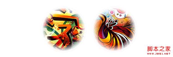
羽化边缘圆形
我们同样可以使用径向渐变产生遮罩,实现羽化的效果。
css:
.feather .image-wrap {
position: relative;
-webkit-border-radius: 30em;
-moz-border-radius: 30em;
border-radius: 30em;
}
.feather .image-wrap:after {
position: absolute;
content: ' ';
width: 100%;
height: 100%;
top: 0;
left: 0;
background: -webkit-gradient(radial, 50% 50%, 50, 50% 50%, 70, from(rgba(255,255,255,0)), to(rgba(255,255,255,1)));
background: -moz-radial-gradient(50% 50%, circle, rgba(255,255,255,0) 50px, rgba(255,255,255,1) 70px);
}
浏览器兼容性
这种实现方式在大多数支持border-radius, box-shadow, :before and :after特性的浏览器中(例如Chrome, Firefox 和 Safari),都能很好的工作。在不支持新特性的浏览器中,只会显示原始图片。
创造你自己的实现
借助:before 和:after伪类能为图片创造很多种样式,你可以自己尝试创建出新的效果。

 HTML中的H5标签是什么?May 09, 2025 am 12:11 AM
HTML中的H5标签是第五级标题,用于标记较小的标题或子标题。1)H5标签帮助细化内容层次,提升可读性和SEO。2)结合CSS可定制样式,增强视觉效果。3)合理使用H5标签,避免滥用,确保内容结构逻辑性。
 H5代码:Web结构的初学者指南May 08, 2025 am 12:15 AM
HTML5构建网站的方法包括:1.使用语义化标签定义网页结构,如、、等;2.嵌入多媒体内容,使用和标签;3.应用表单验证和本地存储等高级功能。通过这些步骤,你可以创建一个结构清晰、功能丰富的现代网页。
 H5代码结构:组织内容以实现可读性May 07, 2025 am 12:06 AM
通过合理的H5代码结构可以让页面在众多内容中脱颖而出。1)使用语义化标签如、、等组织内容,使结构清晰。2)通过CSS布局如Flexbox或Grid控制页面在不同设备上的呈现效果。3)实现响应式设计,确保页面在不同屏幕尺寸上自适应。
 H5与较旧的HTML版本:比较May 06, 2025 am 12:09 AM
HTML5(H5)与旧版本HTML的主要区别包括:1)H5引入了语义化标签,2)支持多媒体内容,3)提供离线存储功能。H5通过新标签和API增强了网页的功能和表现力,如和标签,提高了用户体验和SEO效果,但需注意兼容性问题。
 H5与HTML5:澄清术语和关系May 05, 2025 am 12:02 AM
H5和HTML5的区别在于:1)HTML5是网页标准,定义结构和内容;2)H5是基于HTML5的移动网页应用,适用于快速开发和营销。
 HTML5特征:H5的核心May 04, 2025 am 12:05 AM
HTML5的核心特性包括语义化标签、多媒体支持、表单增强和离线存储与本地存储。1.语义化标签如、等提高了代码可读性和SEO效果。2.多媒体支持通过和标签简化了嵌入媒体内容的过程。3.表单增强引入了新的输入类型和验证属性,简化了表单开发。4.离线存储和本地存储通过ApplicationCache和localStorage等提高了网页性能和用户体验。
 H5:探索最新版本的HTMLMay 03, 2025 am 12:14 AM
html5isamajorrevisionofthehtmlStandardThatRevolutionsWebDevelopmentBybyIntroDucingNewSemanticeLementSemelementsandAndCapabilities.1)itenhancesCodereAdabilityAndSeowitability andSeowithelientsLike,and.2)
 超越基础:H5代码中的高级技术May 02, 2025 am 12:03 AM
H5的高级技巧包括:1.利用进行复杂图形绘制,2.使用WebWorkers提升性能,3.通过WebStorage增强用户体验,4.实现响应式设计,5.利用WebRTC实现实时通信,6.进行性能优化和最佳实践。这些技巧帮助开发者构建更动态、互动和高效的Web应用。


热AI工具

Undresser.AI Undress
人工智能驱动的应用程序,用于创建逼真的裸体照片

AI Clothes Remover
用于从照片中去除衣服的在线人工智能工具。

Undress AI Tool
免费脱衣服图片

Clothoff.io
AI脱衣机

Video Face Swap
使用我们完全免费的人工智能换脸工具轻松在任何视频中换脸!

热门文章
热工具

SublimeText3 英文版
推荐:为Win版本,支持代码提示!

SublimeText3 Linux新版
SublimeText3 Linux最新版

适用于 Eclipse 的 SAP NetWeaver 服务器适配器
将Eclipse与SAP NetWeaver应用服务器集成。

SublimeText3 Mac版
神级代码编辑软件(SublimeText3)

安全考试浏览器
Safe Exam Browser是一个安全的浏览器环境,用于安全地进行在线考试。该软件将任何计算机变成一个安全的工作站。它控制对任何实用工具的访问,并防止学生使用未经授权的资源。

