


本篇文章给大家介绍一下Bootstrap3和Bootstrap4的垂直水平居中。有一定的参考价值,有需要的朋友可以参考一下,希望对大家有所帮助。
相关教程推荐:《bootstrap教程》
Bootstrap水平居中
// 文本:

class ="text-center"
// 图片居中:

class = "center-block"
//其他元素:

//bootstrap3水平居中:利用bootstrap列偏移

class = "col-md-offset-4 col-lg-offset-4col-xl-offset-4"
// bootstrap4水平居中:

class = "m-auto"
Bootstrap垂直居中
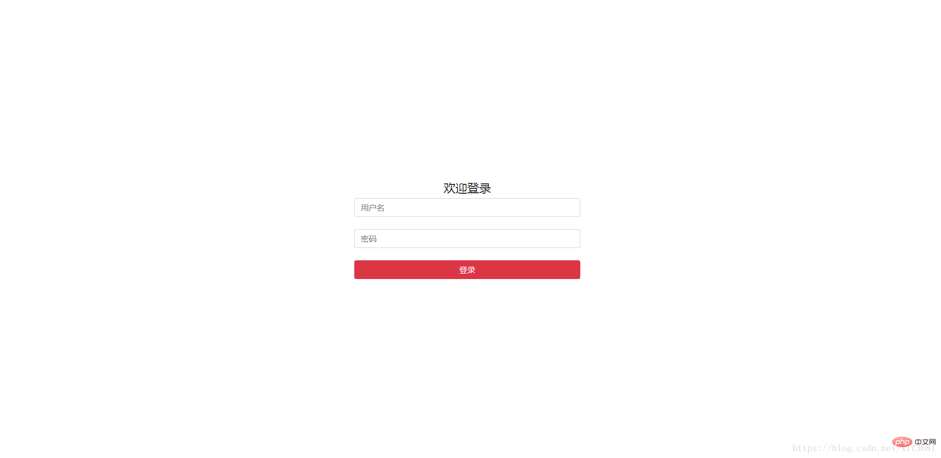
bootstrap3 如何让div内部垂直居中:
Bootstrap的栅格系统使用的是float:left的浮动方式,vertical-align属性不起作用,故把内部div的float属性清除,添加display属性,如下:
.middle {

   float: none;

   display: inline-block;

   vertical-align: middle;

}
Bootstrap3登录框自适应水平居中+垂直居中
https://blog.csdn.net/shenzhen_zsw/article/details/75331515
Bootstrap4 如何让div内部垂直居中:
给元素定高度
.login-center {

 height: 100vh;

}
应用.align-items-center可以使元素垂直居中:
<div class="row align-items-centerjustify-content-center login-center">

…

</div>
应用. justify-content-center可以使元素水平居中:
效果:
更多编程相关知识,请访问:编程教学!!
以上是浅谈Bootstrap中的垂直水平居中的详细内容。更多信息请关注PHP中文网其他相关文章!

 Bootstrap:使网页设计更容易Apr 13, 2025 am 12:10 AM
Bootstrap让网页设计更容易的原因是其预设组件、响应式设计和丰富的社区支持。1)预设组件库和样式让开发者无需编写复杂的CSS代码;2)内置网格系统简化了响应式布局的创建;3)社区支持提供了丰富的资源和解决方案。
 Bootstrap的影响:加速网络开发Apr 12, 2025 am 12:05 AM
Bootstrap加速了Web开发,通过提供预定义的样式和组件,开发者可以快速搭建响应式网站。1)它缩短了开发时间,例如在项目中几天内完成基本布局。2)通过Sass变量和mixins,Bootstrap允许定制样式以满足特定需求。3)使用CDN版本可以优化性能,提高加载速度。
 理解引导:核心概念和功能Apr 11, 2025 am 12:01 AM
Bootstrap是一个开源的前端框架,主要作用是帮助开发者快速构建响应式网站。1)它提供了预定义的CSS类和JavaScript插件,方便实现复杂的UI效果。2)Bootstrap的工作原理依赖于其CSS和JavaScript组件,通过媒体查询实现响应式设计。3)使用示例包括基本用法,如创建按钮,以及高级用法,如自定义样式。4)常见错误包括类名拼写错误和未正确引入文件,建议使用浏览器开发者工具调试。5)性能优化可通过自定义构建工具实现,最佳实践包括使用语义化HTML和Bootstrap的预定义
 Bootstrap Deep Dive:响应式设计和高级布局技术Apr 10, 2025 am 09:35 AM
Bootstrap通过网格系统和媒体查询实现响应式设计,使网站适应不同设备。1.使用预定义类(如col-sm-6)定义列宽。2.网格系统基于12列,需注意总和不超12。3.使用断点(如sm、md、lg)定义不同屏幕尺寸下的布局。
 Bootstrap面试问题:降落您梦想的前端工作Apr 09, 2025 am 12:14 AM
Bootstrap是一套开源的前端框架,用于快速开发响应式网站和应用。1.它提供了响应式设计、一致的UI组件和快速开发的优势。2.网格系统使用flexbox布局,基于12列结构,通过.container、.row和.col-sm-6等类实现。3.自定义样式可以通过修改SASS变量或覆盖CSS实现。4.常用JavaScript组件包括模态框、轮播图和折叠。5.优化性能可以通过只加载必要组件、使用CDN和压缩合并文件来实现。
 Bootstrap&JavaScript集成:动态功能和功能Apr 08, 2025 am 12:10 AM
Bootstrap和JavaScript可以无缝整合,赋予网页动态功能。1)使用JavaScript操作Bootstrap组件,如模态框和导航栏。2)确保jQuery正确加载,避免常见集成问题。3)通过事件监听和DOM操作实现复杂用户交互和动态效果。
 bootstrap搜索栏怎么获取Apr 07, 2025 pm 03:33 PM
如何使用 Bootstrap 获取搜索栏的值:确定搜索栏的 ID 或名称。使用 JavaScript 获取 DOM 元素。获取元素的值。执行所需的操作。
 bootstrap怎么插入图片Apr 07, 2025 pm 03:30 PM
在 Bootstrap 中插入图片有以下几种方法:直接插入图片,使用 HTML 的 img 标签。使用 Bootstrap 图像组件,可以提供响应式图片和更多样式。设置图片大小,使用 img-fluid 类可以使图片自适应。设置边框,使用 img-bordered 类。设置圆角,使用 img-rounded 类。设置阴影,使用 shadow 类。调整图片大小和位置,使用 CSS 样式。使用背景图片,使用 background-image CSS 属性。


热AI工具

Undresser.AI Undress
人工智能驱动的应用程序,用于创建逼真的裸体照片

AI Clothes Remover
用于从照片中去除衣服的在线人工智能工具。

Undress AI Tool
免费脱衣服图片

Clothoff.io
AI脱衣机

AI Hentai Generator
免费生成ai无尽的。

热门文章
热工具

MinGW - 适用于 Windows 的极简 GNU
这个项目正在迁移到osdn.net/projects/mingw的过程中,你可以继续在那里关注我们。MinGW:GNU编译器集合(GCC)的本地Windows移植版本,可自由分发的导入库和用于构建本地Windows应用程序的头文件;包括对MSVC运行时的扩展,以支持C99功能。MinGW的所有软件都可以在64位Windows平台上运行。

螳螂BT
Mantis是一个易于部署的基于Web的缺陷跟踪工具,用于帮助产品缺陷跟踪。它需要PHP、MySQL和一个Web服务器。请查看我们的演示和托管服务。

SublimeText3 Mac版
神级代码编辑软件(SublimeText3)

记事本++7.3.1
好用且免费的代码编辑器

SublimeText3汉化版
中文版,非常好用

