


本篇文章通过代码实例给大家介绍一下svg+css3实现动感的波浪效果。有一定的参考价值,有需要的朋友可以参考一下,希望对大家有所帮助。

一根矢量的波浪
<svg viewBox="0 0 560 20" class="wave-animation__water-wave wave-animation__water-wave--front">
    <use xlink:href="#wave"></use>
</svg>
<svg id="wave" width="100%" height="100%">
    <path d="M420,20c21.5-0.4,38.8-2.5,51.1-4.5c13.4-2.2,26.5-5.2,27.3-5.4C514,6.5,518,4.7,528.5,2.7c7.1-1.3,17.9-2.8,31.5-2.7c0,0,0,0,0,0v20H420z"></path>
    <path d="M420,20c-21.5-0.4-38.8-2.5-51.1-4.5c-13.4-2.2-26.5-5.2-27.3-5.4C326,6.5,322,4.7,311.5,2.7C304.3,1.4,293.6-0.1,280,0c0,0,0,0,0,0v20H420z"></path>
    <path d="M140,20c21.5-0.4,38.8-2.5,51.1-4.5c13.4-2.2,26.5-5.2,27.3-5.4C234,6.5,238,4.7,248.5,2.7c7.1-1.3,17.9-2.8,31.5-2.7c0,0,0,0,0,0v20H140z"></path>
    <path d="M140,20c-21.5-0.4-38.8-2.5-51.1-4.5c-13.4-2.2-26.5-5.2-27.3-5.4C46,6.5,42,4.7,31.5,2.7C24.3,1.4,13.6-0.1,0,0c0,0,0,0,0,0l0,20H140z"></path>
</svg>
完整代码:
<!DOCTYPE html>
<html>
<head>
<meta charset="utf-8">
<meta name="viewport" content="width=device-width,initial-scale=1,user-scalable=no">
</head>
<body>
<div class="circle-countdown circle-countdown--ended">
<div class="circle-countdown__content-wrapper">
<div class="circle-countdown__content wave-animation">
<div id="water" class="wave-animation__water">
<svg viewBox="0 0 560 20" class="wave-animation__water-wave wave-animation__water-wave--back">
<path
d="M420,20c21.5-0.4,38.8-2.5,51.1-4.5c13.4-2.2,26.5-5.2,27.3-5.4C514,6.5,518,4.7,528.5,2.7c7.1-1.3,17.9-2.8,31.5-2.7c0,0,0,0,0,0v20H420z">
</path>
<path
d="M420,20c-21.5-0.4-38.8-2.5-51.1-4.5c-13.4-2.2-26.5-5.2-27.3-5.4C326,6.5,322,4.7,311.5,2.7C304.3,1.4,293.6-0.1,280,0c0,0,0,0,0,0v20H420z">
</path>
<path
d="M140,20c21.5-0.4,38.8-2.5,51.1-4.5c13.4-2.2,26.5-5.2,27.3-5.4C234,6.5,238,4.7,248.5,2.7c7.1-1.3,17.9-2.8,31.5-2.7c0,0,0,0,0,0v20H140z">
</path>
<path
d="M140,20c-21.5-0.4-38.8-2.5-51.1-4.5c-13.4-2.2-26.5-5.2-27.3-5.4C46,6.5,42,4.7,31.5,2.7C24.3,1.4,13.6-0.1,0,0c0,0,0,0,0,0l0,20H140z">
</path>
</svg>
<svg viewBox="0 0 560 20" class="wave-animation__water-wave wave-animation__water-wave--front">
<path
d="M420,20c21.5-0.4,38.8-2.5,51.1-4.5c13.4-2.2,26.5-5.2,27.3-5.4C514,6.5,518,4.7,528.5,2.7c7.1-1.3,17.9-2.8,31.5-2.7c0,0,0,0,0,0v20H420z">
</path>
<path
d="M420,20c-21.5-0.4-38.8-2.5-51.1-4.5c-13.4-2.2-26.5-5.2-27.3-5.4C326,6.5,322,4.7,311.5,2.7C304.3,1.4,293.6-0.1,280,0c0,0,0,0,0,0v20H420z">
</path>
<path
d="M140,20c21.5-0.4,38.8-2.5,51.1-4.5c13.4-2.2,26.5-5.2,27.3-5.4C234,6.5,238,4.7,248.5,2.7c7.1-1.3,17.9-2.8,31.5-2.7c0,0,0,0,0,0v20H140z">
</path>
<path
d="M140,20c-21.5-0.4-38.8-2.5-51.1-4.5c-13.4-2.2-26.5-5.2-27.3-5.4C46,6.5,42,4.7,31.5,2.7C24.3,1.4,13.6-0.1,0,0c0,0,0,0,0,0l0,20H140z">
</path>
</svg>
</div>
</div>
</div>
</div>
<style>
.circle-countdown {
width: 441px;
height: 441px;
position: relative;
top: 0;
left: 0;
padding: 2.5rem;
border: 1px solid #fb64b6;
border-radius: 50%;
overflow: hidden;
}
.wave-animation {
overflow: hidden;
}
.wave-animation__percent {
position: absolute;
left: 0;
top: 0;
z-index: 3;
width: 100%;
height: 100%;
display: flex;
display: -webkit-flex;
align-items: center;
justify-content: center;
color: #fff;
font-size: 64px;
}
.wave-animation__water {
position: absolute;
left: 0;
top: 0;
z-index: -1;
width: 100%;
height: 100%;
/* 调整这里的60%就可以改变进度,波浪高低 */
transform: translate(0, calc(100% - 60%));
background: #f852d6;
transition: all 2s;
}
.wave-animation__water-wave {
width: 200%;
position: absolute;
bottom: 100%;
}
.wave-animation__water-wave--back {
right: 0;
fill: #1d1d1d;
animation: wave-back 1.4s infinite linear;
}
.wave-animation__water-wave--front {
left: 0;
fill: #f852d6;
margin-bottom: -1px;
animation: wave-front 0.7s infinite linear;
}
@keyframes wave-front {
100% {
transform: translate(-50%, 0);
}
}
@keyframes wave-back {
100% {
transform: translate(50%, 0);
}
}
</style>
</body>
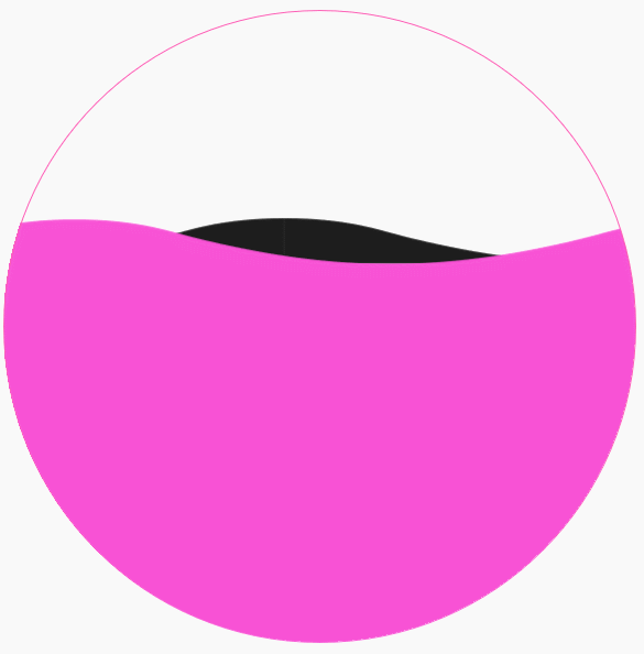
</html>效果图:
更多炫酷CSS3、html5、javascript特效代码,尽在:js特效大全
以上是svg+css3实现动感的波浪效果的详细内容。更多信息请关注PHP中文网其他相关文章!

 轨道力学(或我如何优化CSS KeyFrames动画)May 09, 2025 am 09:57 AM
重构自己的代码看起来是什么样的?约翰·瑞亚(John Rhea)挑选了他写的一个旧的CSS动画,并介绍了优化它的思维过程。
 CSS动画:很难创建它们吗?May 09, 2025 am 12:03 AM
CSSanimationsarenotinherentlyhardbutrequirepracticeandunderstandingofCSSpropertiesandtimingfunctions.1)Startwithsimpleanimationslikescalingabuttononhoverusingkeyframes.2)Useeasingfunctionslikecubic-bezierfornaturaleffects,suchasabounceanimation.3)For
 @KeyFrames CSS:最常用的技巧May 08, 2025 am 12:13 AM
@keyframesispopularduetoitsversatoryand and powerincreatingsmoothcssanimations.keytricksinclude:1)definingsmoothtransitionsbetnestates,2)使用AnimatingmatematingmultationmatingMultationPropertiessimultane,3)使用使用4)使用BombingeNtibalibility,4)使用BombingingWithjavofofofofofoffo
 CSS计数器:自动编号的综合指南May 07, 2025 pm 03:45 PM
CSSCOUNTERSAREDOMANAGEAUTOMANAMBERINGINWEBDESIGNS.1)他们可以使用forterablesofcontents,ListItems,and customnumbering.2)AdvancedsincludenestednumberingSystems.3)挑战挑战InclassINCludeBrowsEccerCerceribaliblesibility andperformiballibility andperformissises.4)创造性
 使用卷轴驱动动画的现代滚动阴影May 07, 2025 am 10:34 AM
使用滚动阴影,尤其是对于移动设备,是克里斯以前涵盖的一个微妙的UX。杰夫(Geoff)涵盖了一种使用动画限制属性的新方法。这是另一种方式。


热AI工具

Undresser.AI Undress
人工智能驱动的应用程序,用于创建逼真的裸体照片

AI Clothes Remover
用于从照片中去除衣服的在线人工智能工具。

Undress AI Tool
免费脱衣服图片

Clothoff.io
AI脱衣机

Video Face Swap
使用我们完全免费的人工智能换脸工具轻松在任何视频中换脸!

热门文章
热工具

安全考试浏览器
Safe Exam Browser是一个安全的浏览器环境,用于安全地进行在线考试。该软件将任何计算机变成一个安全的工作站。它控制对任何实用工具的访问,并防止学生使用未经授权的资源。

SublimeText3 Mac版
神级代码编辑软件(SublimeText3)

mPDF
mPDF是一个PHP库,可以从UTF-8编码的HTML生成PDF文件。原作者Ian Back编写mPDF以从他的网站上“即时”输出PDF文件,并处理不同的语言。与原始脚本如HTML2FPDF相比,它的速度较慢,并且在使用Unicode字体时生成的文件较大,但支持CSS样式等,并进行了大量增强。支持几乎所有语言,包括RTL(阿拉伯语和希伯来语)和CJK(中日韩)。支持嵌套的块级元素(如P、DIV),

记事本++7.3.1
好用且免费的代码编辑器

WebStorm Mac版
好用的JavaScript开发工具

