


这篇文章主要为大家详细介绍了Android自定义环形LoadingView效果的方法,具有一定的参考价值,感兴趣的小伙伴们可以参考一下
最近项目有要用到环形的进度条,Github上有一个类似的DashedCircularProgress控件,但是他画的进度是通过设置画笔的虚线效果来实现间隔的:progressPaint.setPathEffect(new DashPathEffect(new float[]{dashWith, dashSpace}, dashSpace));如果内层还有一层圆环,在动态设置时,内层和外层有细微的偏差.于是我在原有基础上改了一个,实现了我要的效果(设置进度时可以选择加动画或者不加动画):
控件实现:
这个控件继承RelativeLayout,在onDraw时做了两件事:
1、先画出底部的黑色环形;
2、按照当时的进度值画出对应比例的外层绿色环形.
对外提供一个接口,回调当前进度值:
public interface OnValueChangeListener {
  void onValueChange(float value);
}
核心绘制类:
InternalCirclePainterImp2,绘制内层的黑色的环形:
/**
 * @author Chuck
 */
public class InternalCirclePainterImp2 implements InternalCirclePainter {

  private RectF internalCircle;//画出圆弧时,圆弧的外切矩形
  private Paint internalCirclePaint;
  private int color;
  private float startAngle = 270f;
  int arcQuantity=100;//等分(圆弧加间隔),比如arcQuantity=100时,表示将有100个圆弧,和100个空白间隔
  float ratio=0.5f;//每段圆弧与圆弧加间隔之和的比例,ratio=0.5表示每个圆弧与相邻的间隔弧度比是1:1
  private int width;
  private int height;
  private int internalStrokeWidth = 48;//圆环宽度

  public InternalCirclePainterImp2(int color, int progressStrokeWidth, int arcQuantity,float ratio) {
    this.color = color;
    this.internalStrokeWidth = progressStrokeWidth;
    this.arcQuantity = arcQuantity;
    if(ratio>0&&ratio<1){
      this.ratio = ratio;
    }

    init();
  }

  private void init() {
    initExternalCirclePainter();
  }

  private void initExternalCirclePainter() {
    internalCirclePaint = new Paint();
    internalCirclePaint.setAntiAlias(true);
    internalCirclePaint.setStrokeWidth(internalStrokeWidth);
    internalCirclePaint.setColor(color);
    internalCirclePaint.setStyle(Paint.Style.STROKE);

  }

  //圆弧外切矩形
  private void initExternalCircle() {
    internalCircle = new RectF();
    float padding = internalStrokeWidth * 0.5f;
    internalCircle.set(padding, padding , width - padding, height - padding);
    initExternalCirclePainter();
  }


  @Override
  public void draw(Canvas canvas) {

    float eachAngle=360f/arcQuantity;

    float eachArcAngle=eachAngle*ratio;

    for(int i=0;i<arcQuantity*2;i++){
      if(i%2==0){//遇到偶数就画圆弧,基数则跳过
        canvas.drawArc(internalCircle, startAngle+eachAngle*i/2, eachArcAngle, false, internalCirclePaint);
      }
      else{
        continue;
      }
    }

  }

  public void setColor(int color) {
    this.color = color;
    internalCirclePaint.setColor(color);
  }

  @Override
  public int getColor() {
    return color;
  }

  @Override
  public void onSizeChanged(int height, int width) {
    this.width = width;
    this.height = height;
    initExternalCircle();
  }
}
ProgressPainterImp2,绘制内层的黑色的环形:
/**
 * @author Chuck
 */
public class ProgressPainterImp2 implements ProgressPainter {

  private RectF progressCircle;
  private Paint progressPaint;
  private int color = Color.RED;
  private float startAngle = 270f;
  private int internalStrokeWidth = 48;
  private float min;
  private float max;
  private int width;
  private int height;

  private int currentPecent;//当前的百分比

  int arcQuantity=100;//等分(圆弧加间隔),比如arcQuantity=100时,表示将有100个圆弧,和100个空白间隔
  float ratio=0.5f;//每段圆弧与圆弧加间隔之和的比例,ratio=0.5表示每个圆弧与相邻的间隔弧度比是1:1

  public ProgressPainterImp2(int color, float min, float max, int progressStrokeWidth, int arcQuantity,float ratio) {
    this.color = color;
    this.min = min;
    this.max = max;
    this.internalStrokeWidth = progressStrokeWidth;
    this.arcQuantity = arcQuantity;
    this.ratio = ratio;
    init();
    Log.e("ProgressPainterImp","构造函数执行");
  }

  private void init() {
    initInternalCirclePainter();

  }

  private void initInternalCirclePainter() {
    progressPaint = new Paint();
    progressPaint.setAntiAlias(true);
    progressPaint.setStrokeWidth(internalStrokeWidth);
    progressPaint.setColor(color);
    progressPaint.setStyle(Paint.Style.STROKE);

  }

  //初始化外切的那个矩形
  private void initInternalCircle() {
    progressCircle = new RectF();
    float padding = internalStrokeWidth * 0.5f;
    progressCircle.set(padding, padding , width - padding, height - padding);

    initInternalCirclePainter();
  }

  @Override
  public void draw(Canvas canvas) {

    float eachAngle=360f/arcQuantity;

    float eachArcAngle=eachAngle*ratio;

    int quantity=2*arcQuantity*currentPecent/100;
    for(int i=0;i<quantity;i++){
      if(i%2==0){//遇到偶数就画圆弧,基数则跳过
        canvas.drawArc(progressCircle, startAngle+eachAngle*i/2, eachArcAngle, false, progressPaint);
      }
      else{
        continue;
      }
    }
  }

  public float getMin() {
    return min;
  }

  public void setMin(float min) {
    this.min = min;
  }

  public float getMax() {
    return max;
  }

  public void setMax(float max) {
    this.max = max;
  }

  public void setValue(float value) {
    this.currentPecent = (int) (( 100f * value) / max);
  }

  @Override
  public void onSizeChanged(int height, int width) {
    Log.e("ProgressPainterImp","onSizeChanged执行");

    this.width = width;
    this.height = height;
    initInternalCircle();
  }

  public int getColor() {
    return color;
  }

  public void setColor(int color) {
    this.color = color;
    progressPaint.setColor(color);
  }
}
可以自定义的属性:
<declare-styleable name="CircularLoadingView">
  <attr name="base_color" format="color" /> <!--内层圆环的颜色-->
  <attr name="progress_color" format="color" /><!--进度圆环的颜色-->
  <attr name="max" format="float" /><!--最小值-->
  <attr name="min" format="float" /><!--最大值-->
  <attr name="duration" format="integer" /><!--动画时长-->
  <attr name="progress_stroke_width" format="integer" /><!--圆环宽度-->

  <!--等分(圆弧加间隔),比如arcQuantity=100时,表示将有100个圆弧,和100个空白间隔-->
  <attr name="argQuantity" format="integer" />

  <!--每段圆弧与圆弧加间隔之和的比例,ratio=0.5表示每个圆弧与相邻的间隔弧度比是1:1-->
  <attr name="ratio" format="float" />
</declare-styleable>
调用:
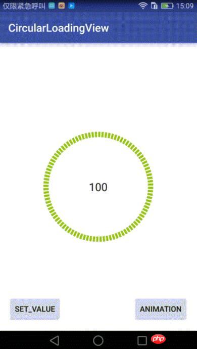
main_activity.xml:
<?xml version="1.0" encoding="utf-8"?>
<RelativeLayout
  xmlns:android="http://schemas.android.com/apk/res/android"
  android:layout_width="match_parent"
  android:layout_height="match_parent"
  android:paddingBottom="@dimen/activity_vertical_margin"
  android:paddingLeft="@dimen/activity_horizontal_margin"
  android:paddingRight="@dimen/activity_horizontal_margin"
  android:paddingTop="@dimen/activity_vertical_margin"
  xmlns:custom="http://schemas.android.com/apk/res-auto"
  android:background="#ffffff"
  >

  <!--自定义控件,继承RelativeLayout-->
  <qdong.com.mylibrary.CircularLoadingView
    android:id="@+id/simple"
    custom:base_color="@color/pager_bg"
    custom:min="0"
    custom:max="100"
    custom:argQuantity="100"
    custom:ratio="0.6"
    custom:progress_color="@android:color/holo_green_light"
    custom:progress_icon="@mipmap/ic_launcher"
    custom:duration="1000"
    custom:progress_stroke_width="28"
    android:layout_centerInParent="true"
    android:layout_width="200dp"
    android:layout_height="200dp">

    <RelativeLayout
      android:layout_centerInParent="true"
      android:layout_width="match_parent"
      android:layout_height="match_parent">


        <TextView
          android:layout_centerInParent="true"

          android:textSize="20sp"
          android:layout_centerHorizontal="true"
          android:id="@+id/number"
          android:text="0"
          android:gravity="center"
          android:textColor="@color/pager_bg"
          android:layout_width="wrap_content"
          android:layout_height="wrap_content" />

    </RelativeLayout>

  </qdong.com.mylibrary.CircularLoadingView>

  <Button
    android:layout_width="wrap_content"
    android:layout_height="wrap_content"
    android:text="Set_Value"
    android:id="@+id/button"
    android:layout_alignParentBottom="true"
    android:layout_alignParentStart="true"/>

  <Button
    android:layout_width="wrap_content"
    android:layout_height="wrap_content"
    android:text="Animation"
    android:id="@+id/button3"
    android:layout_alignTop="@+id/button"
    android:layout_alignParentEnd="true"/>
</RelativeLayout>
MainActivity:
findViewById(R.id.button).setOnClickListener(new View.OnClickListener() {
  @Override
  public void onClick(View view) {
    try {
      mDashedCircularProgress.setValue(66);//没有动画的,直接设置
    } catch (Exception e) {
      e.printStackTrace();
    }
  }
});
findViewById(R.id.button3).setOnClickListener(new View.OnClickListener() {
  @Override
  public void onClick(View view) {
    try {
      mDashedCircularProgress.setValue(0);//无动画,归零
      mDashedCircularProgress.setValueWithAnimation(100,2000);//带动画
    } catch (Exception e) {
      e.printStackTrace();
    }
  }
});
Github地址:https://github.com/506954774/AndroidCircularLoadingView
以上就是本文的全部内容,希望对大家的学习有所帮助,更多相关内容请关注PHP中文网!
相关推荐:
以上是Android自定义环形LoadingView效果的详细内容。更多信息请关注PHP中文网其他相关文章!

 掌握microdata:HTML5的分步指南May 14, 2025 am 12:07 AM
Microdatainhtml5enhancesseoanduserexperienceByByBybyBystructuredDatatoSearchEngines.1)useIteMscope,itemType,anditempropattributestomarkupcontentlikeSoreRoductSssSssSoRorevents.2)
 HTML5表格中有什么新功能?探索新输入类型May 13, 2025 pm 03:45 PM
html5introducesnewinputtypesthatenhanceserexperience,简化开发和iMproveAccessibility.1)自动validatesemailformat.2)优化优化,优化OmportizeSmizesemizesemizesemizesemizesemizeSmobobileWithAnumericKeyPad.3)和SimimplifyDtimePutputientiputiNputiNputits。
 理解H5:含义和意义May 11, 2025 am 12:19 AM
H5是HTML5,是HTML的第五个版本。HTML5提升了网页的表现力和交互性,引入了语义化标签、多媒体支持、离线存储和Canvas绘图等新特性,推动了Web技术的发展。
 H5:可访问性和网络标准合规性May 10, 2025 am 12:21 AM
无障碍访问和网络标准遵循对网站至关重要。1)无障碍访问确保所有用户都能平等访问网站,2)网络标准遵循提高网站的可访问性和一致性,3)实现无障碍访问需使用语义化HTML、键盘导航、颜色对比度和替代文本,4)遵循这些原则不仅是道德和法律要求,还能扩大用户群体。
 HTML中的H5标签是什么?May 09, 2025 am 12:11 AM
HTML中的H5标签是第五级标题,用于标记较小的标题或子标题。1)H5标签帮助细化内容层次,提升可读性和SEO。2)结合CSS可定制样式,增强视觉效果。3)合理使用H5标签,避免滥用,确保内容结构逻辑性。
 H5代码:Web结构的初学者指南May 08, 2025 am 12:15 AM
HTML5构建网站的方法包括:1.使用语义化标签定义网页结构,如、、等;2.嵌入多媒体内容,使用和标签;3.应用表单验证和本地存储等高级功能。通过这些步骤,你可以创建一个结构清晰、功能丰富的现代网页。
 H5代码结构:组织内容以实现可读性May 07, 2025 am 12:06 AM
通过合理的H5代码结构可以让页面在众多内容中脱颖而出。1)使用语义化标签如、、等组织内容,使结构清晰。2)通过CSS布局如Flexbox或Grid控制页面在不同设备上的呈现效果。3)实现响应式设计,确保页面在不同屏幕尺寸上自适应。
 H5与较旧的HTML版本:比较May 06, 2025 am 12:09 AM
HTML5(H5)与旧版本HTML的主要区别包括:1)H5引入了语义化标签,2)支持多媒体内容,3)提供离线存储功能。H5通过新标签和API增强了网页的功能和表现力,如和标签,提高了用户体验和SEO效果,但需注意兼容性问题。


热AI工具

Undresser.AI Undress
人工智能驱动的应用程序,用于创建逼真的裸体照片

AI Clothes Remover
用于从照片中去除衣服的在线人工智能工具。

Undress AI Tool
免费脱衣服图片

Clothoff.io
AI脱衣机

Video Face Swap
使用我们完全免费的人工智能换脸工具轻松在任何视频中换脸!

热门文章
热工具

Atom编辑器mac版下载
最流行的的开源编辑器

记事本++7.3.1
好用且免费的代码编辑器

适用于 Eclipse 的 SAP NetWeaver 服务器适配器
将Eclipse与SAP NetWeaver应用服务器集成。

SublimeText3 Mac版
神级代码编辑软件(SublimeText3)

PhpStorm Mac 版本
最新(2018.2.1 )专业的PHP集成开发工具

